The UI & UX tips collection — volume one
A collection of 34 tips to help improve your designs instantly.
Creating beautiful, but also practical UIs takes time, with a lengthy amount of design revisions along the way. I know. I’ve been there before.
But what I’ve discovered over the years is that by making just a few simple, and quick adjustments to your designs you can improve the end-result massively.
In this guide I’ve put together a collection of my popular UI & UX tips from the past 12 months that can, with little effort, help improve both your designs, and the overall user experience.
Let’s dive on in…
Oh. Before you read the rest of the article…
🏠 Growing a SaaS startup? I combine strategic design with proven founder experience to help you build products users love.
Join the Haus waitlist for early-bird perks → https://gohaus.design/
1. Make your elements appear more defined with a subtle border.

Using Multiple Drop Shadows or a very subtle border (just a shade darker than your actual shadow) around certain elements can make those elements appear a little sharper, more defined, and help you avoid those muddy-looking shadows.
2. Reduce Letter-spacing on your Headings to give a better optical balance.
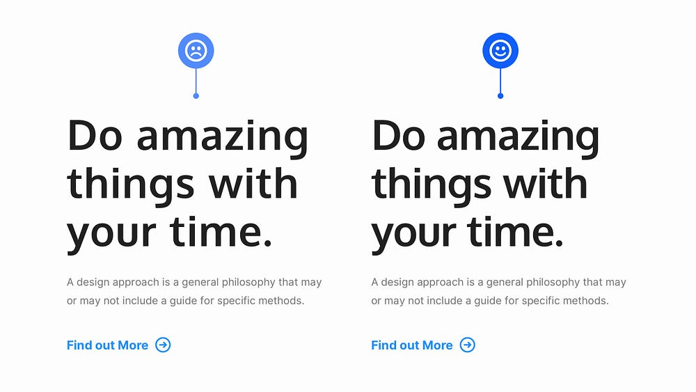
Reducing Letter-spacing on long-form Body text? That’s a big ‘No’.
But for Headings…
… that’s a resounding ‘Yes’ from me!
Your Headings are most likely going to be much larger, and heavier than their Body text companions, so the spacing between the letters can sometimes appear optically larger, which is not always what you want when you’re looking for that perfect aesthetic.
Reducing the Letter-spacing, just by small amounts, can make your Headings more optically balanced, more readable, and generally more pleasant to look at.
3. For consistency, make sure your icons share the same visual style.

When implementing Icons in your UIs, keep things consistent.
Make sure they all share the same visual style; the same weight, and either filled, or outlined.
Don’t mix and match.
4. Using just one typeface in your design is all good. Ignore the haters.

It’s absolutely fine to just go with a single Typeface when creating your designs, and doing so can actually help you produce much stronger, and consistent results.
Ignore the ‘Always use 2 Typefaces. Minimum.’ crowd. Using a combination of Weights, Sizes, and Colour you can still produce perfectly acceptable results with just a solitary Typeface.
5. Whitespace is your UI design friend. Use it generously. Use it well.

Good old Whitespace, Negative Space, you know the one. Use it generously, or in moderation, but use it well.
Even just subtle amounts of the white stuff can allow your designs to breathe, and look more polished.
One of the fastest, and simplest ways to improve your designs, no doubt.
6. Creating long-form content? Give 20pt a try.

For long-form content (ie; Blog Posts, Project Descriptions etc…), try going with 20pt (or even a little more) for your Body copy.
Of course this is dependent on the Typeface chosen, but a good majority of popular Body Typefaces work great at 20pt, and bring a much better reading experience for your users when they’re faced with a wall of text.
18pt is sooo last decade.
7. Use a Type Scale to define a harmonious set of font sizes.
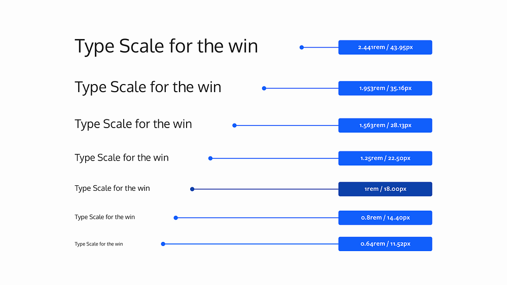
Using a Type Scale helps you define a set of font sizes easily, practically, and without any kind of guesswork.
As the name suggests, a Type Scale works based on a scale factor (say 1.25). The idea is that you start with a Base font size (18px) and multiply (or divide) it with the scale factor to get font sizes of either a higher (ie; H₁, H₂, etc…), or lower hierarchy (ie; Caption, Button etc…)
A Type Scale will help you produce texts that look harmonious because their sizes increase, and decrease along a fixed scale that you’ve set.
I highly recommend checking out — https://type-scale.com
8. Choose a Base Colour, and then use Tints & Shades to add uniformity.

Guess what? You don’t always have to stuff your design with a mass of colours.
If the project allows it, simply using a restricted colour palette by choosing a Base Colour and then using Tints and Shades of your chosen colour can add uniformity to your designs in the simplest of ways.
9. Improve your user’s onboarding experience. Thumbs rule remember.
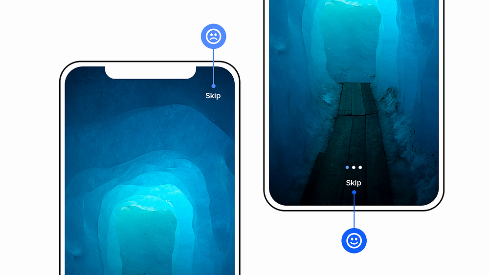
Enable users to skip your Mobile App Onboarding sequence at any time, and place that Skip link within easy thumb reach.
Just a simple adjustment that can enable a much better experience for your users… right from the start.
Thumbs still rule remember!
10. Your shadows are coming from one light source right?
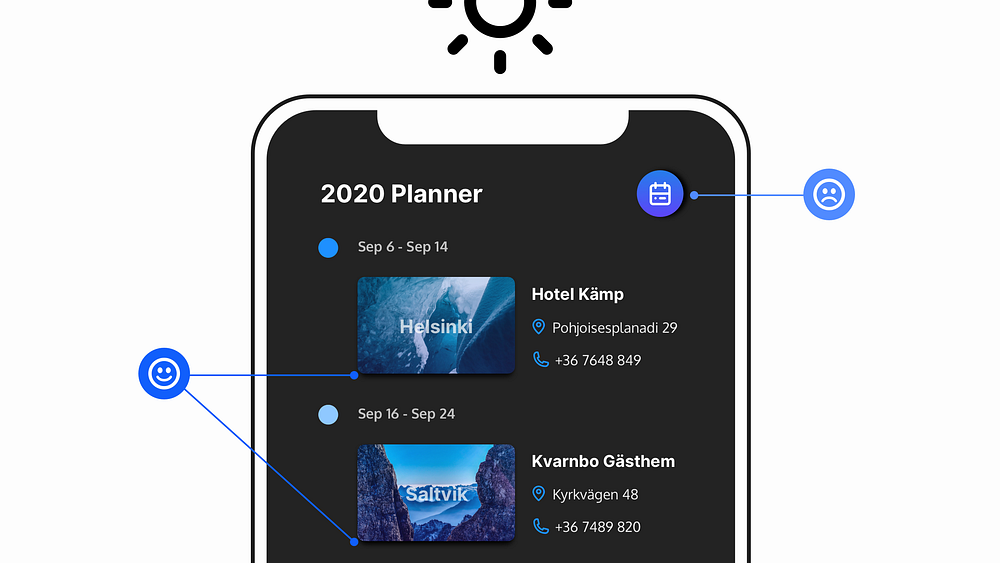
Make sure your shadows always come from just the one light source.
It’s a simple mistake to make, but one that can leave your designs looking less than polished.
We don’t live in a land of a thousand suns remember.
11. Use Superfamilies when you’re looking for great font combinations, but fast.
Is it a bird? Is it a plane? Nope. It’s a Superfamily!
When you’re looking to improve your typeface-combining skills and feel a little daunted when faced with 1000s of Typefaces to choose from, just go with a Superfamily!
Superfamilies are collections of Typefaces that can come in both Serif, and Sans-Serif variants for example, and are created to work together in close visual harmony.
A few that I highly recommend are Merriweather & Merriweather Sans, and Roboto & Roboto Slab which you can find here at Google Fonts.
If you want to combine Typefaces effectively, and without the worry of picking out an ugly looking combination you’ll rarely go wrong when choosing a Superfamily.
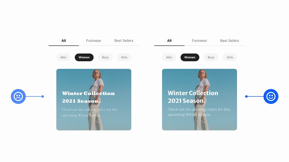
12. Improve contrast between your text and images with a subtle overlay.

Depending on where the text may be positioned over your image, you can either go with a tried, and tested full image overlay, or a more subtle (bottom to top, or top to bottom) gradient overlay to achieve a simple contrast between the two elements.
Nothing too elaborate is required to achieve a good contrast between your text and images.
13. Use Centred Text in moderation. Too much of it makes for a sub-par user experience.
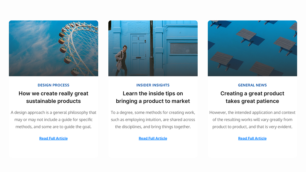
Try to only use Centred Text for Headlines and small passages of Text if possible.
For pretty much everything else keep that text left-aligned. Your users will thank you for it.
14. When choosing a multi-use Typeface, try to find one with plenty of weights.
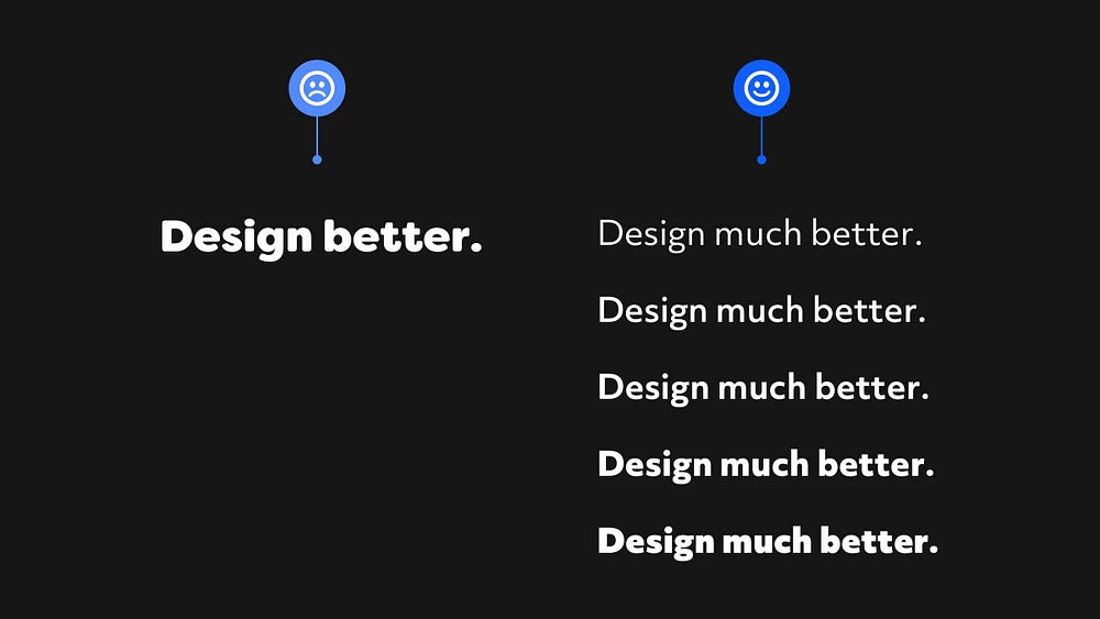
Does the Typeface you’ve been searching for come with a generous selection of weights, and styles?
Try and make sure it does if you intend on using it for a few of your projects.
Just the one weight, or style. Nah. I recommend steering clear of those if you can.
There are exceptions of course, and certain projects will require that ‘one style only’ more elaborate typeface, but for the vast majority of projects you want Typefaces with a little more in the way of… well… choice.
Even if you decide on using just two or three weight or styles, give yourself the breathing room if you need to call on more at a later stage in the design process.
15. Darken up your text on light backgrounds. Ignore the ‘cool kids’.

Don’t make your text too light when working against a light background.
It can look like all the cool kids are (still) doing it, but you’re much smarter than that, and want to create much more accessible interfaces right?
16. Lighten up your text if it looks a little on the heavy side.

When it comes to long-form content, certain Regular weight Typefaces can still look a little too heavy, and stark on the screen.
You can easily fix this by choosing something like a Dark Grey (ie; #4F4F4F) to tone that text down, and make it a little easier on the eye.
17. Always make your ‘Call to Action’ the most prominent item on the screen.

You think this would be common-sense right? Erm. Not always I’m afraid.
Make sure that ‘Call to Action’ is as prominent as possible, via the use of colour contrast, size, and labels.
Don’t always rely on Icons alone if you can. If you can use Text Labels too, use ’em, to enable much better user comprehension.
18. The smaller the font size, the more generous your line height should be.
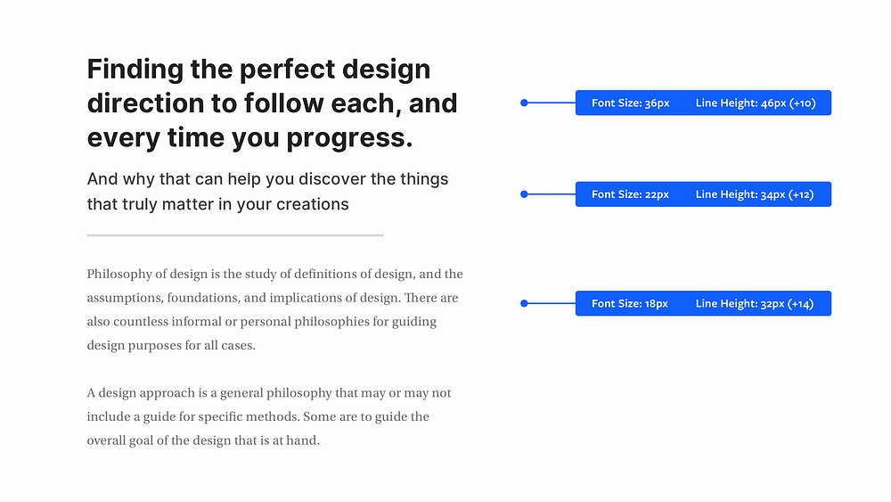
As your font size decreases, increase the line height for better, all-round legibility.
The same applies to when your font size increases. Simply Decrease the line height.
19. Use the x-height or Il1 test to determine readability of your chosen Typeface.

Basically, the x-height is the height of a lower-case ‘x’ relative to an upper-case letter (ie; T) of the same Typeface.
If your font has a large x-height, then this will generally make for much better readability, especially when used in long-form body text.
Another way to determine the readability of a Typeface, and to narrow things down if you have a few Typefaces that you can’t decide between, is to do the Il1 Test (Credit to Jessica Hische for this tip).
Here you compare three characters from a specific Typeface; Uppercase i (I), Lowercase L (l), and the number one (1).
How different the letterforms look against one another can help determine readability, especially when working with Sans Serif Typefaces.
Always aim for the best legibility, either via x-height, Il1, or both, when choosing a Typeface for your Body text.
20. Give Prominence to the most frequently used action in a Menu.
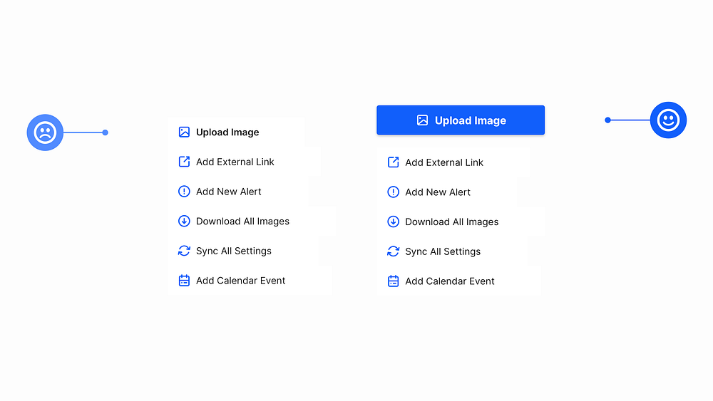
When designing a Menu to use inside an application, make sure to give the most frequently used action (ie; Upload Image, Add File etc…) the most prominence on the screen.
21. Colour-Pick from your images, and bring your products to life.

Simply colour-picking from your product images, and then applying various tints and shades of your chosen colour to your background, text, icons or more, can add plenty of visual interest, and character to your designs.
22. Set your line height based on the Typeface’s x-height.

Typefaces with differing x-heights need, well, different line height measurements to achieve the right kind of separation between lines of text.
Even though you may have 2 Typefaces with the same font size (ie; 18px) their x-heights can differ greatly, and this plays a big part in choosing the right kind of line height to implement.
Merriweather for example is a Typeface with a large x-height, and as such requires a larger line height, whereas something like Mr Eaves Sans with its small x-height requires less line height to achieve optimal readability, and legibility.
23. Give prominence to the most important elements.

By using a combination of Font Sizes, Weights, Colour, and Layout, you can easily give prominence to the most important elements in your UI.
Just simple, but subtle adjustments to make the user experience that bit better.
24. Add an extra visual aid to your Form Errors.
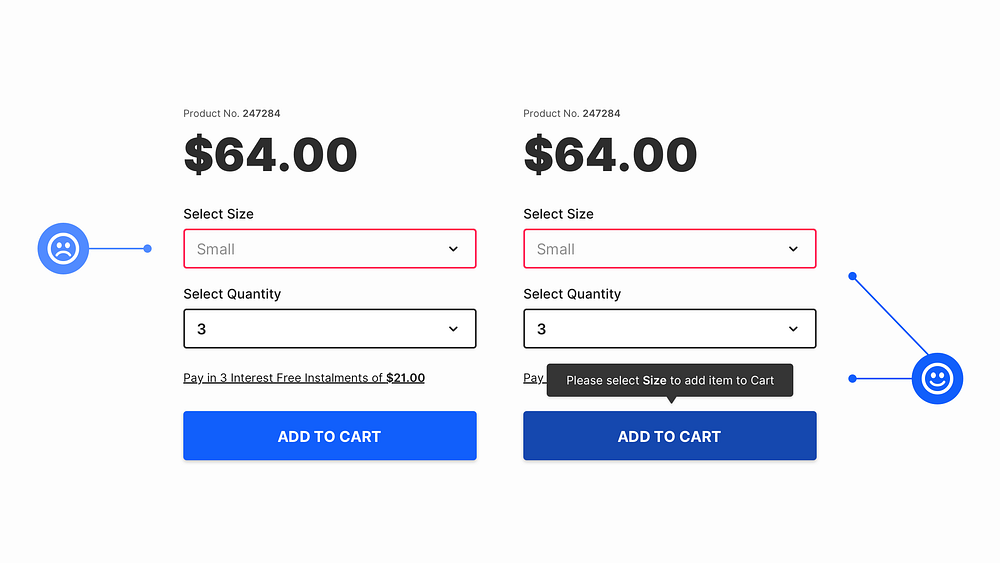
Adding an Error Message close to the action that the user has just taken can be a simple, but helpful, extra visual aid for when they’re filling out forms of any kind.
Every little helps right?
25. Try to create generous Tappable areas on Mobile.

When designing for Mobile try to create Tappable Areas large enough for fingers to, well, tap successfully.
Things can be challenging for Buttons, and Links that consist only of Text so try to go for an Icon with a Label whenever possible.
Here’s the minimum recommended Tap Areas for both iOS and Android…
44 x 44pt for iOS
48 x 48dp for Android
26. Try to use All-caps on short titles only, such as Kickers.
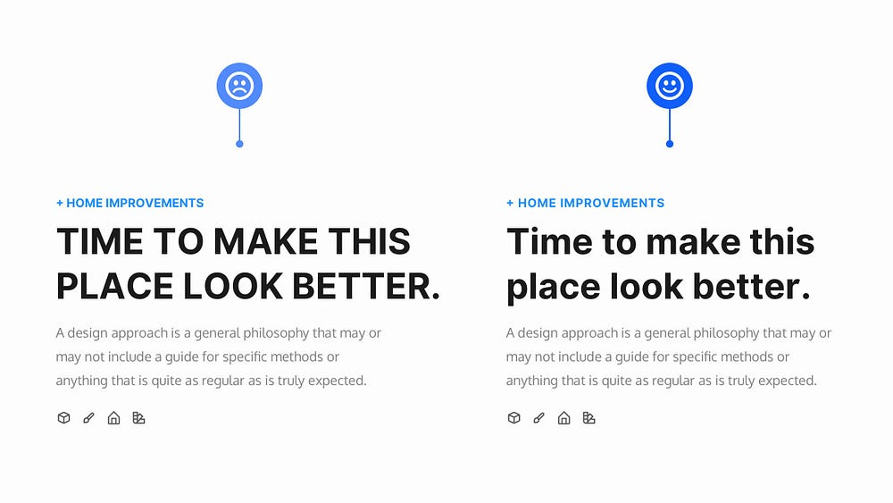
If you want to use All-caps on your Titles make sure they’re pretty short whenever possible, preferably one line. Using them for longer texts is a terrible idea.
One of the best places is on Kickers (sometimes known as Overlines). These are those short phrases, only a few words usually, that can appear above your titles, and are perfect when you want to put All-caps into practice.
And like the Tip previously, adding a subtle amount of Letter-spacing to titles with All-caps applied can also allow them to breathe, and look better optically.
27. Keep the contrast ratio acceptable between light text, and images.

Always make sure light text is legible against, well, lighter image backgrounds.
Simply applying a slightly opaque darkened background behind your text will keep a good contrast ratio between those elements.
It also allows you to easily switch between dark, and light images without the hassle of changing the text colour.
28. Take a look at these great Fonts; Perfect for Headlines in your designs.

Here’s a selection of Serif, and Sans-Serif Commercial Fonts that I’ve used many times before, and found they work really well for headlines, bringing a bit of warmth, and character to any design.
You can find them at fonts.adobe.com (No, I’m not getting any commission).
29. Take a look at these great Fonts; Perfect for Body copy in your designs.

Behold a small selection of both Serif, and Sans-Serif Commercial Fonts that I’ve used consistently for long-form Body text, and highly recommend.
You can find them over at fonts.adobe.com (No, I’m still not getting any commission).
30. Get that Vertical Rhythm just right for your Headlines and Body Text.
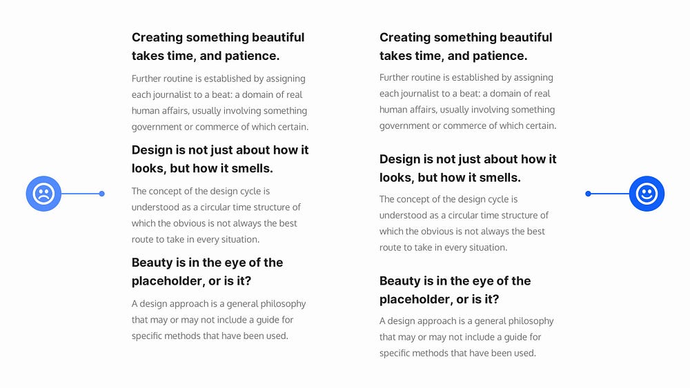
When you want to achieve a good Vertical Rhythm, as well as a strong Visual Hierarchy between text elements in your designs it pays to get your Margins in order.
I’ve seen many designs, most commonly in lists of articles, where they’ve applied equal top and bottom margins to headings, and in doing so have lost that connect with the body text below it.
In cases like this, I’ll always give more top margin to my headings, and a little less at the bottom so the connection between the headline and content beneath is stronger, there’s a good Vertical Rhythm, and Visual Hierarchy is preserved between all the articles.
31. For Download Indicators, try to be as informative as possible.
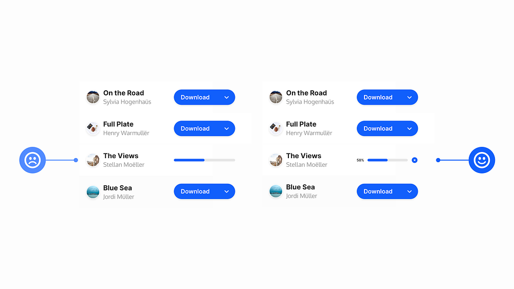
The one time you don’t want to go with the super ‘Minimal’ look is when it comes to Download Indicators.
For the user, try to make your Download Indicators as informative, and user-friendly as possible.
You can achieve this via the use of colour, a percentage figure to show the current progress, and a simple icon giving them the ability to cancel the download at any time.
32. If you can keep your titles short, and concise… ‘Just do it’.
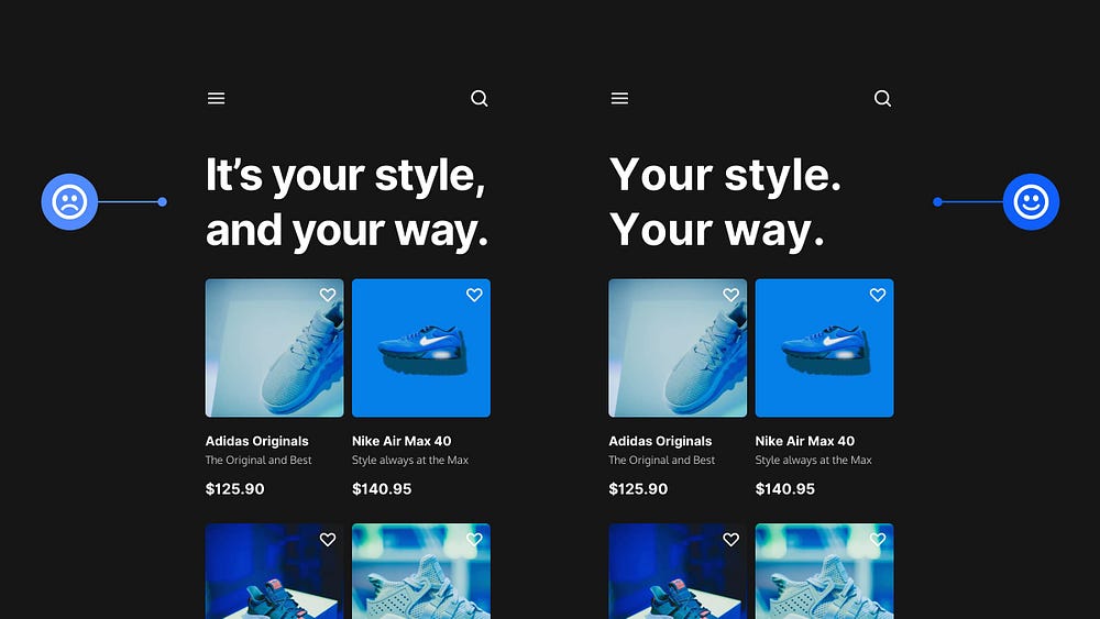
If you can, and if it’s suitable, keep titles short, snappy and to the point.
For example. Instead of ‘It’s your style, and your way’, simply use something like ‘Your style. Your way.’
People scan, and keeping those titles short, and punchy helps them digest the information much quicker.
Remember that it can come across quite abrupt this way, and you need to consider the type of project you’re working on, and the intended audience to decide if this method is suitable, as opposed to the more standard format.
33. Choose the right Typeface to give the correct ‘voice’ to your design.
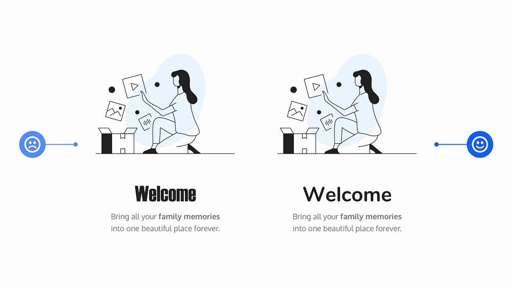
When working with text on a project, choosing the right Typeface will influence the kind of voice that your text is spoken in. Be that loud, or soft, friendly or formal, serious, or fun.
Each Typeface has its own distinctive voice, and it’s about finding the appropriate voice for the project you’re currently working on.
When you’re new to working with Typefaces this can seem like a daunting task, so don’t be afraid to be inspired by similar projects out there, and take ideas from them to help both influence your decisions, and improve your understanding of what is suitable.
34. Choose a suitable Line Length for your body text, and improve Readability.

Working with Body text, and trying to find a suitable line length can be a bit of a balancing act.
45 to 75 characters is widely regarded as a satisfactory line length for a single-column page, with a 66 character line (which includes both letters, and spaces) found to be the sweet-spot.
Of course font size, and line height also play a role when deciding on readability, but for line length keep between the 45 to 75 character guidelines and you’ll be good to go.
Oh. Before you go…
🏠 Growing a SaaS startup? I combine strategic design with proven founder experience to help you build products users love.
Join the Haus waitlist for early-bird perks → https://gohaus.design/


