Member-only story
The ultimate guide to designing icons
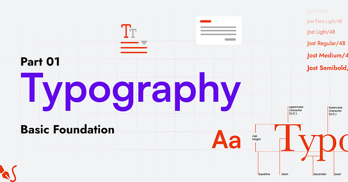
Designing your own icons helps to establish a consistent visual design language. In this guide, I’ll take you through all the steps to consider a well thought out and consistent icon pack.
Icon first
You’ve probably heard the phrase mobile first, there’s a reason for this I talk more about this in my podcast Faster Horses; Apple Podcasts or Spotify. In the same way we’re going to design the smallest possible area so we know that we can fit all our ideas in that small confined space and then build upwards adding more details where needed — I like to call this icon first.
Dieter Rams explains it really well “Weniger, aber besser” (Less but better), in this sense we’re going to remove as much as possible from our icons.

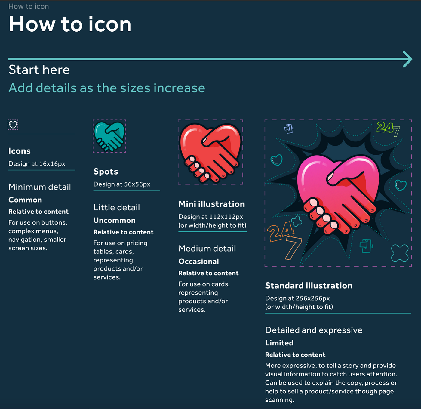
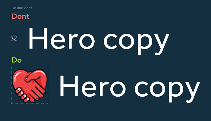
Let’s also get our communication right and tell our colleagues and peers what an icon is and, just as important, what it’s not and how often to use them. I borrow a similar armour or weapon rarity scale from your favourite RPG or shooter game. Another good rule to follow is that of the content it sits next to, a 16x16px icon will be lost in a hero image, large copy or large spaces. Likewise, a detailed illustration will overshadow small and short copy.
Icons
Use: Common
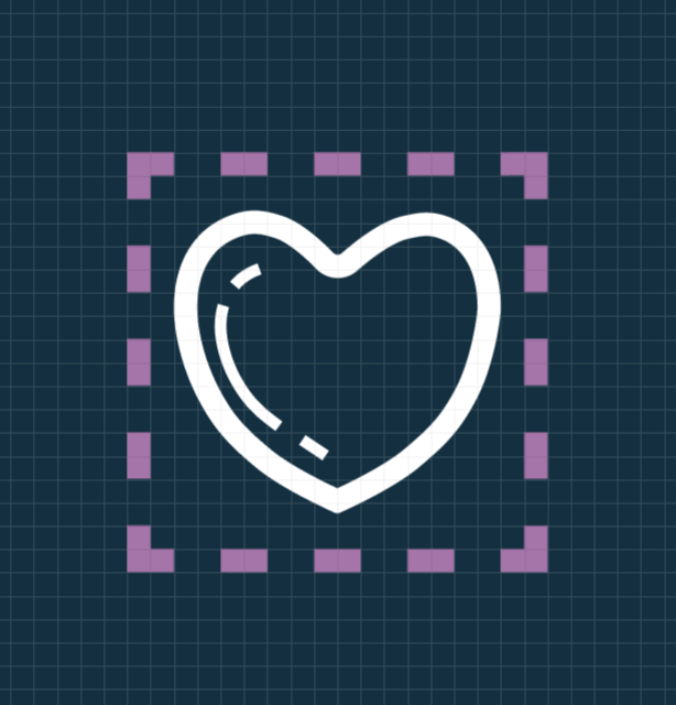
Icons are the smallest iteration of design. I’m using 16x16 pixel icons, I’ve found that this size is a good match for one of the smallest font sizes you should be using in your layouts.
Spots
Use: Uncommon
Spots or ‘spot illustrations’ should start at a size where your icons start to become a little bit blobby (think Duplo vs Lego). This is where you can start to add a little more detail while retaining the core concepts of it’s parent icon.


