The UX of Figma plugins
10 heuristics for crafting plugins for Figma.

Plugins are a way to customize, extend, and automate Figma.
When making a plugin, you’re designing something for yourself, which can be quite fun and a nice change of pace. There’s also a certain satisfaction in definitively solving a workflow that used to take hours, or in hyper-optimizing a particular interaction or piece of UI in your plugin.
This article is my attempt to codify some heuristics for crafting plugins for Figma, referring where relevant to examples from the plugins that I’ve made. I love design tools and UI engineering, and aspire to bring a level of craft and precision to this work. The hope is that this article would be interesting to plugin creators and users alike.
Here we go!
1 / Use UX patterns and UI components that are familiar to Figma users.
Draw inspiration from Figma’s native features and commands. Using your plugin should feel as similar as possible to using Figma itself.

Use colors, text styles, and UI components from Figma’s design system. Consider building your plugin with an existing component library that replicates both the look and behavior of Figma’s UI design. For example:
- React:
react-figma-plugin-ds,figma-styled-components - Preact:
@create-figma-plugin/ui - Svelte:
figma-plugin-ds-svelte - Vue:
figma-vue-boilerplate - Vanilla JavaScript:
figma-plugin-ds
2 / Reduce the number of user actions that are required before your plugin can do its work.
The most efficient plugin possible is a plugin that gets to work immediately when run, without requiring additional user action.
A UI is needed only if your plugin has settings that must be configured by the user. If so, choose appropriate form controls that permit efficient configuration of your plugin. For example:
- If there are just a handful of selectable options, use a Checkbox, a Segmented Control, or Radio Buttons.
- If there are many selectable options, use an Autocomplete or a Dropdown Menu.
- A long list of options can be made more palatable by surfacing options that tend to be selected higher up in the list. Alternatively, group related options, organize options into a hierarchy, or allow options to be filtered via search.
- For a numeric option, use a Numeric Textbox, or a Range Slider.


The first form control should be in focus when the UI is initially displayed, so that the user can make changes immediately.

A good rule of thumb: Options that tend to be selected should be already selected by default, or selectable with a bare minimum of user actions — ideally, a single click.
3 / Solve a single, specific problem.
Your plugin should do just one thing (or, a few closely-related things) well.
Consider if the functionality of your plugin can be “decomposed” and built as sub-commands that can be run independently.

4 / Allow the user to control your plugin UI with the keyboard.
All form controls should have an obvious focus state, and be reachable by pressing the Tab or Shift+Tab keys.
The tab order should follow the visual flow of the form controls in the UI, going from left-to-right and top-to-bottom. In general, refrain from modifying the natural tab order of the form controls.
The tab order should “wrap around”. Pressing Tab on the last form control should move focus to the first form control. (Correspondingly, pressing Shift+Tab on the first form control should move focus to the last form control.)
Allow the form control that is in focus to be controlled using the keyboard. For example:
- Checkbox: Pressing the
EnterorSpacekeys should toggle the option. - Segmented Control, Radio Buttons, Autocomplete, Dropdown Menu: Pressing the
↑and↓keys should change the selected option. - Numeric Textbox: Pressing the
↑and↓keys (orShift+↑andShift+↓) should increment and decrement the value by 1 (or 10).
Pressing Esc should close the plugin UI.
Pressing Enter should execute the plugin with the currently configured settings in the plugin UI.
5 / Define a scope of operation for your plugin.
A plugin that operates on layers on the canvas should have a specific scope of operation. For example:
- Layers in the user’s selection only vs. all layers on the page vs. all layers on all pages in the document.
- Layers that are directly-selected only vs. all layers within the selection, including nested layers.
- Layers at the “top-level” only vs. all layers, including nested layers.
- Layers of a specific type only vs. layers of any type.
- Layers that have the same parent layer vs. all layers, including layers with different parent layers.
A reasonable approach: Default to operating on layers in the user’s selection, but if the selection is empty, operate on all layers on the current page.

Prepare for the possibility that one or more layers (whether in the user’s selection or on the page) would be outside your plugin’s scope of operation. This can be handled in one of two ways:
- Treat this as an error. State the error in a toast notification.
- Silently ignore the irrelevant layers, and only operate on the layers that are within the plugin’s scope.
6 / Retain the user’s previous inputs.
Pre-populate the form controls in your plugin UI with the user’s previous inputs. This is important in plugins that tend to be run repeatedly.

Your plugin should also allow the user to clear the data stored, and essentially reset the plugin to a “clean” state.
7 / Provide system feedback in response to user actions.
Show success and error messages as toast notifications. Prefix these messages with a ✔ and ✘ respectively.

Include a loading state in your plugin UI if there could be more than a few seconds of wait time — for example, when awaiting an API response or the completion of a particular computationally-expensive operation.

8 / Show a live preview of the result of running your plugin.
A preview could be shown either within the plugin UI itself or directly on the layers on the canvas. This preview should update in real-time as the user adjusts settings in the plugin UI, or when there was a change in the user’s selection.

9 / Prefer labels over icons.
Certain concepts could be challenging to represent unambiguously with an icon. For clarity, consider using a label, written in plain language.
Only use an icon if you are confident that users would be familiar with it. A reasonable rule: Only use icons that are already in use in the Figma UI.

10 / Pick a short, unique, and self-explanatory name for your plugin.
The name of your plugin and all its commands should be no longer than four words, and set in Title Case.
Ensure that the name is sufficiently different from the names of Figma’s native features and commands. A unique name allows users to more easily locate and run your plugin via the Figma search box.
The best thing that you can say is that your plugin does exactly what it says on the tin. Be specific, use familiar words, and avoid made-up words. Consider using an action phrase where the first word is a verb.
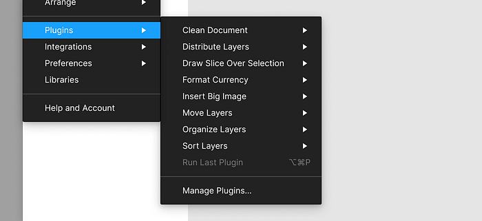
Here, once again, are the 10 heuristics:
- Use UX patterns and UI components that are familiar to Figma users.
- Reduce the number of user actions that are required before your plugin can do its work.
- Solve a single, specific problem.
- Allow the user to control your plugin UI with the keyboard.
- Define a scope of operation for your plugin.
- Retain the user’s previous inputs.
- Provide system feedback in response to user actions.
- Show a live preview of the result of running your plugin.
- Prefer labels over icons.
- Pick a short, unique, and self-explanatory name for your plugin.
Just like Figma itself, plugins are built with the same technologies that power the open web. Using HTML, CSS, and JavaScript, coupled with a comprehensive plugin API, you do have remarkably granular control over how exactly you want your plugin to work.
Good UX is the product of many modest and intentional design decisions. When done well, these details are usually invisible. But when you look a bit closer and start to pay attention, you might think, “Oh, that’s so cool — they actually thought about that!” This is the result that you should be looking for.


