Member-only story
The way we design AI looks like nostalgia already
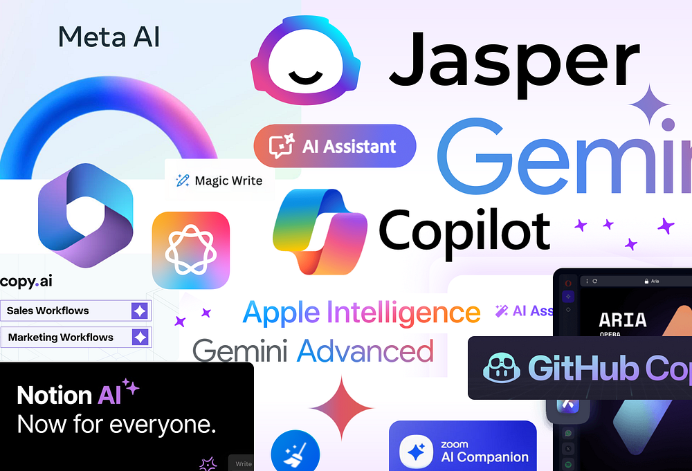
Everything is starbursts, shiny things, and PURPLE GRADIENTS.

AI is new and exciting, but its visual branding has become redundant. Despite how powerful and versatile AI is, the way most companies brand it is dull, repetitive, and doomed to look outdated soon.
Common elements in AI marketing designs include:
- Starbursts
- Glow
- Purple gradients
It almost seems like there is an unspoken requirement for companies to refresh their brand guidelines to incorporate these elements. Today, we will take a look at this trend and see if the design patterns are a sustainable solution for companies involved in AI.
Examples
Adobe
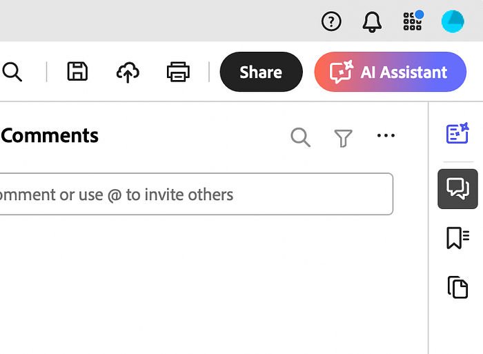
Adobe has decided to include its AI component in Acrobat with a prominent button that is now visually the focus of the app. The design contains the trendy ingredients mentioned and takes user focus away from the rest of the UI. What does the button do? No way to tell as there are no clear cues, besides the chat bubble icon that might imply that it is a chatbot or such.

Microsoft
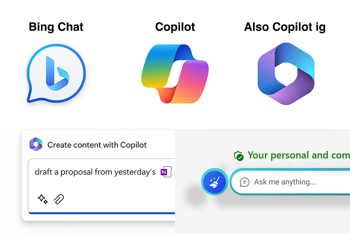
As one of the earliest players in the AI space, Microsoft decided to give its AI offering a unique identity. The designs contain all the expected visuals from this trend as well. Microsoft’s AI has evolved from Bing Chat to Copilot but elements like gradients and starbursts remain.

Google also gave its AI offering a unique name and went through a rebrand exercise from Bard to Gemini. The design style remains mostly the same, once again, with starbursts and purple gradients.

