The “why” of Product Design
My 3 Key Takeaways from a recent book indulgence.
Are you a designer, a Product Manager/aspiring to be one, or just someone curious about the “Why?” of product design? Then you would enjoy reading further. During one of your quarantine daytime aimless wall stares, have you wondered why the door opens to the right or why there are no triangular batteries? Well, there is one book that explains the design of common products, who’s functionalities we take for granted.

drum roll……. Tadaaa!
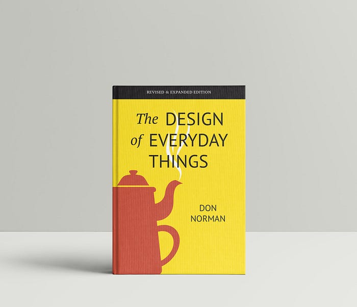
“The Design of Everyday Things” — by Don Norman, Director of Design Lab at UC San Diego.
I might struggle to condense my praise for this book in this article but here is my brief feedback and some key learnings.
The journey is incredible, owing to the well-structured landscape. There is a wonderful synergy of Science of Design, Balancing need vs desire, Understanding Human Psychology, and most importantly, the Common Mistakes that gave us bad products. What makes it super engaging are the anecdotes and case studies that pop up often to compliment his theories & facts.

There are a ton of key concepts from the book but I’m picking 3 learnings that appealed the most to me :
1. Signifier and affordances:
I found this to be one of THE MOST important concepts elucidated. I like how the terms were coined simply from their functions, making it easy to remember and apply to our design process. So, what are they?
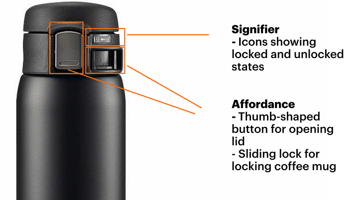
A Signifier is anything that indicates a call to action. Eg, a STOP sign on the street. It gives the user some information on what action needs to be performed and where it must be done.
An Affordance on the other hand literally translates to what a product can “afford’ to do. For example, a simple solid chair can afford to make you sit on it by restricting you to a certain height above the ground. But you can’t move around in it.

2. Conceptual models:
Google can explain this in a million ways, but let’s keep it simple.
A conceptual model is a user’s mental perception of a product’s operation. This can differ for everyone. A photographer might seek a phone’s camera to be important, but a corporate leader might prefer business functionalities like opening presentations, sending emails, etc. So, what one perceives of a product can differ by their preferences.
As I recently began designing my own product idea, I have begun to see this is the backbone of my way of communicating my product goals with the users.
How does a user create a perspective? Through an intersection of gathered memory and past experiences. While these can’t be entirely controlled by a new product you introduce, the thing you can control is- Affordance, Constraints & Mapping. Let’s look at an example of using a pair of scissors :
Affordance: Fingers need to be placed in the finger holes
Constraints: The hole fits in our fingers perfectly well
Mapping: This is where we talk about mechanics. The fingers are now capable of operating the blades, that intern cut materials.

3. Psychology of users & mistakes:
Some of the greatest products ever made like the telephone, Toyota cars or Apple products study user behavior as a central philosophy as part of Human-Centered Design (HCD ).
Do you remember the last time you opened an app and soon hopped out? Well, can you think of what instigated you to close the application? Was it an alternate commitment, the lack of sexiness in design appeal, or the slow response time?
As much as engagement needs to be studied, a more important aspect would be to crack the mystery of how mistakes do not spare experts too. Two key mistakes that stood out to me were knowledge mistakes & slips.
Slips occur when the user envisioned a specific action but committed the wrong one instead. This occurs due to poor design and a lack of apt constraints that restrict false action. The Japanese introduced Poke Yoke, a mistake-proofing concept in their production lines through coloring or design shapes. This helped restrict subsequent installations if someone missed a part or even tightening of a screw.
Knowledge mistakes occur due to the wrong overlap of usage ideas or simply the lack of expertise to use a product. This is where product-market fit places an important role. Is the user able to understand his/her need and is the product delivering that? Does he/she have the knowledge to make the maximum utilization of the product’s intended functionalities?

To conclude, I can hands-down say this is one of the finest technical books to start with, for any design enthusiast. It DOES NOT feel heavy at any point and yet manages to make the home run.
I used Amazon’s Audible version to finish it during my travel or walks around campus. Do consider it!

