Member-only story
The Zenly Experience — a product case study
Design is all about finding balance, and we could all learn from Zenly on how to do that.

So first, what is Zenly? Essentially, it’s a better way to keep track of your friends & family. You can view location, send messages, and a ton of other cool things. The team at Zenly went above & beyond with their added features, so let’s take a look.
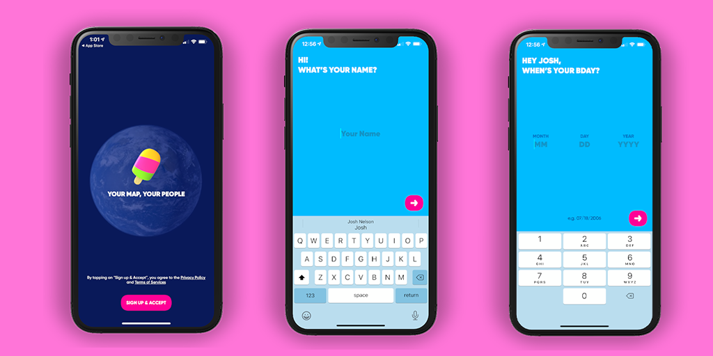
The first experience with Zenly is the onboarding flow. Now, I am a HUGE believer that onboarding is one of the most important features of an app. Zenly’s was so simple, but enjoyable I honestly didnt want it to end. The playful copy, big font, and dynamic cursor sets the tone for the Zenly experience.

During this process you also get a taste of the amazing 3D illustrations that are common place within this app. Simple, clear copy that has a personality matched with eye catching illustrations make for the perfect onboarding experience.

