Featured
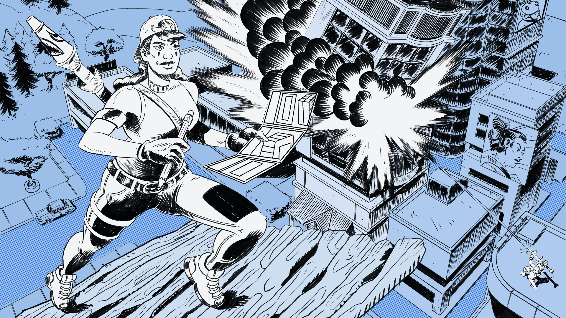
There’s no making without breaking
Fortnite wasn’t a hit when it started. It was a totally different game back then. No battle royale, no millions of dollars in prize money, no Mariah Carey frozen in an ice block for Christmas. Originally, it was a third person, tower defense game. You’d gather resources, build a base, and you and your friends would prepare to be attacked by a torrent of horrible zombies. You worked alongside others to free survivors and combat the horde.
It didn’t sell well. In fact, before being inspire by PUBG, it was almost cancelled. But they pivoted from their original idea. They looked around at other game models and listened to their user base. And they made out with bookoodollares.
I think that the process of making video games lends itself towards making. You have to make a game in order to show it to someone and have them play it. Then, judging by the joy or frustration on that person’s face, you’ll make changes and tweaks to improve the game.
Let’s make more things
In software, particularly big software companies, I’ve seen a different trend. I’ve seen a lot of talking, planning, and twiddling. Oftentimes, there way less making than I would expect. And, I think that it comes from a fear of judgement. Because, with the making, comes judgement.
But that’s a fear that we need to face.
If we really want to make things that are useful for other people, the only way we’ll be able to do that is by making something to be judged. We can’t build things in a vacuum.
Don’t get me wrong, I’m not saying that we shouldn’t plan. Plans are great! Let’s do our research, understand the problem, and cast vision for the future. But when the rubber hits the road, we need to make stuff.
We’re not always going to know what the right thing to do is. Sometimes (most times) there isn’t a right thing. The path is obfuscated. Maybe we’re trying to serve other people, but we’re afraid of making a mistake. What if our mistake hurts the people we’re trying to help?
But, if we do nothing, we’re not helping at all. We’re not making things better.
I don’t think we should let our fear keep us from at least trying to make things better.
And if we make something that messes things up, we can fix it. We can talk all we want about an idea, but until we actually make something visible and tangible, they won’t know what the hell we’re talking about.
People need something to respond to.
And when we make it? People will give us feedback! We can use it! We can make it better, more effective!!!
As long as we keep iterating, we’ll make something great.
Starting with research
Here’s where I was four years ago. I had just started my role at Cisco. It was my responsibility to breath new life into their design system, Momentum. This design system was used to create consistency within the Webex App. But there were a few problems that we needed to deal with.
- I didn’t know anything about this system, how it was implemented, or how people used it.
- It spanned five different platforms, with varying degrees of differences depending on the operating system.
- All the components in those platforms were custom built; no UI toolkits.
At the time, I had one designer on my team and we doubled down on our curiosity. Claire and I put together a research project, interviewing designers and engineers across the Webex App to try and understand what Momentum was and how people were using it. At the time, the Webex App was undergoing a complete rebrand. The entire UI was being evolved, and the transition was pretty difficult. People were building the plane as they were flying it.
We surveyed over 30 users and conducted research interviews with 20 participants across the organization. We used the findings from this research to help solidify our mission as a design systems team and specifically target the areas that we wanted to improve with Momentum.
Here are some of our key insights:
- Give us clarity: Participants communicated that they wanted to have a better understanding of the current state of the design system, where it’s going in the future, and who has ownership of it.
- Build a yellow brick road. Onboarding to the design system is particularly difficult here, because it requires so much one on one time to transfer knowledge. There’s a need for better tools and processes used for onboarding, collaboration and system improvement.
- The system lives inside a select few. It is currently impossible to learn the design system without facetime with experts. We need more solutions to become familiar.
- Build the machine. Users of the design system want more tools, processes, and resources to build effective and efficient solutions.
- Rebalance ownership with engineering. Better collaboration and communication is needed across design and engineering so that we can be on the same page when it comes to components, process, and language.
- More thinking through making. We need to have methods for evolving our system. How do we approach product evolution in a systematic way? How do we incorporate conceptual thinking and cast vision for the future while still delivering product today?
Breaking things to make them better
Writing down our guidelines All the information of Momentum was housed inside the heads of a few designers. They were archons; gatekeepers to the halls of software consistency. They gave out their advice and guidance to others, but it was slow. It wasn’t scalable, and our features were often blocked, or the design system was ignored completely.
Being new to the team, I didn’t know how our system worked. I was unfamiliar with our components, colors, and processes. So, I did what I’ve learned to be one of the most powerful tools for organizational influence: I made friends. I got to know each and every one of these design system leaders and scheduled a regular meeting with them to discuss common design patterns used in our system.
Oftentimes the meetings would revolve around a specific issue for a component or design pattern. A question about the dialog component would come up from a feature designer and we would discuss how to answer it with clarity, and make any necessary updates to the component in the library.
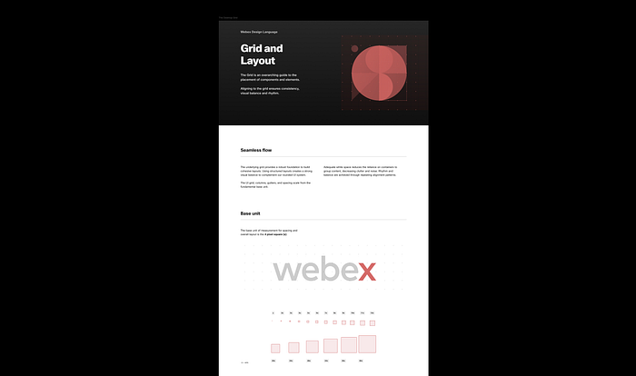
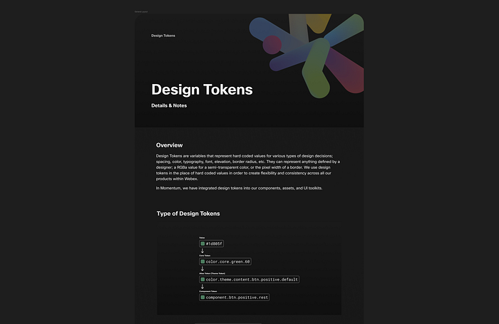
My team and I distilled the information that we learned in various guidelines which we then used to format all our information on our iconography system, layout, illustrations, color tokens, typography, and accessibility.
Any time we got a recurring question in office hours, or received multiples of the same request, we used what we learned as an opportunity for something that might be written in our guidelines.
A brand new process In 2021 when I started, the Momentum Design system consisted of 4 Figma libraries for each of the Platforms that Webex was on (Windows, MacOS, iOS, and Android). A decision was made that the UI of Webex should “lean native”, ie leverage operating system components where appropriate. This has since bit us in the butt, as a lot of these operating system’s core components aren’t as accessible as we need, but that’s another story entirely.
The libraries were maintained via a guild model, with quite a few designers having access and adding components whenever the need arose. This led to massive discrepancies between the libraries as well as an unclear process for new component additions. My team and I were having multiple conversations during the week, being asked to add a new component to our figma library, “because it’s already being built in product.” To top everything off with a cherry, none of the platforms had UI toolkits. Components were being built as part of feature work in a completely custom and unscalable way.
We had very little control or oversight and inconsistency reigned. We needed to stop the madness.
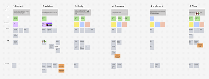
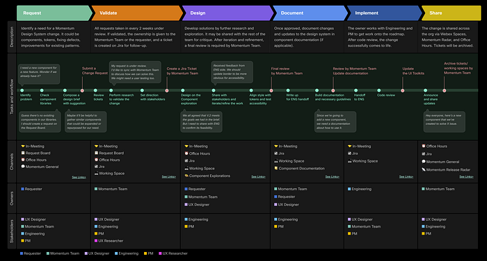
I facilitated a workshop with my team and several key designers who had been on the design system guild where we discussed and created the Design System Change Process. This took work, but was the first milestone in creating order amongst our chaos.
We ran a weekly “Office Hours” where designers with questions could come and ask questions about their feature work. We used it as an opportunity to share the new component creation process, as well as several team’s weekly “Show & Shares”.
We implemented a Momentum Request Form where people could submit requests to our team and they would be stored on our backlog for review and work at a later date.
All this helped create a stop gap for the massive amounts of changes going into our component library on a daily basis.
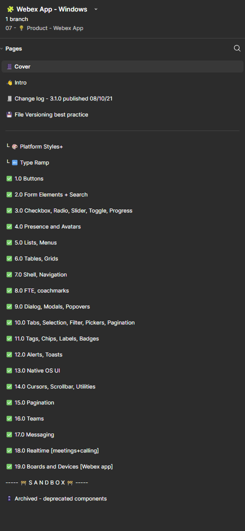
Restructuring our Figma Libraries
While reviewing our four figma libraries, the obvious thing that we noticed was an inconsistency in component naming. In the Windows library, the Banner component would have its own page. But in iOS, it would be on an “Alerts” page with Dialogs and Toasts. These inconsistencies made navigating the libraries, and building features across platforms extremely difficult.
My team and I (at this point Claire and I had another designer, Morgan) met together several times to discuss how we might approach figma component library alignment.
There were three potential strategies that we saw:
- Individual components; grouping individual components on their own page, listed out alphabetically.
- Group by usage; multiple components with similar features or applications would be grouped together on the same page.
- Group by complexity; this is something that Brad Frost discusses in his atomic design model when showing the difference between Atoms and Molecules.
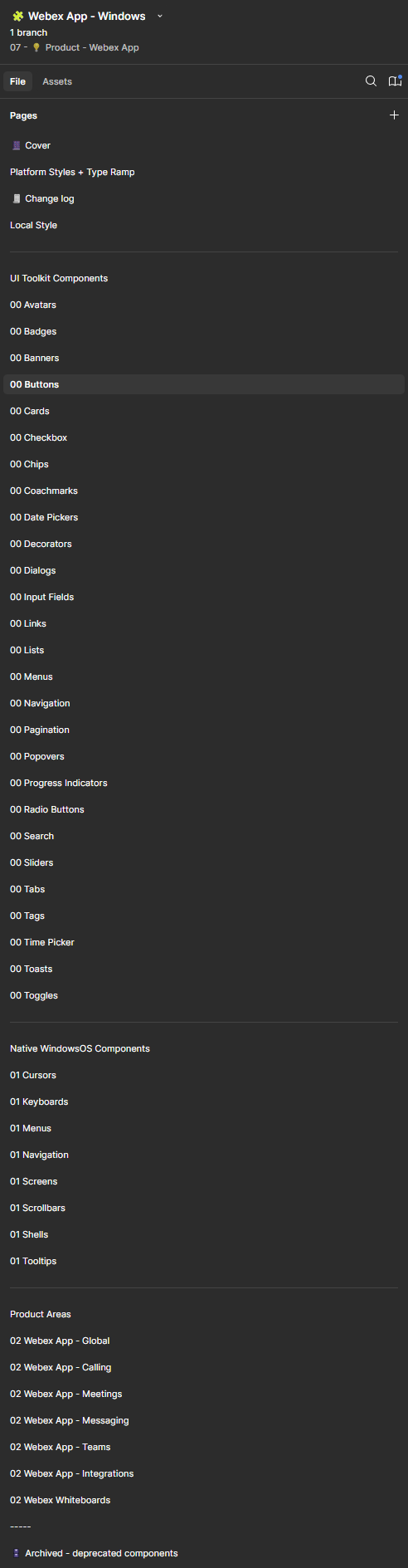
I proposed to the team that we list out our components individually, and group them together by “Core Components”, “Native Components”, and “Application Components”. Because we wanted to align four different platforms, I felt it necessary to show what all the libraries had in common in the Core Component library and relegate any operating system components to the native section. The “Application Components” was honestly a free for all. So many strange and unique cards, widgets, or list items were placed there because they could not be used in more than one part of the product.
This update was one of the biggest that we made. It had the greatest effect on designer’s daily lives. We were really worried that these new changes might impact or impede their workflows.
Conclusion
Throughout this process, I was sweating. As design system designers, the things we make and maintain have an immediate impact on the designers around us. I didn’t know how they would respond to the huge amount of change in their libraries and processes.
A year later we performed another user research project on design system usage. This time around, we were able to increase our overall scores for Momentum’s ease of use and understandability. There’s still a lot of work ahead of us, but we’re ready to both break and make.
References
‘Fortnite’ was nearly cancelled years before it became a global phenomenon, according to a former employee of Epic Games Business Insider

An illustration of the author waving. Credit: Me.
Hey y’all! I’m Trip Carroll, a design leader at Cisco and aspiring cartoonist.
I write and publish a new article on design, leadership, and software development every other Monday. You can see more of my work on my website, check out my drawings on Instagram, or subscribe to my newsletter on Substack.
Let’s make work great!

