Member-only story
These are the fonts behind 30 famous logos
An oddly fascinating closer look at the nuts and bolts of designs we’ve all seen a thousand times

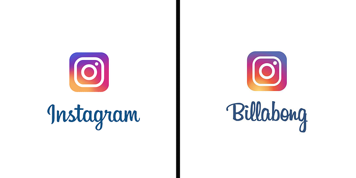
For the last couple of years, designer Emanuele Abrate has been demystifying famous logos by reverse-engineering what fonts they used or evolved from. While many famous brands use a proprietary typeface for their logos, Abrate points out that the designers will normally use an existing font as a jumping-off point, and his project, Logofonts, allows viewers to look under the hood of famous logos by revealing their likely typographical origins.
The inspiration for Abrate’s project comes from his interest in combining the strange and the familiar. “When these two characteristics come together,” he says, “there is the possibility of creating something really interesting. … For this reason, I decided to analyze the logos of famous brands, replacing the company name with the name of the font that was used.”
Seeing these deeply familiar brand images deconstructed in this way is oddly satisfying, especially when the font is one that we’re used to in other contexts. You can see more of Abrate’s work on his website, and follow his ongoing Logofonts project on Instagram.

