Member-only story
Things I wish Medium would stop doing
Annoying UX sides of my favorite platform.

upd. 1: Medium has already fulfilled one of my New Year’s UX wishes just 24 hours after I published the story.
upd. 2: See the comment from Medium’s designer. They also fixed the ALT text bug (my other UX wish). Thank you, Medium.
A singular user’s pain doesn’t even matter. That’s just how it is, unfortunately, in the world of data-driven decision-making. But what if the pain is expressed by a UX writer? I’m deformed enough by my profession (and I’m not just talking about my shrimp posture) to spot the things that might actually matter.
As a long-time Medium user (I remember when you could make your blog neon toxic green), I’ve seen this platform evolve. But not all evolution is progress.
There are a few UX mishaps — or, rather, deliberate choices — that I not only dislike personally but that could also negatively impact:
- readability (and as a platform where people are supposed to read, it’s really serious),
- accessibility,
- and my mental health because of some inconsistent UX writing.
In this article, I address Medium’s problems specifically on the desktop version, not the mobile app. As both a writer and a reader, I find it interesting to examine Medium in light of its recent campaign claiming that “the world needs more writers”:
This campaign positions Medium as “writers-first” and “readers-second.”
But does it truly prioritize writers?
So, I’ll be analyzing Medium not only as a desktop website but also as a platform supposedly designed with writing as the primary focus and reading as secondary. Writing and reading are not the same thing, and their user needs differ.
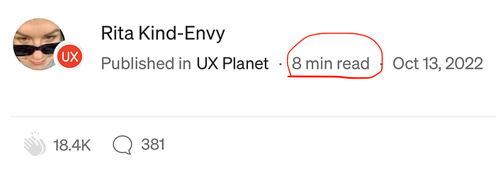
For example, my friend, a former Bloomberg journalist with 25+ years of experience, is really annoyed by Medium (and other digital platforms) displaying the “reading time” next to each article:


