This is how I turned photos into better experiences
Research, design and development of a new digital format.

Intro
Painting, photography and film—you can see it as a continuous development from one medium to another. And, as a result of invention and improvement of technology.
Once again, a lot of progression in technology is happening and an enormous growth in computing capacity in even smallest devices opens up more and more possibilities in digital media. It’s an occurrence which lets many designers rethink of how we can read, create and communicate information right now and in future. Because after all, our physical world where we can experience many sorts of information in a visceral and playful manner holds little resemblance to the digital world.
It feels as if our physical reality is one of perception, exploration and experience but the digital world is one of plain information.
‘Smart’ devices are still governed by flat and two-dimensional information, whereas in reality we can touch and explore our surroundings and grasp information through different lines of sight and the way how sight and sound change.
What made this such a hot topic to me?
The principle of Emotional Design describes how emotions have a crucial role in the human ability to understand the world. If an event or occurrence leaves an impression on you, you are emotionally deeper connected with it — you are more sensing and thus better understanding.
The other way around, with the ability to create an emotional connection to an audience, it comes great power to whoever makes use of it.
This could be by storytellers, photographers, artists, product manufacturers or many others presenting themselves online.
So for me as a designer, I am always keen on finding and creating new things to deliver the best solutions to my clients.

Benchmarking the experience of (current) digital images
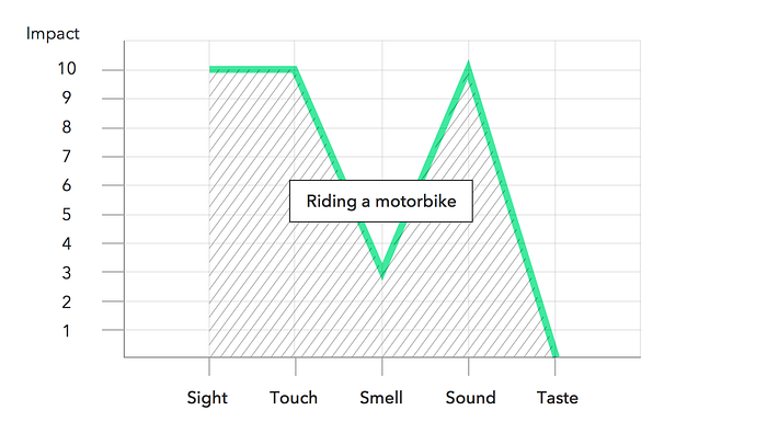
Jinsop Lee, a speaker at TED 2013, states that in order to design products that people enjoy, it is important to design for all 5 senses.
According to him, the impact of an experience can be identified by how much an activity affects each of our five human senses: sight, touch, smell, sound and taste.
To determine the richness of an experience, you could ask a group of people to rank their subjective impression of an activity on a scale from zero to ten for each sense. When you place the results into a diagram with the senses represented on the x-axis and the rating on the y-axis, you get a graph which you can compare with experiences of other activities.

For a comparison, Jinsop Lee applies his theory to the experience of riding a motorbike. After going on a ride together with his friend, he rated the impact on each sense. The resulting graph (Figure 2) makes visible and comprehensible why there is such a fascination for motorbikes if compared to the graph of a perfect experience.
With that theory as a starting point, I thought about how we currently perceive visual content on the internet. After browsing on various online news pages and social networks, I rated ‘sight’ as a six and the remaining senses as zero (Figure 3) because none of the contents, apart from videos, did affect any other senses.
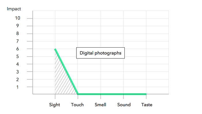
I also came to the assumption that the sensory impulse varies depending on how much the seen catches our attention and causes us to linger on it.
But when looking at the resulting graph (Figure 3) it becomes instantly clear that these images are not even close to a perfect experience. Even if I would have risen the value for ‘sight’ to a ten because maybe I saw an absolutely stunning photograph; the graph would have never grown nearly to the same heights.
Conclusion
The exclusion of senses other than ‘sight‘ makes watching digital photographs a comparably poor experience.
The only catch is by making the viewer pause on an image, for example through interactions or its content itself, and by involving other senses, such as the sense of sound perception.
Alternatives to plain digital images
A couple of techniques exist which attempt to make images less passive and more dimensional.
Stereographs and flip images
For example, there are phone apps that achieve an illusion of depth either through stereographic images which require “red and cyan” glasses (known as the complimentary colour anaglyph method) or in form of digital flip images (Figure 4) (making use of the device’s built-in sensors).
Photogrammetry
A more “serious” approach to create three-dimensional photography is called stereo-photogrammetry. It is a technique where three-dimensional data is derived from multiple photographs which are taken from different positions. Through computer software those flat images are then mapped back as textures onto the digital 3D objects.
The probably best-known showcase is Google Map’s 3D View feature. It is available for lots of famous locations around the globe such as the rock formation El Capitan in the Yosemite National Park, the Pałac Pena in Portugal, the Hoover Dam in Nevada/Arizona or the city Hongkong in China.

Many of those locations are collected on Google Earth VR. It is a platform that belongs to Google VR which is in turn a site where the company promotes its developments for Head-Mounted-Displays (Figure 6) (HDMs) Oculus, HTC Vive, Google Cartboard and Google’s softer fabric headset Daydream View as well as production hardware for filmmakers and developer-tools for programmers.
Virtual Reality
As the name Virtual Reality (VR) suspects, it merges behaviours of the physical world with the digital world. HDMs act as windows to a virtual, spherical surrounding. Combined with spatial audio, it is possible to fully immerse into a new reality.
Such experiences can be created with 3D models which are constructed entirely on computer. This method has the advantage that virtual elements can be three-dimensional and reactive to user inputs. A great example is the “Cardboard Design Lab” (Figure 7). It is a mobile application that takes the best practises as learned in industry and demonstrates them. That way it educates about virtual-reality in virtual-reality.

The alternative production method to Computer Generated Images (Figure 7) (CGI) is the use of optical systems that allow recording or capturing 360-degree images e.g. through an array of cameras (Figure 8).

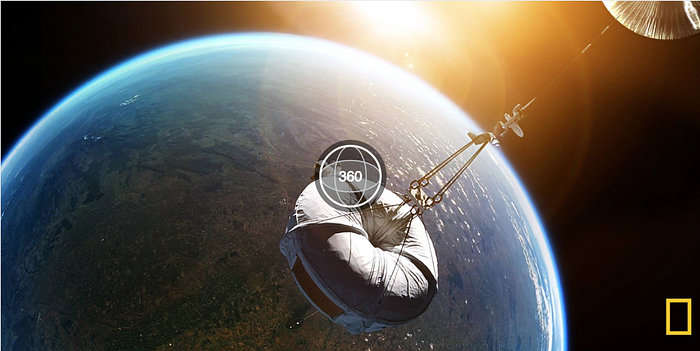
In experiences realised this way, the viewer is limited to looking around spherically from a fixed point of view and is not able to explore a three-dimensional space independently. But it is still a stunning type of storytelling as documentaries e.g. by arte or National Geographic prove.
The viewer can be guided to places he would probably never be able to see, such as the Earth from 20 miles (32 km) above from inside a weather balloon (Figure 9).
The missing link
Ok, so if there exist a couple of solutions already, what’s the purpose of this article?
Well, in regards of virtual reality a lot of development is happening. Especially the large companies Google, Facebook, HTC and Apple are constantly pushing the borders of what is possible. There is just one caveat:
VR that is based on real 360° shoots and recordings is far from being on par with computer-generated environments.
And I believe this should not be like that. Due to their narrower relation to reality, photographs and live-action movies are much more honest compared to their computer-generated counterparts. With CGI possibilities are pretty much endless and the results are often “too perfect” to be credible.
The hurdles
Most problematic is the implementation of three-dimensionality that is captured from more than two perspectives and thus allows the viewers to change their point of view on an object.
Photogrammetry, as a mix of both techniques, comes closest to this desired result. But aesthetics (Figure 5) and the workflow differ a lot from creative photograph- and filmmaking. This means a steep learning curve for people in those professions and a slow implementation to their field of work.

I came up with the goal to develop a solution that utilises photographers and filmmakers with a professional toolset that helps them to create aesthetic, photographic, context-retaining, three-dimensional, interactive experiences — something that does not exist in that combination yet.
To keep the scope manageable, I want to exclude videography for now and put the focus on photography only. Those 3D photographs shall be augmented with spatial sound and interactive elements to turn them into rich experiences.

A three-dimensional photo shall consist of a sequence of images taken in front of a subject from different perspectives (Figure 10). When later viewing it on a digital device, the software application shall reveal the individual image depending on the user’s position in front of the device following the theoretical perspective in front of the subject.
The theoretical perspective of the viewer in front of the subject can be estimated via webcam or device rotation.


Before starting to photograph a vast number of perspectives of a subject randomly, it should be considered how many photos are actually needed and thus how complex this process will end up.
Constraints
Degrees Of Freedom
Determining for the level of complexity of the photographing are amongst other things the Degrees of Freedom (DOF) the viewers are supposed to have in their movements in the final experience. In a three-dimensional space, there is a total of six DOF (Figure 12).
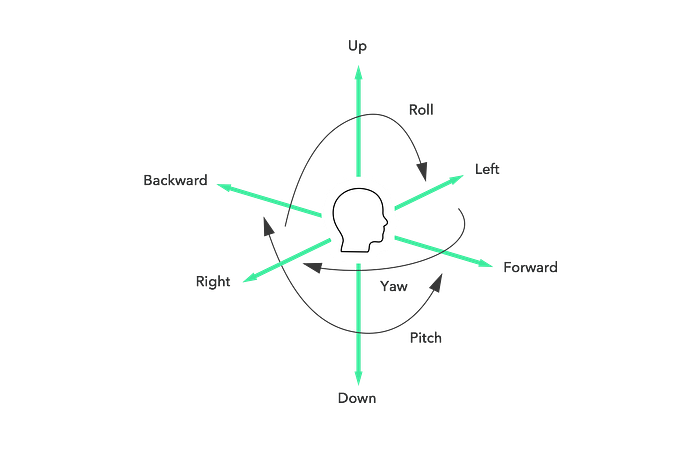
These can be divided into three rotational movements (roll, pitch and yaw) and three translational movements (backward/forward, right/left and up/down).
For the sake of breaking down this immense complexity I decided to constrain the final three-dimensional experience to movements that encounter most often in reality.

As we are — based on personal observations — either sitting or walking, daily movements are located mostly on the horizontal plane. With this consideration, the level of complexity can be reduced to yawing, surging forward/backward and swaying left/right.
Going one step further yawing is in turn a combination of the other two movements. Because yawing also delivers most varying spatial information per frame it is the movement I decided to aim for.
Viewer’s comfort zone
Mike Alger, an interaction designer for virtual-reality at Google, describes in his design manifesto for VR, that in VR there is a zone where content can be experienced most easily and thus is most likely to be seen by the viewer (Figure 14).

Mike Alger divides the viewer’s field of view into the four zones: Content, Peripheral, Curiosity and No-no (= “Too close to the viewer”).
As my goal is to display a three-dimensional object, which means the user is looking directed, these numbers cannot be re-applied. For this reason, I evaluated them individually.

This evaluation resulted into a main zone ranging from 0° to 45° and a peripheral zone from 46° to 60° (Figure 15). Everything beyond that is out of visibility. This means the photographer only needs to photograph a range of 120° (60° in both directions).

The three-dimensional image
How to do it wrong
At its core, a three-dimensional image is a moving picture. For this reason, it made sense to choose a format that has been developed for the rapid display of many successive images — a movie format.
Hence, I first attached a video’s current timeline position to the mouse’s x-position on the viewport.
video.currentTime = video.duration * currentMouseX / width;Unfortunately, it soon became apparent that browsers were not designed to jump quickly from one position to another on a video timeline. And it turned out this approach compromises a lot of image quality, gives little flexibility in regards of loading order and stopped working for large files completely.
How to do it right
To cut a long story short, I ended up stacking images on top of each other and here is the result. 🎊 🎉

I build a JavaScript controller component that generates a value between zero and one which becomes mapped to the image-stack and changes the opacity of the according image (Figure 17).
Right now you can use Mouse-Move, Mouse-Drag or Head-Move on desktop and Device-Orientation or Touch-Drag on mobile.

Making an immersive experience
To address other senses, I added a couple more functionalities and ended up with this very first prototype.
Spacial sound
This part could be way more complex, too, but as a starting I constrained it to only recording two audio tracks.

The controller component is used again to set an individual volume per speaker.
// make x-range between -1 and 1
// instead of 0 an 1:x = (controllerValue - 0.5) * 2;y = 0;
z = 0.5;panner.setPosition( x, y, z );

Interactions
The viewer shall also be able to interact with the visual content. Thus it’s time to add individual HTML markup and map it to the scene through CSS 3D-transforms.
To calculate the correct CSS perspective property value I used the following formula respecting the image’s width , height and FOV (Field Of View). The FOV can be easily read from the EXIF data.
(0.5 * width)² + (0.5 * height)² / tan( 0.5 * FOV * PI / 180 )Masks
As you can see from the above screen recording (Figure 18), the HTML markup did respect elements in the foreground.

I made this possible through CSS clip paths plus a neat trick that makes them responsive.
Vector paths
This component did not make it to the current version yet. It was an experimentation to make three-dimensional vector graphics based on matthiasak’s 3D-svg-model-viewer.
Live example ✨
Let’s stop talking, try out the application by yourself.

Use it in your project
After my very first project, I realised that a reusable library would be immensely helpful. Thus was born wakkle.js which is open source and available as “work in progress” on GitHub.
If you are familiar with HTML it is pretty easy to use.
- Insert as many wakkle images as you like on your page the same way as you would do it for static, non-3D images.
<img src="images/{image-name}.wakkle">2. Include the wakkle.js script on your page.
<script src="wakkle.min.js"></script>3. Initialize wakkle by calling its init() function.
<script>
    wakkle.init();
</script>
Inspiration
While working on this project I encountered many great photographers who I’d love to work together with some day. One of them was Ruslan Pelykh, whose work cloud color I want to show you as a little inspiration.
Feedback
I would be happy to know what you are thinking about this project. Leave a comment below.
You have a wakkle project in mind? Don’t be shy, say hi!
Join and contribute
An African proverb says…
“If you want to go fast, go alone. If you want to go far, go together.“
That being said, I am curious where this can go. So I decided to make it Open Source to involve as many developers and other creative people as possible.
If you enjoyed this article, please hit those little 👏 below and share the story with your friends. Also, there will follow more articles about best photographing workflows.


