This is what we get, when we don’t fully get HTML: Ep 2
Left wondering, figuring out form fields.

This article is part of a mini series on the effects of writing — versus not — semantic HTML, and how that can affect our experience using the web.
Feel free to also checkout the other episodes:
All illustrated examples below have been done on iOS 13’s Safari browser.
Minimalistic forms fields, at the expense of intuitiveness
There is one UX pattern that gets us form fields with:
- no visible labels next to inputs
- placeholders that actually contain what the input’s labels should contain.
Whether caused involuntarily, via haste driven development or pure omission; or intentionally, for aesthetic reasons, or with the end goal of optimising the use of space on smaller mobile screens, the resulting experience is the same.
With this practice, unless corresponding aria- attributes are added to make up for the missing label elements — which is still not an ideal practice but better than nothing — we are directly removing essential functionality for screen readers: reading out loud the meaning of an input element when focused.
Additionally, even for devices that do not use assistive technologies, consider for example information such as postal addresses, or any other form fields where a standard may not be consistent across countries — or may simply not be self-explanatory — where such UI design could get us inputs generically expressing:

Intuitive forms fields, with semantic HTML
Now let’s observe the (redundant to even mention, one would think) utility behind:
- declaring a separate, visible label element associated to each input element,
- combined with using that input’s placeholder to show actual examples or hints for what it should contain:

..And then multiply this, with the number of such fields that usually make up a usual web form.
The UX resulting from semantic HTML in this scenario wouldn’t just decrease the cognitive load for filling up a form, but would also be a step towards less time spent understanding, and then correcting input validation errors — which, too often are there just to reiterate that something is wrong but not also what exactly, nor how could it be solved — or just towards a generally smoother process for the next parties consuming the info we’ve just filled in.
Let’s take one more quick example on this same theme, where this time the whole form consists of just two input fields, both seemingly self explanatory.

The login is always first and the password is always second, though we can’t remember whether we had some sort of an id/username or an email address for the first.
Once again that non semantic yet clean looking form design (left screen above) is not of much use here, whereas the addition of the label plus the correct use of the placeholder (right screen) can save us the trouble of incorrect login attempts, and/or help us skip the use of that beloved forgot account/password feature.
Bonus: touch targets
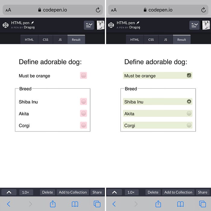
Everyone knows this and yet published web sites&apps out there prove that not everyone knows this. Using labels with input elements and correctly binding them together can ease mobile usage even further than previously mentioned, as tapping the label text (and not just the actual input element) will automatically focus its associated input and bring up the on-screen keyboard.
And while many input elements have relatively decent touch-targets to tap, this really becomes helpful for smaller input elements, like checkboxes and radio controls.
Takeaway
The UX benefits of correctly using inputs, together with semantically correct labels and placeholders, are twofold: it helps eliminate any doubt from a user’s mind, and makes those input elements even easier to access.
Until next time!
Sources for logo image assets used in article cover:
- HTML: https://www.w3.org/html/logo/#downloads
- CSS: https://commons.wikimedia.org/wiki/File:CSS3_logo_and_wordmark.svg#file
- JS: https://github.com/voodootikigod/logo.js


![Holding wholesome tech interviews [part 6/7]](https://miro.medium.com/v2/resize:fit:679/1*O0De9yKqFRHaYi1MUAnY4w.png)
![Holding wholesome tech interviews [part 5/7]](https://miro.medium.com/v2/resize:fit:679/1*-5hzYt_4sfXx3nbKPOFSSg.png)


