Thoughts around design systems: implementation — React, Styled-Components, and more
Before you jump into building screens, take a step back, and observe all the screens.
 For constructing a building, the foundation is a very critical point. On a similar note, investing enough time in understanding the design system and implementing it, will make further development work faster and smoother. A designer provides you with the style guidelines and roughly enough screens to start. This info can guide you in deciding your libraries, packages, and tools you are going to use to style your components. The project complexity and time constraint also could determine your choices. Interaction with the designer to realize his mindset can further greatly influence your way of implementation more logically.
From my experience so far these shall be the fundamental checkpoints when you transform your design systems into code.
- Readable/Intuitive/logical
- Modular
- Reusable
- Extendable
- No over-engineering (Eg Too DRY aka AHA)
Well before I start elaborating on the above-mentioned points, let’s for one time ask why even bother a design system? I believe even on just doing a side project where you are the sole developer with great confidence of design sense (puns intended) and no designer, you can make your app shine (in terms of looks here, I meant) just by setting a style guide beforehand and following basic tips and tools. It will naturally make the app look less messy and enable you to give a unique branding to your app.
Basic starter tips
- Using 4–6 main colors for the app. A random palette generator could be handy https://coolors.co/
- Focusing on 2–3 font families. FootJoy generates font family sets using AI which could be appealing when used together
- Using https://www.modularscale.com/ to generate a set of harmonious font sizes (thanks to Siddharth Kshetrapal for the info)
Symmetry is pleasing to the eyes and reduces the cognitive load on the user. In fact, one of the goals behind having a design system is to make your UI consistent which is a very important aspect of UI engineering and branding. This article talks extensively about how consistency plays an important role in general for a product.
At the same time, the monotonous design would look boring. Hence some variations enable you to break symmetry and also is important to help the user distinguish between different functionalities or bring attention to specific parts.
Now coming into the main discussion here :)
Below is an example of a relatively simple design system. We will discuss further closely referring to this
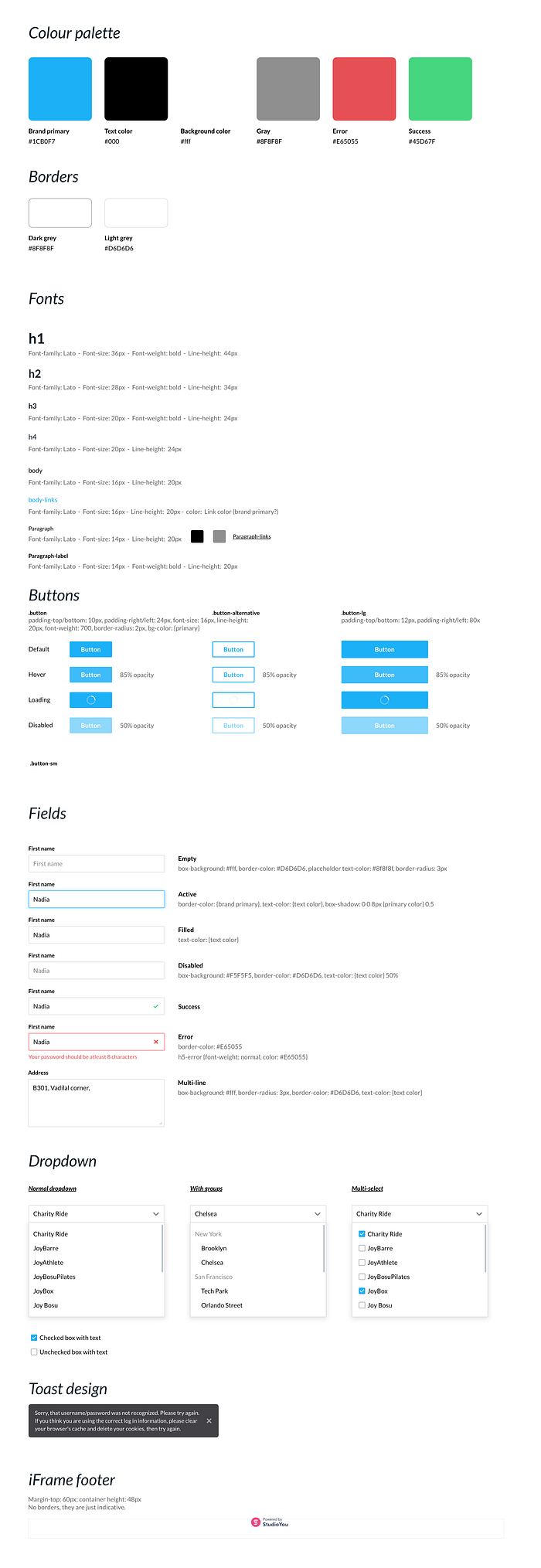
StyleGuide specifically provides you with the atoms and molecules you are going to use throughout your application pages. While your various screens guide you in tracing patterns and converting them into building organisms and templates like React components.
In case you are wondering where such chemistry terminology came from. Atomic Design principles say a page can be broken down into templates. Pages → templates → organisms →molecules →atoms
I highly recommend reading about atomic design by Brad Fost. In fact, whatever good example of a design system you consider, they are somewhere using ideas of atomic design.
Atomic Design details all that goes into creating and maintaining robust design systems, allowing you to roll out higher quality, more consistent UIs faster than ever before. This book introduces a methodology for thinking of our UIs as thoughtful hierarchies, discusses the qualities of effective pattern libraries, and showcases techniques to transform your team’s design and development workflow.
Note: my definition of atoms and so may not strictly comply with the atomic design principles as I just draw inspiration from them and do what suits in my case.
As per the above-shared style guide
atoms: Fonts labeled h1,h2,h3,h4, body body-links, paragraphs, etc, the checkboxes, and the icons (close, tick, spinner)
I like the Material UI framework as it has highly customizable components and themes. As well you get stuff like accessibility out of the box.
But when you have a full-fledged well-defined design system. Converting the Material UI components into yours is a ton of work. Documentation is great. But still often I had to look into the source code of the components to learn to tweak the styles and match with my desired styles. Moreover using another design system is like promoting their brand not yours exclusively.
Wait, there is something I haven’t yet thought enough. Material Design also has motion design. If your design system also includes a motion or plan to include motion design later, I guess it’s even more hard work to tweak the material design’s motion than to build components from scratch. Google has been building mechanisms for customizing motion design. It’s in beta probably.
Owing to the relative simplicity of the scenes and style guide and considering that it wasn’t inspired by Material design, I decided to go with building from the ground up using styled-components. By going through the screens, I realized I may be using Font labeled h2 (style guide) but with tag <h1>. Such scenarios (using the same style but different HTML semantic) are very common especially when you want to be very correct :) and that’s why Styled-Components have got you covered.
Here, we are dealing with (Css-In-Js) way of styling only. If using classes there is no issue in achieving the desired HTML semantic. <h1 class='h2'>Heading</h1>
But with styled-components, as you see you can the `as` prop to change the semantic.
export const H2 = styled.h2`font-size: 1.75rem;line-height: 34px;font-weight: bold;color: ${props =>(props.color && props.theme.color[props.color]) ||props.theme.color.primaryText};`;<Heading><H2 as='h1'>Appointments</H2></Heading>
One thing I want to say that you may be tempted to add margins in atomic and molecular components and even more in template components. But you will ultimately end up thinking why the components are not getting positioned in the pages as expected, and rewriting margin attributes anyway and making them not much reusable.
These building blocks should least affect other neighboring components by themselves.
Next coming to
molecules: Buttons, Form Field, Form Label, dropdowns etc. These actually can incorporate the existing atom-like components to form more complex components.
You surely would like to test those before you start plugging them into whole pages. Previously there was no way and we had to directly make and test them on the fly while building pages mostly. But the storybook has enabled us to utilize the power of this component-based model of doing things even more. Hence, I would like to introduce you to Storybook in the context of documenting the atoms and molecules in the developer’s way.
From storybook’s official page
Storybook is a user interface development environment and playground for UI components. The tool enables developers to create components independently and showcase components interactively in an isolated development environment.
Storybook runs outside of the main app so users can develop UI components in isolation without worrying about app-specific dependencies and requirements.
Further, this also gives a developer clearer and quicker exposure of all the existing building blocks aka components at hand. Hence this can be considered as the developer’s way of documenting the given style guide.
You can also document and experiment entire screens design with storybook.
You can use storybook with React or many other popular UI frameworks.
Below is a tiny sample

Organisms: Navbar, or Breadcrumbs, Searchbar.
Templates: You can consider them as a reusable layout for a group of molecules, atoms, and organisms).
Some time back in this article I mentioned the terms extendable and No over-engineering. What I’m trying to say is that you can make your components highly configurable more than actually essential or make them so rigid that you encounter a previously missed case and start tweaking your basic components every now and then. A designer might just miss something in the style guide and the developer or designer might find them later and add it.
Hence keeping a balance seems good. There is no tangible/software measuring tool I’m aware of. It basically comes with experience.
Awesome design systems is a list of open-sourced design systems including a lot of popular ones. Going through this is surely gonna give you a very wide perspective.
Further, if you are going to attempt a design system from scratch for the first time, some tiny snippets of how the theme configuration objects could look like can help you decide your own.
1.
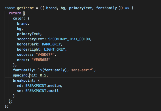
2.

3. A fairly complex one, too big to be shown here. Below is the link of a theme object of an application build by fully configuring the material UI theme.
As I dive deeper into UI Engineering, I have been fascinated by the world of design systems. I hope you get at least a bit of insight from this article which you can keep in mind when you are implementing one yourself.


