Member-only story
Times New Roman doesn’t have to be boring. Here’s why.
We got to push it out of its “comfort zone;” its typicality.
EDIT (30/10/23): Preface has been shortened to a footnote for brevity.

Hi, my name is Micheal Xing, and this is my Creative Monologue! It’s about design-related matters that run in my head rent-free. And rather than letting it be only in my mind, I’ll be exhausting them over here for you guys to be entertained, to try it for yourself, and to also discuss further. I have no idea if this will turn into a regular series, but here’s a start!
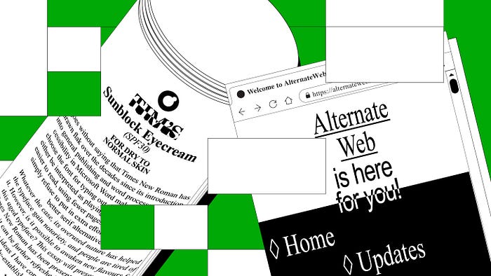
IT GOES WITHOUT SAYING THAT Times New Roman (TNR) has drawn flak over the decades since its introduction into general publishing and word processors. Its accessibility in Microsoft Word makes people choose that font for typing out documents. This can either be interpreted as playing it safe, thinking it’s easier to read, using fewer pages to print, or simply being uninterested to put in extra effort to search for a better serif alternative. Whatever the case, its overused nature has helped the typeface gain notoriety, and people are tired of it. However, is it possible to awaken new flavours for this aged typeface? This essay will present the ways Times New Roman* has been presented in design, and how it can be further refreshed upon with two supporting ideas I have come up with, based on already-established design principles.
*I will also be grouping alternative versions of Times New Roman (e.g. Times, EF Times Modern) as part of the TNR identity. Although they are slightly different from TNR, they have the same intrinsic qualities that people would likely associate them together.

Now, I won’t go into the history of Times New Roman, but I’ll say that the typeface has existed a very, very long time since its use in newspapers. But times have changed, and designers still use Times New Roman in the current Graphic Design scene. What bugs me, however, is that they have only used them mostly as just standardized body text (like the labels in Kiehl’s) or in Brutalist design. People have also approached the typeface with a horizontally-squeezed look (which makes it look like a…

