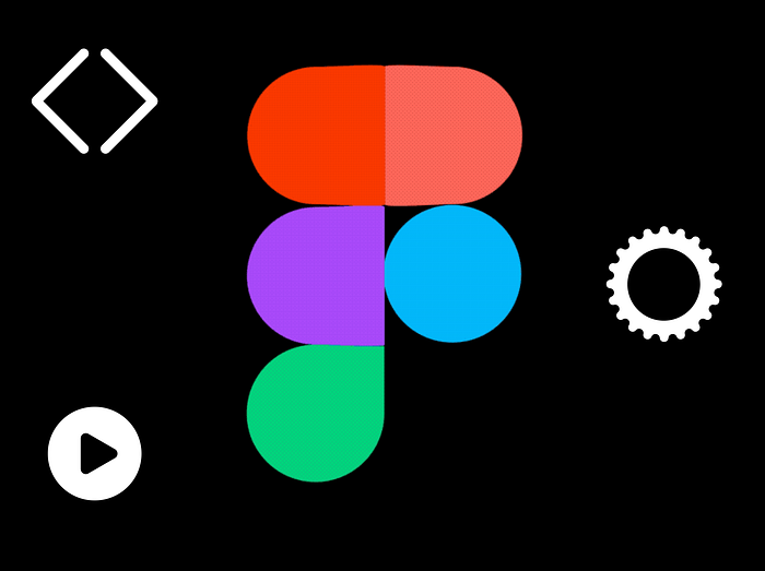
Tips for creating icons and logos in Figma
Thanks to Figma’s incredibly powerful and unique inventions like the Arc tool and Vector Networks, your imagination now has no limits.
Figma’s $40 million in Series C funding led by Sequoia was announced in early 2019. Almost every designer I know uses it. Every designer online has been raving about it ever since it launched.
Companies like Airbnb, Microsoft, GitHub, Notion, and Uber use Figma. As you can tell, Figma is incredibly powerful. A lot of savvy investors and intended users think so. Here’s a progress report on how far the company has come in 2018.
There is no doubt that designers will be paramount to the future of the creative economy. Figma realized that designers shouldn’t work in silos and that collaboration is key for successful projects. Figma has developed a design platform that enables designers to build and share their work collaboratively. No longer is design siloed — no longer are designs an individual endeavor.
The great thing about Figma is that, unlike Sketch, it is free to use for personal projects. You can visit their website and try it for yourself!
So, let’s cut to the chase, shall we?
Boolean Groups and Shapes
To start creating your custom icons and logos, you will need to understand at a fundamental level how boolean groups work with shapes.
Once you have more than two shapes selected within your frame, you will see an option of Boolean Groups in the top panel.
Frames in Figma are like Artboards in Sketch. As a result, you can create a Frame by pressing A or F on your keyboard. You’ll be presented with the option of choosing from Phone, Tablet, Desktop, Watch, Paper, or Social Media templates.
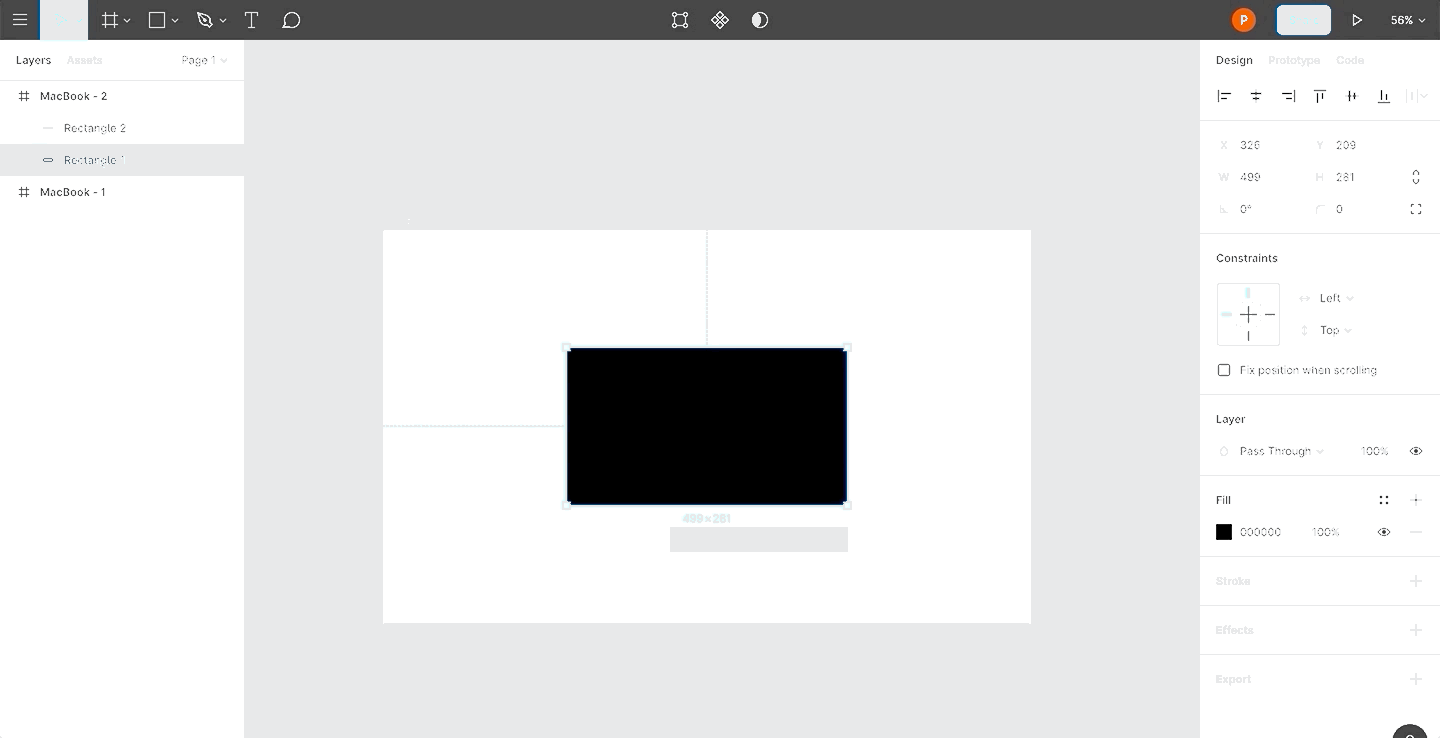
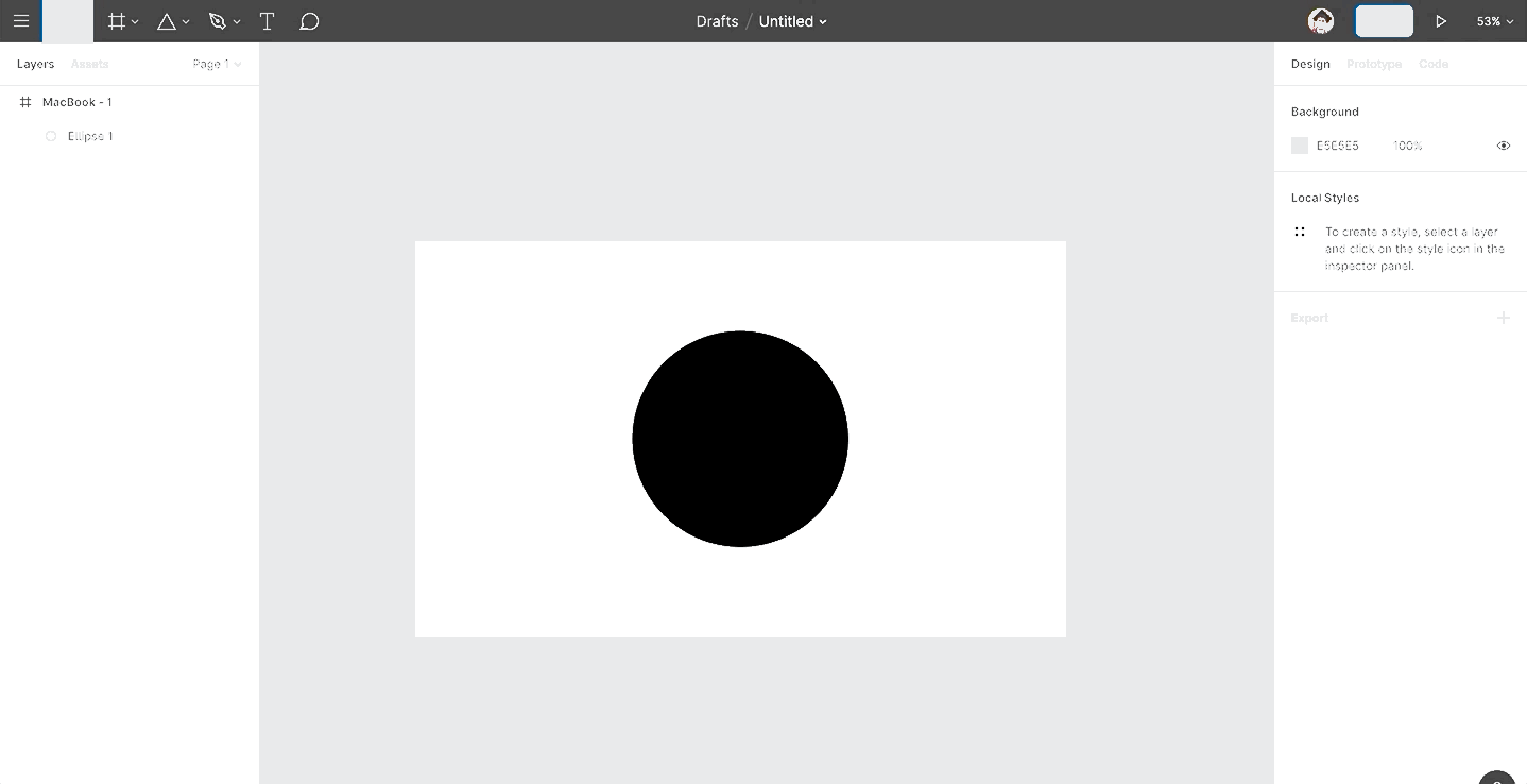
As you saw above, each time you create a shape, it will have a default light gray color.
To override the default properties of a shape, first create a shape like you normally would. Then, set whatever properties (e.g. Fill, Stroke, etc.) you want on the shape.
Once you’re satisfied, select the shape and go to Edit > Set Default Properties to set the properties. The next time you create any shape, it will preserve these settings.
And, voilà!

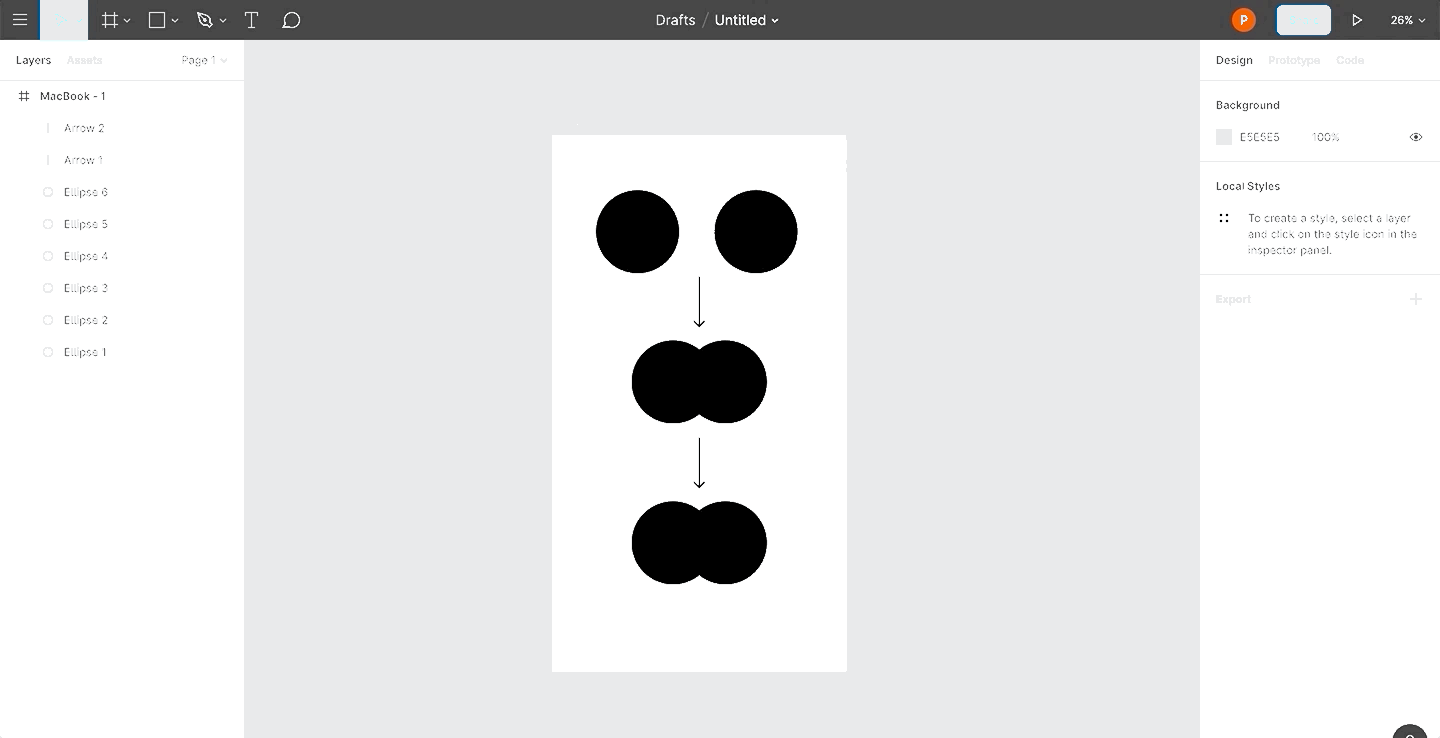
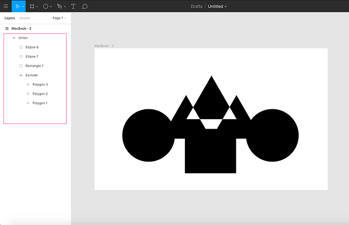
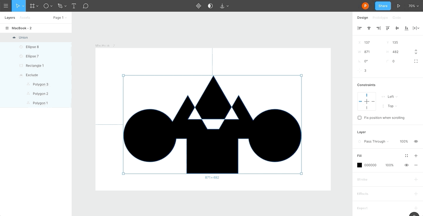
Union Selection
A union merges multiple objects into a single object.
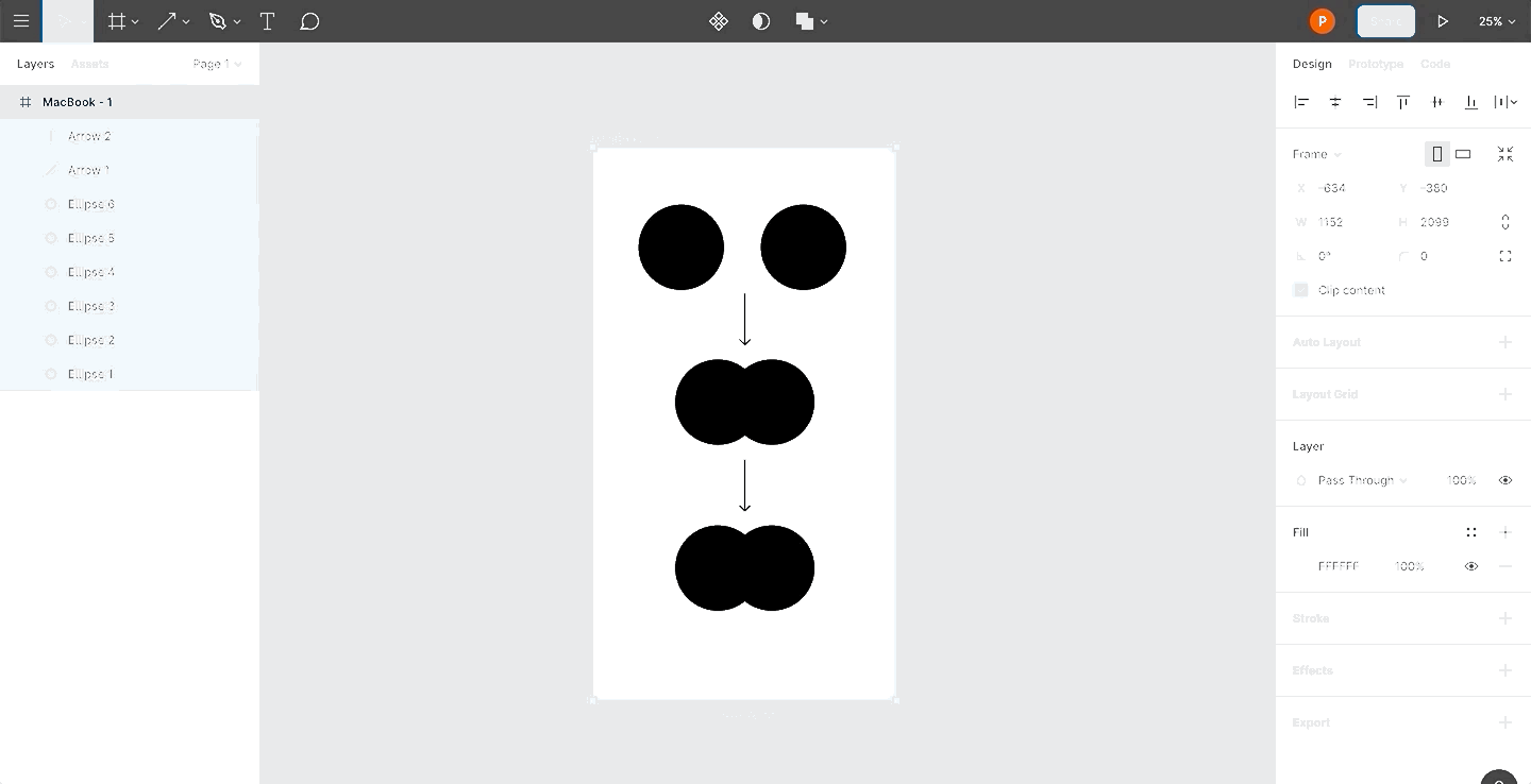
Most icons nowadays leverage this technique. You can create icons such as a ➕ or ✖ icon or a for a task management app, for instance.
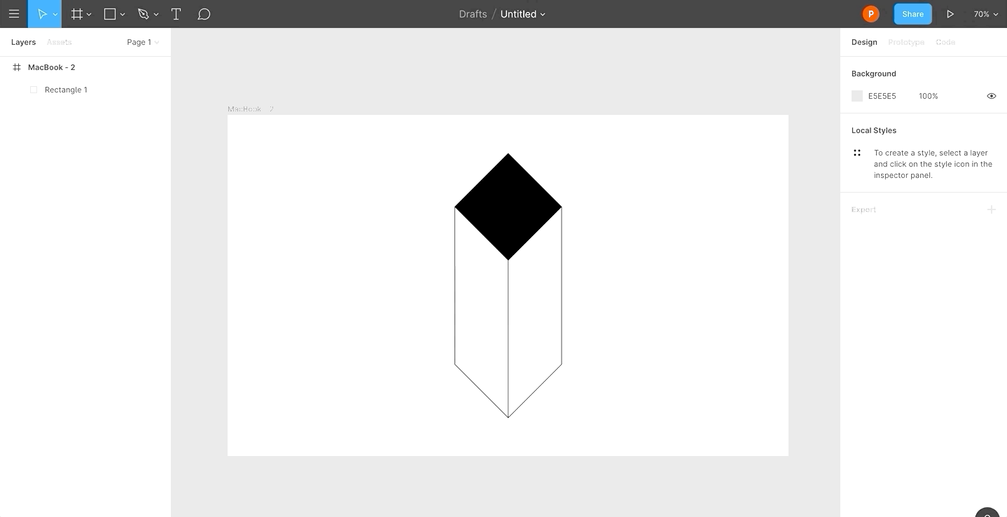
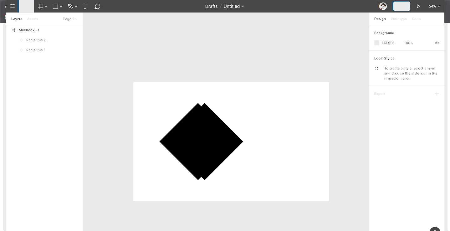
Subtract Selection
Subtract Selection will subtract one or more shapes from the main shape. The main shape here refers to the bottommost shape in the Layers panel.
It’s important to note that all subsequent shapes will always be subtracted from the main shape.

For example, you can use Subtract to create interesting icons such as credit cards. Who doesn’t like credit cards 💳?
Intersect Selection
Intersect will create a shape from the area where two or more shapes meet.
Although not as popular a technique as Union or Subtract, Intersect is a great way to experiment with new shapes.
Here’s how you can create a sharpie using Intersect and Union concomitantly.
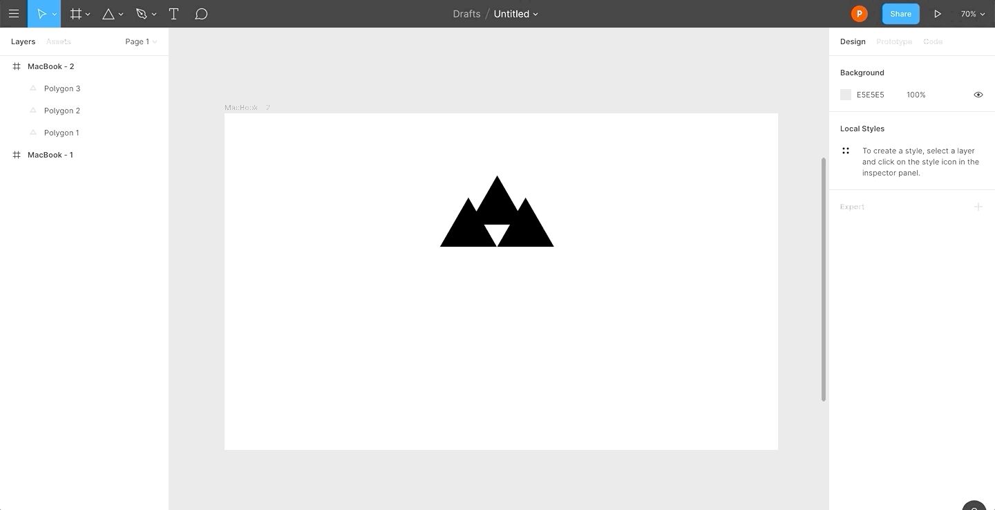
Exclude Selection
Exclude Selection does the opposite of what Intersect Selection does; it creates a shape from the area where two or more shapes don’t meet.

Flattening Shapes
As the number of shapes grows, simply relying on booleans can make your icons complex and multi-layered.
By flattening booleans, you can simplify your workflow. You can do so by selecting the Flatten Selection option under Boolean Groups to create a new vector and work from there.
Vector Networks
Most pen tools tend to draw paths in a loop with a defined direction, always wanting to reconnect to their original point.
Figma allows you to create web-like connections from vectors instead of connecting the paths one after the other.
Figma’s vector networks don’t have a specific direction and can branch off in different directions without you having to create a separate path object.
You no longer need to continue your vector points. You can just draw new vectors from existing ones or connect them to others. This allows you to create complex objects within the same objects with the same properties.

Press the Enter key on a selected shape to go into Edit mode. This is useful when you want to customize the perspective of your shapes.
Creating Custom Icons
We covered a lot of stuff here. Take a moment to read this over and over until you’ve firmly grasped these concepts.
We’ll now apply our learnings to create custom icons. Like I mentioned, you can create as many icons and logos as your imagination allows.
For some inspiration, check out Font Awesome’s website and try to recreate your favorite icons.
I like to keep it short and to the point, so I will showcase how to create some commonly used icons that you’d find on the Web.
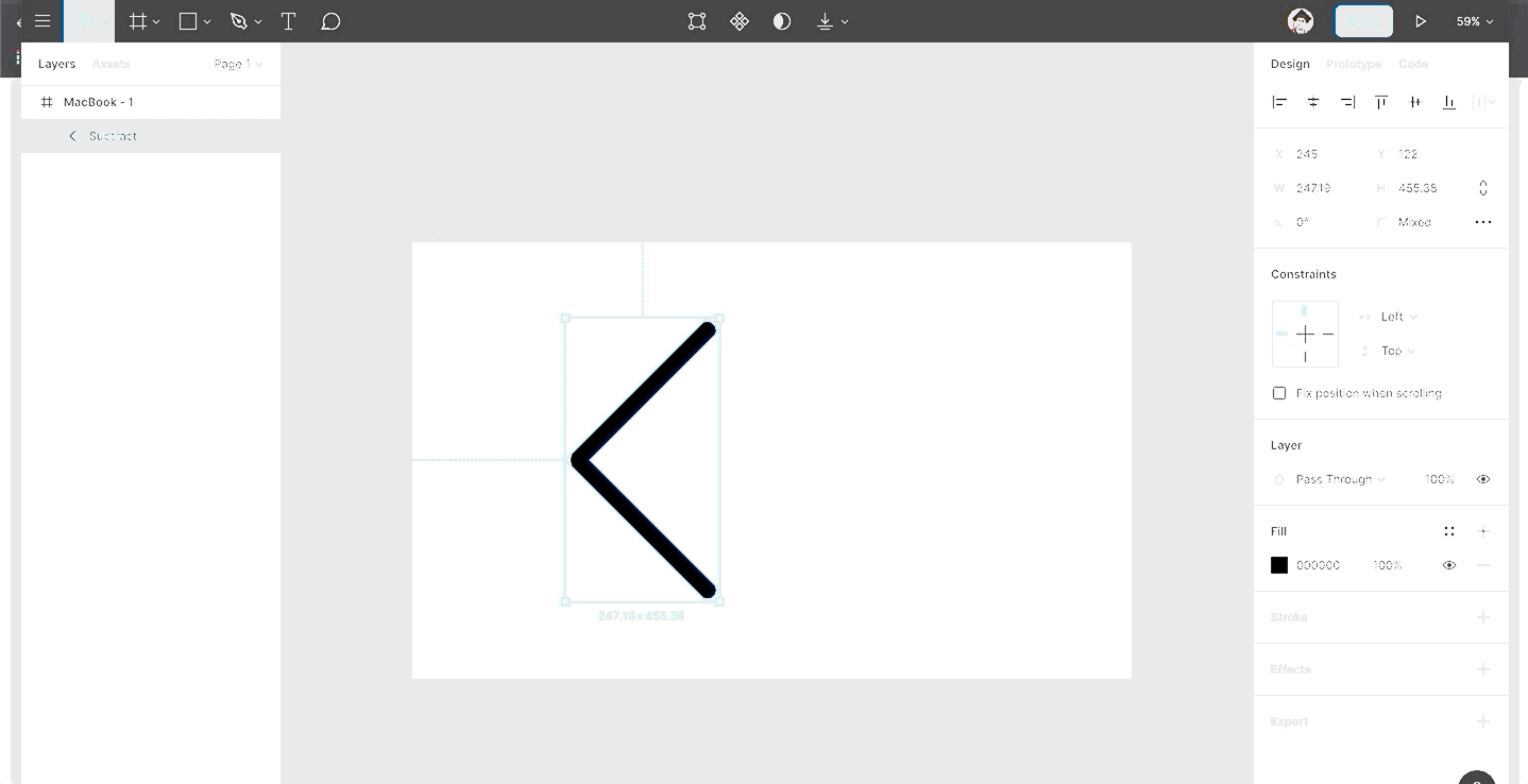
Code Icon
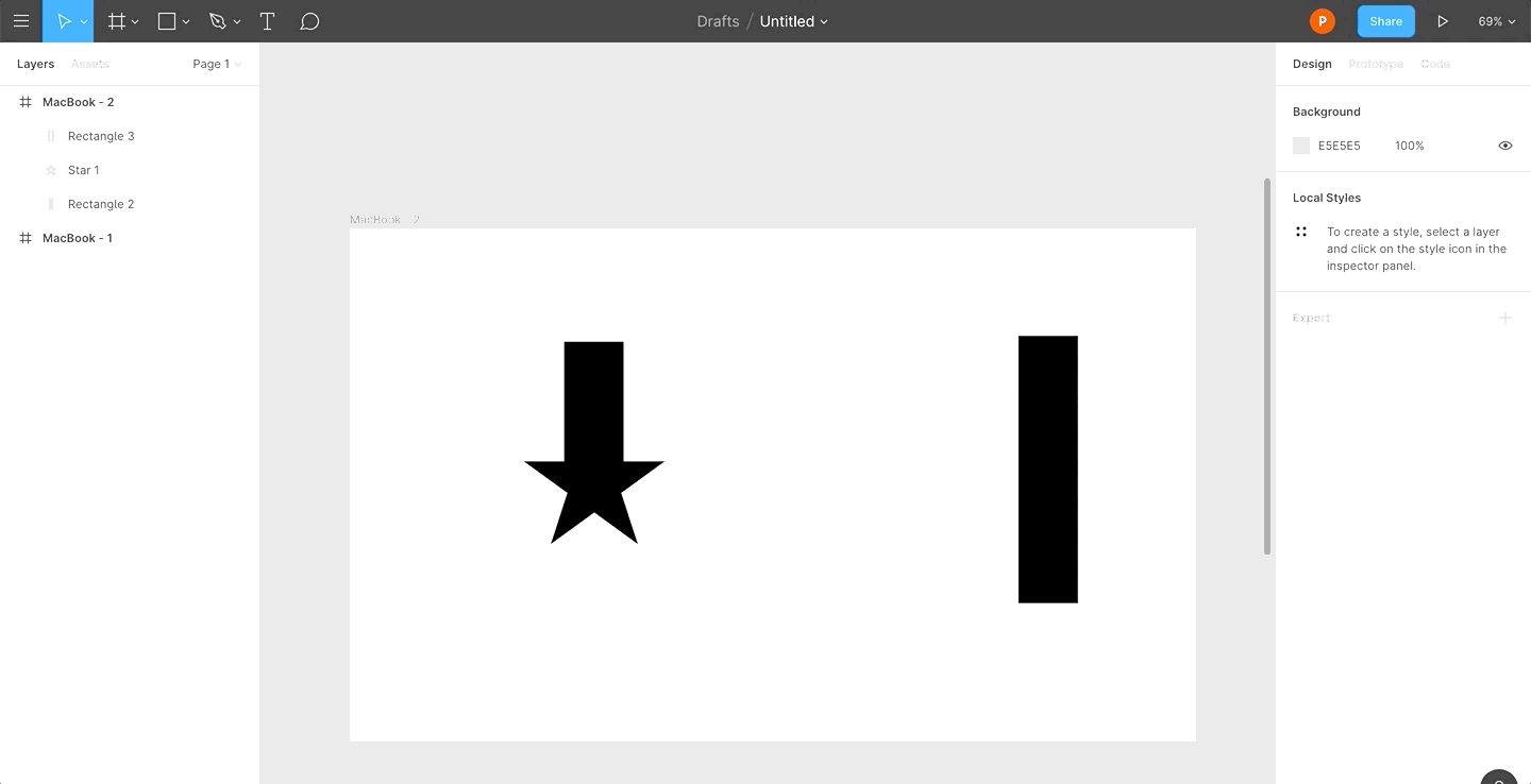
- Create a square (shortcut to create a square is R + Shift + Drag)
- Rotate it by 45 degrees
- Duplicate it (Command + D) and shift it a few pixels to the right
- Select both shapes and do Subtract; then select Flatten Selection
- Press the Enter key to go into edit mode
- Now, select the edges and set a corner radius
- Duplicate the shape and rotate it by 180 degrees
Settings Icon
- Create a Star having a Count and Corner Radius of 20
- Create a circle (shortcut to create a circle is O + Shift + Drag), which should be enclosed by the star
- Subtract the circle from the star
Play Icon
- Create a circle (shortcut to create a circle is O + Shift + Drag)
- Create a Polygon with a Count of 3 and a Corner Radius of 10 inside the circle; rotate it by -90 degrees
- Subtract the circle from the Polygon
Creating Custom Logos
A logo is a graphical element similar to an ideogram that identifies your company as a brand. A logo is unique to each company and its mission. It all boils down to what you want to communicate with your users.
Logo design is a more free space than icon design. A logo could be any shape, color or dimension. Icons, however, should remain consistent since that is what users — who are getting smarter by the day — are expecting to see across websites or apps.
I leveraged Figma to create branding for my website. Thanks to Figma’s incredibly powerful features, I was able to accomplish this in less than ten minutes.
Since I’ve also added support for Dark Mode, I had to create two separate logos for each mode.


These days, design tools don’t differ much. Their layouts are similar and you’ll most probably work with the same essential features such as components, libraries, and developer handoff.
Figma is just as powerful as Sketch, still, it went above and beyond to solve common issues such as collaboration, version control, icon illustration and so forth.
The plugins for Sketch such as Abstract, Craft, and Zeplin are readily available in Figma. Your team no longer needs to rely on third-party tools or an increasingly complex and fragmented set of plugins. Figma bundles all of this from the start.
In a nutshell, Figma is like the Google docs of design tools. Imagine Google Docs, Abstract, and Sketch packaged into a single tool. I’m excited to see how you incorporate Figma in your daily design endeavors.
I hope this was useful and thanks for reading!


