Title case vs sentence case in UX writing
When writing UX copy from scratch, I used to struggle to define what works best. Should I go with Title Case or Sentence case? Who knows. Turned out, that’s a struggle that many UX writers have. In this article, I’m breaking down the pros and cons of using Title Case and Sentence case when writing UX copy.

Title Case Looks Like This
Doing my research, I realized that lots of websites and apps use Title Case. Diving deeper into the topic, I came up with a fascinating conclusion. Okay, it was fascinating for me, as I am an international UX Writer. I didn’t go to school in America. But those who did know that children in American schools learn how to write in Title Case from a very young age. No wonder that the majority of US citizens are big fans of the Title Case.
On the contrary, Europe and the rest of the world find Title Case too cluttery. In the part of the world where I from, people find Title Case hard to skim. And, for example, there is the German language where capitalization goes for all nouns. Thus, Title Case will only confuse a German person and that’s exactly what we’re trying to avoid writing UX copy.
Sentence case looks like this
Pretty casual, right? It has a vibe that most modern companies would like to promote. Sentence case is all about innovations, new tech decisions, automation, and entertainment. And if you’re having an e-commerce business or an online store, Title Case can cause you a drop in traffic and fewer purchases of your goods.
Most international writers prefer Sentence case. And I admit, I am too. It’s so much easier to maintain consistency. And consistency is what we’re trying to achieve writing UX copy.
Google vs Apple
If you’re both an Apple and Google user, you might have already know the difference.

Apple champions Title Case across all of its products, while Google champions Sentence case. Both companies try to maintain consistency here, but as I said earlier with Title Case it’s much harder to do. You may be literally all spun out all the time. Do I need to capitalize this word? No. Or do I? For God Sake!
Know your audience
Whether you’re a fan of Title Case or Sentence case, it’s always good to know your audience. It will tell you which case will work best for your product. For instance, if you’re working on an official website of an established company, Title Case might work just great. Especially, if your target audience was born around 60's. And again, if you’re dealing with a startup or a project that stands for innovations, consider using Sentence case. Chances that your target audience was born around 90’s or later are high. And we l.o.v.e Sentence case, truly.
Why use Title Case?
- Let’s Make It Official. Looks serious, right? Exactly!
- Grabs reader attention. Capitalized phrases stand out from the crowd, as Pieter Heyman nicely put it.
- Keeps a nice visual rhythm. Of course, as long as the sentences are short.
- Stands out. Title Case differentiates title from the body text.
- Maintains symmetry. Yet, works only for short texts (ex. Buttons, Labels)
Why use Sentence case?
- Consistency. Easier to maintain across different platforms.
- Clarity. Easy to navigate and skim, thank you, John Saito. (ex. Home > About us)
- People love it. Yes, we love having human-ish conversations with apps.
- Casual. Gives an impression that anyone can use the product.
- Easier to localize. Much much easier and less stressful.
I gathered some onboarding examples, so you can check out what difference does it make to go for Title or Sentence case.
ASOS
In case you’re not familiar with ASOS, that’s a British online fashion and cosmetic retailer. They did a great job with writing UX copy on-brand. As you can see, the ASOS brand uses uppercase letters and the same goes for their titles. However, hints are in the Sentence case, which makes it easy to comprehend.

HuffPost
HuffPost is an American news aggregator and blog, with localized and international editions. They went for a mix of Title case and uppercase letters, which they use to break down news sections. And here, we can see the inconsistency. Even though they went for the Title Case scenario, Your current email address is written in the Sentence case.
I would suggest here to use email@ address.com or Email or similar to maintain consistency.

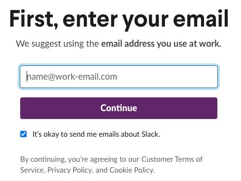
Slack
Slack is where we get our job done. Well, most of us who work in IT. Slack uses Sentence case and they do it brilliantly. It’s clear, conversational, and delightful. You want to go through this onboarding over and over again. Just love it!
Damn, forgot to mention. The reason Slack went for the Sentence case is quite obvious. They stand for easy and effective communication and what’s the best way to promote that? Using Sentence case in-app communication!

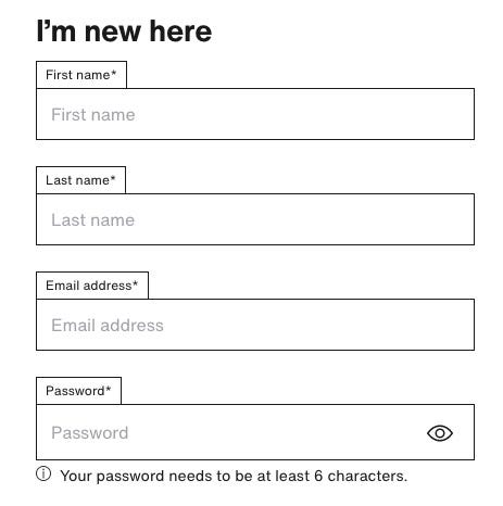
Zalando
Zalando is a European e-commerce company based in Berlin, Germany. As we already know, Title Case is not a German case. Thus, Zalando went for the Sentence case, and look how it turned out! Their onboarding is clear, easy to understand, and quite friendly. However, I would change the placeholder wording so it doesn’t repeat the title.
Ex. First name → John; Last name → Doe.

Skyscanner
Skyscanner is a metasearch engine and travel agency. If you planned a trip (there was the time we planned trips, yeah..), you know that Skyscanner is great for that matter. I always enjoyed its clear copy and enough white space. Just enough not to get lost among the flight listings. So, yeah, the Sentence case is here. At its best!

That would be all, folks. What’s your take on Sentence vs Title case? Tell me all about it in the comments below.


