Choosing fonts: to serif or not to serif
When Google unveiled its new logo in 2015, many were aghast at the exclusion of one particular element — those funny little things at the end of letter strokes known as serifs. The internet quickly divided into two camps, team serif and team sans-serif.

As with most internet discussions, the average internet user probably didn’t give a second thought to this new logo that now greeted them when they searched for the nearest McDonald’s. But for those who cared, they cared a lot.
While some celebrated it as a move into the 21st century, some decried this new look as succumbing to modern, Apple-like design trends and a desertion of their roots. For these folks, the serif was a bastion of sophistication amongst a sea of wannabe minimalist design.
Furthermore, its removal was a signal that classical design sensibilities were now dead.
Does this still ring true though? Not quite. As evidenced by the font that you’re reading right now, it’s clear that serifs still have a place in the modern design language. What this story of public reception means, however, is that the delineation of serif and sans-serif fonts is not a trivial one. People can have strong, albeit misplaced, feelings about the kinds of fonts they interact with across the web.
Even as designers, we can have misplaced ideas about how fonts should be used. We often can get comfortable following the pack and forget that font selection and choosing between serif and sans-serif fonts can have a tangible impact on our design and our users.
Font Selection is a Design Decision
Over the years, I’ve heard designers say that if we’re trying to achieve a “modern” look, we should look solely to sans-serif fonts. This may be due to a strict interpretation of minimalism or just the rise in popularity of Wes Anderson films, but this ignores a wide variety of fonts just because they possess those pesky little tails.
What we need to do is understand that a font selection is in fact a design decision. This means that design principles like contrast, hierarchy, and visibility require consideration amongst the other elements present in the design.
So the question is, how is the font being utilized?
- Is the font being used in conjunction with other fonts?
- Are you trying to promote a certain visual hierarchy?
- Are you trying to emphasize a particular word or phrase?
- Is it being used in prose and for extended reading?
- What is the overall aesthetic you are trying to communicate?
These are all questions that should be answered before you ever eliminate one kind of font outright.
Challenge Assumptions
As designers, we should always be challenging our own assumptions of how we implement certain principles. This will help us stay current with how people are interacting with technology and help us leave antiquated practices behind.
When it comes to fonts, we can easily get in a rut of using only a handful of fonts for a handful of specific purposes. I like Helvetica and Avenir just as much as the next guy, but challenging why we’re reaching for those fonts and identifying if there are more effective ones out there is key for innovation in our work and in the industry.
For instance, for those who think serif fonts aren’t modern, they might be surprised to see how they have evolved and modernized over the centuries.
The Evolution of Typefaces
Take a look at some of the first fonts ever used, starting with Blackletter, created by Johannes Guttenburg in the 1400s who modeled them after the writings of the scribes at the time.
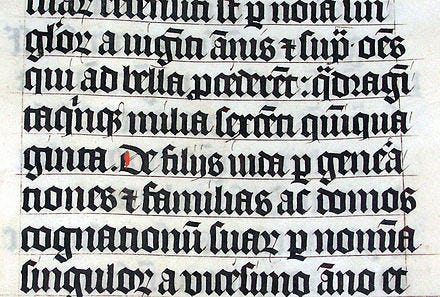
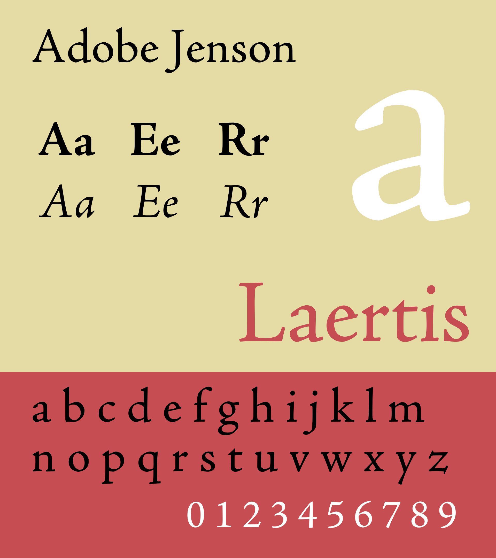
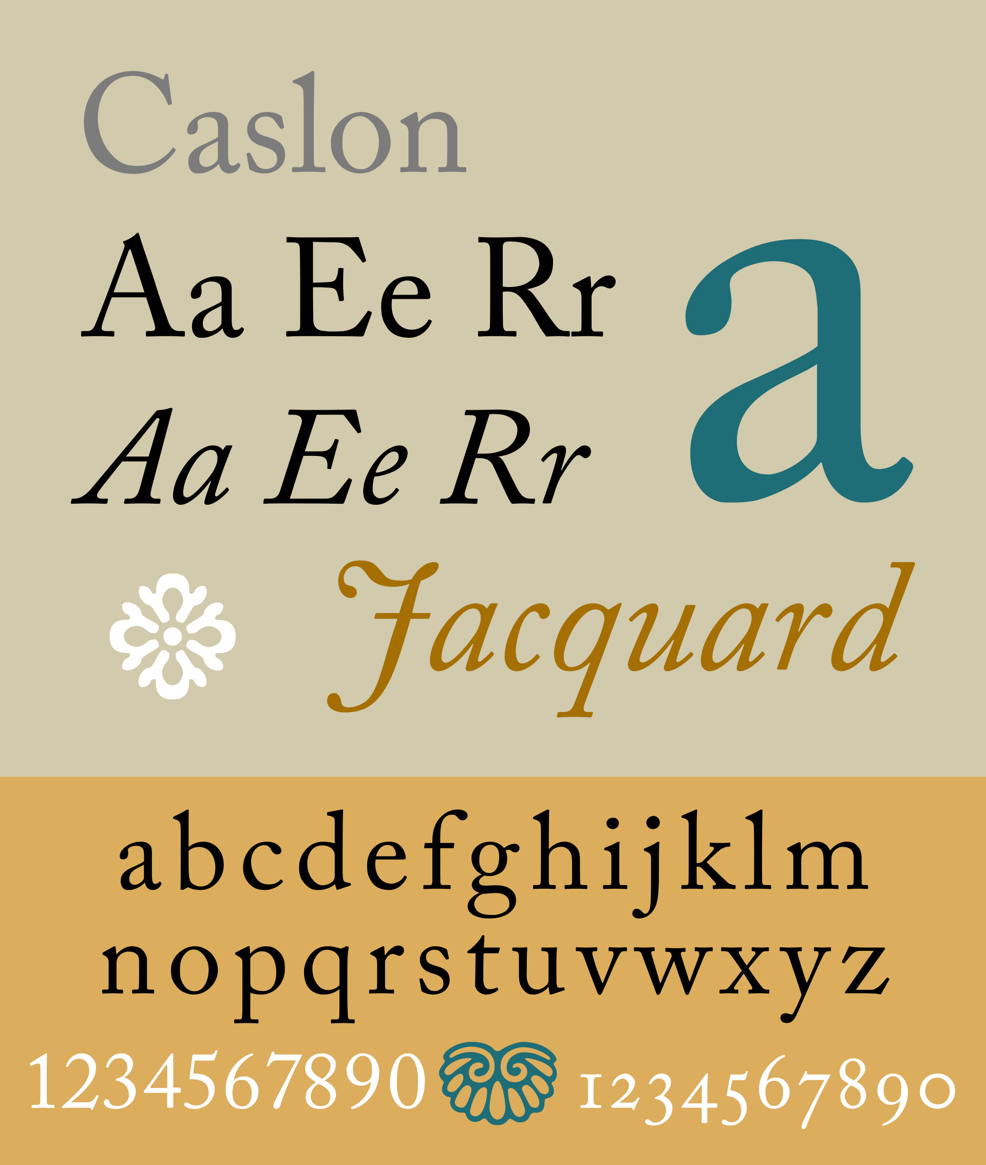
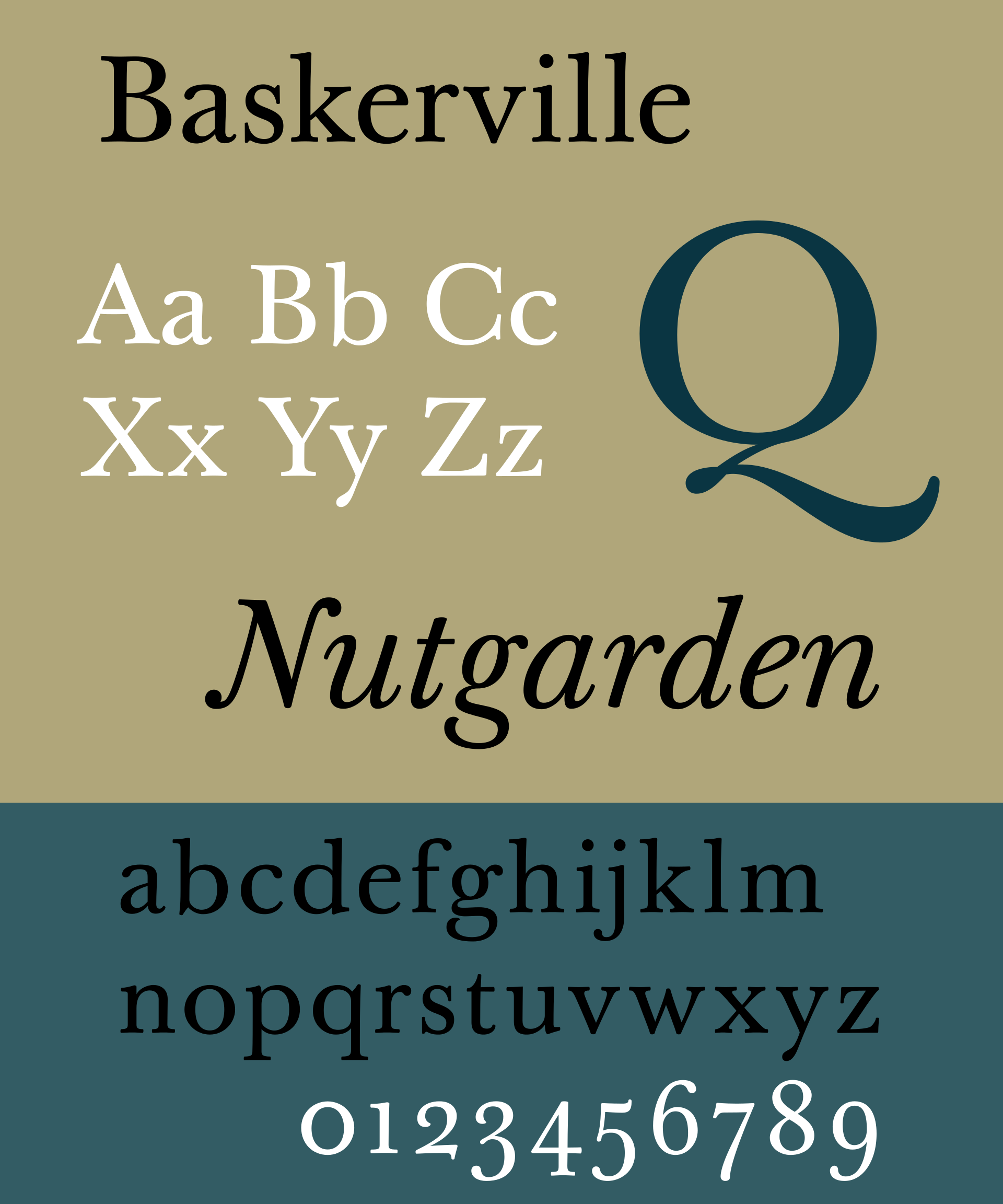
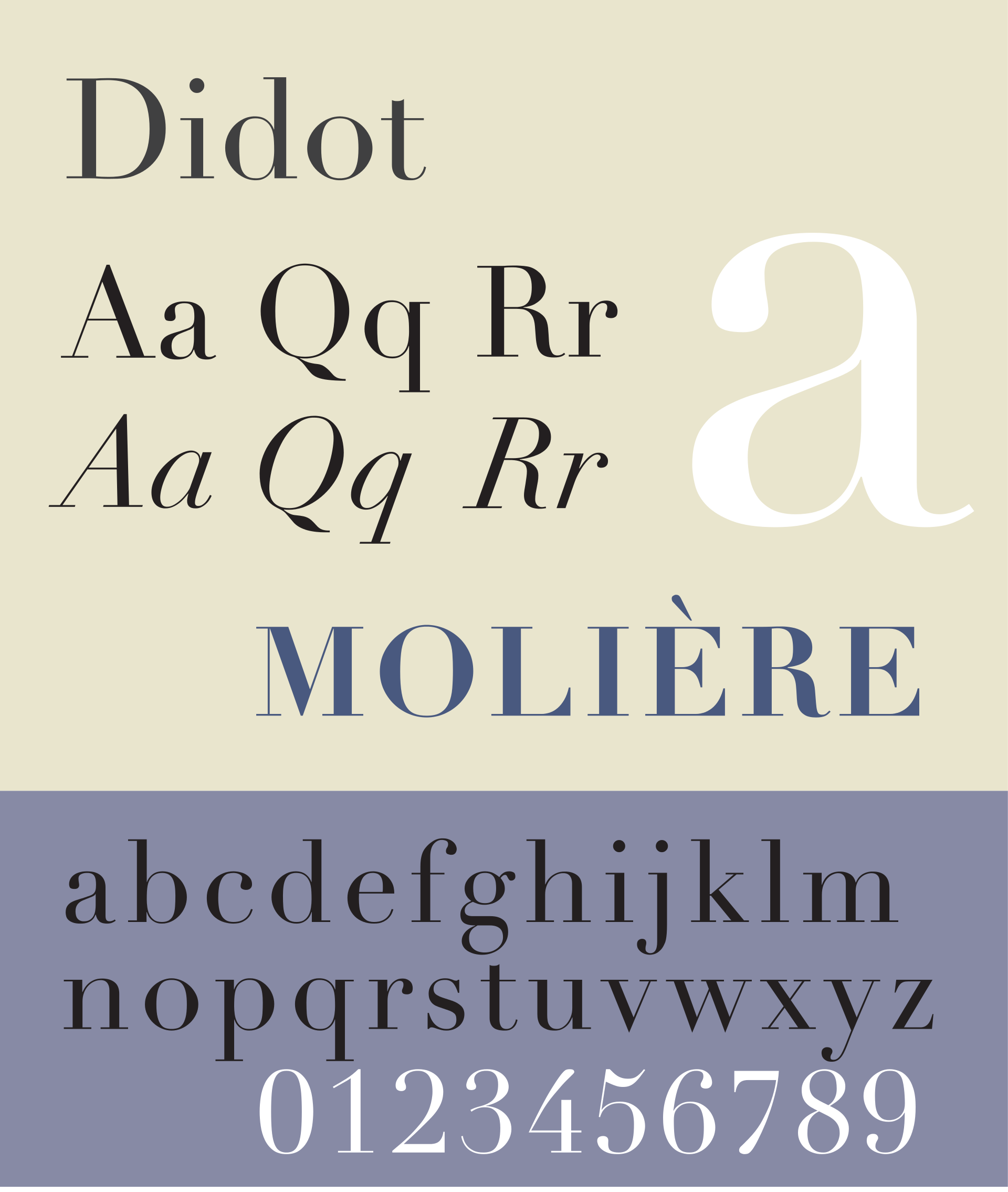
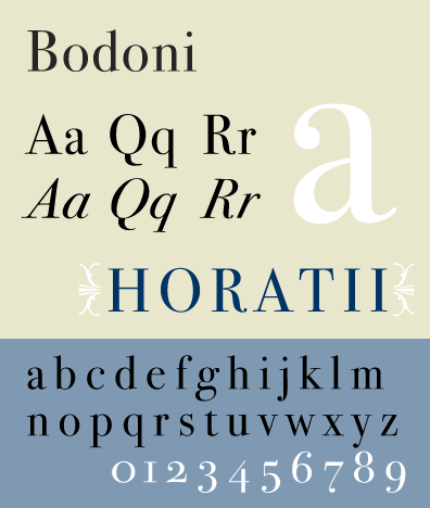
Despite all retaining some of the fundamentals of the handwritten Blackletter, these fonts evolved so significantly over the years that they had their classifications based upon their divergence from previous styles.
Old Style: thick serifs, low contrast between thick and thin strokes (Caslon)
Transitional: thinner serifs, lower contrast between thick and thin strokes (Baskerville)
Modern: very thin serifs, extreme contrast between thick and thin strokes (Didot, Bodoni)
What we may see as classical or traditional is actually as modern as it can get. Modern serif fonts such as Didot are exaggerated in their form and draw the eye rather than the thicker, more compact Blackletter.
Let’s then compare this definition of “modern” serif typefaces with the set of geometrics sans fonts that we’re currently so enamored with.
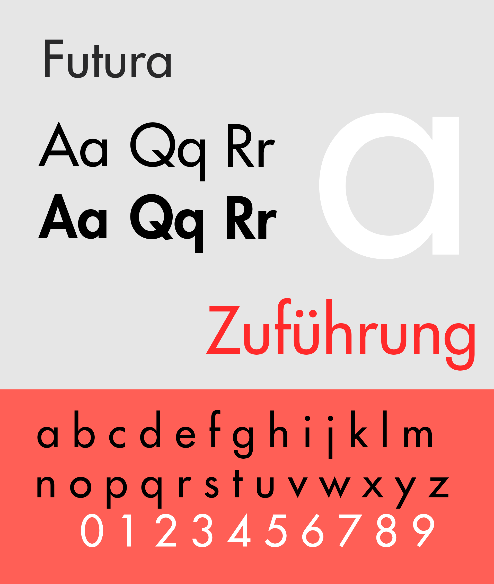
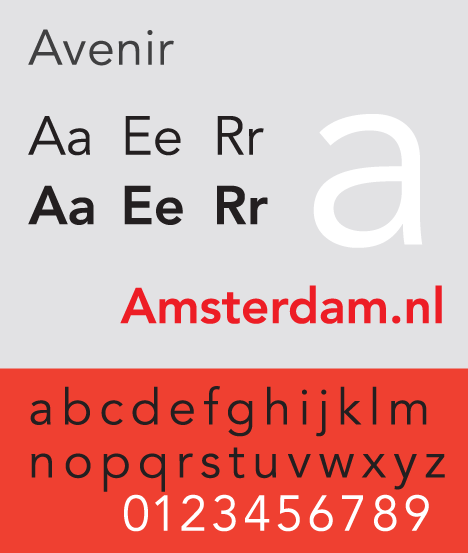

The extreme contrast that was so modern in serif fonts suddenly has little relevance in serif fonts. Modernity in geometric sans fonts is all about balance, symmetrical shapes, and thicker strokes. No longer do fonts care to imitate the handwritten strokes that are formed with an ink-dipped quill. Ironically enough, it is these aspects of geometric sans fonts that made Blackletter and Caslon “old-style” to designers at the time.
What this means is that modernity is irrevocably tied to context.
Just because you’re using a sans-serif doesn’t mean it is automatically going to give your design the modern looks it requires. Some of the most modern typefaces implementations I’ve seen have used serif fonts while some of the cheesiest and outdated have used sans-serif fonts. By understanding the context in which the font is being used, you can unlock new design opportunities, enabling yourself to create more impactful and distinct designs.
Experiment
Just as the typeface creators experimented with the contrast of stroke width, you can experiment with the implementation of the thousands of fonts available to us today. New fonts are being created every day and the ability to create your own typeface is easier than ever.
Experimenting might just mean using that font that everyone has forgotten about and bringing to it new life and new meaning. Juxtaposing the new, the old and the weird is one of the simplest ways to start seeing how fonts can interact with each other and help tell your design story.

So, next time you pick between serif and sans-serif fonts, think twice.
- Why did you choose that font?
- How is that font being utilized?
- Am I making assumptions about this font?
- Can I do something new?
For more on the history of Typography

