Tooltips: your secret weapon for improving feature discovery
As UX professionals, it’s our job to make sure that the most useful, engaging features of our apps and products aren’t just easy to use, but intuitive, too. Far too many apps conceal otherwise-useful features and tools behind illogical design choices or lazy conventions, making them needlessly harder to use.
However, it’s also our job to push the boundaries of design and create genuinely innovative experiences for our users. So how do we balance intuition with innovation when it comes to feature discovery?
Tooltips, that’s how.

Tooltips are an invaluable tool for UX designers. They allow us to gently guide our users through compelling and rewarding UX onboarding flows, highlight useful features that users might otherwise overlook, and demonstrate how to get the most out of our products and applications.
In this post, we’ll be looking at three examples of how tooltips can help you make feature discovery not just intuitive, but fun. By the time you’re done reading this post, hopefully you’ll have some ideas of your own for how to leverage tooltips in your designs and products. But first, let’s talk briefly about what tooltips are.
What Are Tooltips?
Tooltips are a type of in-app messaging pattern that highlight a product’s features or functionality by drawing the user’s attention to the feature in question. Oftentimes, tooltips are presented as self-contained, on-screen messages that appear when a user hovers their mouse cursor (or finger, in the case of mobile apps) over an application’s various navigational elements in the user interface (UI).
One reason why tooltips are so useful — and have become so ubiquitous — is that they can draw attention to specific features of a product without disrupting the flow of using the app. This allows UX designers to draw users’ attention to individual features without having to design entire onboarding experiences or user flows around explanations of how to use those features or cluttering the UI with extraneous icons or menus.
So, now we know a little more about tooltips and what they’re for, let’s take a look at some in the wild.
Facebook’s UI has changed enormously in recent years. It may have retained its dark-blue color palette (chosen due to the color blue’s connotations of security and trustworthiness), but little else remains of Facebook’s earlier incarnations. As the largest social media platform in the world, Facebook is constantly experimenting with new features, all of which require at least some introduction and explanation.
Enter the humble tooltip.
In the figure below, you can see how Facebook first introduced the ability for users to download photo albums uploaded to the platform:

One of the most underrated aspects of tooltips is how they can not only draw users’ attention to new features, as in the example above, but they also help users learn about general design conventions found elsewhere on the site or in the app. The photo-download example above shows users how to download albums of images they’ve uploaded to Facebook, but it also teaches Facebook users that the gear icon is how to access the settings of a page or feature.
As a strongly data-driven company, it didn’t take Facebook long to optimize and refine its tooltips themselves, but the ways in which Facebook uses them have remained largely similar. The examples below both highlight new features, but do so in a seamless, non-intrusive way.
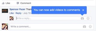
The tooltip below shows users how to add video to a comment on somebody else’s post — that’s it. Just a quick pointer about a new icon visible in the comment field, and the user can get on with composing their comment:
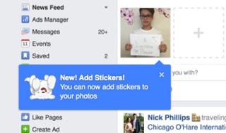
Here’s another example from Facebook, showing users how to add digital stickers to their photos. This tooltip is a little larger than the one above, but it’s still pretty compact and doesn’t get in the way of any core functionality or navigational elements:
All three of the tooltip examples above have one thing in common: Facebook uses them to draw attention to — and drive adoption of — new features. They’re a quick and easy way of highlighting new functionality and showing users how to accomplish a task without being overly disruptive.
For Facebook, tooltips are particularly effective because Facebook’s UI is busy enough as it is, and many of the platform’s newer features are concealed behind small icons added to existing elements. This focuses on one of tooltips’ greatest strengths, which is highlighting subtle changes that might be otherwise easy to overlook.
Professional networking site LinkedIn also relies on tooltips to help users access, learn about, and make the most of new features.
However, although LinkedIn utilizes tooltips quite well across the site — highlighting everything from the ability to follow companies’ updates to the site’s Clipboards feature — they aren’t consistent in tone or style.
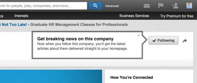
Take the tooltip below, for example. This particular tooltip lets users know that they can follow updates from specific companies. The tooltip itself is pretty wordy, and it’s not especially pleasing from an aesthetic point of view; it’s a little utilitarian, to say the least. Even the copy is poor, as it sounds more like a sales email than letting users know about a handy feature or a cool new tool:
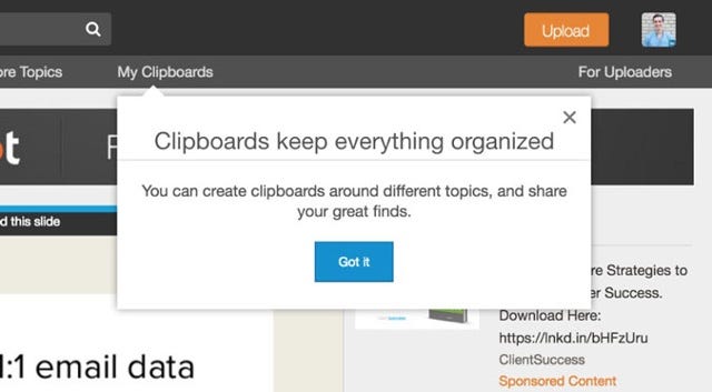
Compare this tooltip to the one below, which is from LinkedIn’s SlideShare app. It’s a lot more attractive visually speaking, and the copy is simpler and punchier:
Finally, check out the tooltip below, which draws users’ attention to LinkedIn’s instant-messaging feature. This tooltip, which is arguably the best of the three, looks and feels a lot more like the tooltips you’ll find on Facebook and other social platforms. The color palette matches that of the site, the copy is crystal-clear, and it doesn’t intrude too much on the overall experience.
Of course, one could argue that most LinkedIn users probably don’t care about design discrepancies like this, and you’d probably be right. These examples do, however, show just how much one tooltip can differ from another, and why keeping the messaging simple and the tooltip itself as minimal as possible can help users without distracting or frustrating them.
Like Facebook, microblogging platform Twitter has undergone some pretty dramatic UI changes. In recent years, Twitter has also introduced a range of new features, including the ability to embed GIFs natively in tweets — one of Twitter’s most popular features.
To promote and publicize its new GIFs, Twitter displayed a full-screen message to users before gently directing them on how to incorporate GIFs into their tweets using a traditional tooltip:
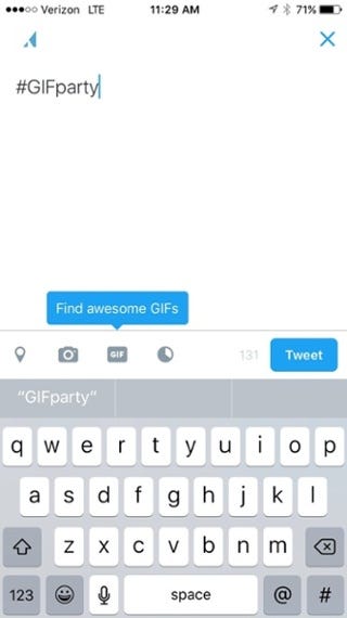
The design of the tooltip itself aligns with Twitter’s broader branding and looks like it belongs in the interface — both major pluses. The tooltip’s copy gets it right, too. Twitter could have said something boring and forgettable like “Click Here to Insert GIFs,” but users don’t want to “insert GIFs” — they want to find awesome GIFs they’ll be excited to share with their followers.
Twitter opted for a similar approach when it launched Moments, except there was no full-screen message accompanying the announcement this time. All Twitter did to launch Moments was to include a tooltip directly in the app itself letting people know about this major new feature:
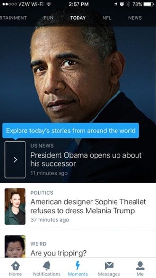
Announcing a major product update with little more than a tooltip was a gamble for Twitter. Although it paid off, and Moments became quite popular with Twitter’s users, one thing Twitter got wrong with its tooltips was their frequency. At that time, many Twitter users were continually prompted to take certain actions, even though they’d seen and subsequently dismissed the relevant tooltips — sometimes more than once.
This might not sound like the biggest deal, but when confronted with apps that harass their users or force them to endure introductory onboarding flows, mild annoyances can become serious grievances.
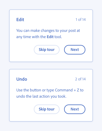
Tooltips and Tricks
You may have noticed that all of the tooltips featured in the examples above are for singular, momentary in-app messages. Many software applications and products rely on multi-stage tooltips to teach users how to navigate and use the app. Although this can work as an onboarding technique, tooltips are best suited for their original function: to provide users with brief, helpful messages to ensure users get the most value from an app.
Hopefully this post has given you some ideas on when to use tooltips in your own projects (and when to avoid them at all costs). Remember — tooltips can be immensely helpful tools, but only if used sparingly and appropriately.


