Top vs side navigation: Which one is better for your product?
Today we compare them to see who will pack more punches.

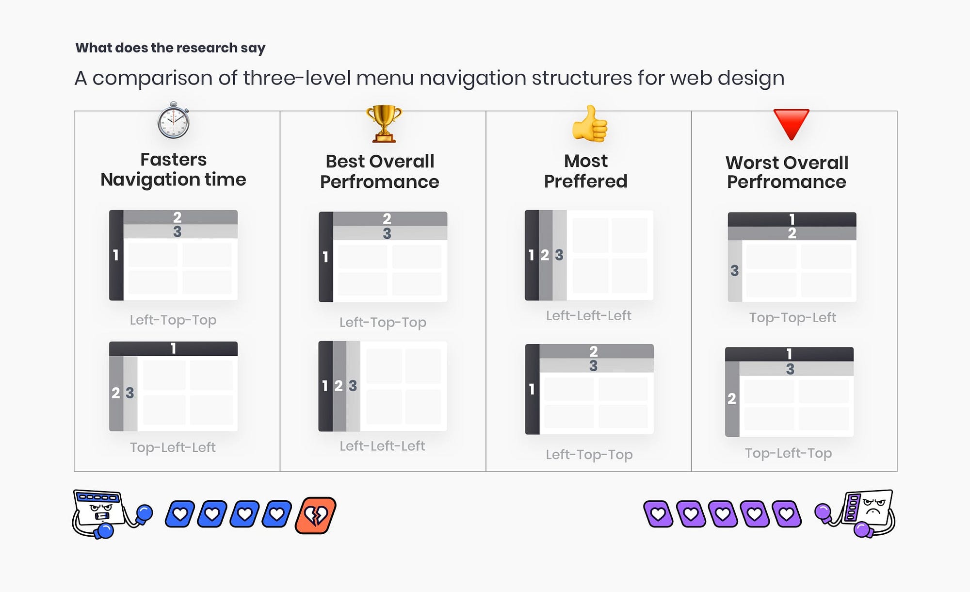
What does the research say?
When choosing a navigation layout for your app usually you will need to define the position of primary, secondary, and tertiary navigation hierarchy. A research study “A comparison of three-level menu navigation structures for web design” by Jennifer Rose Kingsburg indicated many benefits for having primary navigation on the left side. 2 studies with 16 users each measured navigation time, preference, selection errors. You can find a quick summary of this research here. Keep in mind that this study was made 17 years ago and experience and paradigms evolved significantly during this time.
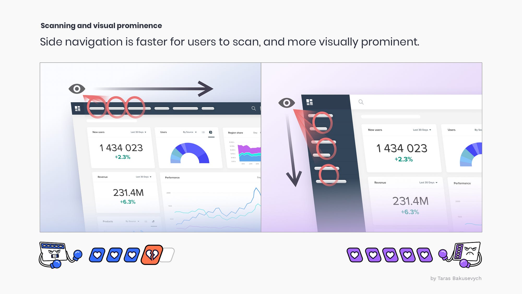
Left navigation is easier to scan
Eyetracking research shows that people scan webpages in an F pattern.
Both top and left navigation seem to be positioned well in that regard.
Left navigation facilitates a vertical scanning direction (yay lists), this greatly improves speed, it also requires fewer visual fixations so we can see multiple navigation links at the same time. (Side navigation can be positioned on the right for the right to left writing systems)
Top navigation saves space
If we look at the common laptop screens and the portion that is taken by the navigation components, left navigation often will take 3 times more space than the top one. Adding to that some reserved header space for search or other elements like notifications or profile. Left navigation can easily take 25% of page space. Collapsing side navigation to save space will also not always work, as you cannot consistently fit long labels, and having icon-only navigation will strain user memory too much.

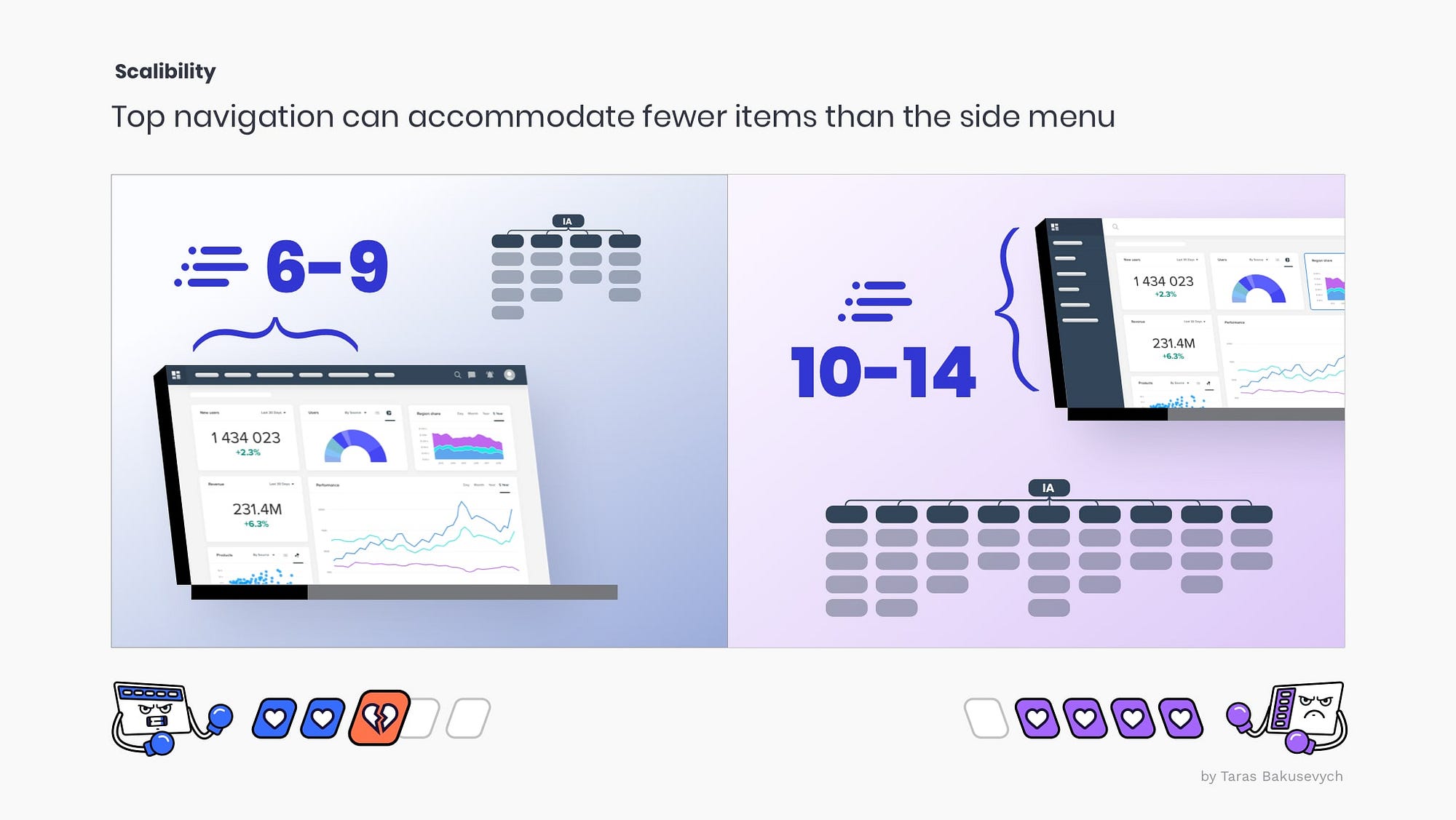
Side navigation is easier to scale
This can change depending on the device and font sizes, but generally, you would be able to show at least double the number of navigation links in the side nav above the fold (not mentioning the scroll). Side navigation works better when your information architecture has many top-level items that cannot be logically grouped into several buckets. This also means it much easier to add more items as your product grows.
Side navigation supports customizable navigation structures
The scalability of the side navigation makes it the only choice when users can configure their own navigation. Variable menus are quite common, be it channels in Slack, folders in Outlook, or hierarchical menus in Drive or Confluence.

Consistency with desktop
If your product has a native application version you would want your web app to be consistent with it. The sidebar is widely used both in macOS and Windows applications as primary means of navigation, as the top area is usually reserved for the menu bar (A menu presents a list of items — commands, attributes, or states).

Hover activated submenus work better with top navigation
The left navigation with a drawer-style submenu has issues with diagonal cursor movement. In addition regardless of the number of items in the submenu, with side navigation most likely you will need to block another vertical pane on the screen.

Top navigation bars and Mega Menus
This edge that top navigation bars have with hover-activated menus, is even more apparent with mega menus that are predominant on e-commerce and other big websites. They are an excellent design choice for accommodating a large number of options or for revealing lower-level site pages at a glance. This layout also leaving more space for product display and ads.

Cases of failed transition to primary side nav
Navigation redesign is always a challenge. Users get used to the navigation, especially when they use your product daily. Even small changes to this navigation can confuse users. Regardless of the new learning curve, some cases like the Jira Cloud navigation transition to the side menu faced a huge backlash from users. When Jira recruited users to give feedback, over 95% of early users (out of 350) preferred the new ”old” top navigation to the side one.

Both top and side nav have challenges with responsive design
For top navigation with not too many navigational links, you have the benefit of keeping all of those links visible on tablet portrait views. Side menu most likely will be hidden in the hamburger menu on tablet portrait, but has the benefit of keeping the navigation view consistent across all screen sizes.

Best navigation for you will depend on your context
Top navigation
Uses little space and takes a prominent position on the page. Works well when there are not too many navigation items. Consider using primary top navigation for small, medium, and large websites, e-commerce, and web applications that don’t have a hierarchical structure.
Side navigation
Supports products with a large number of navigation links, easily scalable and configurable. Consider using primary side nav for complex applications and websites, admin apps, desktop apps, and file/content management products where users can customize their navigation and need support for a tree/folder structure.

