How to design with confidence
Gathering data from people is a piece of cake, but you don’t really get to choose the flavor. So how do we accurately determine what our users really want and feel? Is data alone enough to make good design choices?

Two weekends ago, a couple of friends and I took on the Feeding 9 Billion Challenge, a case competition inspired by the need to feed a population of 9 billion people by the year 2050. This year’s theme was aimed at reducing food waste in Urban Vancouver. With the 24 hours on the clock, the Certified Vegan Beefcakes were off to the races.
I’ll spare you guys the details: we didn’t bring home the bacon, but we did come up with a pretty cool concept for a mobile app. The only problem is that we barely did any customer discovery (that is, we only really interviewed one person — me). So, we did our due diligence and created an online survey and set of interview questions to gather more data on the problem space. Luckily, on the following Friday, I was also co-leading our final UX workshop on analyzing data. Now I’m not saying I condone double-dipping, but this was some pretty low-hanging fruit.
Let’s get cooking
Last Friday, our talented roster of students performed interviews on each other and applied some of the analysis techniques we taught them in order to create affinity diagrams, personas, and journey maps. We also analyzed and compiled the results of the online survey to strengthen our findings.
In a nutshell, we got a better understanding of what our problem space looked like; but what would happen if we didn’t have the labor force of two dozen students fuelling our analysis? What if we don’t have enough data to work with in the first place? That’s where it gets a little messy.

Bearing fruitful results
The goal of analyzing data is to be able to make justified decisions based on information relayed from our potential customers. Without data-driven decision making, we could end up with more than just bad design choices.
Companies like Blackberry are evident of this mistake. In 2009, Blackberry was named one of the fastest-growing companies in the world by Fortune magazine. Now, it’s a little harder to even think of the word outside of the context of a fruit. This is partly due to their failure to identify several trends, including how consumers would soon dominate smartphone adoption and how personal entertainment would play a role in how these devices were used.

Predicting the year’s harvest
Let’s be honest, predicting the future of consumer electronics is no cakewalk. It takes years of data collection and analysis to even come close to hinting at where an industry is heading. Sadly, we can still get that wrong, but that doesn’t make Blackberry the only bad egg. Today, everyone is a victim of making decisions based on absent claims, misleading facts, and false information.
The truth is, we can’t always believe what we read. Because of cognitive biases and our individual accumulated experiences, you can give the same piece of information to two people and still get different interpretations. This is especially true in the context of supporting something you’ve already built because as humans, we like to think we have good ideas even when they’re bad. As a result, we end up ignoring the red flags when somethings fishy.
All in all, we subconsciously apply our own biases when it comes to analyzing data. Thankfully, this is where thinking like a designer comes in handy. In keeping with the theme of this article, I’d like to think that:
“If data is the bread and butter of customer discovery, then we, as designers, are the toasters.“ — Yours truly (do @ me)
There are many ways to crack an egg
So how do we make sure we’re not burning the toast? If you really want to know what your users want, we can’t rely on isolated pieces of information to make thoughtful decisions. In the same respect, we can’t leave the analysis all to ourselves either. We can, however, employ two analytical techniques that increase the confidence of our design choices: triangulation and perspective. To help me explain the two, I have enlisted the help of popular North American gameshows (sorry folks, the food jokes end here).
Triangulation
Think of triangulating data as the Newlywed Game. The gameshow comprises of couples answering questions to test how well they really know their spouses based on how similar their answers are. The objective of the game is to collect as many points as possible and to not get into trouble on the car ride home (not that I know anything about being married).

Now let’s replace host Bob Eubanks with designers and the couples with data sets. In triangulating data, we take information from different sources and see how well they line up to each other. This increases the confidence in the interpretations by using one to justify why certain patterns may persist. In the diagram below, we can use a field study as a starting point and back up any observations with quotes from interviews and statistics from surveys.
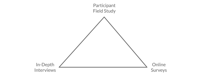
Say you’re trying to determine some common student eating habits. Your interviews are all over the place, with some people saying that they never eat out and some insisting they find sustenance through bubble tea and defrosted, discount burgers from Triple O’s. You notice a pattern where 6 out of 10 female interviewees identify eating healthy as important. Because this isn’t statistically valid, we can cross-reference that information with your survey, where 76 out of 100 female participants also labeled healthy eating as significant.
Here, the survey is used to clarify and support the interview findings. On the flip side, the interviews provide context to the survey results. Triangulation gives us the ability to validate these patterns and shed light onto insights that require a bit more depth and understanding. Making a design choice from the interview results alone could result in prioritizing healthy options on an app when most people are really out here trying to live that boba life.
Perspective
Perspective is just like the Family Feud. Two teams battle it out by answering the same prompt (given by grand mustachio Steve Harvey) and are rewarded points based on how popular their answers are. The popularity of each answer is determined by a survey done with 100 people. The good news for this analogy is we don’t have to replace Steve Harvey (this time).
Instead, let us replace each contestant with designers and you have perspective. Perspective involves having the same piece of data analyzed by two or more individuals. Rather than looking at perspective as human weakness, we can use it to our advantage. Comparing separate interpretations removes bias from human error and allows groups to come to an agreement on why particular patterns exist.
Imagine you’re part of a group of designers who are tasked with finding out why people meal prep. The online survey reveals that its a split vote between being cheap and saving time (exclusive of each other). Your team wants to figure out which of the two is more valid. You suggest that it’s the financial benefit because that half of the surveyed group identified as students who don’t work while schooling. You are confident in your answer until you hear your teammate think its the time benefit. His reasoning? That half of the surveyed group identified as being engineering students (can confirm).
Both sides are equally valid, but the change in perspective helps us identify any details we might personally miss, and could even inspire new insights and discoveries. Likewise, making a design choice from your interpretation alone could result in promoting cheap eats when a majority of your target segment is interested in boujee entrées.

Making sense of it all
At the end of the day, surveys and interviews alone don’t tell us what to do. It’s up to us as designers to compile data, process it and turn unknowns into knowns. The way we do this is by accepting the fact that we’re all human, and while humans make mistakes, we can increase the likelihood that we make less of them. Making sure to triangulate your information and compare thoughts with colleagues and teammates ensures that we’re moving in strides and not walking on egg shells (this is the last joke I swear). With data-driven research and thoughtful analysis, we can only hope that these efforts allow us to make better design choices.
But wait, there’s more!
Try holding down that 👏 button and beat my high score (so far, it’s 51).
As you can tell, I love sharing my insights (and jokes) on design in the context of business and engineering. Every week or so, I try to explore something new so be sure to follow me to get the latest scoop.
Like what you see?
There’s more where that came from.


