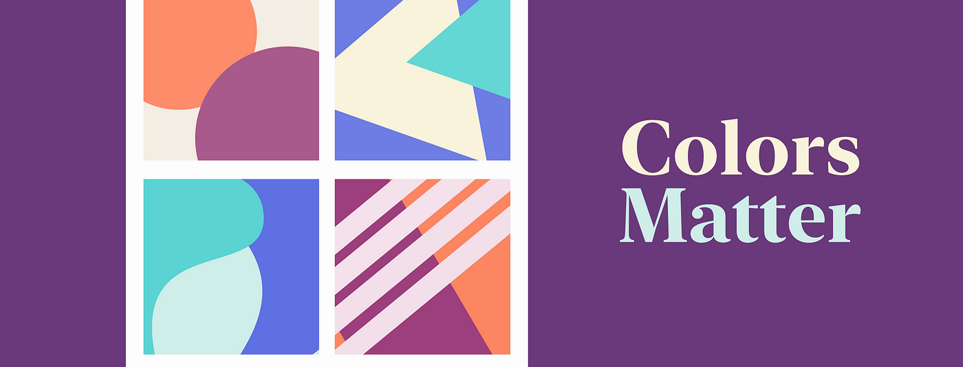
Use color theory to create shape your designs
Learn how to apply color theory to your designs and effectively communicate the messaging of your products.
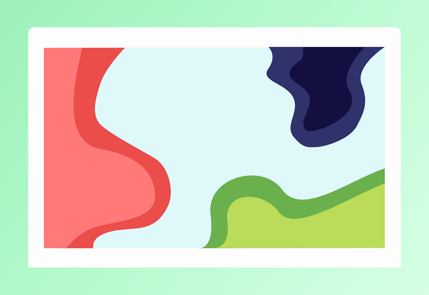
Color is an extremely strong tool that we can apply to solve many design challenges. Colors can draw attention to the right parts of the design when used logically, along with some intuition of course. Since color plays such a major role in shaping the aesthetics and usability of websites, changing a single color can change a user’s perception of the same design.

With roughly 16.8 million colors at their disposal, designers have the luxury of creating unique layouts. But, choosing the right color scheme can become pretty challenging since the possibilities are endless.
16.8 million colors?
An RGB color system comprises three components — red (R), blue (B), and green (G). This system is one of the most ubiquitous in the world. It combines red, green, and blue light to create colors for screens, etc.

Since each color channel can range from 0 to 255, that means there are 256 total options that an R, G, or B unit can take. As a result, there are a total of 256 x 256 x 256 = 16,777,216 colors that the RGB color system can represent.

Understanding how to pick the right colors can not only transform the quality of our designs but also enhance the user experience tremendously.
Before we start to apply color theory to our designs, we should understand:
- How colors pair with one another, the pairings that work best, and how one can create effective color palettes.
- How to use color schemes to produce effective designs.
- How colors evoke emotions and affect the messaging of products.
- How contrast plays a major role in emphasizing certain elements.
The Color Wheel

If you’ve ever audited an art class, you’ve probably seen the color wheel before. Many artists and designers use the color wheel to visualize the relationship between colors.
The color wheel comprises three color groups — primary, secondary, and tertiary.
- Red, blue, and yellow make up the primary color group. These colors are equidistant from one another on the wheel, forming an equilateral triangle. Primary colors form the basis for all colors on the wheel.
- Secondary groups consist of green, orange, and purple. These colors are formed by mixing two primary colors.
- Tertiary color groups are formed by mixing a primary and secondary color. These usually have a two-word name such as blue-green (teal), red-purple (magenta), etc.
As we begin to select colors for our design projects, the color wheel will be vital in concluding which colors pair well together.
The color wheel is our guiding light to the end of the rainbow.
HSLa — Hue Saturation Lightness (and alpha)
Hue Saturation Lightness (and alpha) or HSLa, for short, is one method of declaring colors digitally.
Here’s what it looks like in CSS:
#some-element {
    background-color: hsla(120, 30%, 50%, 1);
}
And, here’s how to toggle this option in Sketch and Figma respectively:


HSLa is generally the preferred syntax for setting colors, for designers and developers alike. Below are some of the many reasons for this predilection:
- HSLa is the most semantic practice of setting colors, giving designers complete control over the color scheme.
- HSLa is extremely flexible in that one easily manage contrast to create related color schemes.
- Designers can’t intuitively adjust RGB and hex values. The brightness of a color, for example, wouldn’t intuitively translate to changes within the RGB or hex space. In HSLa, one can instead play around with the lightness (L) of the color to achieve the desired result.
- HSLa allows us to quickly create color variations on the fly. Most of us can’t maintain this speed and consistency through the RGB or hex model.
- The HSLa model makes it much easier to change color values programmatically.
Let’s examine how each value affects our colors:
- Hue (H) — Hue is the “pure” color and is expressed as the angle (in degrees) around the color wheel. When thinking about hue, think of the color wheel, which is a circle. The reds are at 0° and 360°, the greens are at 120°, and the blues are at 240°.
- Saturation (S) — Saturation refers to the intensity/purity of the hue. 0% is completely denatured (grayscale) while 100% is fully saturated i.e color itself.
- Lightness (L) — Lightness, as the name implies, refers to the lightness of the color. 0% is black while 100% is white.
- alpha (a) — Alpha refers to the opacity or transparency value. 0% is fully transparent while 100% is fully opaque.
This list of HSLa color codes is an amazing resource if you want to visualize how changing these dimensions can affect our perception of colors.
Warm Colors
Each color can either be classified as “warm” or “cool.” Warm colors are those that are intrinsically vivid or bold.
Warm colors generally lie between red and yellow, including several variants and orange. A warm color palette also contains brown and tan colors.
Designers rely on warm colors to generate a feeling of, well, warmth. Take, for example, fire or volcanoes, which typically burn between the red and yellow spectrum. Sometimes these colors induce a feeling of aggression and are considered bold colors.
Here’s how we can create a warm color palette in CSS using a single color as our starting point:
/* Set hue to a value  between 0 and 8 */
.color-1 {
    background-color: hsla(0, 100%, 50%, 1);
}/* Set hue to a value  between 8 and 15 */
.color-2 {
    background-color: hsla(10, 100%, 50%, 1);
}/* Set hue to a value  between 15 and 30 */
.color-3 {
    background-color: hsla(20, 100%, 50%, 1);
}/* Set hue to a value  between 30 and 45 */
.color-4 {
    background-color: hsla(40, 100%, 50%, 1);
}/* Set hue to a value  between 45 and 60 */
.color-5 {
    background-color: hsla(50, 100%, 50%, 1);
}

Cool Colors
On the other side of the color wheel, we have colors that are considered cool. Cool colors are inherently calm or soothing.
Cool colors range between blue, purple and green, including several variants of these colors as well as neutral white and greys. These colors are often associated with water or winter climates (think calming blue waters).
Cool colors aren’t as overwhelming compared to their warm counterparts. Since these colors recede in space, it’s usually a good idea to use them to style secondary or tertiary elements. This technique allows users to focus on the primary content, which designers can represent using warm colors.
Below, I’ve used cool colors to create a simple yet elegant landing page:

Shades and Tints
We saw how to use hue to create cool and warm colors. But, HSLa doesn’t limit us to just the hue. We can also tweak the lightness of color to create shades and tints of a hue.
We can create tints and shades by increasing and decreasing the lightness of the color. Adding white to color forms tints that add to the lightness of a hue. On the other hand, adding black to color forms shades that reduce the lightness of that hue.
You might have noticed that we can easily add shades or tints to colors by manipulating the lightness (L), which is determined by the third number in HSLa. Lightness ranges from 0% (black) to white (100%).
By understanding how to handle the shades or tints of colors, designers can create a wider range of colors for the Web. Let’s take a look at how we can create a palette of increasingly lighter shades by keeping the hue constant:
Here’s how to do that in CSS:
/* Set some lightness for the first color */
.color-1 {
    background-color: hsla(240, 100%, 30%, 1);
}/* Set lightness between 35% and 45% to create a slightly lighter shade of blue. */
.color-2 {
    background-color: hsla(240, 100%, 40%, 1);
}/* Set lightness between 45% and 55% */
.color-3 {
    background-color: hsla(240, 100%, 50%, 1);
}/* Set lightness between 55% and 65% */
.color-4 {
    background-color: hsla(240, 100%, 60%, 1);
}/* Set lightness between 65% and 75% */
.color-5 {
    background-color: hsla(240, 100%, 70%, 1);
}

Pretty sweet, isn’t it?
Color Schemes
Now that we’ve learned some basic color theory and its importance in the real world, let’s explore how we can select and apply colors to our designs.
Understanding how to harmonize colors allows us to create elegant and usable designs. This is where the color wheel comes handy because it eliminates most of the guesswork. We can leverage this handy tool to calibrate the colors that could go well together.
Like I mentioned before, the colors we select can make or break our design. Since colors have such a notable impact on the design, knowing our options can help us make better decisions.
Designers usually evaluate four color schemes before moving forward with a project:
- Monochromatic
- Complementary
- Triadic
- Analogous
Each scheme can work to our advantage depending on how we want to showcase our designs.
Monochromatic Schemes
Monochromatic designs provide us with the most basic color scheme possible, utilizing a single color along with varying shades and tints.

The most basic color scheme possible utilizes a single color with varying shades and tints to create a monochromatic palette.
Each color within the monochromatic palette can be derived from the base color. Although all our elements might feel similar, we can eliminate the monotony with the use of high contrast. That is, when selecting a monochromatic color scheme, we should select a much darker and lighter shade of the main color.

Designers can benefit from monochromatic color schemes since they provide an organized impression when applied to a project. By using a single color, elements in our layout can provide an immediate sense of harmony.
The best way to go about monochromatic designs is to design in black and white with varying shades of gray. We can then enhance it further by choosing a different base color.
Complementary Schemes
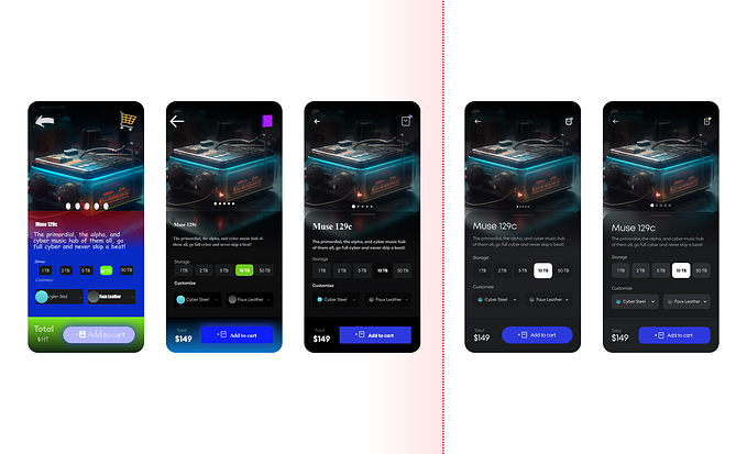
As depicted in the diagram before, a complementary color scheme utilizes colors opposite from each other on the color wheel. For instance, if we were to select blue as our main color, it would create maximum contrast and intensity with orange.

Complementary color schemes are generally more prevalent in logos and uniforms. A key example is the Los Angeles Lakers’ jersey, which features the iconic purple and yellow color scheme.

Complementary schemes provide us with a dramatic display of color that we can also apply to websites!
Triadic Schemes
Triadic color schemes, as the name implies, consist of three colors that are equidistant from one another on the color wheel.

Triadic schemes can provide supplemental pops of color while allowing for some flexibility in the range of colors.

Analogous Schemes
As showcased below, analogous color schemes use three or more colors that are adjacent to one another on the color wheel.

In general, there’s one dominant hue that’s coupled with an auxiliary second color and a third color to accent the palette.
Analogous designs tend to create a gratifying and calming display. For example, we can use the color blue as the dominant hue along with teal and green to create soothing visuals:

It’s important to note that since analogous color schemes fall in line with one another, they usually yield a low-contrast experience, which can hurt accessibility.
Therefore, we should avoid analogous schemes for content that requires a user’s immediate attention. Instead, we can use them to create backgrounds that don’t compete with our products’ main content.
Color Psychology
I know we’ve covered a lot here, but there’s so much more that we can do with this knowledge. There’s no limit to our imagination, which is why the field of art and design is so everlasting.
At the end of the day, the designer will need to determine the “feel” of the product that they can communicate with the users either through the use of colors or similar techniques.
Each color is associated with a particular meaning (both positive and negative) and has a different context, which is why color psychology can help impact how people perceive a design. When designers choose the “right” colors, they’re nonverbally communicating the emotion of their products or services.
Below are some colors that product designers use to elicit certain emotions from their users:

When using color psychology to our advantage, we should acknowledge that there’s no hard and fast mapping of colors to emotions. Color associations will vary throughout different parts of the world.
There’s a lot we can do with this knowledge on colors. Nevertheless, there are still some best practices to which we should adhere to.
Rule #1: Avoid Low Contrast Color Combinations
Color combinations that result in reduced contrast hurt the accessibility of our websites. Accessibility matters, especially since more than one billion people, or 15% of the world’s population, experience some form of disability.
The color combinations we should try avoiding are…
- The pairing of two or more bright colors
- The pairing of two or more light colors
- The pairing of two or more dark colors
Even if we somehow managed to create sufficient contrast using the pairings mentioned above, they won’t create a high enough contrast to stand out and grab a user’s attention.
Rule #2: Avoid Neon Colors
Neon colors are extremely bright versions of primary and secondary colors. These colors are almost always visually straining. It’s uncommon to see companies using neon colors for their primary content.
Unless we’re extremely sure that neon colors will make our design pop, I would suggest refraining from using these. Also, since users are becoming smarter with each digital interaction, they’ve come to realize that neon colors are not the norm, which is why we might catch them off guard.
When used correctly, however, neon colors can create unique designs and help emphasize the message we want to relay to users:

Rule #3: Avoid Vibrating Colors
When pairing two colors, both of which have a high saturation, we get vibrating colors. Vibrating colors tend to create a glowing or moving effect that can often irritate our eyes:

A classic example is a Christmas card, which uses a red and green pairing. This creates a glaring effect on the screen and can seem a little distracting and intense:

Most users will only skim our websites. The real action starts when they find our websites memorable enough to make repeated visits and complete the actions we intended in the first place.
Since users aren’t reading every single word or checking every menu, we need to guide them to the most important facets by managing a sensible color palette.


