Twitter’s new font and Last of Us 2: an accessibility lesson to be learned
How does an accessibility update make the product less accessible for some users?

One hot discussion on Twitter these days (especially in the design/tech parts of it) is Twitter itself. All the buzz is about Twitter’s new look. The update includes:
- New font — Chirp;
- Higher contrast (new high contrast/less blue colours, as well as high contrast buttons);
- Clearing up visual clutter (some grey backgrounds, dividers, etc).
As is usual with all things new, some love it, some hate it.
But those less happy with the new update have raised very valid and important concerns about who it prioritizes vs. who it excludes.
Accessibility for all… or is it?
An important aspect of the new update is that it’s presented as not just a visual facelift, but an accessibility improvement.
Is it, though? Let’s take a deeper look.
New font
The new font, Chirp, was introduced back in January, but has only been used as a part of the larger Twitter brand until now (in promotional materials, etc). This week it finally reached everyone’s screens in-product.
One great thing about Chirp is that it seems to be more readable for some folks with dyslexia , which is definitely an accessibility win.
However, not everyone with dyslexia finds the new font easy to read. This might be due to its unbalanced kerning across platforms that makes the letters seem ‘glued’, as well as the lack of ClearType support which makes the rendering of the font look even worse for Windows users (leading some to speculate that this new change might have only been tested on MacOS/iOS).
Apart from issues it creates for dyslexic users, those regularly suffering from migraines have shared that the font can make them physically unwell, triggering migraines, vertigo, or a feeling of seasickness when scrolling the TL.


Whether this problem is also caused by issues with kerning/lack of ClearType support or by the composition of the font itself remains unclear (and it’s not a question I’m qualified to answer, so I’ll leave a deeper investigation to typographers).
High contrast
Sufficient contrast is one of the requirements of the Web Contents Accessibility Guidelines, so one would presume that the more contrast between the foreground vs. the background, the better.
However, the contrast can be too high in some cases. People with dyslexia have shown to be able to read faster when color pairs have lower contrasts, plus high contrast is known to hurt people with photosensitivity & chronic pain (I can attest to that myself as someone who is suffering from a combination of photosensitivity and migraines).

There is a system-wide high contrast mode available for both Windows and MacOS, but it would be strange if it would be forced on all users by default, with no alternative, as it clearly doesn’t work for everyone. It is equally as strange for a large social media platform like Twitter to do it. Just like with an operating system, users can be expected to spend a large amount of time on the platform, so staring at something that triggers your photosensitivity or chronic pain is less than ideal.


Does all of the above mean that Twitter’s new update is bad? No. I think it’s awesome that they’re continuously working to improve the app’s accessibility and some issues were definitely addressed with this release.
But…
How does an accessibility update make the product less accessible for some users?
There are too many different access needs & ways they combine for different people to accommodate everyone with a very specific set of accessibility improvements designed to only address certain types of access, especially when those ‘improvements’ are forced across the board at a very large scale.
I think there’s a lesson we can learn from the gaming industry and their approach to accessibility when it comes to accommodating for different needs.
The Last of Us 2
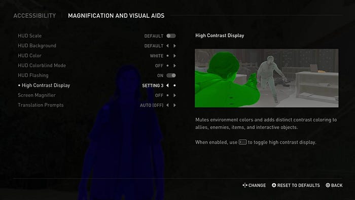
The Last of Us 2, released by Naughty Dog in 2020, is the best example of accessibility in gaming to date.
With more than 60 (!) different accessibility settings, the player can navigate the game almost exclusively by sound, remap every button on their controller or keyboard, or play the entirety of the game one-handed.
While you can read an in-detail breakdown of all accessibility settings in the game, what The Last of Us 2 creators did extremely well was not succumbing to the idea of ‘accessibility modes’.
Initially, the team at Naughty Dog planned to have modes that covered specific areas. There would be one for hearing impaired users, for instance, and another for issues around motor control. The idea being that you switch on that mode and all of the related features will be enabled. “Instantly we got feedback that ‘this is not what we want,’” Gallant explains. “‘We want to be able to dig into the menus, fine-tune things, adjust things, really get into the nitty-gritty of what these options mean.’”
The designers had to give up their nice, tidy menus in favor of something a little messier. Diving into the accessibility menu in The Last of Us Part II is almost overwhelming, with so many toggles and siders to choose from.
Making all of the accessibility settings fully customizable and open to fine-tuning by the player allowed everyone to find the perfect combination of options for their individual access needs. It removed barriers for many who wouldn’t be able to experience the game at all otherwise, but also allowed others to just make their gameplay experience more comfortable.
If Naughty Dog made the game high contrast for all the players and called it a day, it would probably not be dubbed ‘the most accessible game ever.’
Customization is key at such a large scale
There is no one size fits all when it comes to accessibility. Instead of choosing who to prioritize and counting tradeoffs for certain choices like universal high contrast mode, the obvious solution would be to let the user choose.
Twitter already lets its users customize the look of the app to a degree, so adding more variables to the customization menu to accommodate for more accessibility needs feels like a natural progression.
High contrast mode & colour palette could be added to the variety of display modes (‘Default’, ‘Dim’, and ‘Lights out’) already available to Twitter users.
Chirp could be a part of a wider selection of fonts for the app. We already know that the old font (was that Helvetica?) worked well for those users who are prone to migraines — so letting everyone choose between the old vs. the new font would be a great option for a start.
Similar approach can be taken with any accessibility work at a large scale. There is no blanket ‘accessibility mode’ or ‘accessibility setting’ (save for basic compliance) that will fit everyone’s needs. Giving the user full control to set up what works best for them is always the better choice.

Hi, I’m Anna, a product designer by day and a book nerd by night. I frequently explore different design and tech related topics with the focus on ethics and responsible design, accessibility, and inclusion here on Medium. You can also connect with me via LinkedIn or Twitter.