Member-only story
How to create typography guidelines for a product that does not follow a design system
Improve design consistency and efficiency by overcoming typography chaos
When product designers are working on a product that doesn’t have a design system, they can find that the system is chaotic. You can see it in the interface (there is a lack of consistency in the app). Another issue is that it makes the design process more challenging since there are no clear guidelines.
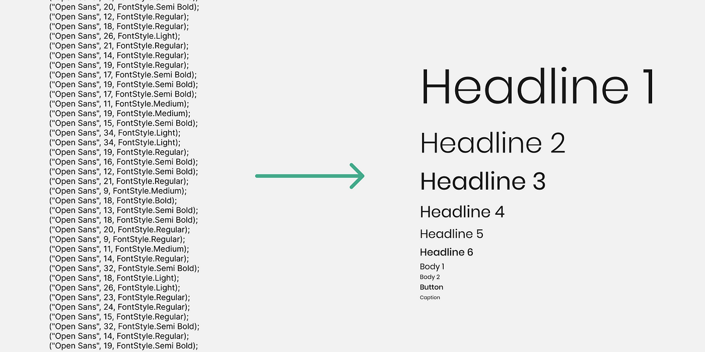
As a result, the designer finds it difficult to understand how to make decisions. Say you want to design a card with a title and subtitle and need a clear typographic hierarchy, but the system has many typography font sizes from 10 to 28. ( 11,12,13,14,15,16,17,18… all the way up to 28px).
How do you pick a font size that’s harmonious with other components?
If this is the case, you can push the product team to build a clear design system so you can work more effectively.
The first step, in my opinion, is to create a typography system since that’s not the most difficult phase. Building the component system (buttons, checkboxes, etc.) can be more challenging because it includes more logic. You can start with typography and then build a clear process and confidence to continue growing from that.
Here, I share how you can build complete typography guidelines for an existing product. So, the designer, the developer, and the product manager will all clearly understand what typography is appropriate for the product and how to use it.
What is the reason for the lack of a design system?
The lack of a design system can be due to various reasons. The team may need more knowledge or may need to be able to work effectively together. However, I believe the most common reason is time.
Because the team wanted to get the product to market fast, the developers and designers postponed developing a design system. The problem is that they delay it again and again until the problem becomes so large that no one wants to deal with it.

