Member-only story
UI cheat sheet: radio buttons, checkboxes, and other selectors
Pick me! Pick me! No, pick me! In today’s cheat sheet we will be looking at selectors and how they differ. Unlike most of my other cheat sheets, this will focus on two components (radio buttons and checkboxes) side by side for easier comparison — while also comparing them to a few others.
In this cheat sheet we will cover the following:
- What selectors are
- Anatomy of checkboxes and radio buttons
- What is the difference between radio buttons and checkboxes
- Common styles of selectors
- States
- Rules for label text
- When you should use them
- Accessibility checklist
- Closing thoughts
1. What selectors are
A selector is an input field where the user has to select one (or more) options, unlike a text field where the user has free rein. Selectors, like Lady Gaga’s hairstyles, come in all different shapes and forms. Dropdowns, checkboxes, toggles, sliders, and more are all different types of selectors, yet they look nothing like each other. The main functional difference between these types of selectors is how many options the user can pick: one or more.
In a perfect world, where there was no more starvation, animal poaching, greenhouse gases, or crime, I would start a petition to change radio buttons to ‘single selectors’ and checkboxes to ‘multi-selectors’. I think they describe what they are much better, but, alas, these legacy names are too ingrained and we are probably stuck with them.
2. Anatomy of checkboxes and radio buttons
While we will look at various selector types in this cheat sheet, we will focus on radio buttons and checkboxes. Below is their anatomy.
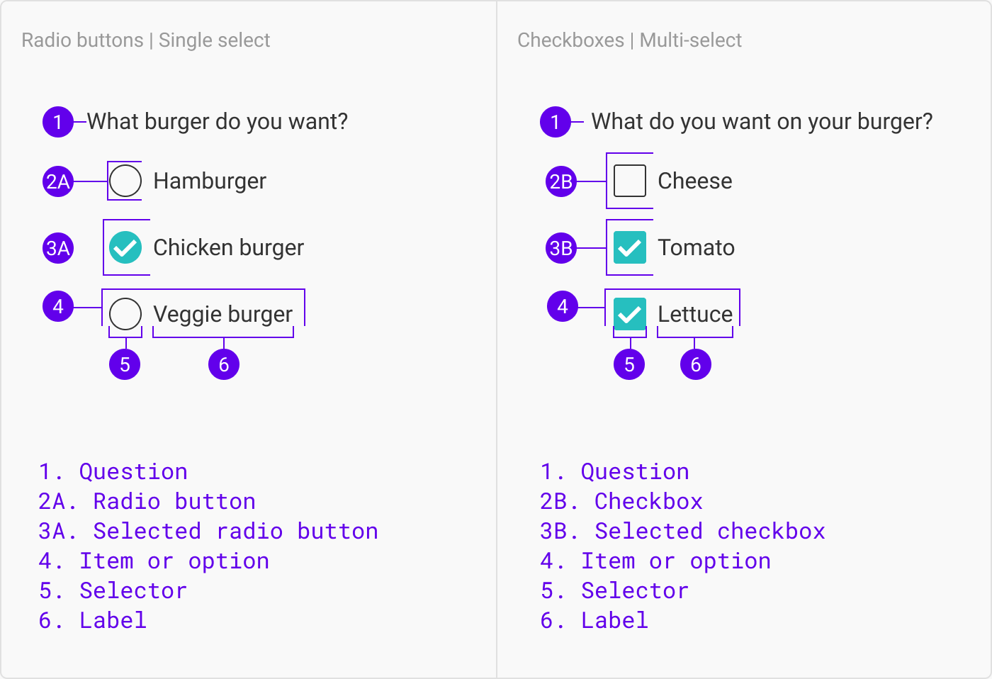
Note: There is some discrepancy in which of the parts above are referred to as the ‘radio button’/’checkbox’. Sometimes people use ‘radio button’/’checkbox’ to refer to the label and…


