Member-only story
UI cheat sheet: Spacing friendships
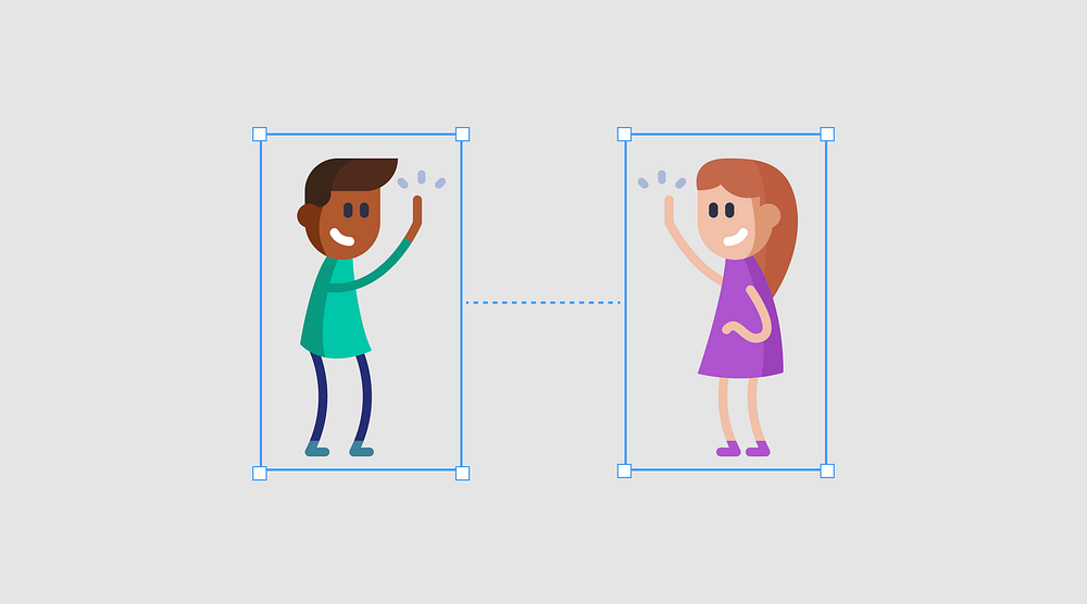
The easiest way for me, to see an interface designer’s skill is by how they use spacing in their design. Color, typography, imagery, etc., are usually given to you in a brand guide — but correctly using spacing is a skill. After a while it becomes second nature, but only after you have learned and used the basic rules.
In this cheat sheet, I explain a rather cheesy metaphor I tell to new joiners to explain how to space elements. These basic rules will hopefully help you train your eye to look at spacing more critically.
In this cheat sheet we will cover:
- Why is spacing important?
- An introduction to point grids
- Spacing Friendships
- The three Cs of spacing
- Closing thoughts
- Further reading
1. Why is spacing important?
When I was a wee junior at my first product design job, I can remember being pretty proud of myself with a design I had done. I handed it over to one of the senior designs, who we affectionately nicknamed Pixel-Perfect-Piet. When I saw my layout again, I was blown away. It looked SO much better but had the exact same elements. By simply improving the spacing in my design, he had created a far more organized, clean, and cohesive…


