UI Mechanics of a Date Picker
A study and an experience redesign of selecting dates from a calendar
Choosing dates using a date picker has been one of the most commonly followed design trends across a plethora of websites. In order to make this process a lot more intuitive and seamless I decided to work on a few different options for picking dates.
Before working on the sketches, it was imperative to pick the different ways dates could be represented and sorting the information that went along with the dates on the form to create an information hierarchy.
The form elements were deduced to-
- Place — Where the user wants to visit.
- In-Date — When the user wants to check-in.
- Out-Date — When the user wants to check-out.
- Number of guests — How many others traveling.
To explore various ways to pick a date, different types of date pickers were categorized to explore the breadth first —
1. Simple from-to date picker.
2. Date Range
3. Timeline Range
4. Story Mode
Understanding that this exercise mainly focuses on the different ways to explore how dates could be selected in a form, it was important for me to understand how the different elements in the form complemented each other. My sketches encompasses the entire form and not just the date pickers.
Simple from-to date-picker
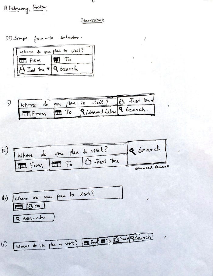
This is arguably the most used form of date picker for the web. A few iterations were sketched to understand how the elements worked in a form. These options were the most used ways of date picking. This was an exercise which was performed to understand the working of a form as one whole unit. This helped me ideate various options to represent the date picker which will be explained in the following sections.
Concept 1
To represent a very simple from-to date picker, the first iteration has a date field expanded as opposed to most current designs where one has to click to open the date selection field. This design very explicitly highlights to the user where to click on for selecting the from and to dates. On selecting the date, there is a very clear visual feedback, which is represented in the diagram, which indicates the selected dates.

Concept 2
To explore a completely different concept to represent the date picker, I tried imagining the clock as a means to represent months as there are 12 months as well, just like the 12 hours of a clock. On the clock’s periphery there were affordances to accommodate the dates that could be selected.

The arrows afford drag-ability and one could selected the date on the from section, and selected the month on the clock. This was visualized keeping in mind the difficulty of accommodating 31 days on a clock, hence a box that is fixed to the periphery of the clock was opted for. On clicking on a date either on the from section or the to section, the dial automatically changes the month based on the selection.
The problem that was encountered in this design was the selection of the same month on the clock. A few other options were explored to address this problem, but the overall design seemed bulky and unintuitive.
Range Date Picker
Concept 3
This concept takes a couple of inputs from the user — the number of days and nights of stay. On entering, the user is able to plan the travel by just selecting the from date. The system automatically selects the range on the calendar based on the entered values on the number of days and nights. There is a very clear feedback right beside the calendar that highlights the selected dates.

Concept 4
This concept consists of a dial that helps selecting the date and the month seamlessly. A user on clicking the from tab, the dial is activated and one can select the date by just typing in it, or using the arrows beside the clock to change it. The month is selected by just clicking on it. Similarly, the to date can be selected by activating the to tab.

Concept 5
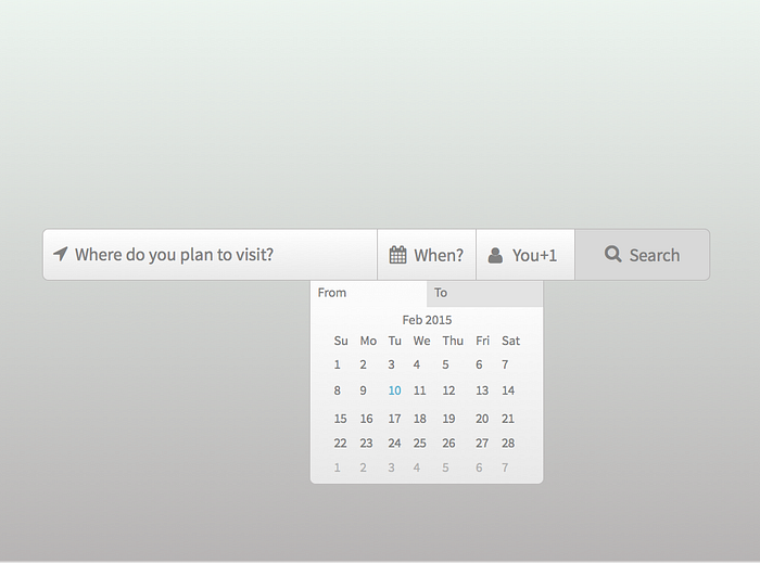
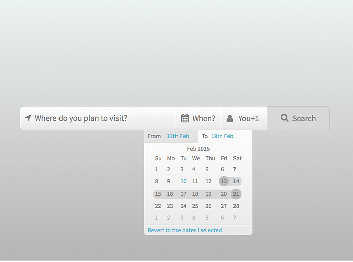
This is a concept that has just one date tab on the primary form, and consists of two tabs — From and To. The from tab is automatically selected first. A user on selecting the date, the to tab is activated and the user then selects the date. A range is then highlighted on the box which clearly indicates the start and end date. An option is provided to the user to select dates that save cost if the user is flexible on their travel dates. There are two options provided below, where one requests user to check cost — efficient dates. The other option clearly specifies the amount of money that could be saved.
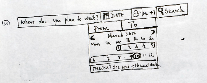

A state that this design aims to handle is if there are is no available vacancy on the selected dates. The system automatically predicts available dates. The diagram below the availability status just above the flexibility tab.

Timeline Range
Concept 6
This concept aims to implement the simple linear number system where a user can select a range between which one wants to book their stay. I imagined that this concept would be rather difficult to implement considering the fact that the timeline runs across the screen horizontally and would take up abundant space.

Concept 7
Similar to the earlier idea, this one aims to implement the timeline concept vertically, thereby making it easier to select dates and also visually appealing. The design consists of two specific end points, one being the from-date and the other being the to-date. On clicking on either of the sections, a calendar pops up on which the date can be selected.

Story Mode
Concept 8
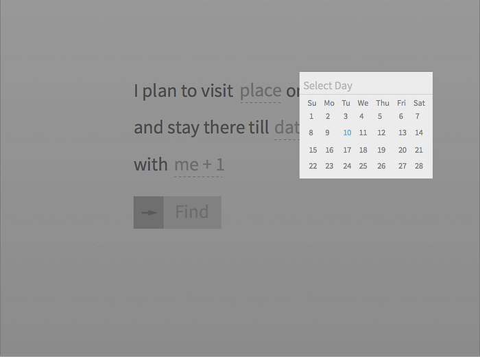
A fairly simple concept where the user is presented with a form that is formatted in plain simple English. This way there is no ambiguity of the user and picking the date becomes seamless and natural. If the user is flexible on the tour dates, one can click on the flexible link and be presented with an option to select dates which would save them on cost.
This concept is very similar to this natural language processing concept at Tympanus — http://tympanus.net/Tutorials/NaturalLanguageForm/

Selected Designs
Of the above mentioned eight concepts, two options seemed promising to me and was prototype-worthy. I decided to prototype concept 5 and concept 8 on InVision app. I used Sketch to create the screen mockups.
Prototype Concept 5 — In-depth
- Clicking on the “When” tab on the bar will open up the calendar. The date highlighted in blue indicates the current date.
- Clicking on 11th February on the calendar which is a created hotspot that takes you to another screen.
- Here, the control automatically shifts to the “From” tab. On selecting 19 on the calendar, you will notice a change in the screen.
- You will notice a selected range, an availability status and an option from the system to allow users to select a range of dates that would save them some cost if they are flexible enough.
- On selecting on “Flexible? Save 22$”, the user is then sent to a screen which highlights system generated dates. This accounts for the state where the system provides the user with a predictive date range that reduces cost.
- There is an option that reads “Revert to the dates I selected”, this takes the user back to the selected dates in case the system generated dates are not feasible for the user.
- Now on reopening the link, http://invis.io/BC28KCKUN and clicking on when, it opens the calendar again. This is done in order to select dates which are not available for booking.
- On clicking on 25th of Feb as the from date and clicking on 28th of Feb as the to date, the system shows a status that reads that the selected dates are unavailable for booking.
- Now, on clicking on “Show available dates”, the system indicates a range of dates available. This handles the state where one can book dates suggested by the system when there isn’t availability for the user-selected dates.
Prototype Concept 8 — In-depth
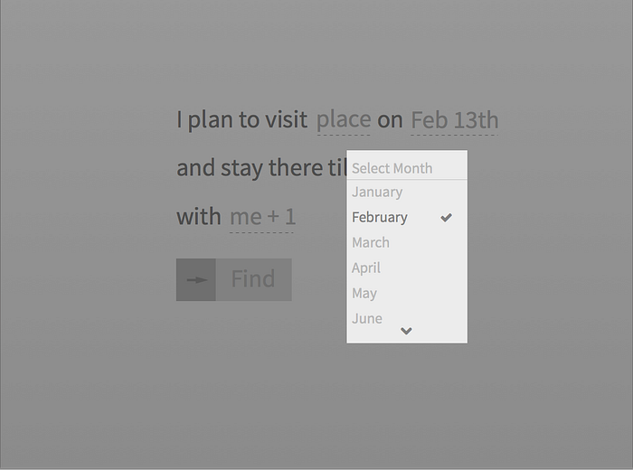
- On clicking on the first “date” on the screen, you are taken to a screen where the month can be selected. The currently selected month is highlighted with a check mark beside it.
- On selecting February, you are automatically taken to a screen where the date can be selected. The date highlighted in blue indicates the current date.
- On selecting the second “date” on the screen and selecting February similarly, and selecting 19th, the form is now fill with the dates and this provides the user with easy feedback where one can know their booking details by just reading one sentence instead of scanning the page for the details.
- The use of natural language to help users understand their actions step-by-step allows for easy usability.
Rationale for picking Concept 5 and 8
- A few initial user tests were conducted to understand how users perceived and used the different date pickers. Most users found Concept 5 to be most intuitive which was closely followed by Concept 8. The simplicity in these concepts allowed the users to easily comprehend the functionalities.
- Concept 5 provides the necessary visual cues whens selecting the date range. The UI elements that highlighted the current day and the range — an circular background and the highlighted dates — makes it easy to understand the selected dates for the tour.
- Concept 8 tries morphing the entire process of booking a tour into a story which allows users to seamlessly book their dates without much hassle. The user tests confirmed this claim where it was evident that the process of picking dates seemed to connect to the users on a personal level.
Screens
The entire flow can be viewed on the inVision link mentioned above for both the concepts.

