A new concept for travel fare aggregators — a UX case study
TL;DR: This is the story of a UI/UX case study on a subscription-based service to help people travel more.
This week in design academy I have got an assignment to do a UX/UI case study on a new concept, feature, or redesign to enhance existing service. In the design academy, we learn how to run a design sprint and work in teams, but this time the challenge was a five days long individual assignment. (Read more about my journey to become a UX designer here)
As I love traveling very much, I chose the traveling industry.
I started by asking people’s opinion about the current services they are using, why they are using them, what are their wishes and what is their difficulties.
The Netherlands as a destination is increasing in popularity for tourist, and that helped me a lot. I even met several tourists during those interviews.
Research and interviews
Even one day of research and interview was enough to gather a lot of information. I really hope travel agencies are aware of this valuable information that is out there for free and they don’t wait for users to write feedback or limit their data source to A/B testing.
The research goal was to find what users can’t find right now and come up with a new concept to address at least one of them. One of the services that people are not satisfied with is vacation planner. There are a few services right now, but many interviewees didn’t know about them, or they believed that is not what they are looking for and they expect more than just destination recommendation. I also noticed that most of the people don’t have a routine to save money for vacation while the budget is still the number one variable in making a decision.
Empathy Map:

One interesting fact was that people are quite aware of vacation’s impact on health and productivity.
- People are aware of the health impact of traveling.
- The general feeling about booking tools is good.
- They believe mobile apps and online services is helping them a lot to book their tickets/hotels.
- When it comes to finding vacation ideas, They didn’t find booking tools helpful (They tend to ignore marketing emails from booking companies) ,and they still use friends suggestions most of the time.
- Most of the people don’t have a routine to travel.
- Budget is the main variable when it comes to choosing a destination.
- Most of them have a long bucket list of destination but most of them don’t have a plan to tackle it.
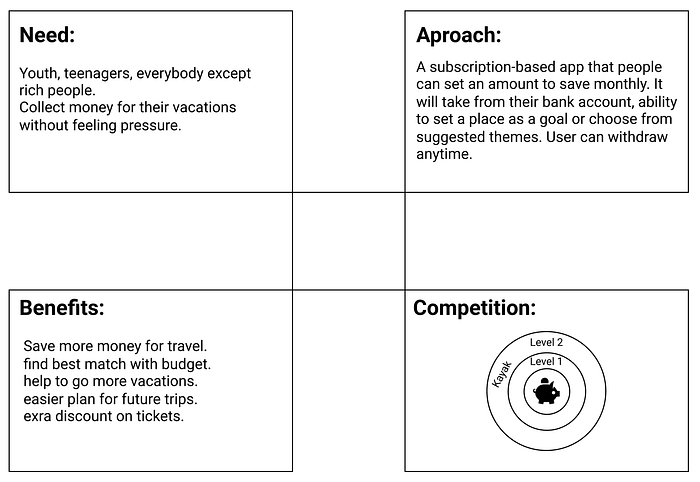
Problem:
There is no tool to save/manage a budget for vacation while budget is the number one variable to make travel decision.
Goal:
Help people to travel more; dedicate a budget for vacation; while keeping essential booking features next to it.
I wanted to try a new concept, not just a redesign for exiting concept. Therefore based on the data I had from interviews, I designed a new concept. A vacation piggy bank app. A subscription-based booking service that helps you to plan your vacations.
Some people actually do that. They try to maintain a budget in advance for their trips.
Proposal:
- Design a subscription-based service to save vacation budget.
- Allows users to set a monthly amount to be collected into their vacation saving account.
- Let users set vacation goals (intervals, fixed destinations, etc.)
- Give them ideas to travel more.
- Notify them on discounts and offers.
- Let them book tickets via the app.
Benefits for The service provider:
- Having potential users makes it easy to find better deals.
- More loyal customers.
- Users book tickets through their channels.
NABC Method:
I used the NABC method to develop the idea. It looks simple, but it truly helps a lot to think about different aspects.
Design Process:
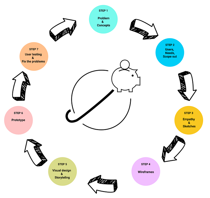
Now that I had the concept, next step was to research about it and do the second round of interviews.
In a real design sprint, your team will come up with several concepts to address the problem, and the final idea might be one of the ideas or a mix of them. Since this was an individual assignment with a limited time, my concept was a mix of a couple of draft ideas. But in normal the design sprints, the team can explore and analyzes multiple concepts simultaneously to find the optimal solution.
I certainly didn’t want to just use my gut feelings which means it was time to work on the first prototype and user testing.
Wireframe:
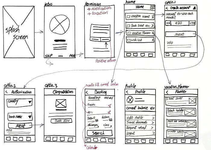
Considering the limited time for the assignment, I couldn’t cover the full user journey considering how much time I had, so I’ve decided to surface the most critical part of the concept. Are people interested in using a subscription-based service for traveling?


Creating IA helps to identify patterns in the design and once you can see these patterns, it helps you to work on task flow optimizations.
Information Architecture and task-flow
In order to make navigation easier, we have to use different patterns. For example, in this project, I’m using the following patterns.
Both Home and Footer are using hub pattern to give a direct access to main functionalities and tasks.
Create a saving account is a nested doll pattern because a user may want to go back to the previous step at any point.
Creating IA helps to identify these patterns in the design and once you can see these patterns, it helps you to work on task flow optimizations.
IA also makes it more understandable by giving context to each page/task and by setting the goals.


Working on UI
I have built and iterate a few sketches, then I decided to go for a high fidelity prototype right away because first, the app is about payments, so I wanted to give a better feeling to test users, and second, I had to make some progress on UI while building the prototype since I was short on time for the assignment.

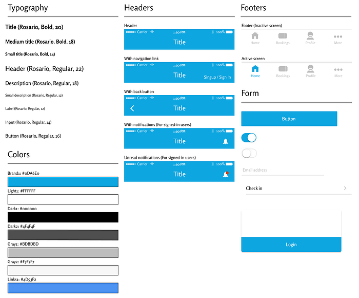
Stylesheet
Prototype color: Light blue
- Blue tones are often associated with feelings of relaxation and trust.
- Blue tones convey social approval of competence, quality, and corporate.
I also included different variations of header and footer in the stylesheet. For example how the notification icon should look like when there is an unread notification. Making sure nobody works base on assumptions by adding details and being more specific.
Mockups


User tests
After creating the prototype, it was time for user testing. As a rule of thumb, my plan was to observe users while using the app and avoid talking and telling users what to do and what is the there, that is why I implemented a few side pages, to make sure they don’t stop or get stuck in the app or feel forced to do one task.
I planned to watch, take notes, and just ask them to think out loud.
Although somehow I was confident about my idea, I still surprised to see how people like the idea.
Thanks to Figma present mode, I was able to run the prototype on my phone to give a natural feel to the users.
Feedbacks from user tests
- The user wants a clear explanation about service and terms. Mostly because it is a new concept. They also mentioned that they would go easier if the service provider is a decent brand.
- Seeing transaction logs in the app instead of going to their bank account.
- Couldn’t find the saving account after being created.
Changes after first user test
- Add terms & conditions step to the subscription process. Because the majority of users tried to read it to find the answer to their question.
- Added Infoboxes on each step to explain how it works.
- Added “View transaction logs” menu.
- Added “View saving account” to the profile screen. (I would like to try another iteration to add current balance in the header as well)
Conclusion
Based on user tests and interviews, people are familiar with subscription-based services. However, some of them declared that they would trust to use the service if there is a well-known company like Booking.com is behind it.
Testers said that it is an exciting idea and they feel it will help them to travel more as it will make them think more about investing for vacation.
They also admired the vacation planner part of the prototype quite a lot and said that they often know what they would want to do, but they don’t know where to find it, so they have to spend a lot of time to see it on the internet or ask friends about it.
I absolutely enjoyed doing this case study. I’m considering to follow up this concept with some travel fare aggregators to see what they think about it and see if they can help me with data that they have to do a more in-depth study.
Thanks for reading up. Please let me know what do you think about the concept? And also about the process that I used for this assignment.


