UI/UX case study: a step-by-step guide to the process of designing a pet diet app

Introduction
A few months ago, my mother asked me to find the best brand of pet food for her beloved pets.

Online research led me to two conclusions. One, that most processed (ie. branded) food possess significant health risks for pets. And two, that the healthiest choice is a balanced homemade diet.
Understanding the challenge
Processed food is unhealthy for pets. Ingredients often include waste products from the human food industry or leftover meat from diseased animal carcasses. On top of that, the vast majority of commercially available pet foods on the market contain chemicals, preservatives, emulsifiers, artificial colors, flavor enhancers and extra fats that make the food more palatable to dogs and cats, but also less healthy.
Since processed food for pets has been introduce, the pandemic of degenerative health problems has escalated in dogs and cats. Pets continually suffer from leaky gut syndrome, inflammatory and degenerative diseases as the result of a poor diet.
However…
Providing a homemade diet that meets all the animal’s nutritional requirements is challenging. It entails research, ingredients, measurements and recipes that fit both the pet’s individual needs and the owner’s lifestyle.
Commercially available pet food might have low quality ingredients or even be species-inappropriate, but it must provide balanced nutrition to meet the standards of AAFCO (The Association of American Feed Control) and FEDIAF (European Pet Food Industry Federation).
Research Methods
The Survey
I prepared a survey with Google Forms and distributed it among multiple groups of pet owners on Facebook. The purpose was to determine the basic ‘pain-points’ of pet owners when it comes to preparing a homemade diet. Learning about the problems of potential users is a great way to be inspired and motivated. Working with real world data is a good staring point to help avoid guesswork and preconceptions. Using this information provided a better chance to discover the root of the problem and how to solve it.

Quotes Directly from Users:
“Max is a very fussy eater, and I’ve already tried every brand that exist on the market.”
“I love cooking for Daisy, but I’m not always sure I know what I’m doing.”
“I’m worried that homemade food is just too expensive and time consuming.”
“The diets I find online are not relevant for my dog’s specific needs because they are too general.”
“The biggest headache is figuring out the amounts.”
Personas
The results of my survey suggested that there were several types of users with diverse needs. The accumulation of the different insights and common patterns that came from the users’ answers helped me create three personas which are the manifestation of that data in a character. Two of the personas presented edge cases since they were based on certain needs of some of the participants. Therefore, eventually I focused on the more common persona.
Focusing on a specific user helps to keep her needs in mind and not get distracted whenever an idea for a new feature or demand pops up.

User Journey
Next, I scripted a typical daily feeding routine for my persona. This process helped me decide how the app’s user experience might be designed to fit in with a feeding routine.

Jobs To Be Done
One of the most powerful tools I used is a JTBD form. Instead of focusing on what the problem is or what the users want, I ask myself why they need it. By understanding why people might want this app it increased my chances of making a truly valuable product.
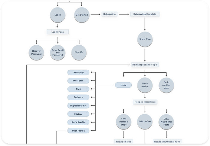
User Flowchart
Up until now I had a vague idea of how the app will function. Mapping the basic flow of the app forced me to figure each step on the path the users will take throughout the solution. I first sketched it on paper and then digitally rendered it.
Sketches
This was the first step to help me outline the app and visually imagine it.

Wireframes
This visual guide represents the skeletal framework of the app. It helped me arrange the interface elements while I focused on the functionality rather than what it looks like. Moreover, the simplicity of wireframes allows me to quickly test ideas without diving into the details.

Storyboard — Using The App
I created a storyboard describing my user’s experience with the app. This is a great tool to explore how the product will be used in a larger context, as if it was a part of a bigger narrative. It’s an effective and inexpensive way to capture, relate, and explore the app in a real world setting. I created a storyboard describing my user’s experience with the app. This study helps understand the circumstances and the larger context in which the app will be used.

Visual Research
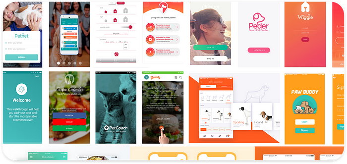
Inspiration Board
Before getting started with the visual design I create an inspiration board. The purpose was to learn about the visual world and gathering inspiration from other pet and nutrition apps.
Iteration
Next I explored different design possibilities: From each repetition of the design I learn something that I can use for the next iteration.

Color Palette
The color green symbolizes nature, life, health, youth, spring, hope, renewal, growth, rest and relaxation. Hence, a green color palette is fitting for an app that promotes healthy and natural pet food. Additionally, I used grey for the text and and included a great deal of white to give a calm and clean appearance.

Typography
Nunito Sans is a free Google font designed by Vernon Adams and Jacques Le Bailly. It is a well-balanced sans serif typeface superfamily that seems to complement the interface. Simplicity was the leading mantra; therefore, I decided to go with just one font family.

Icons & Illustrations
The illustrations and icons are an important part of the design. They communicate ideas and concepts that should not and sometimes cannot be communicated with words. Furthermore, they allow consistency of the visual aesthetics that help build the users’ trust and produce moments of delight.

Naming & Logo
The main reason to choose the name Petcy was practical. I wanted to have the word ‘pet’ in the name but every other combination with it was already taken. The suffix ‘cy’ means ‘the state or the condition of’. I felt this suits the app’s vision and therefore I chose Petcy.
I wanted the logo to be simple, reflecting how effortless it is to use the app. The logo looks like a scribble that was put together quickly with very few lines, just like a meal prepared with Petcy. I originally wanted it to also indicate health (stethoscope), love for pets (heart), and pets themselves (cats and dogs). However, eventually I decided that it was more important to keep it simple, so I settled on a logo that was just the name.

Micro-Interactions and Animation
One of the last things I did was to explore how motion will be implemented in the app, helping me to grasp the app’s flow and functionality on the deepest level.

Final Design
Onboarding Flow
The goal of the onboarding flow in Petcy is to collect information about the user’s pet to truly make it tailored to their needs. The critical part was to have the user answer ten questions without getting discouraged and turn off the app. It required a simple and quick process. Numbering the questions, big sliding cards and a progression bar were some of the solutions I used to ease the process.

Preparing a Meal
This element is the heart of the app. After onboarding, users receive a recipe tailored to their pet’s needs. When viewing the recipe, one can see a list of ingredients, three simple steps explaining how to prepare the meal, a how-to video and a breakdown of the nutritional values of that meal.

Obtaining the Ingredients
For extra convenience I decided to offer users an option to obtain all the necessary ingredients. Therefore, the next challenge was to create a process that consisted of a shopping list, picking a provider, comparing prices and having it delivered to their front door. This procedure should be easy and quick to keep it in line with the app’s easy interface.

Conclusion
What did I learn?
Designing the app has been a challenging and rewarding journey. It was clear from the onset that the major challenge will be to make pet owners interested in something that competes with the habit and ease of transferring a cup of dry kibble from the sack to the pet’s food container. I researched the dietary needs, recipes and costs for homemade dog meals. I understood the needs of the users through the survey and conversations. Finally, I faced the challenge of creating an engaging app both from the user experience perspective and the visual perspective.
What are the next steps?
- Deep research about specific features
- Usability test of the prototype with users
- Improve user flow
- A comprehensive business model
Future Features
Pair up option: pairing up with friends and other users to buy ingredients in large quantities to save money and time.
Final Thoughts
Pet food is a $75 billion industry that produces foods that by and large are not the healthiest dietary choice for dogs and cats and may even harm the health and longevity of our furry friends. However, in the hectic daily lives most of us lead, the convenience of using dry foods understandably wins over.
The goal of this free mobile application is to allow users to quickly and easily make healthier food for their beloved pets at comparable costs to premium packaged foods. Petcy is designed to help pet owners prepare homemade food for their furry friends. The app provides a daily feeding plan for each individual pet based on their nutritional needs. The app also tailors the food quantity and can deliver the products from local stores.
It is my hope that this app will be supported by a pet food producer or marketer, with the understanding that providing pet owners with additional and healthier choices is socially, caninely and felinely, a more responsible way to conduct business.

Special thank you to Sagi Shrieber and everyone who supported and helped me while working on this project.
