UI & UX micro-tips: Volume eleven
A collection of handy tips to help improve your designs instantly
When creating efficient, accessible, and beautiful UIs, it takes only the smallest tweaks to improve your designs.
In this follow-up article I’ve brought you another selection of easy to put into practice UI & UX micro-tips.
Tips that can, with little effort, help improve both your designs, and the user experience.
Let’s dive on in…
Oh. Before you read the rest of the article…
🏠 Growing a SaaS startup? I combine strategic design with proven founder experience to help you build products users love.
Join the Haus waitlist for early-bird perks → https://gohaus.design/
1. Lower that text contrast when working with Dark themes.
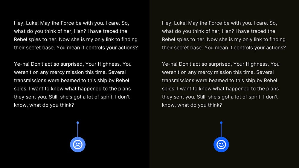
This tip applies to me on a much more personal level. I suffer from a condition called Astigmatism, so working on and viewing a Dark themed design can be troublesome sometimes, with an effect called Halation coming into play.
So when pure white text is set against a pure black background, the text can appear (to me personally) to have a strange kind of ‘shimmering’, and ‘haloing’ effect, which makes things particularly troublesome when viewing Dark text-heavy sites, or apps.
To improve things for users with Astigmatism (of which there are many more than I realised), setting your White text to around 85–90% opacity (as well as avoiding those pure black backgrounds) can improve things significantly for users with this condition.
2. Present Icons with Labels for easier comprehension.
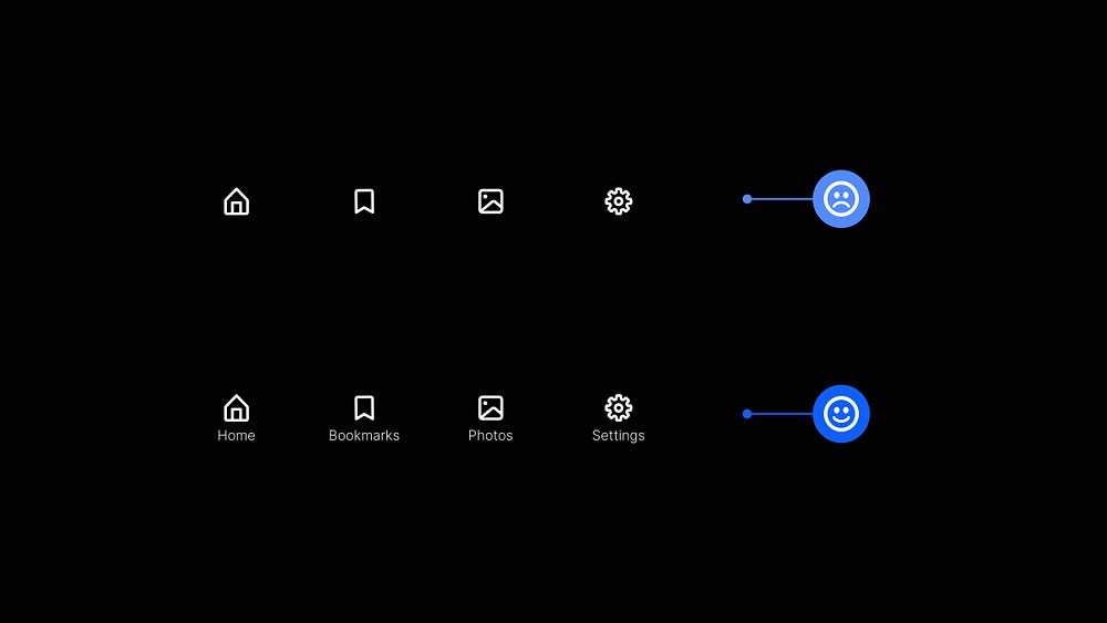
Try not to leave those Icons all by themselves. For the benefit of your users, they need some company in the form of Labels.
In some circumstances, yeah, you can get away with a sneaky lone icon (Search function anyone?). Shhh! We won’t mention Hamburgers here.
But for Primary Navigation elements, it aids usability and brings easier comprehension to have a Label alongside its accompanying Icon and not have the user second-guessing things.
3. Use complementary border radiuses. Avoid making things look ‘off’.
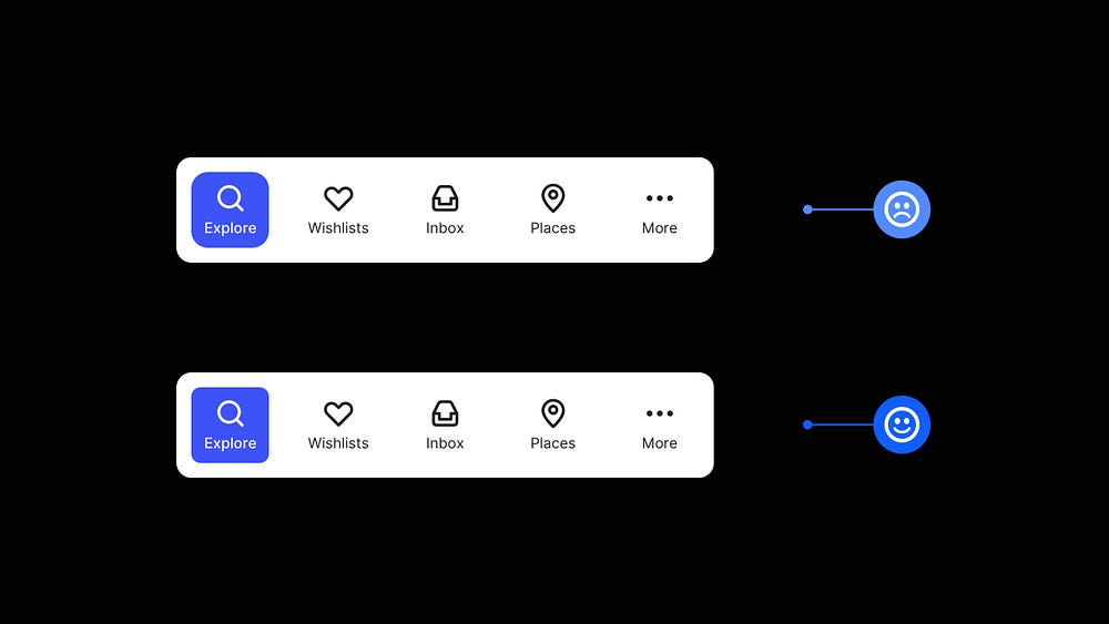
It pays to keep your border radiuses consistent and complementary and avoid that slightly ‘off’ feeling within your designs.
Tightening up those border radiuses can create a much more pleasant visual harmony between elements in your design, with only the smallest tweaks required to make them look complementary to one another.
Give your designs a much more refined and professional look and avoid those ‘Ooh, something looks off here?’ feeling from your users.
4. Use elevations correctly when working with Dark themes.

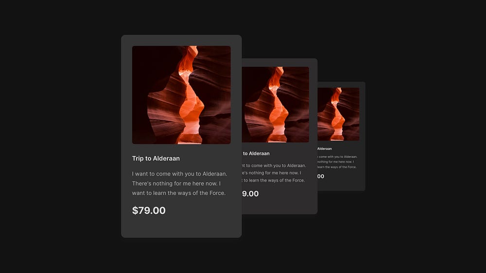
When working on Dark themes, use dark greys rather than black to communicate an element’s elevation correctly and effectively.
The closer an element is to you (and in the real world, closer to a light source), the lighter that element should be against the background to communicate depth well.
Using this simple method, you can effectively express depth within your design, and if you choose so, without the need for shadows of any kind.
5. Make your long-form content more accessible with the Atkinson Typeface.
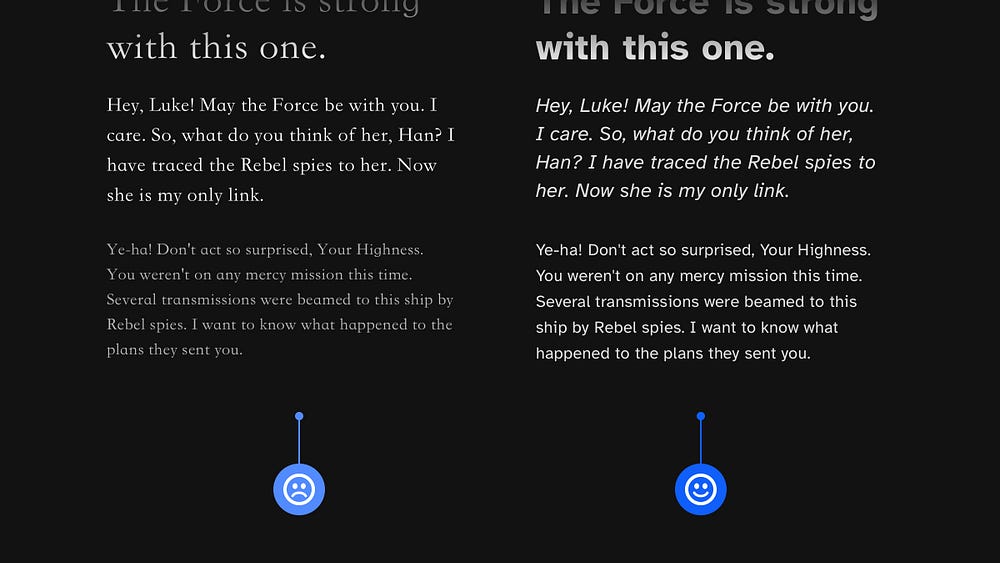
I mentioned Atkinson in a recent article but just wanted to namecheck it again if you’re looking for ethical ways to improve your long-form content for users with Low Vision.
Atkinson Hyperlegible (the clue is in the name) is a Typeface created to improve readability and increase legibility, especially when creating long-form content.
For long passages of text, Atkinson is a highly recommended choice. It is the best I’ve come across for legibility for users with low vision and just all users in general to be honest.
6. Cut out the noise. Make those messages short, and to the point.
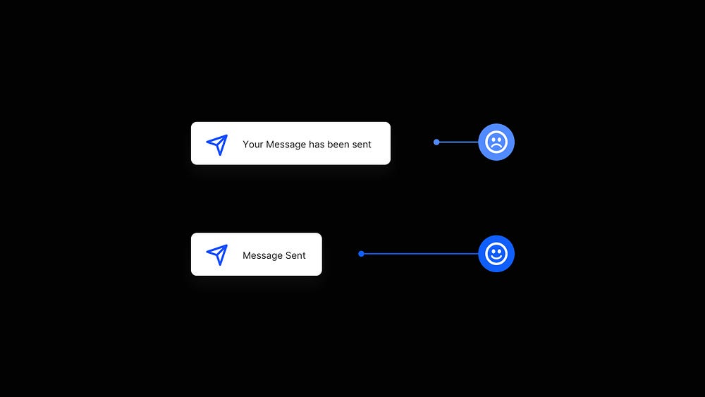
Always keep your messaging short and to the point and reduce the cognitive effort required by your site or app’s users.
If there’s no real need for a more detailed message, then trim it down, and keep your messages short and to the point.
Presenting the user with clear and straightforward messages will help them achieve their objectives more effectively.
I hope with this short collection of tips you’ve realised how the smallest of adjustments to your designs can produce better end-results for both yourself, and your users.
Oh. Before you go…
🏠 Growing a SaaS startup? I combine strategic design with proven founder experience to help you build products users love.
Join the Haus waitlist for early-bird perks → https://gohaus.design/

