UI & UX micro-tips: Volume four
A collection of handy tips to help improve your designs instantly.
When creating practical, accessible, and gorgeous UIs, it takes only the tiniest tweaks to improve your designs.
In this follow-up article, I’ve brought you another selection of easy to put into practice UI & UX micro-tips.
Tips that can, with little effort, help improve both your designs and the user experience.
Quick Note: Want even more UI & UX Micro-Tips? Then check out my previous articles here, here, and here.
Let’s dive on in…
Oh. Before you read the rest of the article…
🏠 Growing a SaaS startup? I combine strategic design with proven founder experience to help you build products users love.
Join the Haus waitlist for early-bird perks → https://gohaus.design/
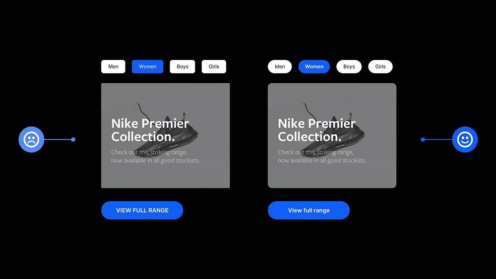
1. Be consistent with your design elements.

We’re creatures of habit and expect products to be presented in a familiar way.
We expect consistency throughout when navigating a site or app, and it’s an essential design principle to implement.
Be that with Layout, Icons, Colours, and Buttons, to name but a few.
Be consistent. Reduce confusion, and improve that user experience.
2. White Space. Use it generously.
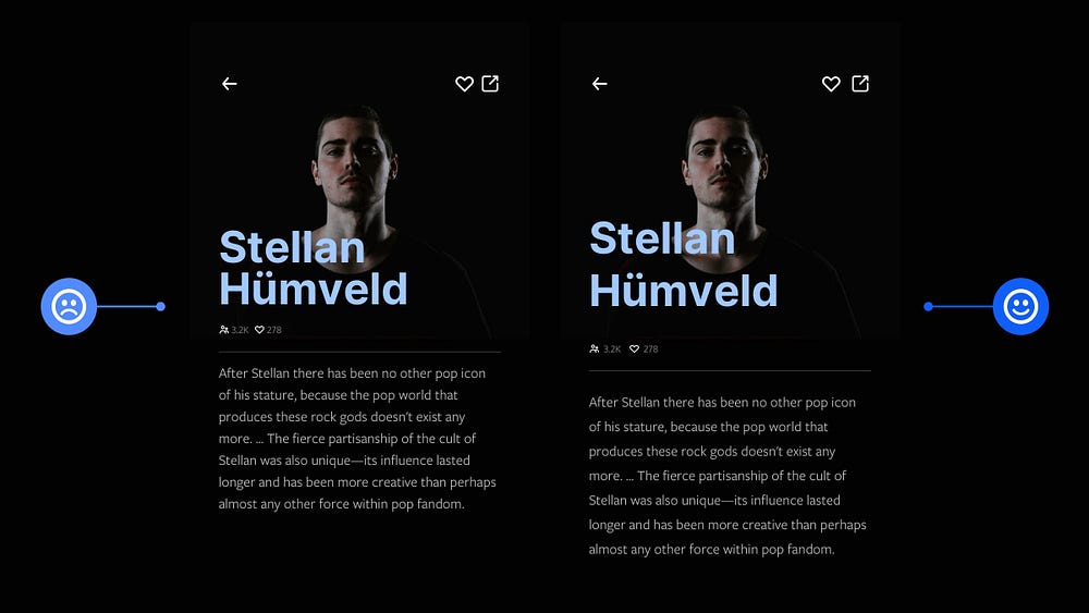
Whitespace. Negative Space.
Same thing. Different titles.
My advice to you. Use it generously or in moderation, but use it well.
Adding whitespace to your designs is one of the simplest ways to instantly improve them, allowing your work to breathe and look more refined.
3. Style that opening paragraph, and draw the user in.
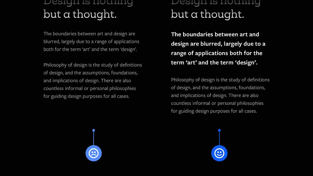
If you’re working with long-form content, such as blog posts/articles, it’s essential to draw the reader into the content.
The appearance of the opening paragraph can be just as important as the content itself in achieving this.
Simple tweaks such as different font size, line height, weight and colour are all it takes to make an improved first impression.
4. Design for scanners. Use short paragraphs.
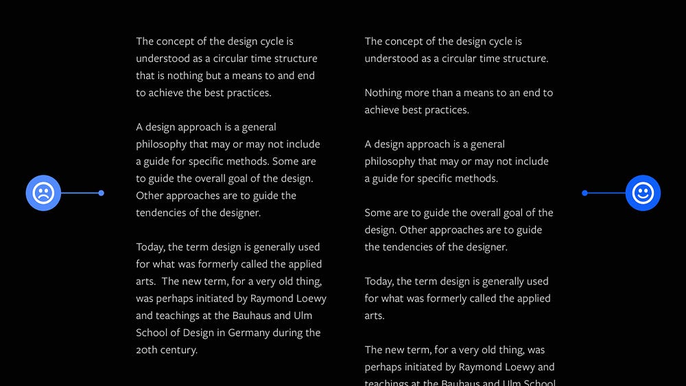
When working with long-form content, and it’s practical, try and keep those paragraphs short and punchy.
We’re all scanners now and want to digest information as quickly as possible.
Presenting your copy in short, clear paragraphs wherever possible is a sure-fire way of getting your information read and digested better by the user.
5. Define a colour palette, and create uniformity in your designs.

Want to create more professional-looking UIs? Define that colour palette.
Don’t overstuff your design with an abundance of random colour choices and hope for the best.
Build a strong colour palette from the start and stick with it. Doing this will avoid headaches and add uniformity throughout your designs.
6. Lay out your icons consistently when using the 8pt Grid System.

When working with icons and the 8pt Grid System, you’ll find that most well-built icon sets have icons that sit inside frames that are multiples of 8 (, i.e. 16x16, 24x24, 32x32 etc.)
Sometimes, just sometimes, that’s not always the case.
If not, make sure that any icon inserted into your design you frame it inside a container that uses an 8pt Grid value (i.e. 24x24).
Doing this will enable your icons to be laid out consistently within your designs.
I hope with this short collection of tips you’ve realised how the smallest of adjustments to your designs can produce better results for both yourself and your users.
Oh. Before you go…
🏠 Growing a SaaS startup? I combine strategic design with proven founder experience to help you build products users love.
Join the Haus waitlist for early-bird perks → https://gohaus.design/


