UI & UX micro-tips: Volume ten
A collection of handy tips to help improve your designs instantly
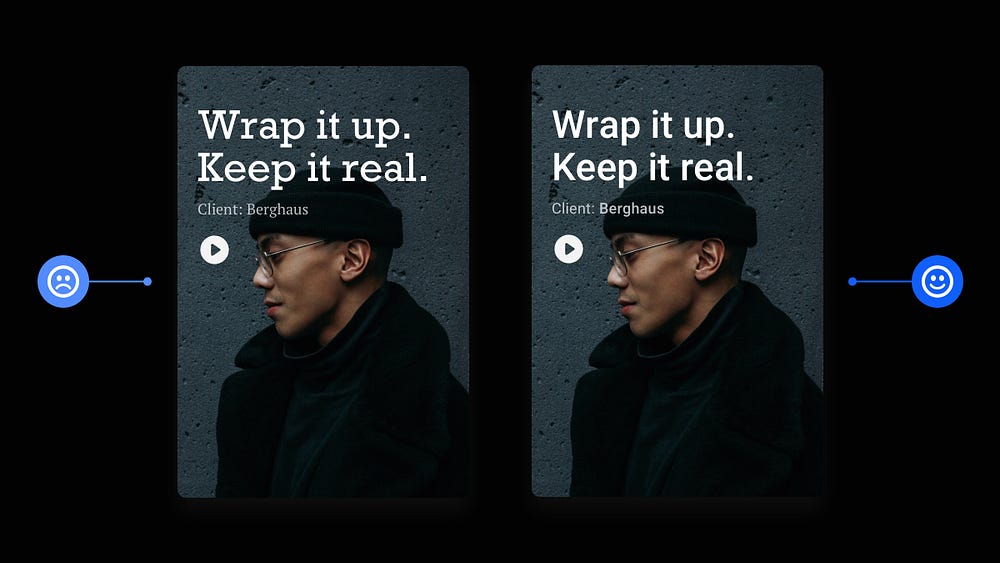
When creating efficient, accessible, and beautiful UIs, it takes only the smallest tweaks to improve your designs.
In this follow-up article I’ve brought you another selection of easy to put into practice UI & UX micro-tips.
Tips that can, with little effort, help improve both your designs, and the user experience.
Let’s dive on in…
Oh. Before you read the rest of the article…
🏠 Growing a SaaS startup? I combine strategic design with proven founder experience to help you build products users love.
Join the Haus waitlist for early-bird perks → https://gohaus.design/
1. Proximity. A key Design Principle. Use it well.
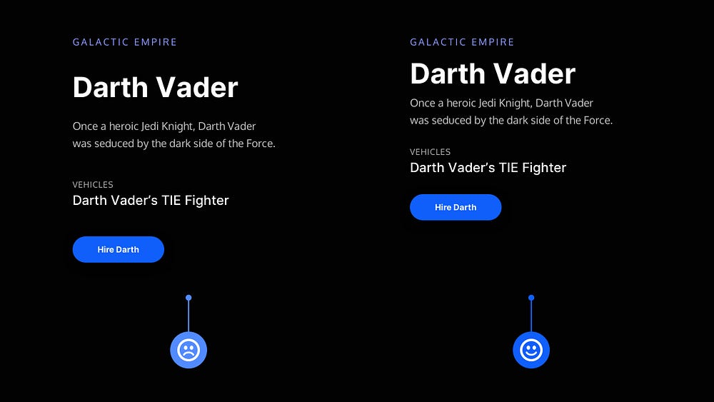
Proximity. One of the many Design Principles that can help you produce stronger and clearer UIs for your users.
With Proximity in play, you ensure that related design elements are placed together, which in turn signals a relationship between them and helps speed up the user’s cognition when using your site or app.
Use it regularly and use it well.
2. Always make elements in your UIs distinguishable from one another.
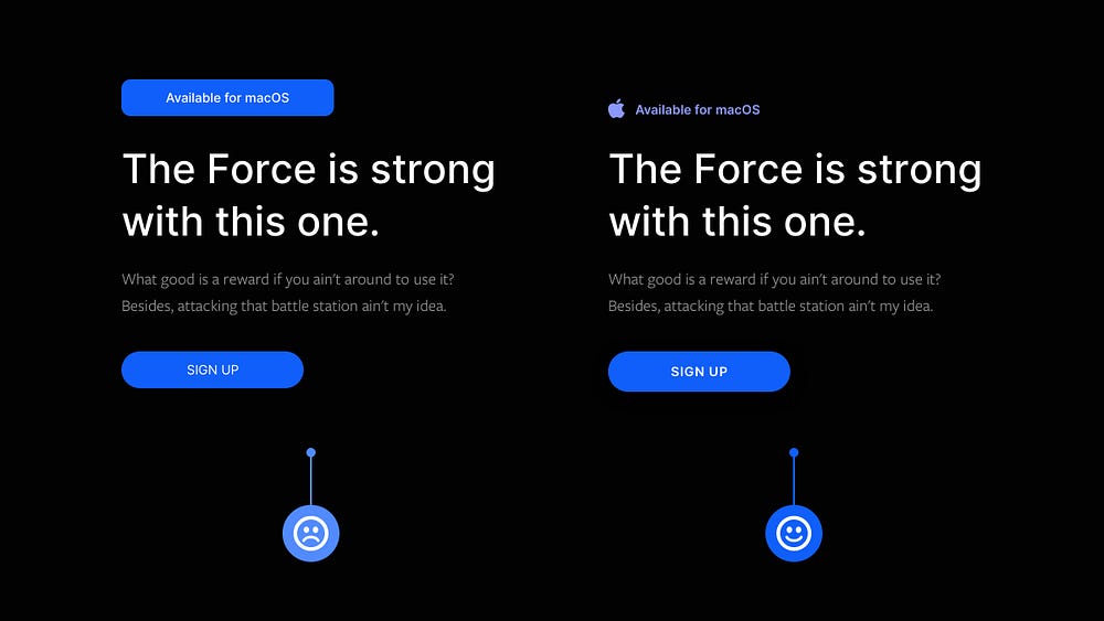
Essential elements in your UIs should always be easily distinguishable from one another to improve the user experience.
Take, for example, Buttons and Notifications.
Buttons will take precedence in most circumstances, so make sure they’re the most prominent thing on the screen and can be recognised easily from other components such as Notifications.
3. Check out these Sans-Serif fonts; Perfect for both Headlines and Body.
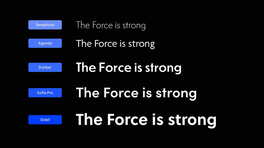
I know how great Type can instantly improve a design and help get the right message across to the end-user of your site or app.
I’ve used this selection of Sans-Serif fonts many times before, and they’re equally useful for both Headlines and Body copy.
You can find all of these great fonts at fonts.adobe.com
4. Check out these Serif fonts; Perfect for both Headlines and Body.
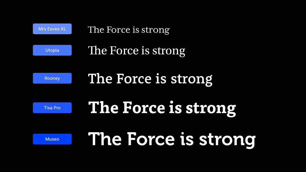
Like I mentioned in the previous tip, great Type is one of the key elements to help lift a design from ‘Eh’ to ‘Amazing’, and this selection of Serif fonts can help you do that.
I’ve used a few of these consistently for both Headlines and long-form Body copy and highly recommend them.
You can find all of these beautiful Serif fonts at fonts.adobe.com
5. Looking for great font combinations fast? Use Superfamilies.

I’ve discussed Superfamilies previously, but I wanted to mention them again because they can be so helpful when you’re having trouble finding great font pairings.
Superfamilies are sets of Typefaces that can come in Serif and Sans-Serif flavours and are designed to work together in perfect visual harmony.
If you want to mix Typefaces effectively without worrying about selecting a not-so-great combination, a Superfamily is an excellent place to start.
6. Shadows. Go subtle or go home.
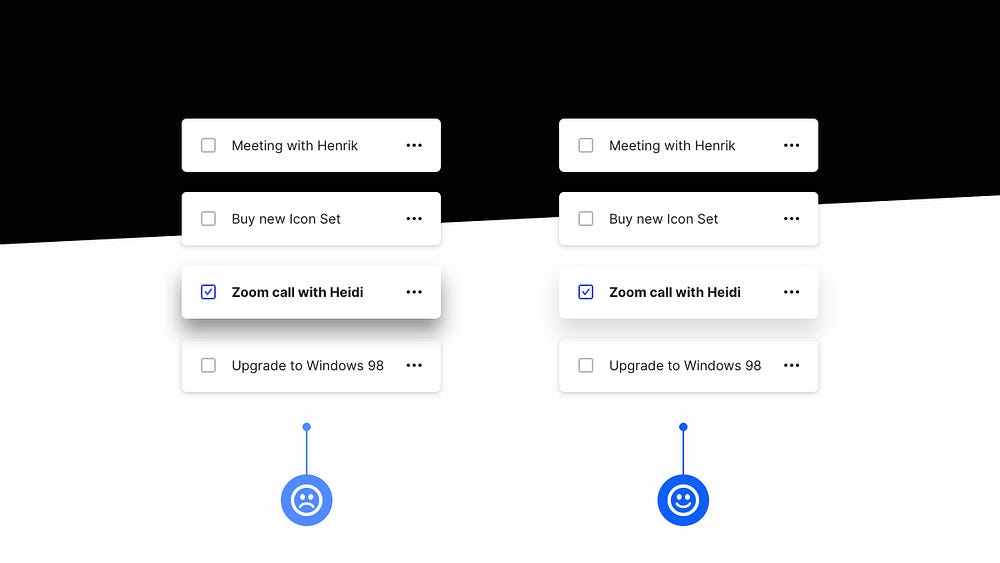
Drop Shadows. Used subtly can act as powerful visual cues in your designs.
Remember. Shadows in the real world are nearly always unnoticeable for most of the time; thus, you should aim to replicate this type of behaviour in your UIs.
When it comes to shadows in your UIs, go subtle, or go to your place of residence.
I hope with this short collection of tips you’ve realised how the smallest of adjustments to your designs can produce better end-results for both yourself, and your users.
Oh. Before you go…
🏠 Growing a SaaS startup? I combine strategic design with proven founder experience to help you build products users love.
Join the Haus waitlist for early-bird perks → https://gohaus.design/

