UI & UX micro-tips: Volume thirteen
A collection of handy tips to help improve your designs instantly
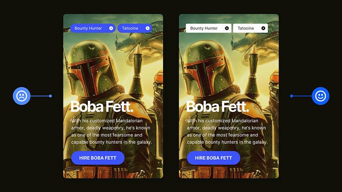
When creating efficient, accessible, and beautiful UIs, it takes only the smallest tweaks to improve your designs.
In this follow-up article I’ve brought you another selection of easy to put into practice UI & UX micro-tips.
Tips that can, with little effort, help improve both your designs, and the user experience.
Let’s dive on in…
Oh. Before you read the rest of the article…
🏠 Growing a SaaS startup? I combine strategic design with proven founder experience to help you build products users love.
Join the Haus waitlist for early-bird perks → https://gohaus.design/
1. You don’t need a Degree in Colour Theory to make things look cohesive.
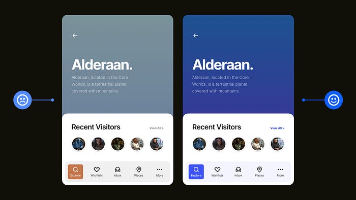
If you’ve got a design project that’s enabling you a little more freedom in the way of colour choices, don’t always feel inclined to pack it with a rainbow of colours.
If you go down the rainbow route, you may find that things can start to look visually mismatched very quickly.
Simply using a Base colour and then Tints and Shades of that chosen colour can add uniformity, cohesiveness, and a much more professional look to your designs, without those shiny rainbows and the need for a Degree in Colour Theory.
Oh. Want to quickly produce Tints & Shades from your chosen Base colour? You need to check out my old favourite https://maketintsandshades.com.
2. Make those selected items stand out and grab the user’s attention.
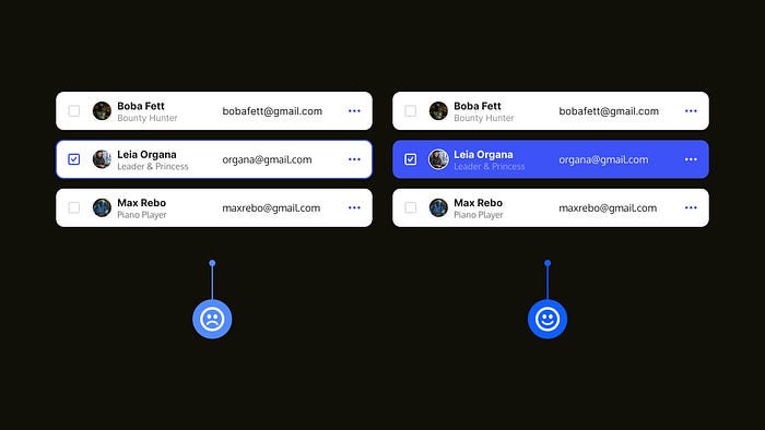
UIs can be clean, stripped back, and straightforward. No doubt. But not at the expense of a neglected user experience.
For something as simple as a menu of options, make sure that a selected item can be easily identified with a quick glance.
You don’t have to go crazy here. Simple but bold wins the day and allows the user to easily distinguish which item they’ve selected and that their input has been recognised.
3. Using a lighter font weight? Darken up that text if you can.

When it comes to long-form content, you may be inclined (because all the cool kids are doing it) to go with a mid-shade of Grey, which can be all good until you start using a lighter font-weight, affecting legibility in a big way on screens of all sizes.
Don’t have users with reduced vision reaching for the back button, and quickly fix this issue by darkening the text and making it more accessible to everyone.
With Typefaces that have a lighter weight, just darkening things down a few notches can significantly improve their legibility.
4. Give the most important elements on the screen more prominence.
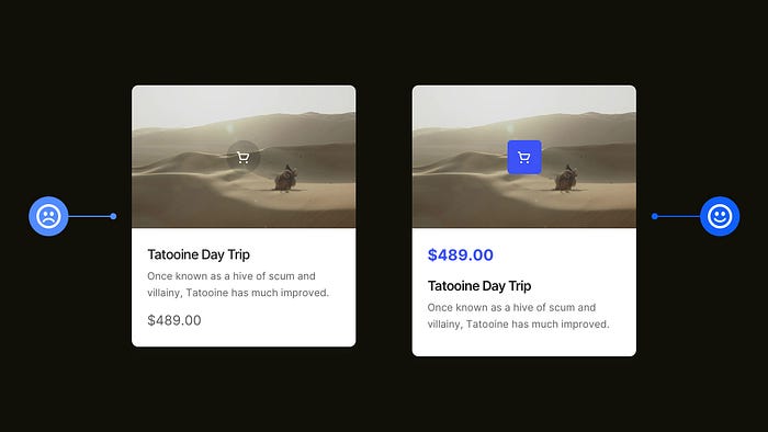
You want the user’s eye to be drawn to the most important elements on the screen quickly, efficiently, and with minimal cognitive effort every time.
By using visual hierarchy principles such as Font Size, Weight, Colour, and Layout, to name but a few, you can easily give prominence to the most essential elements.
Following these principles will help improve the user experience and help lead the user through your product in a much more streamlined manner.
5. Don’t have the user second-guessing the next step. Keep them informed.
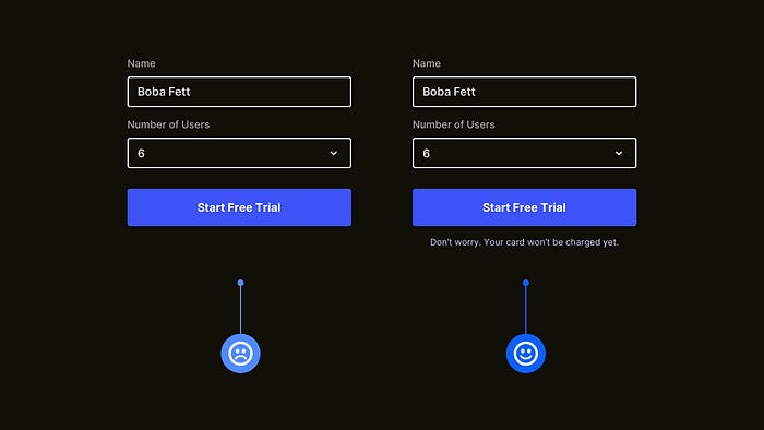
Before a user takes action, especially on some types of Calls to Action, make sure they’re not left in the dark as to what may happen next.
Always keep the user well informed before an action is taken as to what they can expect when clicking on that shiny, sparkly CTA of yours.
Improve the user’s experience every step of the way and don’t leave them second-guessing at any point in their journey.
6. Reserve one colour for your Calls to Action. Be selfish with that CTA.

The Call to Action (CTA) needs to be one of, if not the most crucial element on the screen. Make it shine in its own coat of paint!
Don’t have the user confuse it with any other kind of element on the screen (ie, Notifications or Tags). It needs to be easily distinguishable between those elements, and that can be achieved by simply reserving one colour for the CTA and nothing else.
Of course, you can go a step further with sizing, shape and more, but just reserving that one colour for your CTA, and that alone, can reduce most friction.
I hope with this short collection of tips you’ve realised how the smallest of adjustments to your designs can produce better end-results for both yourself, and your users.
Oh. Before you go…
🏠 Growing a SaaS startup? I combine strategic design with proven founder experience to help you build products users love.
Join the Haus waitlist for early-bird perks → https://gohaus.design/

