Understanding the end-to-end UX of the Sephora Virtual Artist app — a UX case study
Overview
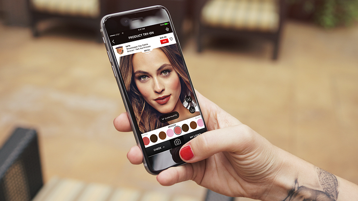
The Sephora Virtual Artist App (SVAA) Product Try-On is an augmented reality feature housed within the Sephora app. This feature enables users to try on makeup products carried by Sephora, virtually, before purchasing.
Role Assumed:
Solo UX Researcher
Problem Statement
This study was designed to understand the end-to-end user experience of shopping for makeup using the SVAA. Specifically, I wanted to know if users would actually buy makeup products after trying the augmented reality feature and how purchased makeup products compared to what was shown on the app.
The Process
How I came up with this study
One afternoon, I was surfing YouTube looking for makeup videos (as makeup is my side hustle @swati.mua, #shamelessplug), and came across the video:
I Tried the SEPHORA VIRTUAL ARTIST MAKEUP APP… YIIIIKES where the YouTuber described her experiences using the SVAA. You can tell from the title of the video that the review wasn’t positive.

I decided to download the app and see for myself. My initial thoughts were “YIKES!” indeed. I wondered if others felt the same. I also wondered about what users wanted to do with this app. Would their goals be to do a full-face makeup look or just find one or two specific products? Regardless of the goals, I figured that an augmented reality app like the SVAA should enable users to find what they were looking for, apply it easily and get a good sense of how the product would look in real life. The obvious answer here was to do a usability test, which became Part 1 of my study.
However, this wasn’t enough because the assumption of the app’s creators was that once users tried the makeup, they would then BUY it right off the app. Okay, but not all users would jump at this opportunity. Makeup is expensive and some users might not be ready to fork over the cash, if they weren’t 100% confident in what they were getting.
For those who would actually buy after they try, I had the following questions:
Does what they get in the mail really match with what they saw on their phone screens?
When they actually receive the makeup, does the makeup meet users’ expectations in terms of the shade or feel of the product?
How can users be sure they are actually getting what they think they are getting?
It was clear to me that the end-to-end user experience of the SVAA doesn’t just stop after hitting the checkout button. It fundamentally includes the real-life application of the makeup. I decided to include this in my study design. However as I already mentioned, makeup is expensive and I didn’t have the budget for it.

I decided to do the next best thing. If I couldn’t buy the makeup, then I could at least have my participants try out the recommended products in-store. I figured this would be a realistic next step too because if I were in this position, I probably would have done just that.
I imagined what it would be like to be in my participants’ shoes. Would they want to put on the makeup in front of other people? What would they use to actually put the makeup on? What are all the emotions that would come from doing that out in the open? Would the products meet participants’ expectations? There were a lot of questions that came to mind here. The best way for me to really see what would happen in this setting would be to observe it directly. Hurray! Part 2 of my study was born! Contextual Inquiry!
What do I want to know? — Defining my High-Level Research Goals
At a very high-level, I wanted to get the answers to the following questions:
1) How do users use the Product Try-On feature on the Sephora Virtual Artist App?
2) What is the complete user experience for the users that don’t buy right away?
To achieve each of these goals, I broke them down into operational research questions. I had to be clear about what I meant by “use” the feature and “complete” user experience. I landed on the following research questions:
Research Questions to Achieve Goal 1
· Can participants easily navigate the app and successfully select makeup products?
· Can participants create a complete makeup look? (Complete look = select and apply a product from each section)
· Are there any features that distract or impede participants from selecting products?
· What are the opportunities for improvement for the Product Try-On feature?
Research Questions to Achieve Goal 2
· What do participants do when given the opportunity to try products suggested on the app, in-store?
· What tools do participants use in-store to apply makeup products?
· What are participants’ mental models about the Sephora Virtual Artist App and do these match with their experiences in-store?
Great! It looked like I was on my way. Now I just needed…participants.
Makeup is for Everyone! — Defining my Users

True! Makeup is for everyone! That’s one of the things I love about it! Theoretically, I could have included just about anyone for my target audience… for the most part.
This is where being broke can be useful! Hurray!
I was doing this project totally on my own. I thought the best (and really only way) I could get myself some participants was to ask my friends.
So, that’s what I did. But that also meant my sample (n =5) was not going to be representative of A LOT of potential users. My findings couldn’t be stretched to the very young (teens and maybe even some tweens) or older users (my mom and her friends). I couldn’t stretch my findings to boys or men. Oh well maybe next time!
(P.S- Sephora if you are reading this, hit me up to do a more representative study!)
My target population and recruiting criteria for this study was:
Target Population — (Young Users):
Females aged 20–39 who were well-versed in using smartphone apps, well-versed at online shopping, may have funds for purchasing makeup and were from various nationalities/ speak various languages.
Participants recruited! Now what do they do? — Tasks and Instructions
Part 1: Pinpointing my Usability Tasks
Now that I had my participants, I needed to give them something to do. Usability tasks can be either open or close-ended. I thought about asking them to create any look they liked, so I could learn about app exploration without constraints. This would’ve been realistic of what users normally do with an app like this. For example, if a participant didn’t want to select an eyeshadow because they didn’t use eyeshadows, then that was realistic for that participant. However the drawback was, I would lose information on these particular makeup products. Hmm…🤔
I didn’t want to tell my participants exactly which products to select either, as that was a bit too constrained and unnatural. I opted to choose tasks that landed somewhere in the middle. The tasks were verifiable to an extent. If the task was to “select a red lip product”, so long as the participant picked a red lip product, they would be considered successful at that task. The brand, shade or style (lipgloss vs. lipstick) they chose was up to them. I thought this was the best way to discover major usability issues when navigating the app for products. It also helped participants feel comfortable with the makeup they chose, as they would be recreating that look in-store.
I structured my usability tasks in the order in which I put makeup on myself or my clients (again @swati.mua, #shamelessplug), starting with the eyes, doing the skin and then finishing with brows and a lip color. There is no right way to pick products but many makeup artists do start with either the eyes or skin. Every attempt was made to ensure the wording of my usability tasks was as neutral as possible, so as to not lead participants. However, it’s hard to rephrase makeup terms like “eye crease” in a different way. For a full list of my usability tasks click here.
I did not tell participants they would be recreating their look after the usability testing (in-store) as I did not want to influence my participants’ makeup selections in any way. I simply told them they should be comfortable with the look they achieved. I did tell them that we would be visiting a Sephora store after the usability test to take a look at the products.
Side note: The whole “try before you buy” theme might make you wonder if I included the checkout process in my usability testing. I definitely considered it but realized that that process wasn’t necessary for achieving the research goals in this particular study.
Part 2: Instructions for Contextual Inquiry
Part two of my study was very simple. Once participants had created and saved a look by completing the usability tasks, I took them to a Sephora makeup store. I gave them one instruction and set them loose, while I followed them around the store and recorded what happened. Just in case I didn’t get everything, I sent out a survey after returning from the store, asking participants about their end-to-end experience. You can check out that survey here.
Instructions:
“I would like you to recreate the look that you created on your app, using the products available in-store.”
Outcomes and Results
Part 1: Usability Tests
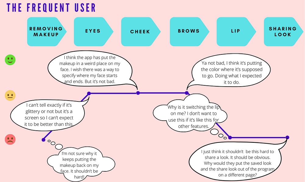
Usability tests revealed that there were several features on the app that impeded participants from accomplishing the task of creating a full makeup look. Most of the usability issues surrounded navigation of the app. More specifically, participants had immense difficulty selecting and staying on a product and knowing what certain features did. For a full list of findings/recommendations click here.
Personas and Journey Maps
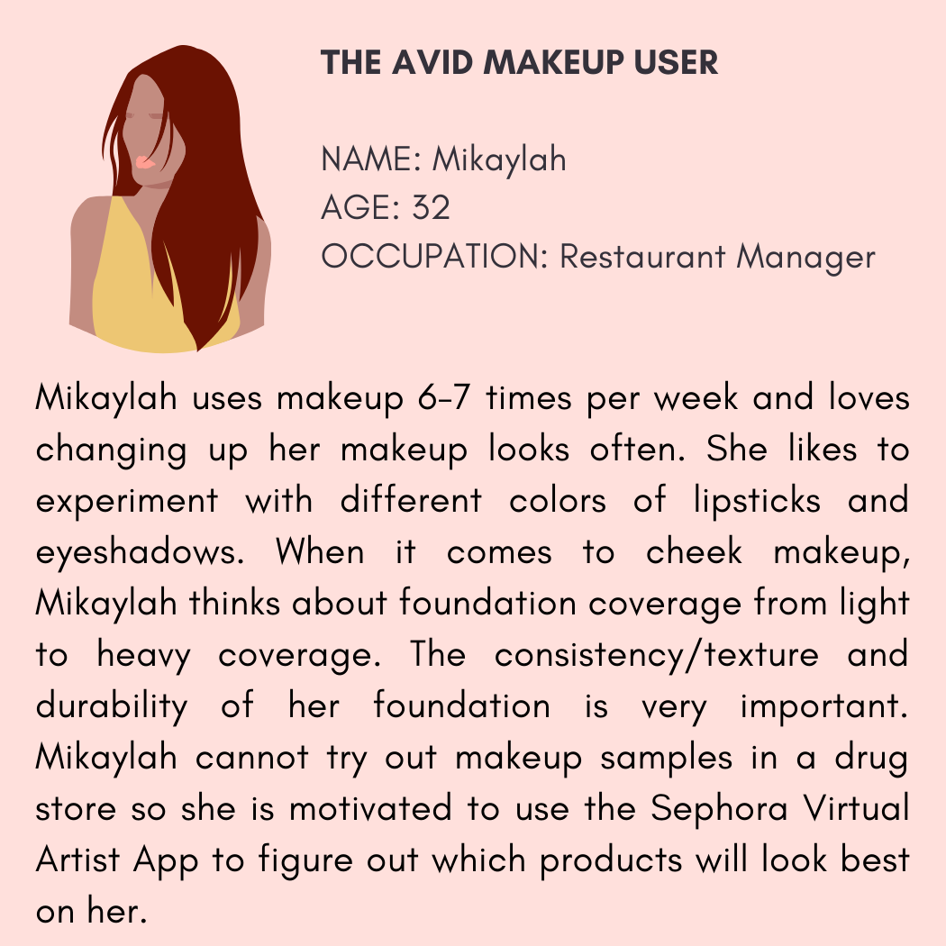
To better empathize with my users I created some personas and journey maps of them interacting with the app.



Part 2: Contextual Inquiry and Survey
Contextual inquiry and survey results indicated that participants had difficulty easily accessing their created looks and had to use workarounds. Perhaps the most alarming finding was that many of the participants reported that the products were not accurately represented on the app (e.g. the shade of a product in-store did not match what was shown on the app), which decreased their confidence in the app. This is a big deal because if the whole point of the app is to enable participants to try on makeup and then buy immediately, it should accurately represent what the product will be like in real life. For a full list of findings/ recommendations from this part of the study click here.
Finally, Participants were asked the following question twice: Once after completing Part 1 (Usability Testing) and once after completing Part 2 (Contextual Inquiry/Survey):
How likely or unlikely are you to buy makeup products directly from this app, in the future?


Bottom-line: In-store experiences impacted participants’ likelihood of using the app for future purchases. The end-to-end experience reveals decreased confidence in using the app for future makeup products for 80% of participants.
Takeaways
> The end-to-end user experience of using the app and then trying the makeup on in real-life is fundamentally connected. Both experiences need to be delightful as they impact users’ perceptions of each other.
> For an augmented reality app like the SVAA to really work the way it is intended, products need to be represented accurately on the app.
>The SVAA could be integrated in the shopping experience for makeup users.
What I would do differently
- Have a more representative participant group including varying genders, ages, income levels, occupations and races.
- Have a larger sample size (n=5 in this study).
- Select one Sephora store. In this study, the location of the Sephora store varied due to convenience. This actually may be more realistic since users go to varying Sephora locations, but perhaps in a future study this could be kept constant to see if it makes a difference to the outcomes.
- If I had more resources, time and budget, perhaps I would include the checkout process as part of my usability tasks.
- Learn more about the participants’ backgrounds to draw deeper insights— Interestingly, only one participant knew how the “Color Picker” feature of the app worked and that was because she worked in tech. She was the only one who could finish that particular usability task.


