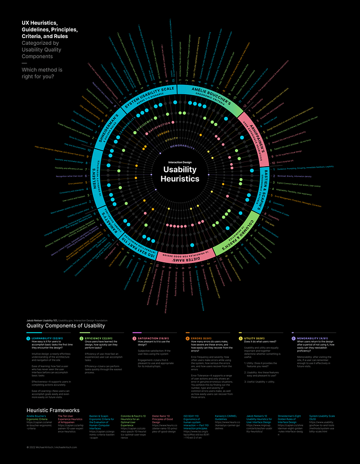
Usability heuristic frameworks: which one is right for you?
Going beyond Nielsen’s Usability Heuristics (with Infographic)
In this article, I explore, categorize, and standardize heuristic evaluation methodologies and data visualization to help inform which method to choose.
Like many UX designers, my go-to heuristic evaluation approach is Jakob Nielsen’s 10 Usability Heuristics for User Interface Design, first published in 1994 and updated in 2020. However, placing all issues found during an assessment into Nielsen’s ten options often felt forced; I would discover discussion-worthy user experience problems that did not fit the mold.
A brief moment of searching for alternative heuristics led to the question, how do I choose the appropriate method? Determining the heuristic similarities and, perhaps more importantly, the differences, were vital to understanding which to choose and when.
What is a heuristic evaluation?
A heuristic evaluation is a process where evaluators assess the usability of an interface against established usability principles.
Usability expert Nielsen Norman Group states:
“Heuristic evaluation is a usability engineering method for finding the usability problems in a user interface design so that they can be attended to as part of an iterative design process. Heuristic evaluation involves having a small set of evaluators examine the interface and judge its compliance with recognized usability principles (the “heuristics”).”
Dictionary.com defines heuristic as:
adjective
- serving to indicate or point out; stimulating interest as a means of furthering investigation.
- encouraging a person to learn, discover, understand, or solve problems on his or her own, as by experimenting, evaluating possible answers or solutions, or by trial and error: a heuristic teaching method.
- of, relating to, or based on experimentation, evaluation, or trial-and-error methods.
- Computers, Mathematics. pertaining to a trial-and-error method of problem solving used when an algorithmic approach is impractical.
Notice the last definition: “…when an algorithmic approach is impractical”. This statement is a good summary of the subjective, qualitative nature of heuristic evaluation methods. And while this subjective nature is primarily true for the frameworks discussed here, the System Usability Scale (SUS) attempts to quantify heuristic evaluations. Or, for more measurable results, you may want to consider the PURE method for evaluating ease of use.
Approach
My approach to understanding the criteria was to first narrow down the heuristic frameworks to those of a similar number of heuristics. I chose ten frameworks with 6–12 heuristics. Frameworks with more heuristics tend toward checklists and are less heuristic.
Note: I’m using the term framework to collectively refer to each author’s set of heuristics, guidelines, principles, criteria, or rules.
Usability Heuristic Frameworks
Below are the ten frameworks evaluated. Full heuristics are detailed at the end of this article.
- Amélie Boucher’s Ergonomic Criteria
- Arhippainen’s Ten User Experience Heuristics
- Bastien and Scapin’s Ergonomic Criteria for the Evaluation of Human-Computer Interfaces
- Colombo and Pasch 10 Heuristics for an Optimal User Experience
- Dieter Rams’ Ten Principles for Good Design
While Rams did not write his principles for interface evaluations, many in the UX field have adapted his list as a unique lens to measure against. - ISO 9241–110 Ergonomics of human-system interaction — Part 110: Interaction principles
- Kaniasty’s CARMEL Guidelines
- Jakob Nielsen’s 10 Usability Heuristics for User Interface Design
- Shneiderman’s Eight Golden Rules of Interface Design
- System Usability Scale (SUS)
The following four frameworks are not included in my evaluation, but are included at the end of this article for consideration and a centralized point of reference of heuristic evaluation methods.
- Connell Full Principles Set
- Weinschenk and Barker Classification
- Gerhardt-Powals’ Cognitive Engineering Principles
- Dourado and Canedo’s Usability Heuristics for Mobile Applications
Lastly, the following noteworthy frameworks are provided here as a link only; their content is behind payment barriers or are too long for heuristic evaluation.
- Developing SMASH: A set of SMArtphone’s uSability Heuristics,
Computer Standards & Interfaces, Science Direct, https://doi.org/10.1016/j.csi.2015.08.007 - First Principles of Interaction Design (Revised & Expanded), asktog.com
- User Interface Context of Use Guidelines for Mobile Apps, cscjournals.org
Standardize the data
I categorized all heuristics against core, recognized usability standards from the established sources of Nielsen Norman Group, International Organization for Standardization (ISO), Interaction Design Foundation, and usability.gov.
I’m terming these usability standards ‘quality components’ based on Nielsen Norman Group’s definition that usability is a quality attribute that assesses how easy user interfaces are to use and that usability is defined by 5 quality components:
- Learnability: How easy is it for users to accomplish basic tasks the first time they encounter the design?
- Efficiency: Once users have learned the design, how quickly can they perform tasks?
- Satisfaction: How pleasant is it to use the design?
- Errors: How many errors do users make, how severe are these errors, and how easily can they recover from the errors?
- Utility: Does it do what users need?
- Memorability: When users return to the design after a period of not using it, how easily can they reestablish proficiency?
Heuristic Findings
Evaluating 91 heuristics against the six attributes of usability, I found:
- Learnability: More than one-third (32/91, 35%) of all usability attributes assess Learnability.
- Efficiency is the second most referenced attribute of usability. (22/91, 24%)
- Satisfaction was the third most referenced, just behind Efficiency (19/91, 21%)
The drop from this point was steep:
- Errors: 8/91 (9%)
Virtually every shortlist of usability principles or quality components across the industry notes Errors as a primary consideration, but only 8 out of 91 heuristics are in the Errors category. Interestingly, Nielsen uses 2 of his 10 heuristics to talk about Errors. - Utility: 6/91 (7%)
I added Utility as a usability quality component based on experience and research. Features are commonly evaluated by getting from point A to point B without stepping back to ensure it fulfills a need. Utility is vital, and I wanted to understand which frameworks address Utility in their assessment of products. Supporting this line of thinking, Nielsen Norman Group notes:
“There are many other important quality attributes. A key one is utility, which refers to the design’s functionality: Does it do what users need? Usability and utility are equally important and together determine whether something is useful: It matters little that something is easy if it’s not what you want.” - Memorability 4/91 (4%)
Similarly, while there is widespread consensus for Memorability as a usability quality component, only four heuristics focus on memorability.
Framework findings
I categorized each framework by its dominant usability attribute category. For example, 5 out of 10 Colombo & Pasch heuristics evaluate Efficiency, so their overarching framework is categorized as Efficiency.
- Learnability: 6.5 of 10 frameworks lean toward Learnability. (Bastien & Scapin, ISO, Kaniasty, Nielsen, Shneiderman, and System Usability Scale) (Bouccher splits evenly between Learnability and Efficiency)
- Efficiency: 1.5 of 10 focus on Efficiency (Colombo & Pasch, and Bouccher is split with Learnability)
- Satisfaction: 2 of 10 lands in the Satisfaction category (Rams and Arhippainen)
- 0/10 frameworks provide a heuristic for every quality attribute.
- 2/10 frameworks have heuristics in five of the quality attributes (Bastien and Scapin, ISO 9241)
Which framework to use?
Ben Shneiderman (Eight Golden Rules of Interface Design) says it well:
“No list such as this can be complete. These underlying principles must be interpreted, refined, and extended for each environment. They have their limitations, but they provide a good starting point.”
Categorizing the frameworks and individual heuristics is an attempt to simplify the starting point. With a visual reference, one can quickly understand the intent in simple terms like Learnability and Satisfaction.
- Mix and match heuristics. Add, remove, validate, adjust for specific use cases and domains.
- Use Arhippainen or Rams to improve user Satisfaction.
- Use the Learnability frameworks to focus evaluation efforts around intuitiveness (Bastien & Scapin, ISO, Kaniasty, Nielsen, Shneiderman, SUS, or Bouccher)
- Try the System Usability Scale for a quick, quantifiable review with a Learnability focus.
- Consider Boucher’s criteria for a simplified and balanced evaluation of Efficiency and Learnability.
- Use Bastien and Scapin or ISO 9241 for a well-rounded, balanced approach.
Heuristic frameworks
The originating source is credited whenever possible. Visit these links for additional information and context from the authors. For example, Arhippainen provides extensive rationale, examples of guidelines, and comments for each heuristic.
Resource links offer helpful details or tools for consideration. I am not affiliated with any organization listed.

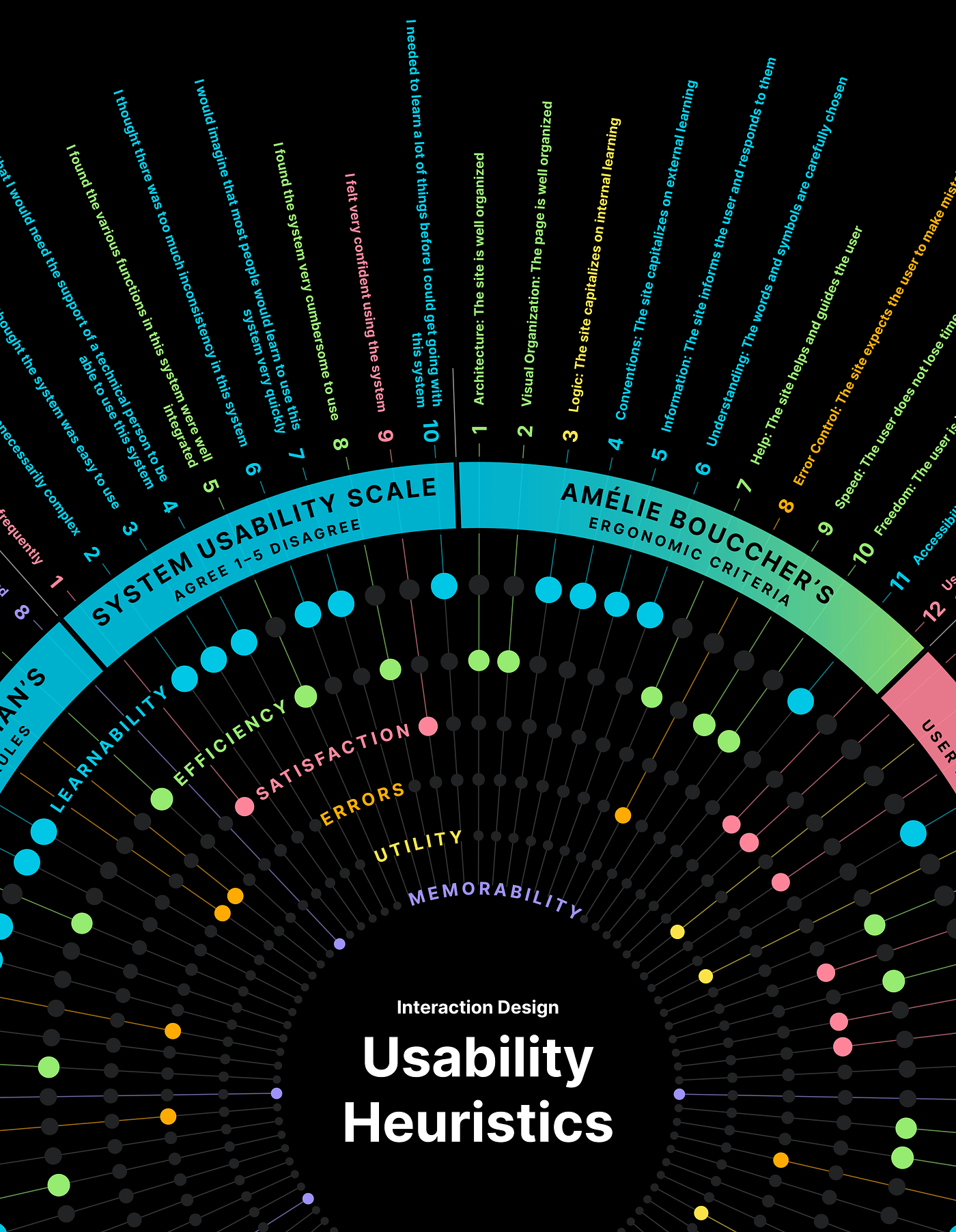
Amélie Boucher’s Ergonomic Criteria
Source: Ergonomie web et UX Design: Pour une conception centrée utilisateur.
Resource: Capian.co
- Architecture
The site is well organized. - Visual Organization
The page is well organized. - Logic
The site capitalizes on internal learning. - Conventions
The site capitalizes on external learning. - Information
The site informs the user and responds to them. - Understanding
The words and symbols are carefully chosen. - Help
The site helps and guides the user. - Error Control
The site expects the user to make mistakes. - Speed
The user does not lose time. - Freedom
The user is in command. - Accessibility
A site that is easy for all to use. - User Satisfaction
The navigation is pleasant and meets the expectations of the user.
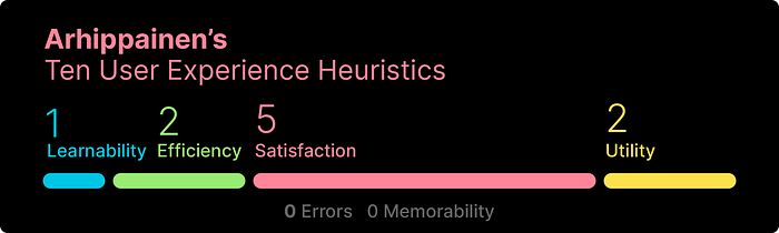
Arhippainen’s Ten User Experience Heuristics
Source: Arhippainen, 2009
- Ensure usability.
Users experience usability. It is important to ensure that the designed service or product is usable. - Provide utility matching with the user’s values.
Utility of the product or service affects the user experience. Perceived utility forgive lacks in usability or other product qualities. Utility is related closely to the user’s values. The user compares the utility of the product against his/her values when choosing to use it. - Surpass the user’s expectations.
Often, the user’s expectations are negative for no reason. Expectations have been formulated via prior experiences or rumor of the product, and thus expectation may have nothing to do with the product in question. The product should be able to catch the user’s attention in a positive way and get a user start to use the product, and then surpass his expectations by easiness, pleasure, utility, whatever quality could fit in the case. - Respect the user.
Know the target user groups. A user’s background has a strong impact on how he/she will perceive the product or system. In addition to the user’s needs and actions, designers are required to understand the user’s values, prior experiences, user type, skills, restrictions, etc. The better the service fits the user’s world, the better experiences the user will have. - Design the product or service to fit the intended contexts.
The service or product is always used in particular contextual circumstances: the user is using a product in a physical situation, with a company or alone through the specific cultural habits and way of life in a certain temporal moment. All these context factors have impacts on user experience. - Provide several ways to interact, leave choice for the user.
People are different and prefer several ways to interact with products and services. It is important to provide several ways to interact. Provide manual and adaptive controls and, touch, gestures and voice based controlling when possible. - Respect the user’s privacy and security.
The world is digital and technologically oriented. Even though attitudes have changed to be more open for technological solutions, people are still concerned about privacy and security issues. User experience is always dependent on the uncertainty of how reliable the service is in terms of privacy and security. - Support the user’s activities — do not force.
All services should be shown from a supportive perspective, e.g. how does this service support me in my actions and everyday life. The service is not allowed to force a user. Forcing will have a negative impact on user experience. - Go for a perfect visual design.
From a user experience point of view, visual aspects have two meanings. The first is that the visual design can improve usability by making the user interface more understandable, consistent and guiding. The other meaning is to make the user interface aesthetically pleasurable by designing visual aspects. Moreover, selections in visual design, for instance, use of colors, can have an impact on user experience by the values one respect (such as health, fitness, nature, beauty). - Give a surprise gift.
This means that people want more. Usability is not enough. “Jackknife phone” is not enough. Users need some extra, which makes them happy: surpass expectations, increase and improve user’s experiences. Breadth of experience is not allowed to decrease. User experience is the seventh sense that people use for sensing technology — sensing life within technology.

Bastien and Scapin’s Ergonomic Criteria for the Evaluation of Human-Computer Interfaces
Source: Christian Bastien, Dominique Scapin. Ergonomic criteria for the evaluation of human-computer interfaces. RT-0156, INRIA. 1993, pp.79. ffinria-00070012f
Resource: Capian.co
- Guidance
User Guidance refers to the means available to advise, orient, inform, instruct, and guide the users throughout their interactions with a computer (messages, alarms, labels, etc.), including from a lexical point of view.
1.1 Prompting
As it is used here, Prompting has a broader definition than usual. Here it refers to the means available in order to lead the users to making specific actions whether it be data entry or other tasks. This criterion also refers to all the means that help users to know the alternatives when several actions are possible depending on the contexts. Prompting also concerns status information, that is information about the actual state or context of the system, as well as information concerning help facilities and their accessibility.
1.2 Grouping/Distinction of Items
The criterion Grouping/Distinction of Items concerns the visual organisation of information items in relation to one another. This criterion takes into account the topology (location) and some graphical characteristics. (format) in order to indicate the relationships between the various items displayed, to indicate whether or not they belong to a given class, or else to indicate differences between classes. This criterion also concerns the organisation of items within a class. The criterion Grouping/Distinction of Items is subdivided into two criteria: Grouping/Distinction by Location and Grouping/Distinction by Format.
1.2.1 Grouping/Distinction by Location
The criterion Grouping/Distinction by Location concerns the relative positioning of items in order to indicate whether or not they belong to a given class, or else to indicate differences between classes. This criterion also concerns the relative positioning of items within a class.
1.2.2. Grouping/Distinction by Format
The criterion Grouping/Distinction by Format concerns more precisely graphical features (format, colour, etc.) that indicate whether or not items belong to a given class, or that indicate distinctions.
1.3 Immediate Feedback
Immediate Feedback concerns system responses to users’ actions. These actions may be simple keyed entries or more complex transactions such as stacked commands. In all cases computer responses must be provided, they should be fast, with appropriate and consistent timing for different types of transactions. In all cases, a fast response from the computer should be provided with information on the requested transaction and its result.
1.4 Legibility
Legibility concerns the lexical characteristics of the information presented on the screen that may hamper or facilitate the reading of this information (character brightness, contrast between the letter and the background, font size, interword spacing, line spacing, paragraphs spacing, line length, etc.). By definition, the criterion Legibility does not concern feedback or error messages. - Workload
The criterion Workload concerns all interface elements that play a role in the reduction of the users’ perceptual or cognitive load, and in the increase of the dialogue efficiency.
2.1 Brevity
The criterion Brevity concerns the perceptual and cognitive workload both for individual inputs and outputs, and for sets of inputs (i.e., sets of actions needed to accomplish a goal or a task). Brevity corresponds to the -goal of limiting the reading and input workload and the number of action steps.
2.1.1 Concision
The criterion Concision concerns perceptual and cognitive workload for individual inputs or outputs.
By definition, Concision does not concern feedback or error messages.
2.1.2 Minimal Actions
The criterion Minimal Actions concern workload with respect to the number of actions necessary to accomplish a goal or a task. It is here a matter of limiting as much as possible the steps users must go through.
2.2 Information Density
The criterion Information Density concerns the users’ workload from a perceptual and cognitive point of view with regard to the whole set of information presented to the users rather than each individual element or item. - Explicit Control
The criterion Explicit Control concerns both the system processing of explicit user actions, and the control users have on the processing of their actions by the system.
3.1 Explicit User Action
The criterion Explicit User Action refers to the relationship between the computer processing and the actions of the users. This relationship must be explicit, i.e., the computer must process only those actions requested by the users and only when requested to do so.
3.2 User Control
The criterion User Control refers to the fact that the users should always be in control of the system processing (e.g., interrupt, cancel, pause and continue). Every possible action by a user should be anticipated and appropriate options should be provided. - Adaptability
The adaptability of a system refers to its capacity to behave contextually and according to the users’ needs and preferences.
4.1 Flexibility
The criterion Flexibility refers to the means available to the users to customise the interface in order to take into account their working. strategies and/or their habits, and the task requirements. Flexibility is reflected in the number of possible ways of achieving a given goal. In other words, it is the capacity of the interface to adapt to the users’ particular needs.
4.2 User Experience
The criterion User Experience refers to the means available to take into account the level of user experience. - Error Management
The criterion Error Management refers to the means available to prevent or reduce errors and to recover from them when they occur. Errors are defined in this context as invalid data entry, invalid format for data entry, incorrect command syntax, etc.
5.1 Error Protection
The criterion Error Protection refers to the means available to detect and prevent data entry errors, command errors, or actions with destructive consequences.
5.2 Quality of Error Messages
The criterion Quality of Error Messages refers to the phrasing and the content of error messages, that is: their relevance, readability, and specificity about the nature of the errors (syntax, format, etc.) and the actions needed to correct them.
5.3 Error Correction
The criterion Error Correction refers to the means available to the users to correct their errors. - Consistency
The criterion Consistency refers to the way interface design choices (codes, naming, formats, procedures, etc.) are maintained in similar contexts, and are different when applied to different contexts. - Significance of Codes
The criterion Significance of Codes qualifies the relationship between a term and/or a sign and its reference. Codes and names are significant to the users when there is a strong semantic relationship between such codes and the items or actions they refer to. - Compatibility
The criterion Compatibility refers to the match between users’ characteristics (memory, perceptions, customs, skills, age, expectations, etc.) and task characteristics on the one hand, and the organization of the output, input, and dialogue for a given application, on the other hand.
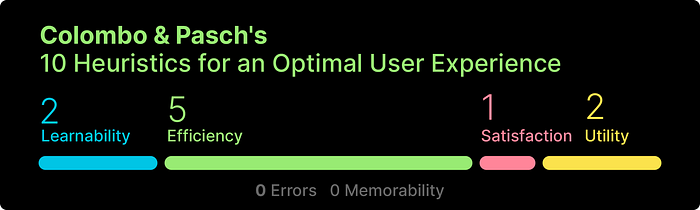
Colombo and Pasch 10 Heuristics for an Optimal User Experience
Source: CHI’12, May 5–10, 2012, Austin, Texas, USA. Copyright 2012 ACM 978–1–4503–1016–1/12/05
Resource: Caspian.co
- Clear goals
The purpose of the system should be clear. The system has to fulfill, or even better exceed, user’s expectations. - Appropriate feedback
The user-system interaction should be sustained through steady, prompt and unobtrusive feedback. - Focused concentration
The system should be simple and intuitive in its use; it should facilitate user concentration on the task at hand by providing meaningful feedback and avoiding nonrelevant distractions. - Ergonomical transparency
The system should almost disappear, be transparent, while used to allow users to focus on the activity and to engage in the experience. - Technology appropriation
Users should be allowed to customize and manipulate the system according to their peculiarities and preferences, to feel familiar with the system, as if the system was tailored specifically for them. - Challenges/skills balance
The system should adapt to the user in that it should be designed to dynamically provide adequate challenges for both novice, average and experienced users. - Potential control
The system should make users feel “free” of constraints and, at the same time, in control of the experience. - Follow the rhythm
The pace of the system should adapt to the user and to the rhythm of the experience. - Know thy user’s motivations
The system should help users to fulfill the motivations
behind its use and to satisfy basic psychological needs. - Conservative innovation
The system should be innovative (and conservative at the same time).
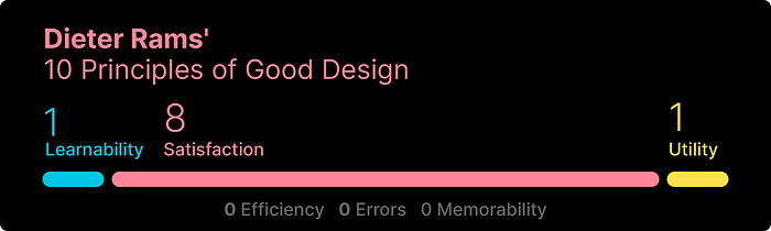
Dieter Rams’ Ten Principles for Good Design
Resources: Interaction Design Foundation, Vitsoe.com
- Good design is innovative.
The possibilities for innovation are not, by any means, exhausted. Technological development is always offering new opportunities for innovative design. But innovative design always develops in tandem with innovative technology, and can never be an end in itself. - Good design makes a product useful.
A product is bought to be used. It has to satisfy certain criteria, not only functional, but also psychological and aesthetic. Good design emphasizes the usefulness of a product whilst disregarding anything that could possibly detract from it. - Good design is aesthetic.
The aesthetic quality of a product is integral to its usefulness because products we use every day affect our person and our well-being. But only well-executed objects can be beautiful. - Good design makes a product understandable.
It clarifies the product’s structure. Better still, it can make the product talk. At best, it is self-explanatory. - Good design is unobtrusive. Products fulfilling a purpose are like tools. They are neither decorative objects nor works of art. Their design should therefore be both neutral and restrained, to leave room for the user’s self-expression.
- Good design is honest. It does not make a product more innovative, powerful or valuable than it really is. It does not attempt to manipulate the consumer with promises that cannot be kept.
- Good design is long-lasting. It avoids being fashionable and therefore never appears antiquated. Unlike fashionable design, it lasts many years — even in today’s throwaway society.
- Good design is thorough down to the last detail. Nothing must be arbitrary or left to chance. Care and accuracy in the design process show respect towards the user.
- Good design is environmental-friendly.
Design makes an important contribution to the preservation of the environment. It conserves resources and minimizes physical and visual pollution throughout the lifecycle of the product. - Good design is as little design as possible.
Less, but better — because it concentrates on the essential aspects, and the products are not burdened with non-essentials. Back to purity, back to simplicity.
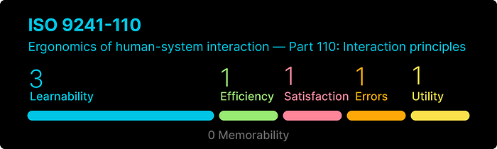
ISO 9241–110 Ergonomics of human-system interaction — Part 110: Interaction principles
Source: iso.org, U.S. Purchase
Note: Access to the ISO 9241–110 principles are restricted. While I had access to the source material for my evaluation, I am unable to redistribute the full content.
- Suitability for the user’s tasks
1.1 Principle
1.2 Recommendations related to identifying suitability of the interactive system for a given task
1.3 Recommendations related to optimizing effort in task accomplishment
1.4 Recommendations related to defaults supporting the task - Self-descriptiveness
2.1 Principle
2.2 Recommendations related to presence and obviousness of the information
2.3 Recommendations related to clear indication of processing status - Conformity with user expectations
3.1 Principle
3.2 Recommendations related to appropriate system behaviour and responses
3.3 Recommendations related to consistency (internal and external)
3.4 Recommendations related to changes in the context of use - Learnability
4.1 Principle
4.2 Recommendations related to discovery
4.3 Recommendations related to exploration
4.4 Recommendations related to retention - Controllability
5.1 Principle
5.2 Recommendations related to interruption by the user
5.3 Recommendations related to flexibility
5.4 Recommendations related to individualization - 6 Use error robustness
6.1 Principle
6.2 Recommendations related to use error avoidance
6.3 Recommendations related to use error tolerance
6.4 Recommendations related to use error recovery - User engagement
7.1 Principle
7.2 Recommendations related to motivating the user to use the system
7.3 Recommendations related to trustworthiness of the system
7.4 Recommendations related to increasing user involvement with the system

Kaniasty’s CARMEL Guidelines
Resource: Heurio.co
- Consistency
1.1. Style guides
The design follows branding or style guides that dictate the use of logos, color, and typography.
1.2. Design patterns
The design follows a cohesive set of human interface guidelines or design patterns.
1.3. Naming conventions
Naming conventions are consistent across pages and widgets.
1.4. Look & feel
Layouts and page elements have a cohesive look and feel.
1.5. Interactions
Similar interactions and design patterns behave consistently. - Accessibility
2.1. Font size
The design meets minimum font size legibility guidelines.
2.2. Contrast
The design meets guidelines for minimum contrast between foreground, text and background.
2.3. Double coding
Visual information is ‘double-coded’ for accessibility by users with color blindness or other visual impairments.
2.4. Target size
The design meets guidelines for minimum target size for mouse and touch targets.
2.5. Screen Readers
The design meets W3C’s Web Content Accessibility Guidelines (WCAG) for users of screen readers. - Recovery
3.1. Confirmation dialogs
The design meets minimum font size legibility guidelines.
3.2. Undo functions
Undo functions prevent major data loss and unintended consequences.
3.3. Error messages
Error messages include instructions for recovery.
3.4. Version control
Version control, history or archiving functions are built into data intensive or collaborative workflows.
3.5. System recovery
The system mitigates impact of catastrophic errors, crashes, and network outages. - Memory
4.1. Limited choices
Lists of critical choices (menu options, navigation categories) are visible in a single view, or limited to <10 items.
4.2. Automatic calculations
The system ‘does the math’ for the user.
4.3. Feedback
Microcopy and microinteractions provide ongoing feedback to the user.
4.4. Chunking and masking
Long strings of text or numbers (security codes, phone numbers) are visually chunked or masked.
4.5. Security practices
Security systems reduce need for spontaneous recall by utilizing password best practices, 2-step-authentication, or single sign-on. - Efficiency
5.1. Shallow navigation
Navigation hierarchy is no more than 3 or 4 levels deep.
5.2. Responsive layouts
Layouts are responsive, or optimized for the screen size of target devices.
5.3. Navigation shortcuts
Navigation breadcrumbs, progress trackers, and keyboard shortcuts improve findability.
5.4. Accelerators
Autocomplete, auto-detect and other accelerators improve task speed.
5.5. Autosave
Auto-save and/or cookies maintain session state and prevent accidental data loss. - Language
6.1. Internal language
Branded vocabulary, internal language, and marketing jargon is used sparingly, and absent from navigation, menus, and buttons.
6.2. Technical jargon
Technical or system jargon is absent from error messages and other microcopy.
6.3. Acronyms
Acronyms include access to definitions, and appear in narrative content only.
6.4. Plain language
Technical, legal, and other potentially difficult-to-understand content is written in plain language.
6.5. Readability level
Content readability level is appropriate for the target audience(s).

Jakob Nielsen’s 10 Usability Heuristics for User Interface Design
Source: Jakob Nielsen Apr. 24, 1994; Updated Nov. 15, 2020
- Visibility of system status
The design should always keep users informed about what is going on, through appropriate feedback within a reasonable amount of time. - Match between system and the real world
The design should speak the users’ language. Use words, phrases, and concepts familiar to the user, rather than internal jargon. Follow real-world conventions, making information appear in a natural and logical order. - User control and freedom
Users often perform actions by mistake. They need a clearly marked “emergency exit” to leave the unwanted action without having to go through an extended process. - Consistency and standards
Users should not have to wonder whether different words, situations, or actions mean the same thing. Follow platform and industry conventions. - Error prevention
Good error messages are important, but the best designs carefully prevent problems from occurring in the first place. Either eliminate error-prone conditions, or check for them and present users with a confirmation option before they commit to the action. - Recognition rather than recall
Minimize the user’s memory load by making elements, actions, and options visible. The user should not have to remember information from one part of the interface to another. Information required to use the design (e.g. field labels or menu items) should be visible or easily retrievable when needed. - Flexibility and efficiency of use
Shortcuts — hidden from novice users — may speed up the interaction for the expert user such that the design can cater to both inexperienced and experienced users. Allow users to tailor frequent actions. - Aesthetic and minimalist design
Interfaces should not contain information which is irrelevant or rarely needed. Every extra unit of information in an interface competes with the relevant units of information and diminishes their relative visibility. - Help users recognize, diagnose, and recover from errors
Error messages should be expressed in plain language (no error codes), precisely indicate the problem, and constructively suggest a solution. - Help and documentation
It’s best if the system doesn’t need any additional explanation. However, it may be necessary to provide documentation to help users understand how to complete their tasks.

Shneiderman’s Eight Golden Rules of Interface Design
Source: Shneiderman, B., Plaisant, C., Cohen, M., Jacobs, S., and Elmqvist, N., Designing the User Interface: Strategies for Effective Human-Computer Interaction: Sixth Edition, Pearson (May 2016) http://www.cs.umd.edu/hcil/DTUI6
- Strive for consistency.
Consistent sequences of actions should be required in similar situations; identical terminology should be used in prompts, menus, and help screens; and consistent color, layout, capitalization, fonts, and so on, should be employed throughout. Exceptions, such as required confirmation of the delete command or no echoing of passwords, should be comprehensible and limited in number - Seek universal usability.
Recognize the needs of diverse users and design for plasticity, facilitating transformation of content. Novice to expert differences, age ranges, disabilities, international variations, and technological diversity each enrich the spectrum of requirements that guides design. Adding features for novices, such as explanations, and features for experts, such as shortcuts and faster pacing, enriches the interface design and improves perceived quality. - Offer informative feedback.
For every user action, there should be an interface feedback. For frequent and minor actions, the response can be modest, whereas for infrequent and major actions, the response should be more substantial. Visual presentation of the objects of interest provides a convenient environment for showing changes explicitly (see the discussion of direct manipulation in Chapter 7). - Design dialogs to yield closure.
Sequences of actions should be organized into groups with a beginning, middle, and end. Informative feedback at the completion of a group of actions gives users the satisfaction of accomplishment, a sense of relief, a signal to drop contingency plans from their minds, and an indicator to prepare for the next group of actions. For example, e-commerce websites move users from selecting products to the checkout, ending with a clear confirmation page that completes the transaction. - Prevent errors.
As much as possible, design the interface so that users cannot make serious errors; for example, gray out menu items that are not appropriate and do not allow alphabetic characters in numeric entry fields (Section 3.3.5). If users make an error, the interface should offer simple, constructive, and specific instructions for recovery. For example, users should not have to retype an entire name-address form if they enter an invalid zip code but rather should be guided to repair only the faulty part. Erroneous actions should leave the interface state unchanged, or the interface should give instructions about restoring the state. - Permit easy reversal of actions.
As much as possible, actions should be reversible. This feature relieves anxiety, since users know that errors can be undone, and encourages exploration of unfamiliar options. The units of reversibility may be a single action, a data-entry task, or a complete group of actions, such as entry of a name-address block. - Keep users in control.
Experienced users strongly desire the sense that they are in charge of the interface and that the interface responds to their actions. They don’t want surprises or changes in familiar behavior, and they are annoyed by tedious data-entry sequences, difficulty in obtaining necessary information, and inability to produce their desired result. - Reduce short-term memory load.
Humans’ limited capacity for information processing in short-term memory (the rule of thumb is that people can remember “seven plus or minus two chunks” of information) requires that designers avoid interfaces in which users must remember information from one display and then use that information on another display. It means that cellphones should not require reentry of phone numbers, website locations should remain visible, and lengthy forms should be compacted to fit a single display.
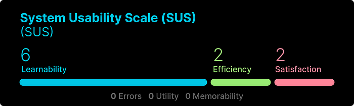
System Usability Scale (SUS)
Source: usability.gov
Participants are asked to score the following 10 items with one of five responses that range from Strongly Agree to Strongly disagree:
- I think that I would like to use this system frequently.
- I found the system unnecessarily complex.
- I thought the system was easy to use.
- I think that I would need the support of a technical person to be able to use this system.
- I found the various functions in this system were well integrated.
- I thought there was too much inconsistency in this system.
- I would imagine that most people would learn to use this system very quickly.
- I found the system very cumbersome to use.
- I felt very confident using the system.
- I needed to learn a lot of things before I could get going with this system.
Bonus Usability Analysis Frameworks
The following two frameworks were not included in the set of 10 due to their expanded heuristics. However, due to their detailed analysis they are worth consideration for your evaluation.
Connell Full Principles Set
Source: CONNELL, I.W. (2000). Full Principles Set. Set of 30 usability evaluation principles compiled by the author from the HCI literature.
Requirements and Functionality Principles
These principles concern the match between what the system does and what its intended users want it to do, and between who those users are and who they are perceived to be by the designers of the system.
Requirements and functional specifications would normally be performed as part of a requirements analysis process.
1. Functional Needs
The set of functions offered by the system (ie. what the system does) should cater for the needs and requirements of the users for whom it is intended.
2. Requirement Needs
The characteristics and functional requirements of the users for whom a system is intended should have been accurately determined.
3. Functional Organisation
The set of functions offered by a system should provide the best means of performing the required operations. The organisation of system functions should match with the expectations and knowledge of the intended users.
4. Functional Provision
The set of functions offered by a system should provide the best means of performing the required operations. There should be no redundancy or under-provision of system functions, there being exactly those required and no more.
User — System Principles
These principles concern the ‘flow of interaction’ between user and system, that is, the sequences of choices and actions which the user makes in response to the system, and the types and nature of the messages, displays and other outputs which the system presents to the user.
The range of issues include the locational and navigational information which the system provides to the user, the type of feedback which is given in response to user commands, the way in which the system defines and handles errors, the range of choices available to the user at each stage in interaction, and the terminology and language used by the system for its text messages and displays.
5. Minimum Steps
It should be as easy as possible for the user to move (in steps or stages) between system states and between functional components. There should be minimum number of steps between related components, and un-necessary repetition of step sequences should be avoided.
In a multi-state (eg. multi-tasking) system, there should be a means of access to states which are hidden or occluded
6. Minimum Retraction
It should be as easy as possible for the user to move (in steps or stages) between system states and between functional components. There should no un-necessary retraction of steps already made.
7. Memory Load
Complex input formats should be avoided where possible. If they are necessary, indication should be available concerning the format required, and defaults should be provided.
8. Error Management
Prevention of erroneous user actions (before the action) is preferable to identification (after the action).
User actions with potentially serious consequences should be completely prevented, or warning given before final initiation. In both cases, the consequences of the error should be indicated, along with any alternative action(s). User actions with less serious or trivial consequences should be immediately retractable; this includes the provision of a general
‘undo’ facility.
Compound or complex inputs should be retractable and modifiable before initiation.
The tone of error messages and warnings should be affirmative and positive rather than negative.
9. Feedback
The status of the system (ie. what it is doing) should be visible to the user at all times.
Immediate confirmation of user-initiated processes should be given, and all system processes should indicate that they are continuing. For processes of any length (>10 seconds), indication of elapsed duration or completion time should be given.
All user inputs (ranging from keyboard to tracker ball) should be immediately confirmed. All continuous user input should be matched by appropriate feedback.
10. Locational Information
It is important that the user knows ‘where’ in the system they are, that is, what step in an interaction sequence they have reached and what they can do from it. Thus every system state (eg. screen, window, dialogue box) should be labelled or titled.
The relationship of every system state to other states should also be indicated. Thus as well as labelling, each state should indicate the range of user options which it permits. These should always include a return to the previous state; it should not be possible to enter a state from which there is no exit. Where states represent different functional modes, those modes should be clearly distinguished.
11. Locational Modes
Where states (eg. windows, screens) represent different functional modes, those modes should be clearly distinguished. Where different states (eg. windows) can be opened concurrently, the ‘top’ or currently active state should be clearly indicated. It should also be possible to determine which states are currently open, and to switch between states.
12. Choice Availability
At ever system state, the range of user options should represent those which are appropriate from that state. Thus neither too few or too many choices should be available from any one state, a balance being maintained between the number of steps required for particular operations and the number of options available at each step. The range of choices at any step should not appear overwhelming or impossible to encompass.
Each option available at a state should be functionally distinct from the other options at that state.
13. Terminology and Language Style
Terminology and language style should match with the experience and background knowledge of the intended users.
The size, format and complexity of each piece of text should be minimally sufficient to convey its intended meaning.
14. Visual Metaphor
The system should encourage users to create for themselves a coherent conceptual model of its functions and organisational structure. This can rely on metaphors from the user’s environment or task domain, using visual and other representations of real-world objects and operations. The use of visual metaphor is particularly appropriate in this context.
User Principles
These principles concern the degree to which the system caters for the user’s preferences and the need to adapt the system in line with those preferences. It also concerns the way in which the system can cater for more than one style or type of user input.
The content (as opposed to the style) of the system output is also dealt with here, along with the need for emphasis of certain parts of that output.
15. Functional Modification
The system should allow users to modify or adapt some aspects of its functional scope and organisation to fit with their level of experience or preferences. This might be in line with other, similar, applications and systems (or previous versions of the same system).
16. Step Modification
The system should allow users to modify or adapt some aspects of its functional scope and organisation to fit with their level of experience or preferences. This includes shortcuts for frequently used operations or sequences. Default or given shortcuts may themselves be modifiable, as may the default set itself.
17. Multiple Initiation
While single operations will normally be performed in one fashion, in larger systems it will often be possible to complete a particular operation from more than place in different sequences. Thus the initiation of operations may be from various steps in more than one sequence of steps.
18. Multiple Inputs
In mixed-input systems (eg. allowing combinations of mouse and keyboard), it may be possible to perform most operations using more than one input mode.
19. Accuracy of Content
Each piece of information conveyed by the system should be accurate, unambiguous and explicit.
20. Salience
Some system components may be of particular salience, either exceptionally (unlike the remainder of the system, occurring rarely) or prominently (in terms of its importance for system operation, or having particular content). Such components should be given appropriate emphasis.
21. Consistency
The steps required to complete any one operation should be consistent. Movement between components should also operate consistently, such that the user should be able to predict what the result of a particular movement will be. The layout any one component or state should not differ according to the type of operation being performed. Thus the range of options available from any one state should not change, nor should the relationship between different components and sub-components.
Terminology and language style should remain consistent across components and states, as should the format of informational content of the same type. All messages and feedback should be consistent in style and format. All salient (exceptional or important) content should be consistently emphasised.
System Performance Principles
These principles concern the degree to which the system inhibits or imposes restrictions on the user’s ability to physically manipulate its components. As well as responsive to inputs and manipulation of screen objects, it includes the ability to switch between active processes and components, and any delays
between input and initiation of processes.
22. Manipulability
The user should have the maximum freedom to switch between components and to arrange interface elements. In a multi-tasking or multi-state system, there should be means of access to states which are hidden or occluded, and means of switching between active states. In a graphical system, containing objects such as windows should not be immovable, or prevent interaction with other objects, without good reason.
23. Responsiveness
System components which are physically moveable by the user should present no resistance. There should be minimum delay in the initiation (as opposed to processing time) of system processes.
Perceptual and Motor Principles
These principles concern the visual and auditory load which is presented to the user by the system, the motor load (number of physical actions) which the system puts on the user, plus the clarity and contrast of and between screen images.
24. Visio-Perceptual Load
The visual load presented by any system component (in a multi-state system, a combination of components) should not appear excessive. This includes clutter, alignment, grouping, colour, etc.
25. Audio-Perceptual Load
The auditory load presented by the system should not be excessive. Audio output should be used sparingly, such as to indicate salience, and volume levels should be adjustable.
26. Motor Load
The number of physical actions required of the user should be kept to a minimum. Thus apart from the requirement to keep the number of steps in any sequence to a minimum, the motor action required to accomplish a sequence should also be minimised.
27. Perceptual Clarity
All graphical objects should be both discernible and distinguishable from other objects. All Explanation text should be readable (via font size, type and line separation).
28. Perceptual Contrast
The contrast between visual objects, including text, and their background should be sufficient to discriminate them, but should not be excessive. Positive polarity (dark on light) is preferable to negative (light on dark), and common colour clashes (red-green, blue-black, blue-red, blue-yellow) should be avoided. Saturated (bright) colours should be avoided unless used to indicate exceptional salience.
User Support Principles
These principles concern the nature and extent of online assistance which is available to the user, both as general, searchable help and as context-sensitive help.
29. General help
Online help should be provided and should be accessible from any state or component. It should be possible to search the material in more than one fashion. The amount of material should not be excessive; a minimum focus is the steps required to achieve operations. Illustrations and examples from the system should be used wherever possible. The means of navigation through help material should be consistent with that used elsewhere.
30. Context-Sensitive Help
In addition to searchable online help, material relating to the context of use should be available from every state or system component. This is particularly necessary for error states, where the material should amplify and not supplant the information already given. Context-sensitive help should not merely replicate or allow retrieval of the existing general help material relating to the attempted operation.
Weinschenk and Barker Classification
Source: Weinschenk, S and Barker,D. (2000) Designing Effective Speech Interfaces. Wiley.
- User Control
The interface will allow the user to perceive that they are in control and will allow appropriate control. - Human Limitations
The interface will not overload the user’s cognitive, visual, auditory, tactile, or motor limits. - Modal Integrity
The interface will fit individual tasks within whatever modality is being used: auditory, visual, or motor/kinesthetic. - Accommodation
The interface will fit the way each user group works and thinks. - Linguistic Clarity
The interface will communicate as efficiently as possible. - Aesthetic Integrity
The interface will have an attractive and appropriate design. - Simplicity
The interface will present elements simply. - Predictability
The interface will behave in a manner such that users can accurately predict what will happen next. - Interpretation
The interface will make reasonable guesses about what the user is trying to do. - Accuracy
The interface will be free from errors. - Technical Clarity
The interface will have the highest possible fidelity. - Flexibility
The interface will allow the user to adjust the design for custom use. - Fulfillment
The interface will provide a satisfying user experience. - Cultural Propriety
The interface will match the user’s social customs and expectations. - Suitable Tempo
The interface will operate at a tempo suitable to the user. - Consistency
The interface will be consistent. - User Support
The interface will provide additional assistance as needed or requested. - Precision
The interface will allow the users to perform a task exactly. - Forgiveness
The interface will make actions recoverable. - Responsiveness
The interface will inform users about the results of their actions and the interface’s status.
Gerhardt-Powals’ Cognitive Engineering Principles
Source: Gerhardt-Powals, Jill (1996). “Cognitive engineering principles for enhancing human — computer performance”. International Journal of Human-Computer Interaction. 8 (2): 189–211. doi:10.1080/10447319609526147
- Automate unwanted workload
Eliminate mental calculations, estimations, comparisons, and any unnecessary thinking, to free cognitive resources for high-level tasks. - Reduce uncertainty
Display data in a manner that is clear and obvious to reduce decision time and error. - Fuse data
Bring together lower level data into a higher level summation to reduce cognitive load. - Present new information with meaningful aids to interpretation:
New information should be presented within familiar frameworks (e.g., schemas, metaphors, everyday terms) so that information is easier to absorb. - Use names that are conceptually related to function
Display names and labels should be context-dependent, which will improve recall and recognition. - Group data in consistently meaningful ways:
Within a screen, data should be logically grouped; across screens, it should be consistently grouped. This will decrease information search time. - Limit data-driven tasks
Use color and graphics, for example, to reduce the time spent assimilating raw data. - Include in the displays only that information needed by the user at a given time
Exclude extraneous information that is not relevant to current tasks so that the user can focus attention on critical data. - Provide multiple coding of data when appropriate
The system should provide data in varying formats and/or levels of detail in order to promote cognitive flexibility and satisfy user preferences. - Practice judicious redundancy
Principle 10 was devised by the first two authors to resolve the possible conflict between Principles 6 and 8, that is, in order to be consistent, it is sometimes necessary to include more information than may be needed at a given time.
Dourado and Canedo’s Usability Heuristics for Mobile Applications
Source: Dourado, Marcos Antonio Durães and Edna Dias Canedo. “Usability Heuristics for Mobile Applications — A Systematic Review.” ICEIS (2018).
- Visibility of System Status
The device must keep the user informed about all processes and state changes through comments and within a reasonable time frame. - Correspondence between the Application and the Real World
The device must speak the language of the users and not technical terms of the system. The device must follow the conventions of the real world and display the information in a logical and natural order. - User Control and Freedom
The device must allow the user to undo and redo their actions and provide “emergency exits” clearly pointed out of leaving unwanted states. These options should preferably be available through a physical button or equivalent. - Consistency and Standards
The device must follow the established conventions, allowing the user to do things in a familiar, standardized and consistent way. - Error Prevention
Your device must hide or disable unavailable feature. - Minimize User Memory
The device must provide visible objects, actions, and options to prevent users from having to memorize information from one part of
the dialog box to another. - Customization and Shortcuts
The device must provide basic and advanced settings for setting and customizing shortcuts for frequent actions. - Efficiency of Use and Performance
The device must be able to load and display information in a reasonable amount of time and minimize the steps required to perform a task. Animations and transitions should be displayed seamlessly. - Aesthetic and Minimalist Design
The device should avoid displaying unwanted information by overloading the screen. - Helping Users Recognize, Diagnose and Recover from Errors
The device should display error messages in a familiar language to the user, accurately indicating the problem and suggesting a constructive solution. - Help and Documentation
The device should provide documentation that is easy to find and help, focusing on the user’s current task and indicating concrete steps to follow. - Pleasant and Respectful Interaction with the User
The device must provide a pleasant iteration with the user so that the user does not feel uncomfortable while using the application. - Privacy
The device must protect the user’s confidential data.


