The usability of road signs
The history of road signs goes back to the early 1800s. First road signs were meant for bicycles, they warned cyclists about bad roads, dangerous turns, etc. but with human advancement and the appearance of cars on the roads, signage became important not only for the safety of cars but also for pedestrians. Car crashes and driver mistakes can lead to fatal consequences, so the creation and standardization of signs was a crucial step toward road safety.

But are we doing it all right today? Are modern signs creating a good user experience?
I chose the topic because it has a huge impact on drivers and pedestrians around the world. It is extremely difficult to design road signs as they should be legible, perform the function for which they are intended, should be read and understood by road users in good time for subsequent actions to be carried out safely, shouldn’t be over-designed, but should clearly carry the meaning. Yep, should follow a long list of characteristics. To simplify: road signs should keep us alert and safe, so they should provide information very quickly and very intuitively.
We often talk about patterns in digital design, we use similar patterns across different digital products to ensure a good user experience, fast learning time, and low error rate. Road signs are a common type of physical pattern and users learn and use them every day. They help us navigate in the physical world and in my opinion, making sure they provide a good user experience is very important and should be taken care of.
To start the conversation and convey the idea of the article, let’s look at the simple example of a problematic road sign. Japanese STOP sign:

Despite the fact that most of the population outside Japan would have a hard time understanding what the sign says, different shapes are also a problem. For me, personally, the red octagon seemed so standardized and globalized, I would never have thought that the triangle on the left was also telling me to STOP. The problem I came across during research was that a lot of road signs are not consistent across territories. For example, If you learn all the road signs in Europe, you might not be able to understand signs in Asia. Or even worse, you might be used to signs in a specific European country and might not be able to understand signs in different European countries.
Another representation of the same problem is a Couple of Czech signs. 2 years ago, I was traveling around the Czech Republic and visited 5 cities. I came across a lot of textual signs and it was really hard for me to understand any of them. They usually didn’t have any visual clue to correspond to their meaning. For example:

These types of textual signs were very common, even on the highways it was very confusing and most signs didn’t have any other hints to show the meaning.
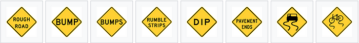
It turns out textual signs are more popular across America. American signs mostly rely on blocks of text, whereas it is not common in Europe. Originally, with faster cars, it was recommended to have Pictograms on traffic signs to quickly grab drivers’ attention and convey the meaning. It is proven that the faster driver goes, the narrower their field of vision becomes. So it is not only extremely hard to read blocks of text, but can also be hard to spot a warning sign at all. So on one hand, it might be possible that these blocks of text may distract the driver, or maybe be easily missed and neglected. On the other hand, it might be used to be sure that everybody gets the correct idea and doesn’t misunderstand the pictogram. The problem with text blocks can be explored deeper, for example when these signs are combined together, they create a visual cluster, which makes it even harder to read and understand. Furthermore, American textual signs seem less alerting, therefore, less likely for the driver to slow down and take time to read through.
Another difference is the color of the signs and shapes. Using orange and yellow colors for the warning signs may be associated with widely known danger signs.
We are used to paying attention and feeling danger while seeing the combination of black and yellow.
On the other hand, most European counties use white and red, which also creates great contrast in bad weather conditions. Red color and triangle shape is also widely associated with warning and quickly grabs attention. The exception is with American speed limit signs, they seem less attention-grabbing than European speed limit signs, which is strange because speed limit signs can carry one of the most important information at the moment of driving. They also can be easily confused with regulatory signs, which drivers may easily neglect. European countries, in contrast, use the same color combinations as for warnings.
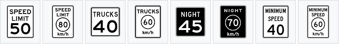
Problems may also be caused by metrics. For example, European drivers measure speed with km/hour, while American drivers rely on mph. So signs that only tell you the number and not the km/hour or mph can be misunderstood by both sides.
Static and dynamic signs
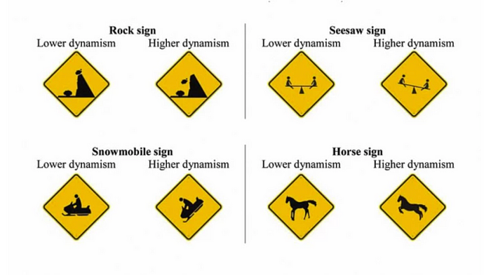
According to Courtesy Brigham Young University research, drivers tend to pay attention more to dynamic signs than to statics.
To break it down, it seems like drivers become alerted when they feel like children are really about to run out, like the sign itself is more realistic. Signs showing higher dynamism are drawn in action, so it might be possible, that changing static signs to dynamic ones can slow down traffic and get drivers to be more focused on the road.

International Road Sign Comprehension Evaluation Project conducted by the UNECE Expert Group had shown very interesting details, research focused on people from different countries perceive signs. The highest rate of recognizability among signs was shown for prohibition signs with red bars over or under the main object. During observing prohibition signs I came across an inconsistency :
For direction prohibitions, most European countries use red bars across the red circle
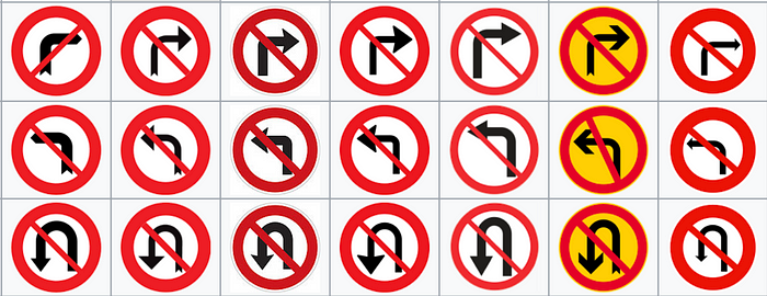
But for other types of prohibitions mostly only a red circle and the object :
The study shows that people recognized signs with red bars better and had a hard time associating only the red circle with prohibition. It can be easily predicted, that crossing things make them seem banned.
Another obvious finding was associated with minimum speed limit signs, research showed, that placing textual small clues with the number makes a huge difference. For example, most European countries show a minimum speed limit this way:
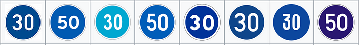
Whereas in America, people rely more on simple black and white, text-dominated signs
Research showed, that showing the only number isn’t that intuitive or recognizable for participants, and adding a measurement system and a word gave it more meaning and made it more globally understandable. But relying only on black and white signs for both maximum and minimum speed limits can also create unnecessary confusion on the road. So maybe mixing the two can get us somewhere?
The signs shown above are the most common signs people usually see and use as a guide, there are a bunch of other signs which are even harder, more complex, and sometimes impossible to recognize, but the point of the observation is that we have room for improvement in this area and even if done right, we can apply methods and frameworks we use for developing digital experiences, on physical experiences. Learn to observe user actions, pay close attention to cultural and geographical differences and constantly improve these kinds of physical experiences to ensure safer, simpler, and more convenient everyday living.