Member-only story
We should bring back the retro 3D buttons of OS X’s Aqua UI
A SwiftUI tutorial.

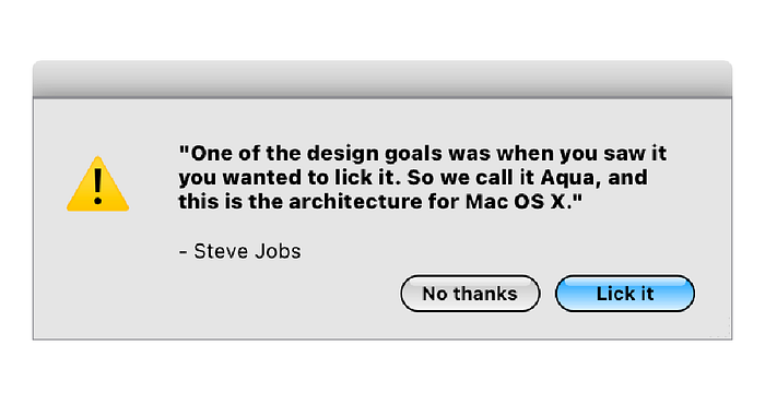
STEVE: One of the design goals was when you saw it you wanted to lick it. So we call it AQUA, and this is the architecture for Mac OS X. And we are incredibly, incredibly excited and pleased with how this has turned out. Now when we talk about user interfaces, um, let me show you… So these are the user interfaces out there, they’re all credible, they all work. How do we take this to the next level? Well let me show you a few slides on Aqua, and then I’d like to demonstrate for you.
The original Mac OS X (version 10.0) introduced a new User Interface called Aqua.
As you can see above, Steve Jobs was confident that it would look good enough to lick. This was probably due to the way that the lighting on the button bubbles made them seem like candy. This is a tutorial for recreating the dialog box above, which more closely resembles OS X 10.5, otherwise known as Leopard. The main differences between this version and previous versions are the lack of pinstripes behind the content or brushed metal effect on the top bar.
We’ll start with the most difficult part, which is replicating the Aqua button.

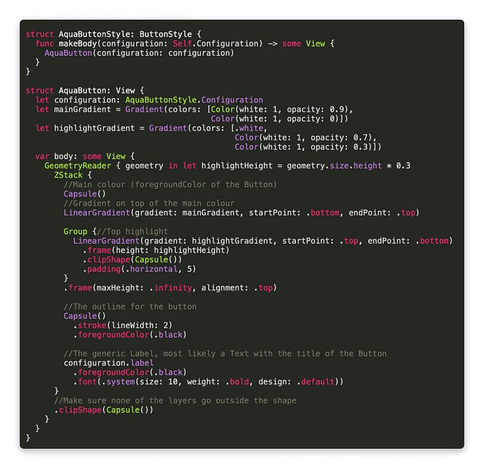
There’s a lot going on here, but I’ve commented it which should help. At the top we’ve created a structure that conforms to the ButtonStyle protocol, which requires the makeBody(configuration:) function. The function is passed a ButtonStyleConfiguration, which only gives us the Label and the isPressed Boolean. While we won’t be doing anything with the isPressed state, the Label provides a generic View that was created as part of a Button.
In my examples the Label will take the form of a Text.
In order to allow the foregroundColor modifier to work, there is a Capsule shape at the back of the ZStack with no explicit colour of its own. On top of the colour we have the main gradient, which goes from almost opaque white to completely transparent white. On top of that is a highlight that itself resembles a Capsule that is less wide than the button.


