User flows, then and now: Bezos style
An incomprehensive history of Amazon’s UX/UI features and assumptions about its user flows
Amazon, where you can order anything from A to Z, from an air-fryer to a ZORFIN fanny pack — a fashion waist pack belt bag with adjustable strap for outdoor workout traveling casual running hiking cycling, the #1 Best Seller in “Fashion Waste Packs,” Amazon, where shopping is made easy! Like…very easy…too easy…
I don’t know about you, but instant gratification is a pretty motivating force for me, and if I’m being honest, Bezos hasn’t been the best accountabilibuddy. For him and me alike, our goals are pretty much the same; user ease and convenience while purchasing a product on the website.
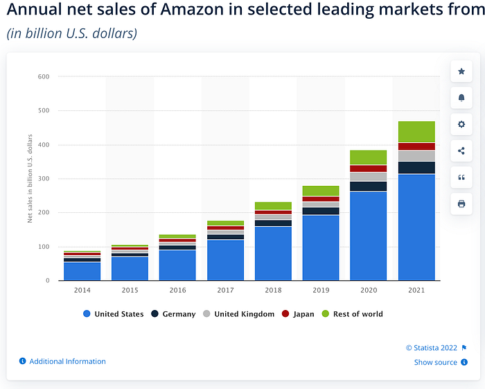
With online shopping being at an all-time high and projected to grow even more in the next couple of years, it’s no wonder why users expect more from e-commerce sites. It’s also no surprise that Amazon’s worldwide annual net sales increased from less than $100 billion to nearly $500 in just seven years.

So, it’s clear that Amazon has somethin’ going for them, and it’s working pretty well, and I’d be willing to guess that a focus on good UX, enabling a better user flow, and well thought out information architecture has much to do with their success. Let’s break it down!
***Please look at the links above if you’re unsure what those terms mean. That will help you understand the following material***
A brief history of their design over the years
Note to the reader: The following sections will be cited from this article, published by Version Museum. I will summarize everything in that article and use all its photos and sources. For a more in-depth understanding, please click the link above. Give credit to where credit is due…
The early stages (1994–1995)
Bezos saw the potential of the World Wide Web and what impact it could have on e-commerce. While deciding between a few different names for the company, he eventually landed on “Amazon” — to reflect ideas of grandiosity and abundance. The company was officially founded on July 5th, 1994.
Original Amazon website
Starting with the logo, an abstract letter ‘A’ with a river flowing through it, we see the original purpose of the e-commerce store was focused on books. Amazon offered more than 1 million book titles, putting competitors to shame. Take a look at a “very typical design for 1995,” as the author states.

My thoughts: I can’t speak much about the user flow, but I can draw some assumptions based on the information architecture provided. Which, to be fair, is also a little confusing, as the information provided on the page are just hyperlinks. So I’ll say no more about that… Back to the summary!
Another early Amazon Homepage (1997)
With the company off to a good start, raising $54 million soon after launching, the website underwent significant changes. A left sidebar was added for more straightforward navigation (also providing more clear information architecture!), making the site much more usable. Take a look:

One might be able to make more assumptions about the user flow as more information is provided here. The information seems more organized, easier to understand, and starts to look closer to the Amazon we know today, but still, a ways to go!
Introduction of tabs and more navigation features (1998)
At this point in Amazon’s history, its ambitions grew beyond selling books, and as a result, tabs were introduced as well as the search bar. Information architecture is becoming more precise, and a more clear user flow is now visible. Take a look:

By this point, user experience has made a huge leap. Assumptions about the user flow become more apparent as navigation options expand.
Possible user flow:
User: Opens website → searches keyword → adds product to cart → opens cart → orders product.
Even based on UI features, we can see how much easier this website version would be more user-friendly and convenient.
Product expansion, zShops, and auctions (1999)
zShops: Individuals, mega-conglomerates, and small manufacturers were now able to set up a shop to sell products on Amazon’s platform.
Tabbed navigation became more practical when other products were featured on Amazon’s platforms. Amazon wanted to expand its services. A right sidebar was also added.
zShops would allow third-party sellers to showcase products on Amazon, which would eventually become the Amazon Marketplace in 2000.
Amazon experimented with Auctions in this timeframe, but that was later shut down in 2002.

Okay, so here's the point where a user flow might be a bit more involved and more complicated as more UX/UI features have been added and the introduction of more products and, yet again, more precise information architecture…I’ll give it a shot.
Possible user flow:
User: Opens website → Sees more products → option to use the search bar or tabs → decides to use tabs → Should I buy my kid a toy? Y/N → adds toy to cart (or doesn’t) → continues browsing → adds intended product to cart → checks out with or without additional products → continues browsing or leaves the site.
Again, this is a total assumption of the flow and the persona, but a possibility nonetheless. It shows that Amazon’s convenient platform, as history shows, creates more revenue for the corporation. With this development, the user has more opportunities to browse, buy, browse, cart, etc.
You can see where this is going. The more features added to the website, the easier it would be for users to purchase whatever they need in just one spot. With more straightforward navigation and overall better user experience, a user is more likely to become a returning customer.
I could go through more years of development, but I’d like to skip forward a few years to 2008, when significant changes in the site’s UI began to occur.
Tabs begone! (2008)
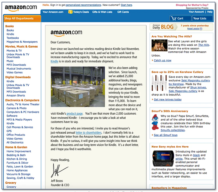
The tabs became obsolete in favor of the left sidebar by popular demand. The color scheme became more uniform, and a prominent logo made for a more robust visual hierarchy.
The kindle, being released in 2007, took the limelight as it took up the most valuable real estate — its homepage.

That’s right. Amazon selling…Amazon…
I’ve not much to say, as you may have recognized a trend by this point:
Amazon continues to develop better UX, implement better information architecture, and remain user-centric while also making intelligent business decisions by expanding its product market.
Let’s fast forward to a more recent Amazon, then draw some conclusions.
(If you’re interested in seeing the in-between years, here’s the link to the article I’ve been summarizing)
Amazon selling itself (2016–2019)
Amazon continued to be a site that sold a wide variety of products, but it started featuring more of its own products in recent years. The design became much slicker, with a simpler UI and accessible navigation features.

Amazon, by this point, had grown into a massive company, producing billions of dollars, able to sell its own products at record levels, creating even more revenue.
My first thought when I saw this was, is this really what users want to see when they open the website? I assume they had done research to confirm this decision, but maybe not! I’m not sure, but it certainly seems to lean toward benefiting the business and not necessarily the user.
After thinking on this for a while, I concluded that even if users did not necessarily want to see Amazon products when they open the website, it wouldn’t matter. Most people probably use Amazon when looking for something specific, so they search it! Again, this is an assumption and maybe just a reflection of how I use Amazon.
Amazon now
Over years of redesigns, Amazon now is much different than its humble beginnings. The landing page is formed solely based on what users are interested in. Like any social media site, algorithms are included based on what the user has searched, favored, or visited.
These algorithms show you items similar to ones you’ve recently purchased or viewed. If a user no longer wants to see a specific item, they can altercate the algorithm so that item no longer lingers on your home page.
It seems as though Amazon has continued to understand its users and their flows and has iterated designs based on that knowledge. Navigating Amazon, to me, is a very natural process because my goal 95% of the time is to search for a specific item and then order it. But if I’m not searching for a particular item, I would know exactly where I could find something. This is a result of good information architecture. The product information is organized to make products accessible and easy to find.
I’ve mapped out my user flow to study how many steps I might take when purchasing something. The goal for this particular flow was to show when I buy something specific. I created this flow while using my mobile, as I usually do when using Amazon. I am also already signed in. Here is the result:

Most of the time, purchasing an item only takes 4–5 steps for me. I did not consider when I might put an item in my cart, which happens occasionally, but even if that were the case, it would still only be a few steps. Like I said at the beginning, this makes online shopping very…very…very…easy…
The takeaway
User flows make or break a design, in my opinion. If a task takes too much time or has unnecessary steps that cause frustration, bouncing from the website becomes a higher possibility. Amazon, over the years, has learned how to cut steps to increase usability, thereby making it easy for users (especially me) to keep coming back. With Literally one tap and one swipe, I can have an item arrive on my doorstep, sometimes on the same day of ordering.
The usability improvement with most e-commerce products over the years, especially Amazon, is astounding. This shows that user experience is also improving at a rapid rate. The need for easy and understandable user flows while completing a task on a website is and always will be crucial for a successful product. To satiate a user's gratification through an online experience should always be at the forefront of the designer's mind. Where will we be in ten years? Five years? One year? Tomorrow? One can only speculate, but one thing is sure: Bezos is pretty ahead of the game when it comes to good flow, and for that, we thank you, Jeff!

