User onboarding lessons from The Legend of Zelda: Breath of the Wild

As a product designer and gamer, I was always fascinated by how the best video games onboard players. How can these games manage to put players through how-to-guides and still make it fun? What makes these video game tutorials so enjoyable? How can product designers learn to onboard users in such a delightful way?

As it turns out, video games have been onboarding users for a long time, since the 80s to be exact. And back then, teaching users how to play a game wasn’t the only challenge, as it was common that these users had never played a video game before.
A video game’s onboarding experience can mark the difference between becoming the next hit or a total flop. Products are not usually measured to such high standards. Why? It’s a matter of journey vs destination.
Digital products are all about getting to the destination. As long as the destination proves valuable, users are more than willing to forgive a terrible journey. But this isn’t so for games, as games deliver the value through the journey, rather than the destination. In other words, the best of the endings won’t save a game with a mediocre playing experience.
It is this focus on delivering value through the experience that makes games so great at onboarding. To prove my case, I would like to show you how one of my favorite games of all time onboards users. I am talking, of course, about The Legend of Zelda, Breath of the Wild.
Watch the video to get the full experience
The Legend of Zelda, Breath of the Wild (or BotW for short), is a multi-award winning video game. It was released by Nintendo in 2017 and has been acclaimed by critics and gamers alike as possibly one of the best games ever made.
If you have the game, I encourage you to play through the first five minutes again. If you don’t have it, don’t worry, I’ve included a short video below. It’s the closest thing to experiencing the game yourself, and better than reading my writing anyway.
Back already? Let’s go!
Learning by doing
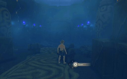
Following the Zelda tradition, the game starts with Link waking up, this time inside a cave. As the video sequence ends, you’ll notice the camera pulling away from the door and stopping right behind you. After this, you are free to move Link around.

That camerawork shows players what to do next in a way that feels nothing like a tutorial. This gentle nudge is always preferable over telling players what to do first. It encourages users to take action on their own without feeling patronized.
A hands-on application of this is to use subtle animated hints to draw the user’s attention. This communicates what to do next in a way that is both unobtrusive and trustworthy.
It’s ok to teach users, as long as they don’t notice. The trick is to make the process feel more like a discovery and less like work. As a rule of thumb, you should try to avoid holding the user’s hand, but if you have to hold it, try to hide it from them.
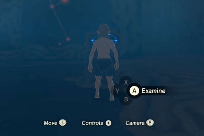
Alright, we are still stuck in the room so let’s get out of here. Notice how focused the UI is, displaying nothing but a couple of basic controls. There are no interrupting dialogs telling users how to do things, just the minimum amount of information needed to get to the next step.
By reducing the number of actions available, players can focus on learning the relevant ones first, allowing them to master those actions before progressing to new ones. After all, it would be nearly impossible for anyone to master all 20 control available in such a short time. This is known as progressive disclosure and it serves a two-fold purpose.
One, it increases learnability by minimizing how much information users must keep in working memory. And two, it reduces the number of mistakes made while trying to use unfamiliar controls.
As we approach the pedestal, a hint message appears, providing help as soon as we can use it, not before. This is better than showing tutorials before users decide to take action, as it avoids unwanted interruptions.
If you look back at the “Examine” hint, you’ll see that it mirrors the button layout, allowing users to find the button faster. And by making the hint available as needed, users don’t have to remember it. They can rest assured that the help will be there if they need it in the future.
Replacing upfront tutorials with on-demand help offers many advantages: users have to think less, they gain a sense of ownership, and it allows you to teach more advanced actions, like keyboard shortcuts.
Better tutorial text for a better experience
Introducing users to unfamiliar features is a well-established practice. It happens during the onboarding of digital products and games alike. And as expected, it happens in this game too. As we continue with the walkthrough, we receive the Sheikah slate.
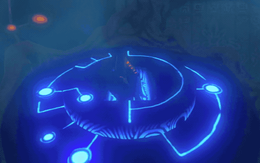
As a user, this moment arrives with uncertainty. Questions come to mind like, What’s this? What do I do with it? How does it benefit me? As designers, it is our job to answer these questions as soon as possible.
When answering, remember that nobody wants to read a how-to-guide, so it’s better to keep it short. A mere 16 words is all we need to answer the most important questions: “That is a Sheikah Slate. Take it. It will help guide you after your long slumber”.
Reducing the information to smaller, bite sized chunks may be harder, but it will pay off.
However, if you can’t bring yourself to reduce the amount of text, here’s a trick to make sure it sticks. Try to end or start with the most important bit, depending on the context. This strategy takes advantage of the human tendency to recall the first and last items of a list. These are known as the “Primacy” (first) and “Recency” (last) effect.
If you are having trouble identifying the most important bit, look for the one telling users how the feature benefits them. This is more important than feature names, your brand, technical specifications, or the latest marketing buzzwords.
Help users discover the app
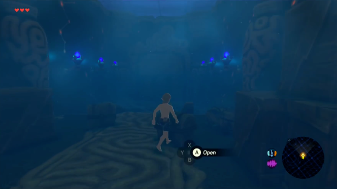
We grab the Sheikah Slate and run through the door, leading us to a pair of chests! What do we do? Open them? Walk past them? Choices, choices!
Resist the temptation to provide help before users take action. Preemptive help is not the magical experience it seems to be, and it will often backfire. First, if you guess wrong, it will feel like you are interrupting what users are trying to do. Second, because users have different skill levels, miscalculations could make them feel patronized. The better approach is to let users choose. After all, don’t we all like to feel in control?
How can you apply this? Help users discover the features, but don’t force their hand, just like the game does with the chests. If the interaction requires help, offer it after users decide, not before. Let users play around. Don’t forget that great experiences encourage users to explore at their own pace.
With so much freedom, how can we make sure users actually engage? Just like how BotW uses treasure, you can use rewards to entice users to complete certain actions. The trick is to make it attractive. A good example is how Dropbox entices users to unlock ‘Free storage’ for installing the desktop app, uploading photos, etc.
Any reward should work, but if you want to maximize engagement, rewards should align with user goals. In the case of BotW, using locked chests is a great way to introduce the hunt for treasure, which is a central pillar in the game. For Dropbox, rewarding users with more storage allows users to store more files.
Show, don’t tell
Link can’t resist the temptation and opens both chests, earning some very useful clothes. Now would be a perfect time to learn how to put them on. But there’s a problem. Explaining how to open the inventory and equip gear is too difficult to use hints. So the designers resort to a new tactic: showing users how to do it.
Using visuals to show users how to perform a task removes the need to interpret written instructions. This minimizes the mental effort and allows users to focus on execution.
Similarly, there are other ways to use animation to minimize mental effort. Right after leaving the chests behind, you will notice a pedestal lighting up as we approach the next door. This animation brings our attention to the next step, making it an easy choice to follow up. These subtle animations can be applied to any interaction where you want to make it easy for users to move forward, like a submit button that animates when you complete a form.
Celebrate the learning moments
After leaving the chests behind, Link goes through a second door by interacting with the pedestal, just like we learned before.
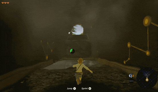
It is past this second door that things get interesting, as two new action hints replace the previous ones: X to jump and B to Sprint. Using these actions drains a resource meter that recovers shortly after. By limiting the hints to what’s new and relevant, users can learn two new interactions with just a few taps. Such is the power of progressive disclosure.
Eager to put these new skills to use, we arrive at something unusual: a wall, blocking our path. As we jump to overcome it, we realize the wall is too tall but… we can climb it!?
Another problem solved and a new skill learned in the process. Evoking this sense of accomplishment is the surest path to a great onboarding.
As a takeaway, look for similar learning moments in your app. They may seem hard to find, but they are worth the time. When you find them, make them part of the onboarding, then celebrate your user’s success, like the game does below.
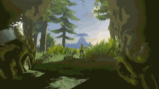
As we make our way to the exit, a flash of light and a rising crescendo give way to a beautiful panoramic of Hyrule. Every moment of struggle built up to this reward. As we gaze over the vast landscape, we can’t help but want more. It’s a teaser to the many adventures awaiting us in the world of Zelda, Breath of the Wild.
Let users experiment in a safe place
If you ask anyone about what makes BotW special, you’ll find an underlying theme: freedom. You can climb anywhere you want, complete the game in any order, solve puzzles in any way you can imagine, use physics in unbelievable ways… the list goes on.
Why then does the onboarding feel nothing like the rest of the game? You start in a cave, with a clear linear-path to follow, and there’s only one solution to every obstacle. Why onboard users in a way that feels nothing like the game itself?
The answer is safety and predictability.
When everything is new and unfamiliar, users feel uncomfortable. It’s a natural response. To help users navigate the unknown, you must help them feel safe. Nintendo knows this, that’s why they have players start the game inside a cave.
Why a cave? Because it’s a familiar metaphor. Users know what to expect: if we are inside, we must go out. It’s also easy to navigate and has none of the distractions of the infinite outdoors. Moreover, the cave’s boundaries reassure users that enemies won’t sneak up on them. When combined, all these contribute to help players feel safe.
A way for you to provide a safe place for users is to onboard them with a demo or tutorial document. The trick is to make it feel disposable. This encourages users to experiment. After all, who cares if you break a demo document?
Give users something to do
Ever heard of the “blank canvas syndrome” or “writer’s block”? It refers to the mental block state people tend to suffer when facing an infinite amount of possibilities. Guess what. The same thing happens when you drop users into a tutorial document with nothing to do, they get stuck.
Many products offer demo documents for users to play around. The problem is, users have no reason to use these documents and they are usually left untouched. If you remember the cave, after every obstacle, not far, there is something to do next. Small goals such as these keep the user focused on the next step, leaving no room for guessing.
When you use demo documents in your onboarding, don’t forget to give users something to do. This will free them from thinking about what to do next, allowing them to focus on completing the task. And if you are up for some extra points, give them something unfinished they can complete.
What to do next: Test and iterate
All the knowledge in the world won’t do anything for you unless you put it to the test. Don’t think you can skip it. Even Nintendo, with decades of experience, considers play-testing central to their design process.
You don’t even need a fancy UX research lab, a little testing goes a long way. Test the onboarding in batches of five users, test it yourself, invite teammates, and eventually, do it with real users. Learn from the results, and use the insights to make improvements, then do it again.
It’s the journey, not the destination
By designing product onboardings more like video games, we force ourselves to deliver a better experience through the journey, instead of focusing on the destination.
Yes, building great onboarding experiences is not easy. And yes, it takes time to get it right. But when you do, users feel engaged, proficient, and they have a great time.
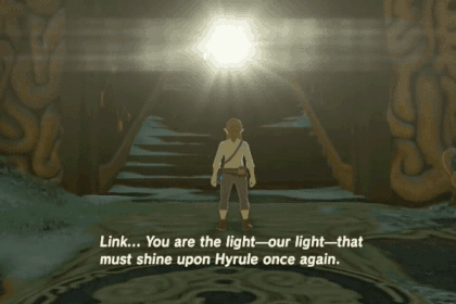
It’s up to you to be the light — the user’s light — and guide them through the unknown.
Now, go…
Further reading and shootouts
References and inspiration.
- useronboard.com You can’t talk user onboarding and not mention Samuel Hulick. His teardowns are hilarious, instructional and free. Check his site out if you want to learn more about user onboarding.
- 3 fundamental user onboarding lessons from classic Nintendo games, by Jackson Noel The piece that inspired me to write this.
- Jacob Nielsen’s piece on progressive disclosure Written by the UX legend himself.


