Using colours in your app interfaces
A study on app interfaces with colours.
Preface
Here’s a great read I came across recently by Yaz on how all the apps are starting to look the same and why it’s a good thing for the users. He talks about how app interfaces are starting to follow a similar clean design pattern — giving more importance to the content and maintaining consistency. I agree to it, the more people get familiar with the interface & navigation the better and easier it will be to use your product.
With more apps starting to look the same, it can be a real challenge for product designers to come up with a unique interface that not only excels in the user experience but also defines the brand of the product.
Colours in interfaces

If all your interface is going to look the same like any other popular app available out there, how can you differentiate it from the rest visually? — This question might have popped up in some of your heads, just like how it happened to me after reading the article.
The success of the product depends largely upon the colours chosen for the design. The properly selected colours help put users in the frame of mind that compels them to take action. The research provided by Colorcom showed that it takes only 90 seconds for people to make a subconscious judgment about a product and between 62% and 90% of that assessment is based on colour alone. — From Colours in Design — Influencing User Actions.
Infusing colours into the app interface that is in harmony with the function and the user experience is a challenging task for any product designer. The colours you choose and use is going to have a huge impact on the product and it’s users. Every tiny bit of colour you use in your app should definitely have a purpose and the need behind it. In addition to this, the interface with colours must reflect the brand value of your product and what it stands for; if not — the use of colours is simply meaningless.
Many apps you use everyday, have put in great efforts with the use of colours in their interfaces. Do go through the examples below and you might get an idea on where and how to use colours in your apps.
Some of the apps you use almost everyday — they use colours in their interfaces without disturbing the content and the experience. The usage is so well executed that it uplifts the overall visual identity and also provides a uniqueness to the product. I have listed some of them with screenshots below — hope it will be a good start for beginners who are looking for references and also for professionals to brush up their basics a bit.
Splash Screens
Splash screens are like the book-covers of your app.Properly crafted splash screens setup the tempo whenever the app is launched.Twitter, Skype, and many more apps present us with a solid fill of their brand colour with the logo as their splash screen.

PayPal also has a gradient fill with a clear logo if you were looking for one.Medium has a pretty interesting splash screen.

Login/Signup
Though these are ought to have form field elements, brands like Facebook and Instagram have made good use of brand colours in their login screens as well.

Onboarding
These screens give more details about the product and what it does and is a playground for creatives. Loads of apps use illustrations (Even photos and videos) — that gets the user engaged with the app. Asana, is one such example which uses colours and also a pleasing motion to all it’s onboarding screens.

Notifications & Alerts
Google Pay brings up a beautiful animation whenever a payment is made successfully. Note the solid fill colour is the product’s brand colour and it has been used as a background for the animation. Similarly, any banners, toasts and dialogues can be customised with the brand colours and tried upon with the interfaces.

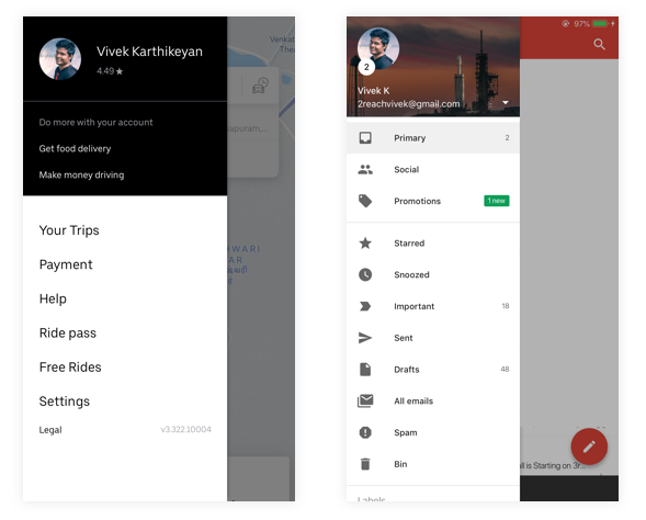
Hamburger menu
The profile details under the hamburger menu in Uber has some colour usage that is used mainly as a background to the profile picture. Gmail and other google apps also provide a colourful background by material design (which can also be customised).
App Store/Play store Images
Seriously? you may ask, Yes. Beautiful app store images can definitely boost the impressions and the number of downloads of your app. Companies and products are slowly realising this and starting to come up with creative ways to make it visually appealing. Here’s how HubSpot does it.

I’m pretty sure there are much more examples live on the app that you use everyday. If you’ve come across such interesting interfaces with colours, please do let the readers know in the responses.
Colours in your product interface is definitely not a must have — use them only when you feel it is absolutely necessary. Uniqueness and brand feel can be brought in using several other ways inside your product than having interfaces with brand colours. Brands like Dropbox and Mailchimp have their own illustration styles with a very minimal use of colours and they still they stand out from the rest.
The future? — I always think everything goes in a cycle. We now see the return of skeuomorphism again in the interfaces and I also hope the clean interface patterns will also take a turn into more colourful ones some day. Let’s see. :) Feel free to leave your thoughts in the responses and I’ll be happy to take them into my learning.

