Creating a simple skeleton loader with CSS
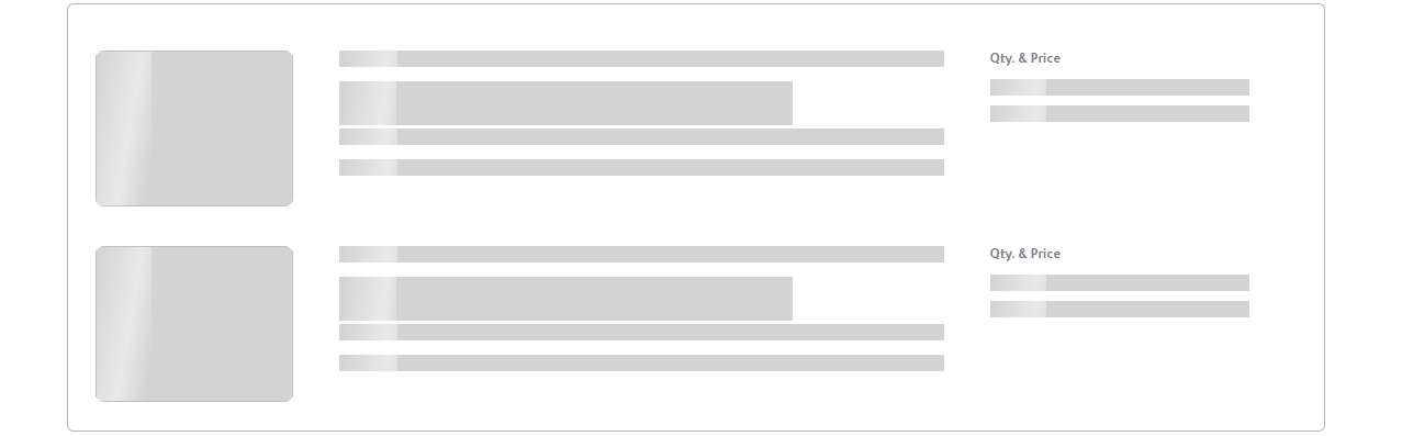
Visual by Author
In this post, we will dive into the actual implementation of skeleton loader step by step. The first post of the series is focused on providing an overview of skeleton loader, its purpose, usage and points to keep in mind while designing. If you are still uncertain regarding concept, refer Skeleton Loader: An overview, purpose, usage and design.
Steps involved:
- Design a background
- Design a gradient
- Animate gradient
- Display loader only for empty placeholders
- Complete implementation
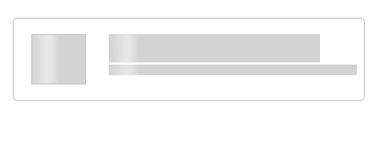
Design a background
We have to keep the background for the placeholders where content has not been loaded yet. These visual placeholders should be in light gray or neutral colors.
A. Create a section for loading content.
B. Create<span> inside that section for adding hooks to a text. Assigned a class “skeleton-loader-background” for styling background.
C. Specify background with light-gray color.

Design a gradient
A. Create a section, span for adding hooks and assign a class “skeleton-loader-gradient” for styling gradient.
B. Specify linear-gradient direction and pattern. Here, gradient will get applied from left to right. It consists of white color with 0% opacity (transparent) in the starting, 50% opacity in the middle and 80% opacity at the end. Also, background contains two values separated by commas. According to specifications, values gets stacked vertically. The first value remains on top and other goes down from there.
C. Repeat gradient vertically i.e. on Y-axis.
D. Specify the size of the gradient i.e. width and height.
E. Set the position of the gradient to start i.e. 0 0.

Animate gradient
Motion plays an important role in applications. It can help to make interfaces more expressive and intuitive. For the skeleton loader, we have to animate a gradient from the left most end towards the right.
When thinking of motion, we should aim for an appropriate duration. If it is slow it makes users feel they are waiting more than they actually are. If it is quite fast it gives a bad perception.
We have to keep the right balance of speed, direction, and easing to give performant experience.
We have a light-gray background and gradient designed. Next, we have to animate gradient from left to right, repeatedly with ease.
A. Create a section, span for adding hooks and assign a class “skeleton-loader” for styling gradient.
B. Specify gradient and light-gray background for loader.
C. Specify animation name, duration and iteration count.
D. Using keyframes rule, specify how the animation will gradually change from the current style to the new style at certain times. Here, it will change background-position from left to right (0 to 100%).

Show loader only for empty placeholders
A. The :empty selector matches every element that has no child elements or text nodes. Here, it will display the skeleton loader only when content has not been loaded.
Complete implementation
Here, we have designed product tile containing image, product name and product description. We are fetching content through live API using JavaScript.
A. DOMContentLoaded will get fired on load of HTML DOM. We will perform JavaScript operations on receipt of this event.
B. Access elements through HTML DOM API.
C. Fetch data from live API. Here, we are using dummy API for fetching product details (https://fakestoreapi.com/products/1).
D. Populate HTML elements with appropriate content.
You can also check my video depicting the designing of the Skeleton Loader as per the steps mentioned above.
Bottom Line
While working with animations, it looks demanding at first sight. However, implementing them shouldn’t be that tough compared to the experience it provides.
Also, you can reuse the CSS anywhere in your code.
For a working example, head over to the repository.
Thank you for your time.

