Using Gestalt principles in UX design
The gestalt principles or the principles of grouping were first proposed by the gestalt psychologist. These principles were proposed by observing humans behavior of grouping the things together, these laws can be used while designing. There are seven laws of Gestalt as follows.
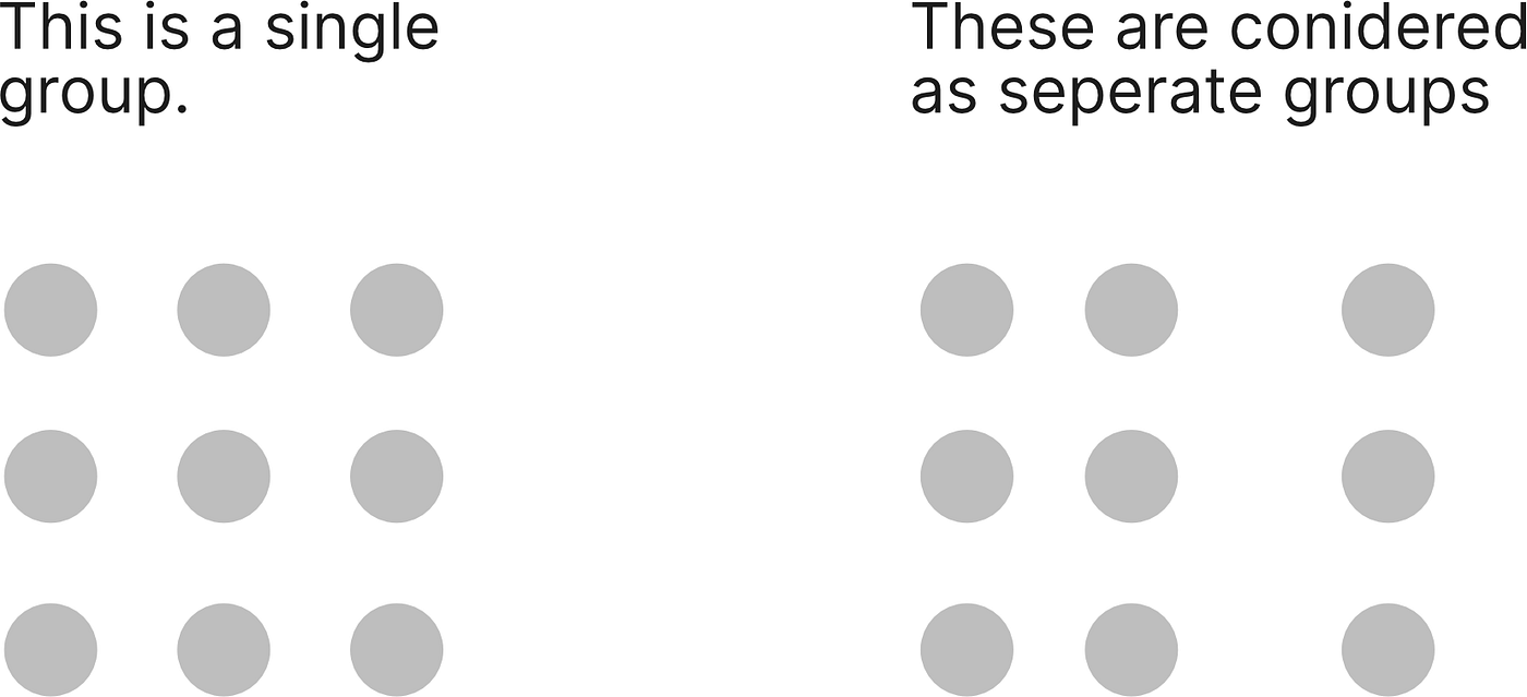
1. The law of proximity
The principle of proximity states that things that are close together appear to be more related than things that are spaced farther apart. For example, look at the following elements, both have the same elements but in first the elements are closed to each other, and in the other, they are separated apart.
Use in UX Design
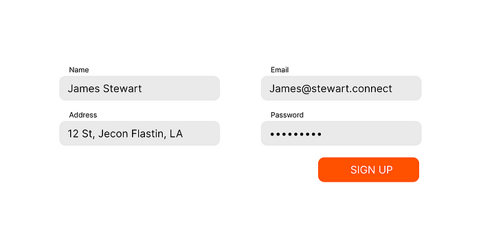
In UX design we have used this law a lot of time, and you can see this law used almost everywhere. In below example, the labels are always placed near to the field text, so that user can perceive it as a single element.

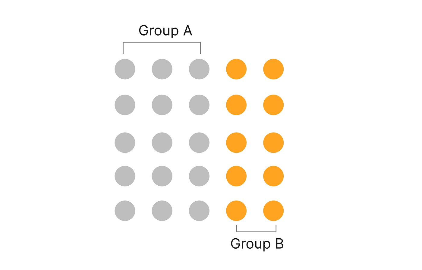
2. The law of similarity
The principle of similarity states that when things appear to be similar to each other, we group them together and we also tend to think they have the same function. For instance, in this image, we have a group of elements but some are colored different, thus user perceives it as different group.
Use in UX Design
In the below login form, the fields and button have the same size, but due to the different color of the button, we know that its function is different. Also in the description text below, we knew that the blue texts are links. Yep that the similarity law.

3. The law of common-region
The principle of the common region is highly related to proximity. It states that when objects are located within the same closed region, we perceive them as being grouped together. You have elements that are grouped together but if you draw a region around it, they behave as a separate group.

Use in UX Design
In UX this law has dominated with the use of cards If you observe cards creates a specific region of information, even if other information is placed near to them.
4. The law of focal point
The focal point principle states that whatever stands out visually will capture and hold the viewer’s attention first. The element that is highlighted than the surrounding holds the user attention first, like the below image you noticed the duck first.

Use in UX Design?
Yes, you guessed it correct! It's a button, we have button all over the digital design, and button always has different eye-catching color/shape so that the user finds it easily, and perform the actions quickly.
5. The law of continuity
The principle of continuity states that elements that are arranged on a line or curve are perceived to be more related than elements not on the line or curve.

Use in UX Design
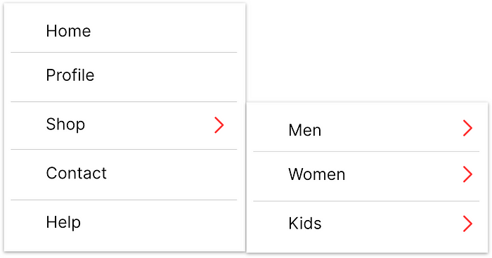
In navigation, you can differ and understand primary and secondary navigation, In below, you can relate home, profile, shop, contact and help as a group of navigation easily because they are arranged in one line rather than home, profile, men, women.
6. The law of closure
The principle of closure states that when we look at a complex arrangement of visual elements, we tend to look for a single, recognizable pattern. This state that you work in your memory and convert the complex object in easy ones. You find the missing part by memory. Why did these moving dots look like a dog?

Use in Graphic Design
In design, this law is highly used to create negative spaced logos. Some examples are below.

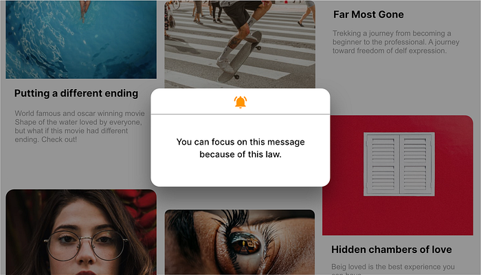
7. The law of figure-ground
The figure-ground principle states that people instinctively perceive objects as either being in the foreground or the background. As a human, you can focus on either the foreground or the background.

Use in UX Design
In UX design this law is used in the navigation panel, modals, and dialogs.