Using Figma’s New Sections Feature
We now have access to the same sections feature that has long been available in FigJam. (As of 10/22) This represents a much needed addition to keeping our design systems, libraries and files easy to use.
What are Sections
Previously, we used shapes or frames to organise our boards. However, frames and shapes aren’t built for organising and can be hard to differentiate and work with.
Enter “Sections”. Purpose built for organisation. They are a new objects similar to frames with a few key differences both in look and behaviour. Let’s take a look at how they work and more importantly how to use them.
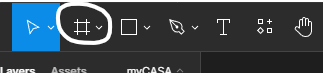
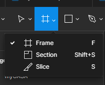
Where are they?
Sections are a new tool under our frame tool, select the frame drop down in the top left toolbar and choose section. (or use the shortcut Shift+S).
How do they work?
Generally they look and can do most of what frames can do with a few key distinctions. There is also a few design features that are focussed on optimising organisation.
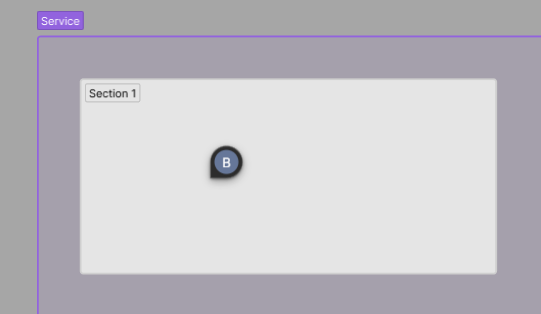
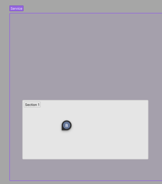
The Design of a Section
Sections have a few visual design differences that make them standout from our frame counterparts:
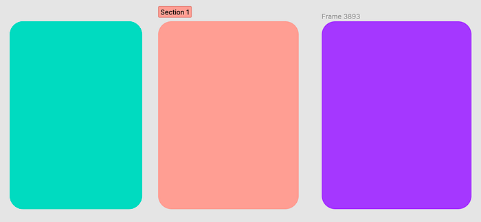
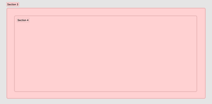
- Sections are by default the page background colour.
- Sections have 2px rounded edges automatically.
- A section heading font is a strong black colour for clarity and is within a box that is given the same fill colour as the section.
- A section heading font colour will automagically adjust their colour in dark or light backgrounds to keep good contrast. (Frames do this too)
- Stroke lines are automatically inside the shape.
- The section heading moves depending on whether it’s nested or not.
- Opacity on fill colour does not affect the heading colour.
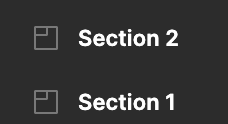
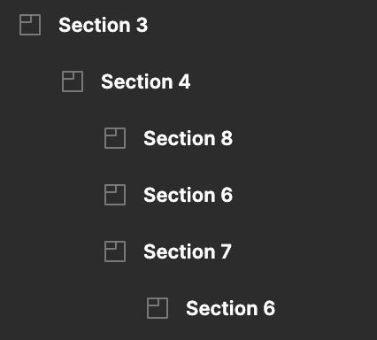
Section Layer Icons
Sections have a new unique icon that helps differentiate them from frames, shapes and other objects design oriented objects.
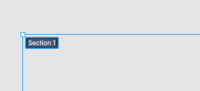
Section Headings
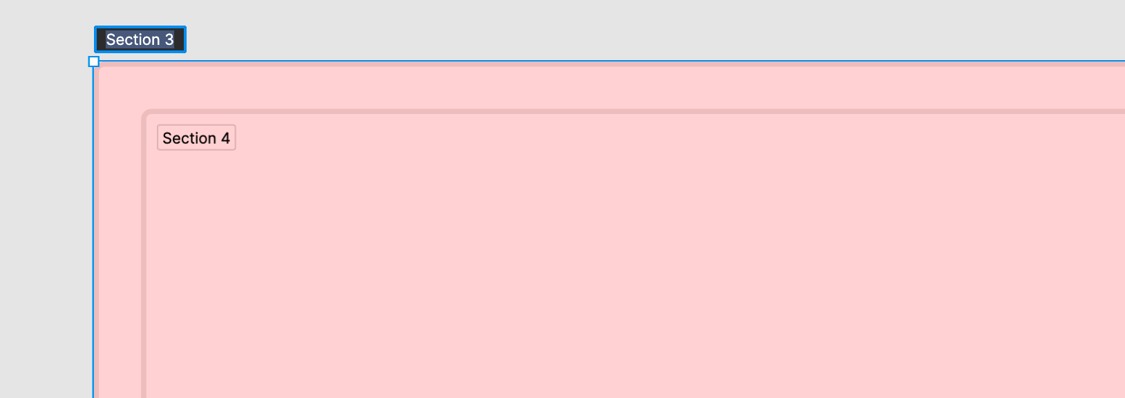
Naming sections is the same as frames though headings. Sections have a new blue highlight that can make it easier to see where you need to double click to change the headings.
Note: f you are not very close to the heading when renaming, it will automatically shift into the section while your rename it. (this can be a bit annoying if you accidentally triple click)
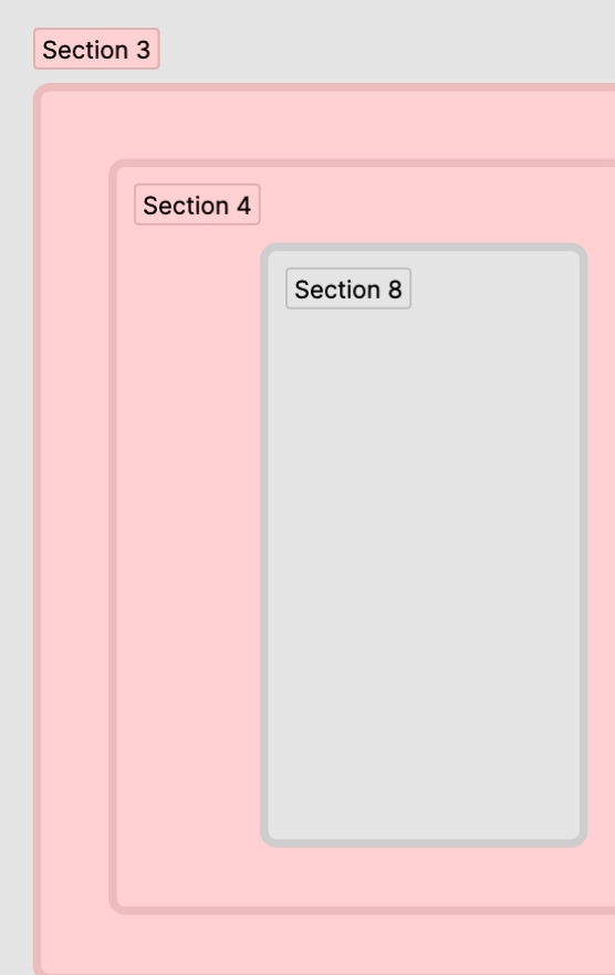
Nesting
We can nest sections the same way we do frames. Occasionally, if you’re duplicating a section rather than drawing a new one it can take a bit for Figma to notice it is nested.
There are some slight differences with frames in that you can’t nest sections inside frames or groups.
Organising
Other than the visual design sections have some small features that help us keep organised:
- Sections automatically push themselves to the top of the layer stack.
- Double clicking the outline of the section will automatically resize it based upon the section contents.
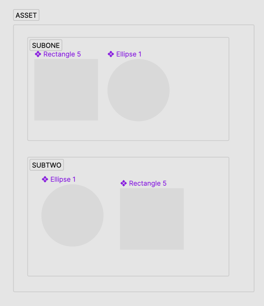
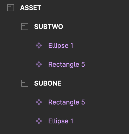
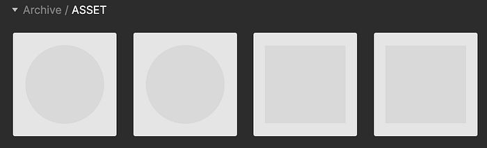
- Different sections with the same name still group assets under one unified name on the asset panel.
- Sections are their own layer object meaning we can treat them as a seperate layer.
- Sections cannot have auto-layout or constraints applied to them.
Prototyping
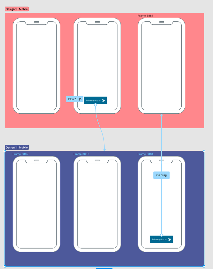
We can wire prototypes to sections themselves and to any screens, frames and subsections within those sections.
Sections are able to contain state, If your prototype links to a section instead of a frame then Figma will remember the last screen you were on in that section if you exit.
This allows you to exit a flow and re-enter at the same point without having to handle any fancy prototype wiring.
This is one of the first “state” features (other than the auto-back feature) Figma has introduced. Exciting!
Exporting
Exporting is 99% the same with sections, except the section title is carried over. This make the export output just a bit nicer.
Comments
Comments now nest and move with sections so you don’t have to shift them across manually when making layout or position changes!!
- Comments don’t move when resizing
- Comments don’t duplicate when copying.
- Comments attach to the the child frame (which ever is nested deeper).

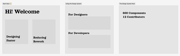
How can we use them?
The new Figma docs have a few great ways they saw use cases being useful, they can:
- Designate areas of the canvas for collaboration or ideation
- Organise files for easier navigation
- Link to a grouping of designs
- Add clarity on what’s ready for implementation during developer handoff
Let’s see some more concrete examples on how we might use sections for these.
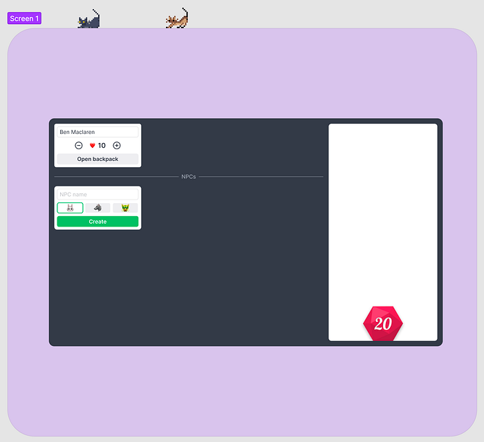
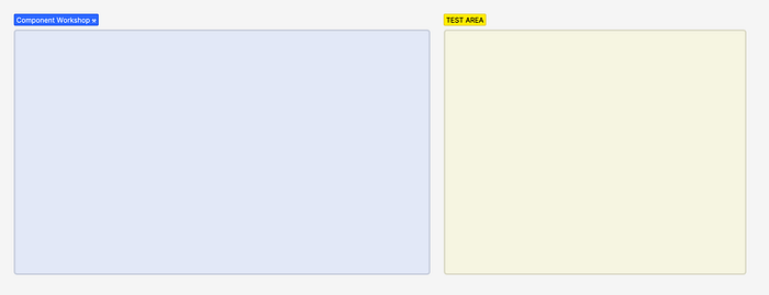
Designate areas of the canvas for collaboration or ideation
It is great having a clearer area for organisation and collaboration. Here we can section areas for:
- Prototyping new components or screens.
- Onboarding or training areas in your file.
- When you need to reserve a spot for experimentation or that is a work in progress.
- Reserve areas for different team members.
Organise files for easier navigation
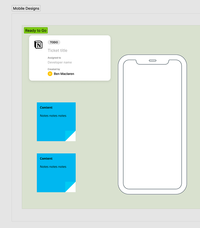
- Using sections we can properly segment areas, indicate status and group in a visual way.
- The new section icons helps us differentiate organisation from our design frames.
Note: You can add emojis to most text layers.
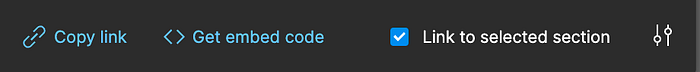
Link to a grouping of designs
This one is something I’ve been waiting on for ages!
Whenever I send links to a developer to reference a design, I always either need to send a link to the first frame, the whole file or the page.
Now I can section the design off and link them to that! This works the same way as linking to a frame.
Note: If you share a link to a section (or frame) then copy and paste that section/frame to another page the link will no longer work. You can use right click “move to page” to preserve the share-link.
Add clarity on what’s ready for implementation during developer handoff
When we combine a the nesting and linking features above we can use sections to indicate what parts of a design area ready for hand-off.

We can also combine these with our widgets, annotations and any documentation to make our designs even clearer.
Section Widgets
There’s been a widget specifically for sections that has caught my eye.
- Table of Contents for Sections: Generates a table of contents automatically for sections on a page.
Widgets used in my images:
Sections is a great addition. It sets the scene for even more future improvements to help us collaborate even better.
I can’t wait to see what we get at the Figma Schema 2022 conference! Feel free to check out my other article The Complete Guide to Figma Branching
I hope this article been useful! If you have questions, things to add or wanna grab a coffee, reach out on linked in or tweet me at BenMaclaren
If you liked this article show your support by clapping or following this author.


