Member-only story
Using spacer components to drive consistency (in Figma)
There are many different ways to organize spacing — with the most popular (probably) being the use of auto-layout. My first big disclaimer — there is absolutely nothing wrong with this method.
Traditional auto-layout method
With the traditional auto-layout method — content is framed from the inside out — similar to the traditional CSS box-model method.
However, working quickly, and applying this method consistently, can be overwhelming for designers who aren’t super efficient with auto-layout.
(Learn your shortcuts!
Command + Option + G = “Frame selection”
Shift + A = “Add autolayout”)
Additionally, heavy use of auto-layout can make collaboration difficult, or at times, it can even make editing your own files frustrating.
(Pro tip: Holding spacebar while dragging something into an auto-layouted frame will ignore the auto-layout!)
Most importantly, for the sake of this article, designers often ignore the spaces between larger sections when using this method, resulting in poor spacing with whole forms.

Spacer method
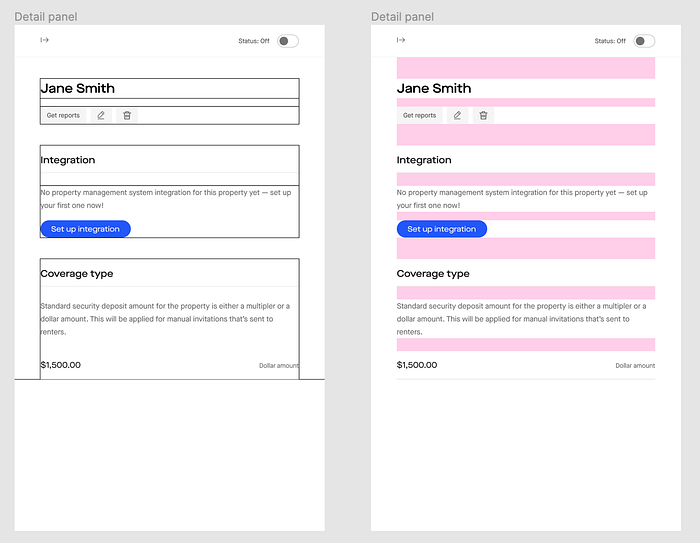
The spacer method in its simplest form makes everything full-width (within the container of your form) and puts spacer components between every item vertically.
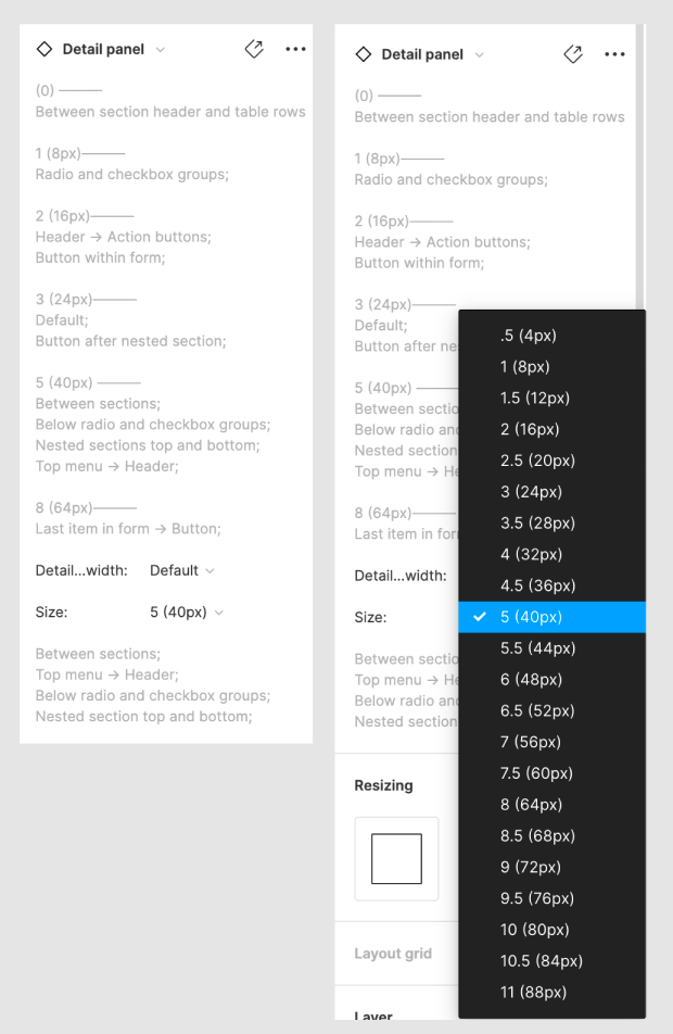
These spacers are simply empty boxes. I opt to make my spacers into components and use the variants within designs. The spacer component has variants that account for the different vertical heights. In the description I’ve included instructions for use that give the designer enough information to use either the spacers or traditional auto-layout.

After the form is laid out, auto-layout can be applied to the entire form and set to “Space between = 0px.”
This makes it easy to quickly drop new components in, change the spacing between…


