Member-only story
Using treemaps to understand hierarchical data
How to make sense of a complex visualization technique.

I didn’t understand the point of treemaps until I worked with a large structured dataset.
As part of an extensive user research effort, we collected open-ended survey data from 130 participants. After standardizing the data and doing thematic analysis, the next topic was to try and figure out a way to visualize it.
After analyzing the data, it was a dataset with over 20 themes and several different categories of respondents. This was a much larger dataset than I was used to visualizing: what was I supposed to do?
That’s when I first started to learn about treemaps. To understand why let’s first examine why they were first created: what’s taking up all my hard drive space?
Understanding hierarchical data
In 1990, Ben Shneiderman, Human-Computer Interaction and Information Visualization pioneer, had an issue: his hard drive was full of files, but he didn’t know what was taking up so much space.
Rather than sort through several directories, he instead devised a method for visualizing the hierarchy of files by a technique called treemapping: this technique fills all available space with a hierarchy of rectangles of different sizes to represent how big a file was.

This allows you to make sense of what is on the hard drive quickly, but looking at it closely, we can see a problem: we can’t compare categories easily. To understand why let’s revisit the accuracy of visual cues.
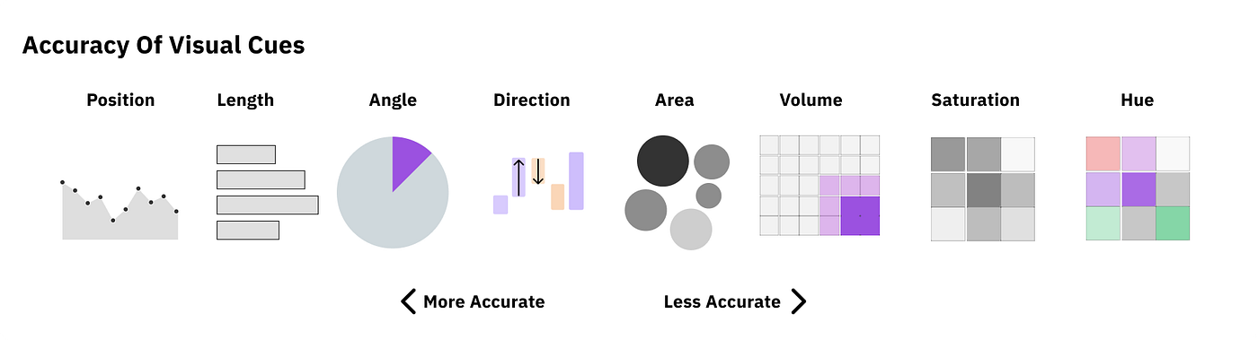
According to Cleveland and McGill's research, humans can perceive specific cues more accurately than others. But looking at treemaps, we can see that it uses less accurate cues, such as area or volume, to showcase data.
This means that any comparisons we try and draw between data points are harder to see.