UX best practices on mobile
Recommended best practices and A/B testing ideas to consider when designing Homepage, Navigation, Search, Filter, Product Pages, Checkout and Forms.
Part 2 of 6 series detailing my learnings in Google’s Mobile UX Marathon#mUXMarathon. This series will greatly benefit marketers, UX practitioners, designers, developers, product teams and business owners.
Homepage/Landing Page
Idea: Put key things above the fold
When users visit your website for the the first time, they probably came there with some intention, interest or expectation.
There are 3 key things that needs to be above the fold when designing landing pages for mobile:

Value proposition: What are you offering the users?, Call-to-action: How should they start exploring your site?, Visuals: What first impression would you like them to form?
A/B Test: Your CTA
Every call-to-action button is a collection of four things: a placement, a shape, a message and a colour. Always A/B test any of these variables, don’t rush into commitment.

Above is a result from a case study shared by Maggie at Google I/O in the talk How Words Can Make Your Product Stand Out on how testing A/B testing “Book a room” and “Check availability” resulted in a +17% engagement rise.
A/B Test: Exposing the search bar on the homepage
Search is one of the main ways people can start exploring your content. Users who search usually convert more.
A/B tests have shown that the more prominently you display the search, the more actual searches and clicks you are going to get.

When Matalan ran an A/B test on an exposed search bar, the result was a 32% increase in searches on mobile and a 51% increase in searches on tablet.
A/B Test: Using static carousel
Automatic rotation is not a great user experience as it is a forced content exploration. Also, quite often they are perceived as ads, and even if users get interested on the banner and want to study it a bit more, it moves away.
Statistics have shown that the first banner usually gets most of the interactions and the rest are just being ignored, so try testing a user initiated exploration with the animation switched off. On the other hand, moving promotions usually cause a lower page speed and makes everything look important.
Navigation
A/B Test: Top sticky navigation panel
Test an iteration where the navigation always stayed available for users no matter where they were on the page or how deep they scrolled.
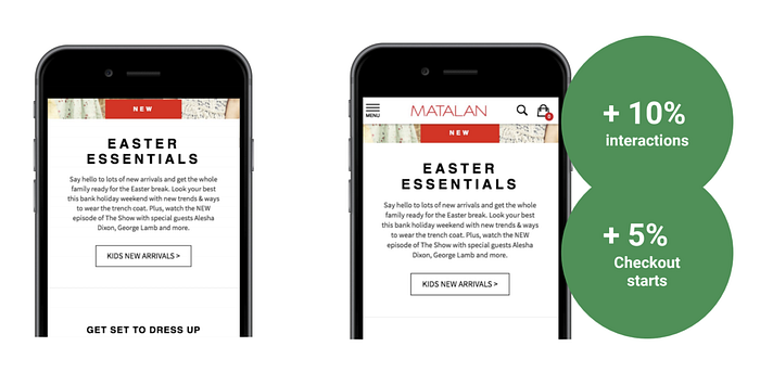
Matalan saw an increase in total interactions, with 10% more interactions with the navigation and 5% more checkout starts.
A/B Test: Complement icons with text
Complementing icons with texts could increase the clarity of your navigation. Just call it what is going to happen when users click on it.
Every icon is a room for misinterpretation and because users may probably have different assumptions, different backgrounds or different experiences in the past, it is a good practice to add a text label to icons.
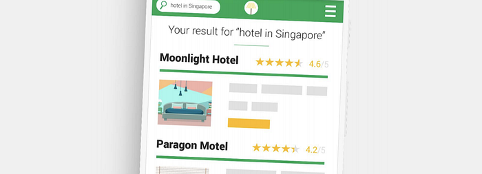
Search
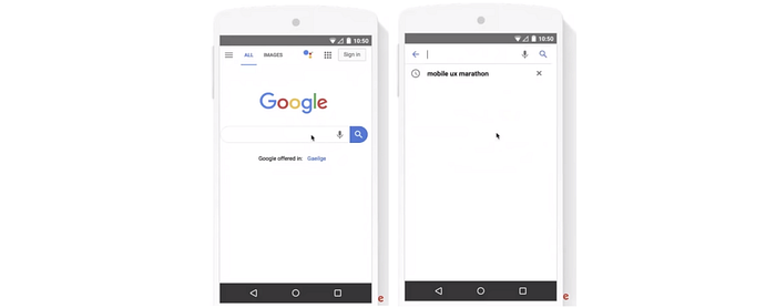
Idea: Show search suggestions based on popular
Search results should be easy to scan with a prominent helpful filtering. Allow users to easily delete queries by adding a small x at the end of the search bar.

Once users start typing in the search bar, you can show popular suggestions that that will help them make the decision whether the keyword they are using is right or just immediately click on one of the suggestions and not type anymore.
Idea: Show search suggestions when no matching results
You should never return an empty or a sorry page if the search was performed. This means validating input real-time for item availability. You can always show either popular items or a contact us.
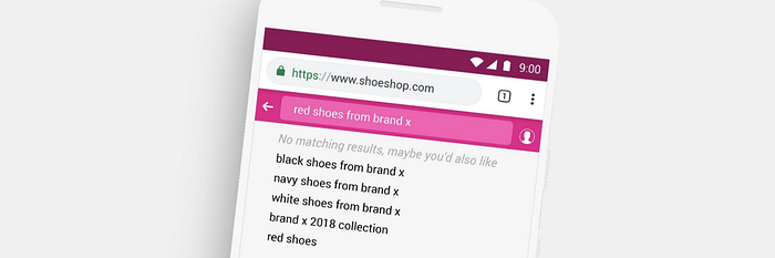
You should also show search suggestions with spelling corrections. This means validating input real-time for misspelling corrections
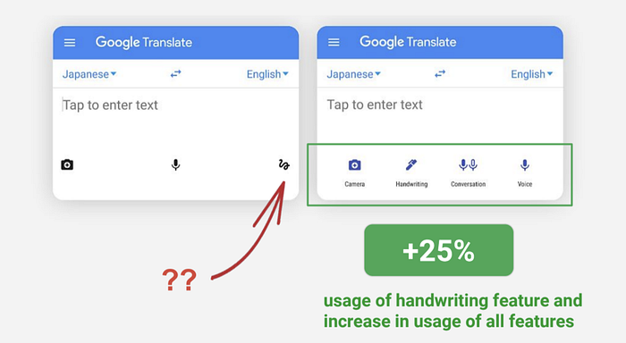
Idea: Improve interactivity on search bar/icon click
Open the keyboard immediately. Display popular searches if the user doesn’t have a search history. Display recent searches if the user has a search history.
Showing recent searches in your website helps with product recall and this can increase sales and help users access highly relevant information in seconds.
A/B Test: Exposing the search bar
A/B tests have shown that the more prominently you display the search, the more actual searches and clicks you are going to get.
Filter
Idea: Update the number of results in real-time
Displaying how many results is going to be returned when the filter is applied helps users make informed decisions

When you have a lot of filters, allow the user to choose all filters first and then update the results. The right solution for showing many filters could be to implement a pop-up window for the filter function.
Idea: Open filter window on full screen with options exposed
Try to avoid drop-downs. Allow user to choose all filters first and then update the results.

Make it clear to the users how they can close the filters window. Implement a reset functionality to clear all filters at once.
A/B Test: Sticky filters and positioning
Test sticky filters to the top or bottom.
Product Listing
Idea: Break the fold by making sure the page continues
Make sure your users are clear this is a listing page and there is more than one item displayed.
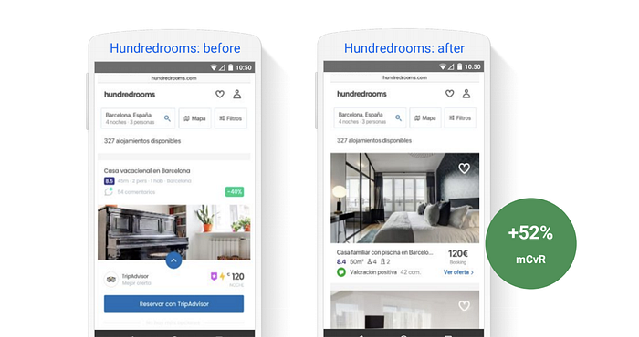
Hundredrooms allows users to compare properties and prices from various platforms. They hypothesized that adapting the size of the product card to show multiple cards on one screen and adjusting the information hierarchy would make it easier for users to compare and convert. The result of the A/B test showed a 52% increase in conversions to sales.
A/B Test: Product reviews visibility on the listing page
Social proof increases credibility. Different studies show that customers on average spend more on website with excellent product reviews.
A/B Test: Pagination vs show more
Avoid infinite scrolling. Allow a user-initiated exploration of search results and display the number of items left in the list on the “Show more” button.

Analogous to the behaviour of carousels, infinite scrolling represents zero user control and always comes unexpected. Pagination gives an understanding of how many more pages there are to explore but the downside is that it’s not easy to tap in mobile and also forces the user to remember what page they are on or that they found a product they really liked.
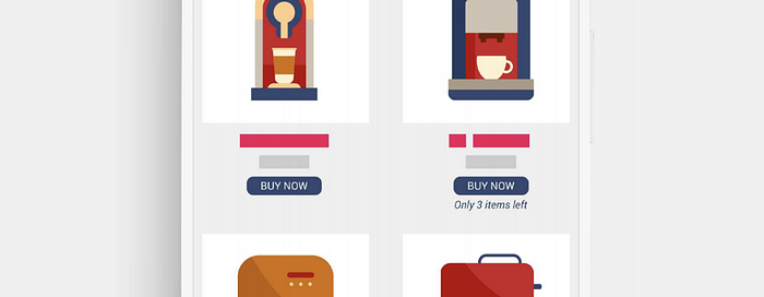
A/B Test: Displaying product information in real time
Displaying the number of items left or any other relevant information could help potential customer with real-time awareness and urgency motivation.
Product Detail Pages
Idea: Keep showing your value proposition throughout the funnel
Show value proposition next to the key CTA in a clear and descriptive manner.
Provide secondary CTAs like Add to favourites: for better experience for returning users, Check in store: for offline conversions, Email me this item: for cross-device conversions. Implement arrows, dots or thumbnail images to make sure users know there are more pictures available.
Idea: Keep users within context once an item is added to the cart
Inform users the item was added to cart and give action options.
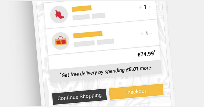
The pop-up window is an opportunity to up-sell (display either some other popular items that people usually buy with these products or display how much the user needs to spend more for a free delivery). In case they choose “Continue shopping” return them back to the same product page.
A/B Test: Add to cart vs Buy now
Rushing the user into commitment with urgent messaging can either push them away or motivate them to purchase.
Checkout and Forms
Idea: Display a progress bar
Manage user expectation about the steps they need to complete. Use a combination of text+icon and limit exit points at this stage.

Consider duplicating the name of the next step on the CTA instead of generic
“Proceed” or “Next”. If the next step is “Payment”, it could be better to use “Proceed to Payment” instead of just “Proceed”, this is something you may need to test but the best practice here is to be as descriptive as possible.
Idea: Try upfront progress instead of starting from zero
Users are more motivated to complete a task when they are not starting from zero.
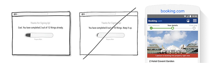
For example, if you have three steps in your checkout, you can introduce the fourth step which is already completed e.g Basket review, Your selection e.t.c
A/B Test: Test guest checkout
Different studies show different numbers but on average, about a third of your users is abandoning checkout just because it asked them to create an account.
Some users do not understand that you need their information to keep in touch with them. So think about all the potential revenue that you may be losing because of the magnitude of registration.
Idea: Expose options instead of hiding them
For <5 items, provide instant user awareness about options available
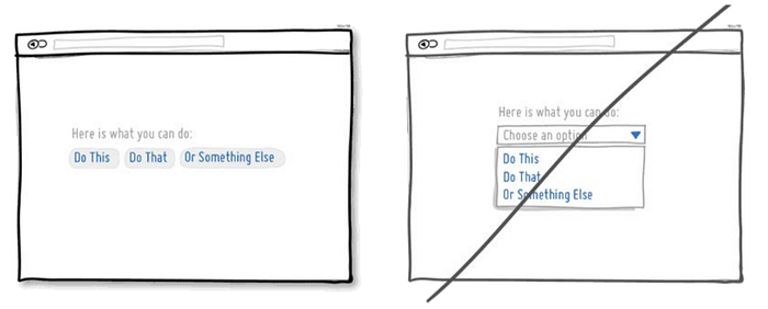
The left affords just one tap instead of 2+, its customization does not also depend on device OS. Consider opening a pop-up though if the selectable list has 5+ items.
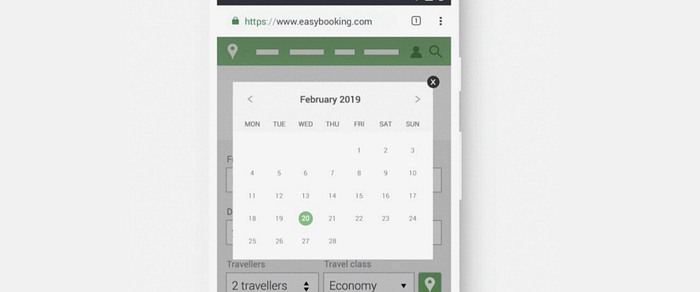
Idea: Simplify date selection
Avoid drop-downs on mobile. Use mobile-first calendar to choose close dates (upcoming travel, insurance period, etc). Use manual input for the date of birth
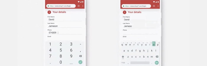
Idea: Validate input real-time
Tell what works, tell what doesn’t work. Be forgiving.
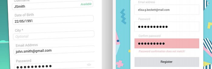
Highlight mistakes real-time and tell users what exactly they need to fix.
Try not to be be super strict about every single form field. When asking for phone numbers for instance, it can be entered in many different ways (with brackets, starting from zero, starting from plus extensions e.t.c).
You need to spend a little bit more time on building the code for your website so the users can spend just much less time on entering the input for you.
Also, to make sure users enter the correct email input: Use scripts to suggest
correct domain and use auto-suggestions for popular email domains.
Idea: Enable browser autofill
Leverage information already stored in the browser
Idea: Use correct keypad for every input type
Numeric for phone numbers. Alphabetic + @ for email addresses. Alphanumeric for mixed inputs.
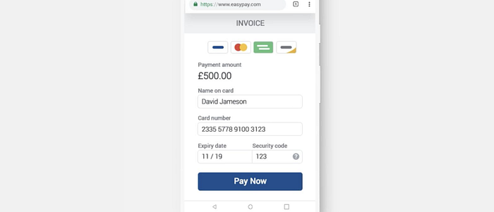
Payments page
Idea: Display icons for payment methods or payment safety
Confirm the payment amount, use a clear CTA copy. In case you redirect to a 3rd party, the page should look native to your website.
A/B Test: CTA colour
If you like this article, please do not forget to clap. In a couple of days, I will be posting a separate article which summarizes the Question and Answers session of this first part. 👌👌👌

