UX best practices: registration
How the top companies in the world give users a seamless sign up process
In order to design registration for a thriving startup, I assembled a competitive/comparative analysis, paged through sources and design tables, and learned more than you ever want to know about autofill.
Below is my shortlist — 6 Do’s and 3 Don’ts for the ideal registration experience, designed to be instantly forgotten.
This is how the biggest companies on the net do sign ups:


Lesson 1: No Navigation
Turn off all distractions. When the registration form opens, the background, pretty pictures, the primary menu, and even the utility menu all disappear. All that’s left for users to do is enter their info and hit “Submit.”
With two exceptions:
- Keep a “Sign In” button for regular users who clicked into the registration page by mistake.
- Post a “Help” button (or phone number) for potential users who need questions answered before they can sign up.

Lesson 2: Your Headline is “Your Company, Their Benefits”
Remind users what they’re getting out of filling out all these input fields. No one wants to do this. Tell them why it’s worth it.
Lesson 3: Make It Fast. Then Make It Faster.
Your users have a barrier to entry. Make that barrier as small as possible — the lowest number of fields. Just ask Expedia, which cut one form field and gained $12 million.
If you can save a required input field for after registration is complete, do it!
Lesson 4: Flow Like a Waterfall.
That means one column of input fields with labels above the fields, not on the left. Avoid two input fields side-by-side. Users should seamlessly read and enter info from top to bottom, not left to right to top to bottom. Remember: the simpler the flow, the faster it feels.
Got 15 input fields? Group them, divide them into steps, and give the user a visual cue as to what step number they’re on and how many more there are to go. Try not to exceed 4 steps total.
Lesson 5: Do All the Work for Them.
Optimize the layout and let autofill take the wheel. For phone input fields, fill in the dashes for the user. For dates, the slashes. Transition from one field to the next automatically, and from one step to the next automatically.
Your goal is for registration to be so easy users don’t even remember they did it.
If information is tough to find, tell them how to find it (“This ID number appears in red in the upper right hand corner of your billing statement”).
Lesson 6: Be Reassuring.
Let users know their information is secured by a 3rd party or with specific security measures. Offer them a privacy policy that is accepted upon clicking submit (saving them from another click) or is a big friendly link to show that you’re not hiding anything.
Major Warnings Unveiled by Usability Tests
BEWARE
Check your questions. Any fields that require your user to go elsewhere (to check a date, to find a ticket number) is where you’ll lose users. Cut it or put it at the very end of the process.
BEWARE
A list of more than 4 text input fields will discourage users. Alter formats (large buttons, toggles, etc.) to prevent open/close syndrome.
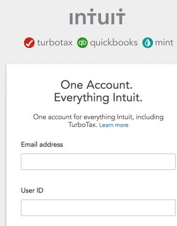
A big trigger of 5+ fields is any field that must be entered twice for confirmation (email addresses, passwords). As Luca Longo warns, do not repeat fields. Luckily, Intuit has a clever workaround: display one email field, then, once it’s being entered, display another one below it.
I didn’t even realize the second field popped into being. I was too busy entering my email to notice.
BEWARE
Some input fields are known for blocking your user’s registration just when they hit submit. I tested a website that blocked registration for 4 out of 5 users because the phone number they entered did not contain dashes. If undetected, frustration points like this one can have a very real impact on your growth.
Errors should…
a) Be detected and revealed to the user as they leave that field, not after the submit button is clicked. This stems from an eye-tracking usability test completed by the Baymard institute, which concluded that, “in order to perfect the user’s recovery experience, live inline validation must be used.”
b) Have a clear error message that is visually pronounced, brief, and tells the user how to fix the problem. Don’t tell the user they did something wrong. It’s Alex Birkett’s first of many great rules on error messages. Instead, tell users how to fix the problem.
Reddit does a good job of this:


Users don’t want a lengthy input session only to get hit with a rejection at the end of it. The rules above turn that stop sign into a speed bump.
With this guide, you’ll ensure your users’ first experience with your company is a great one.
If you’d like to dive deeper into these guidelines, check out some fantastic resources below.
Amelia is looking for new opportunities to combine her background as a content strategist with her skillset as a UX designer to create thoughtful user experiences.
Great Resources on Registration Design:
Birkett, Alex. “13 Empirically Backed Design Form Best Practices.” Conversion XL. 15 June 2017. Web. 17 June 2019.
Gardner, Oli. “How to Optimize Contact Forms for Conversions.” Unbounce. 11 April 2013. Web. 17 June 2019.
Heath, Nick. “Expedia on How One Extra Data Field Can Cost $12m.” ZDNet. 1 Nov 2010. Web. 17 June 2019.
Holst, Christian. “Usability Testing of Inline Form Validation: 40% Don’t Have It, 20% Get It Wrong.” Baymard Institute. 27 Sept 2016. Web. 17 June 2019.
Longo, Luca. “UX Login, Register, and Password: The Ultimate Design Guide.” Design Excellent. Web. 17 June 2019.
Rao, Roopa. “18 UX Design Tips for Registration and Login Forms.” UX Planet. Medium, 18 Jan 2018. Web. 4 June 2019.
Sousa, Carlos. “8 Ways to Create the Perfect Registration Form.” Prototypr. Medium, 28 March 2016. Web. 4 June 2019.
Wainwright, Corey. “12 Ways to Create a User-Friendly Website Registration Process.” Hubspot, 11 March 2019. Web. 4 June 2019.
Wainwright, Corey. “5 Foolproof Ways to Prevent Form Abandonment.” Hubspot, 04 April 2018. Web. 4 June 2019.