Barbican app — a UX case study
Crafting an interactive experience | GA UXDI | Concept Project

Overview
The Barbican is a performing arts centre located in the Barbican Estate in the City of London. With over 1.3 million visitors in 2017/2018, the Barbican serves as an important cultural institution hosting a wide range of events in Art and Design, Music, Theatre and Dance, as well as a variety of talks and workshops.
The challenge of this group project was to design an interactive experience for the Barbican centre’s Art exhibitions, over a two-week sprint. The project followed an agile framework, incorporating UX design tools and methodologies, including user research, synthesis, user testing and prototyping.Through the process of iterative design, we developed a high-fidelity prototype which not only provided an engaging experience, but allowed users to create a personalised profile, from which they could keep track of their visits, as well as receive recommendations for future exhibitions.
My role:
- Despite there being no predefined roles, I took the opportunity to act as project organiser, ensuring work was divided between the team and schedule kept on track.
- Initial analysis of the existing Barbican website and exhibition apps.
- Conducting User Interviews and User Testing, including collaborative writing of the interview and testing scripts.
- Synthesis and analysis of key opportunities, identified through the research process.
- Facilitated and participated in our group Design Studios.
- Created wireframes throughout the iteration stage, from lo-fidelity to the final hi-fidelity prototype (using Sketch and InVision).
Brief
At the time of this project, the Barbican provides a service of dedicated apps for exhibitions. Meanwhile, their website provides event ticket booking options. However there is an opportunity to integrate these services into a single app experience.
For this project on the immersive General Assembly UX Design course, myself and 3 other designers were briefed to build an engaging and interactive experience for the Barbican exhibitions, that could help visitors appreciate and experience their visit, in a new and compelling way.
Challenge
Provide a responsive website/ native application that provides the user with:
- A highly engaging and interactive experience
- The ability to keep track of information and exhibits
- Tips on what they should explore based on their profile
- One place to do all of this plus event information and ticket booking
Discover
Competitor Analysis
The discovery stage of the project began with local market research of other cultural institutions, and of the way they use apps for their events and exhibitions.

The Tate Modern was the only one that had a corresponding exhibition app, so we looked further afield at other competitors.

All three competitors provided audio tours. However, the way in which exhibit information was searched for differed, from manually searching artist/ exhibit number, to camera scanning of exhibit image. Both Tate and Norman Rockwell had location-based triggers integrated in to their app, providing exhibition information. This feature was something that we felt would definitely enhance the user’s experience of the exhibition.
Define
The screening surveys and the 10 user interviews were an important stage in understanding the Barbican user demographics, as well as identifying their behaviour in terms of needs and current frustrations. We compiled our insights together on an affinity map:


The main trend we identified related to the user’s flow in regards to visiting an exhibition:
The BEFORE: relating to exhibition discovery and event booking
The DURING: how the user navigates and interacts through the exhibition
The AFTER: the sharing of attended events, as well as discovering similar events in the future.

Given the time constraints we decided to focus on the ‘During’ as this was the most interesting opportunity to enhance user experience— how could we improve the experience of the user during an exhibition?
From these findings, we developed a persona and an outcome statement to act as a representation of our primary user based on our research:


Outcome Statement
Situation | Jamie arrives at the Barbican — she’s looking forward to the exhibition.
Problem | She spots an exhibit she wants to see, but there’s a crowd — she can’t get near enough to see it or read the mounted information
Outcome | An integrated app that provides an interactive information and audio experience.
Solution | Jamie can have access to information, enjoying the exhibition as she goes at her own pace.
User Flow
A user flow was devised to outline the steps Jamie will take when using the app during an exhibition. This flow assumes Jamie has previously set up an account and purchased a ticket through the app.

Develop
Minimum Viable Product
Using the key flow, we held a design studio to identify the key features that would help define the MVP. Using the list of features provided by the client, as well as concepts devised through the Crazy Eights exercise, we assorted these features on to a feature-prioritisation chart. The features that were deemed essential and involved the least effort laid the foundations of the app and its Minimum Viable Product.
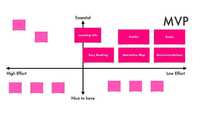
The features we started to develop included:
Profile — users create a personalised account, where they can easily book tickets. This can also act as a database of their saved items, which helps to provide recommendations.
Audio & information — provision of additional information in form of text and audio.
Interactive map — user’s location is indicated on the map, describing the layout of the exhibition space in relation to the exhibits.
Technical Considerations
When deciding whether to develop a native app or responsive site, we had to take into account the requirement of bluetooth and compass for geolocating the user around the exhibition. This therefore would not have been possible using a responsive site. Therefore a native app was chosen for the reasons highlighted in the images below.


Style Guide
We based our app style on the Barbican’s existing brand, focusing on their brand colours for Art and Design, which use pink as the primary colour. On the Barbican website they use a lot of white space; this was also incorporated into the app design.

Prototyping & Testing
We then started to ideate the design, and went through several rounds of user testing and design iterations, based on the main flow.
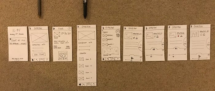
At each round, we synthesised our findings, and iterated the design as we moved from lo-fidelity to high-fidelity design.
Main iterations included — implementing ‘enabling interactive mode’ earlier on in the flow; introducing on-boarding; advancing to next exhibit.
Interactive Mode
Enabling interactive mode is the most crucial part of the user journey. The bluetooth signal identifies where the user is in the exhibition, and provides them with the interactive exhibit information and audio stream.
At lo-fidelity the ‘enable’ CTA was mid-flow, which users found confusing and assumed that the interaction was manual i.e. they assumed that they would navigate through the app to an exhibit to receive information, as opposed to it being received an automated bluetooth trigger.
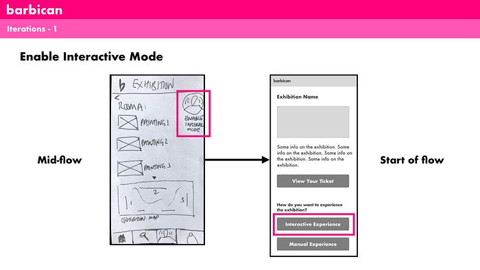
The design was iterated, with the enable CTA defined at the beginning of the flow. The user has two viewing options — manual OR interactive, introducing a clear ‘Interactive Experience’ CTA.
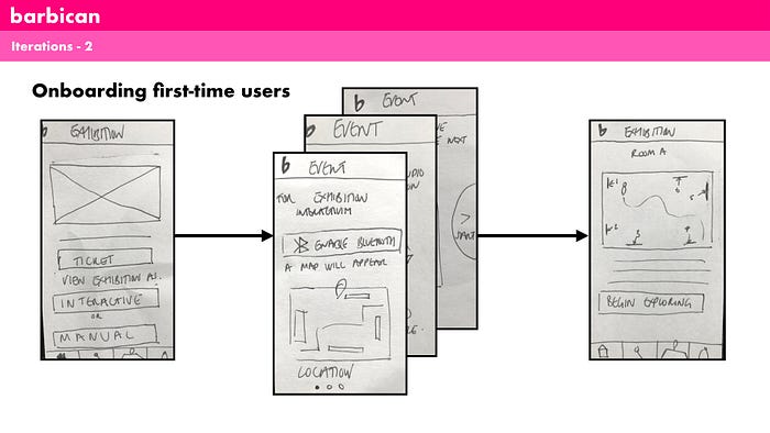
On-boarding for first time users
The earliest version did not include on-boarding screens explaining how the interactive mode worked. This was a big pain-point during initial user testing. A series of on-boarding flows was introduced explaining how to use the app using bluetooth.
Advancing to next exhibit
When moving between exhibits, once in range of the next painting/ exhibit bluetooth beacon, the user will receive a notification informing them that they can receive the corresponding exhibit interactive info/ audio.
The challenge here was how to give the users control without confusing them. Users found the initial ‘Next’ CTA to be misleading, and they needed an onscreen clue of what to do next.
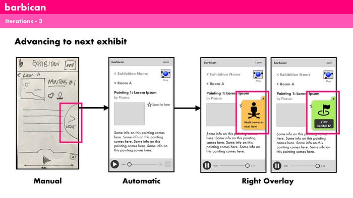
Initially the info for each exhibit was selected manually by the user. We then moved to a more advanced version whereby bluetooth would locate the user in the exhibition and automatically provide the information that was associated with the exhibit they were beside. However, this led to some issues whereby users found that the audio/info from the previous exhibition could be curtailed before they had finished listening to it. We therefore arrived at a hybrid iteration, whereby the geolocating tool would provide a prompt to begin the exhibit information, rather than changing it automatically. This provided a balance of convenience and usability for the user.
Outcome
Below is a video walk-through of the final prototype. This walkthrough focuses on the user journey during the exhibition process — entering the exhibition, enabling interactive mode, saving items to profile, and receiving recommendations post the event.
Click here to view the project `Barbican_mid-fi`
This prototype brought to you by InVisionApp
invis.io
Future steps
- The app currently focuses on the Barbican’s Art and Design events. It would be extremely interesting to develop the app and its interactive features for the other events.
- Provide wider accessibility — additional audio streams in other languages as well as a different stream for children. This also includes the option for more descriptive information for visually impaired users, enabling more users to have access to an interactive experience.

