UX Case Study: Bookstore Responsive Website Redesign
The UI/UX case study documents the processes involved in the redesign of a bookstore responsive website. Through this redesign, we hope to increase sales and membership sign-ups for the bookstore.

The bookstore featured in this project is Kinokuniya, Singapore, a Japanese bookstore operating in 8 countries. It has both physical stores and an e-commerce website. In this case study, the name will not be repeated often to avoid promoting the brand.
The project is a marketing ‘pitch’ completed as part of the User Experience Design Immersive (UXDI) course at General Assembly, Singapore.
Project Focus
The focus of our project is on these 3 key points.

- Streamlining the book finding process and make it easier for customers to navigate the website.
- Enhancing the appeal of the bookstore membership programme.
- Improving the mobile & web usability.
Competitive Analysis
At the start of the project, we conducted a competitive analysis to find out how the bookstore compares with its competitors. Our competitors include local (Singapore) and online competitors including, POPULAR Bookstore, Times, and Book Depository.
We compared the bookstores base on:
- Pricing,
- the books and products it offers,
- the size and scale of the bookstore,
- and the appeal of their membership programmes.

We found out that our client stands out as it:
- Provides the widest selection of books in English, Chinese, French, German, and Japanese.
- Best place to buy Japanese books, Manga, magazines, and stationeries.
- One of the largest bookstores in South-East Asia.
However, the bookstore cannot compete on:
- pricing offered by its competitors.
- The membership programme is also not as appealing as the local bookstore, POPULAR which is cheaper and more accessible since it has 27 stores island-wide.
Through this redesign, we hope to level the playing field, to better compete with our competitors. With our enhanced membership programme, we can offer more discounts to match the prices of our competitors.
User Research
We conducted user research to find out more about customers’ needs. For example, we spoke to customers at the store. We also conducted house-visits to find out the books they like to buy.

Likes
Through this research, we found out that:
- users love shopping at the physical store since they can read the books
- browse the books which are displayed on the shelves.
Pain Points
While the experience at the store is good, this is not the case when they shop online. For instance:
- they can’t read the content of the book that they are intending to purchase.
- They also noted there are fewer discounts online since they can’t use a physical voucher.
- The membership sign up process is also troublesome.
Opportunities
As the bookstore has a huge pool of customers that are loyal, they may be converted into online customers. This can be done by providing value-added services that complement their offline experience. For example,
- we can provide customised book recommendations and book previews.
- The membership sign-up can also be simplified on the website.
New Website Features

We listed out various new features that we may include on the new website. These features were arranged on a Content & Feature Prioritisation Matrix according to its business impact and whether it meets user needs.

They can be further split into 2 categories: book finding and membership enhancement features.
Streamlining the Book Finding Process

On one hand, our client wants to get more sales from online, on the other hand, customers want to find the books they like online. So for our website redesign, we try to meet both the business goals and user needs.

We drew out a Customer Journey Map to illustrate the process of how a typical online customer uses the website. While browsing for a book, users find the site is difficult to browse and the website is over cluttered.
Our Strategy
To increase sales, we will provide customised book recommendations that help our online members browse and select the books that they like.
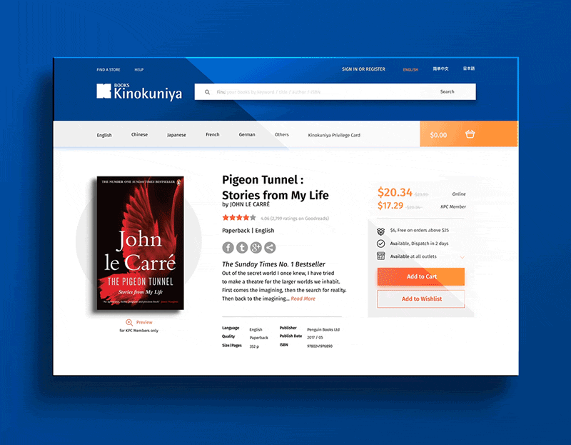
High-Contrast Search Bar
From research, most users say the main reason they used the site, was to look for a specific book. Hence, in our redesign, we made the search bar more prominent by enlarging it and contrasting it against a dark coloured background.

Visual Search Results
Another enhancement we made was to provide visual search suggestions. Instead of having to look for the book on the search results page, we immediately provide a book cover to allow users to go directly to the product page. It is also easier for users who recognises books by its cover.

Customised Book Recommendations
A highlight of our website is the new book preference customisation feature. Customers get to pick the topics they are interested in to see recommended books on the homepage.
Enhancing the Membership Programme

On one hand, our client wants to get more members through the online platform. While on the other hand, customers want to get more discount through online. So we try to meet both the business goals and user needs in our new design.
Referring back to the previous Customer Journey Map, while users are paying for their online purchase, they weren’t able to use a physical voucher as payment. In addition, there are fewer discounts online compared to those at the physical store. Without these monetary incentives to purchase online, customers prefer to buy their books at the store.
Our Strategy
To increase membership card sign-ups, we will integrate a streamlined membership application process during online checkout for customers to get more discounts while making their purchases.
Service Design
To improve our online service, we represented it on the service design blueprint.

Normally at a physical store, the sales assistant will ask the customer for their membership card to give them the discount on their purchases. If the customer does not have one, the sales assistant will suggest they sign up for one.
Borrowing this physical store experience, we replicated that on our proposed website by asking the online customer if they’ll like to sign up for the membership while they are making their purchase. These discounts can be applied immediately to the current order and no additional details are needed to be filled up if the user is signed in.
Integrated Membership Sign Up
The membership sign up form is added as a step in the payment process. Showing the bill comparison on the same page helps the customer to make their decision easier. This is so as they can visually see the cost breakdown and why they should join the membership.

Proposed New Privileges
As part of the pitch to make the membership more appealing, we are proposing several new privileges to be included.
- Able to preview the content and chapter 1 of any books.
- A credit point system for further discounts.
- Birthday vouchers to encourage users to buy more books.
Book Preview
With the new book preview feature on the proposed website, users can browse the contents of the book and read the first chapter. This will allow them to be better-informed before making a purchase.
Prototype
We created an adaptive web prototype on Axure RP to demonstrate the proposed redesign of the bookstore website. The prototype design differs from the images presented here as I have reworked the visuals on my own.

Usability Test
We went on to conduct user testing for our new and improved website.
Methodology
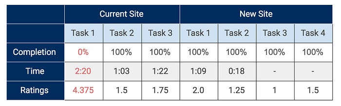
The tests were conducted face-to-face with 6 participants. They were asked to complete a series of routine tasks on the current and new website. Participants were timed on how quickly they completed those tasks on both the site. At the end of the tests, participants rated each task on a scale of 1(very easy)– 5(very difficult).
These statistics are important as it provides quantitative results to sell the design.
Tasks Assigned
- Using the navigation menu, search for an assigned book. Next, check for the stock availability at the outlet
- Using the search bar, look for the same book.
- Place an order for the book.
- From the home page, sign up for a membership.
Task Completion Success Rate
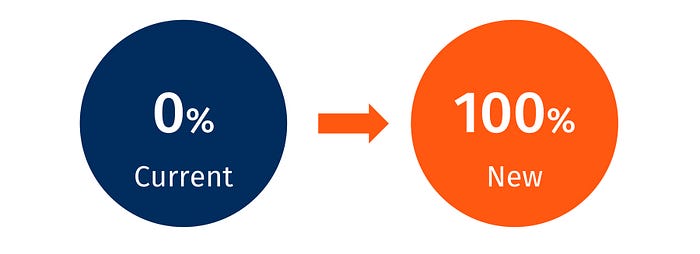
None of the users completed the task on the current website, while all our 6 participants successfully completed the task on the new website.
Average Time Taken to Complete
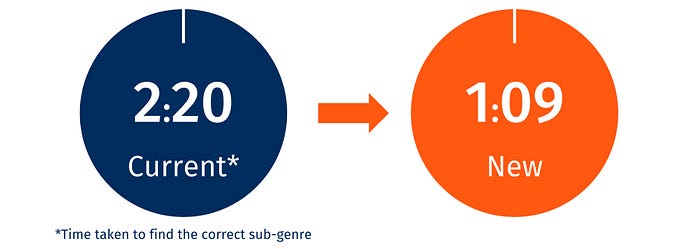
The average time they took to complete task 1 improved from 2:20–1:09.
Rating on Task
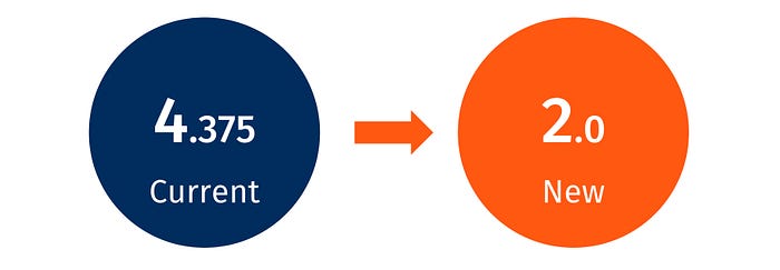
After each task, we asked the participants to rate on a scale of 1(very easy) – 5(very difficult) what they felt about the assigned tasks.
What Users Like Most
- Addition of the membership sign up in the checkout process
- Recommendations on the home page based on their book preferences allows them to browse easily.
- Book preview feature is useful when a user is unsure about buying a book
Our participants found the proposed bookstore website to be organised, comprehensive, clean and uncluttered, very useful, and easy to use. They also felt the process was easy since it adopts a familiar e-commerce process.
Usability Test Report
More in-depth information can be found on our usability test report.
Presentation
As part of a ‘pitch’, we prepared a presentation to win the project. Our team created a creative consultancy, Novel & Chord to pitch for the project. We won the best presentation for this project!
Conclusion

Through our redesign, we streamlined the book finding process so that customers can find the books that they like. We enhanced the membership programme to reward our loyal customers. The website is now responsive, allowing users to have access to the books while on the go.
Special Thanks

A shout out to my teammates from Novel & Chord, Yvonne & Si Liang.
Without them, this project wouldn’t be complete.Thank you, Zhen Zhi and Wilson for their guidance.
Thank you, friends and participants, for taking their time to answer questions for our user research, usability tests, and online surveys.
Hi-Fi Prototype & UX Design by Yvonne,
Interactions & UX Design by Si Liang,
Visual Design & UX Design by Me