Heuristic analysis of yuppiechef.com — a UX case study
In short, a Heuristic Analysis is an inspection methodology to evaluate a website using a number of evaluation criteria based on a broad set rules of thumb and not necessarily specific usability guidelines. This type of evaluation is usually done on an existing product, or it can be conducted at a later stage in the development of a new product to iron out usability issues before implementation. Keep in mind this methodology is not the same as Cognitive Walkthrough or Usability Testing — each plays a significant role in improving the usability of a product though.
The Nielsen Norman Group has established The 10 Usability Heuristics for User Interface Design, which is not only renowned for its credibility through the authors, Jacob Nielsen and Don Norman, but also the continuous evaluation of this set of heuristics.
What’s needed to conduct a Heuristic Analysis?
- 3–5 Human evaluators to conduct the Heuristic Analysis
It’s possible for one person to conduct a Heuristic Analysis, but the analysis will be more effective if there are 3–5 evaluators. Each person is unique and will find different usability issues which will make the evaluation more thorough. - The scope
It’s recommended to have a set of outcomes based on business requirements. - A set of maximum 10 evaluation criteria
More than 10 evaluation criteria will possibly render no significant change in the outcome, while a minimum of 5 evaluation criteria will ensure the analysis has some depth. - A set of maximum 5 severity criteria
More than 5 severity criteria can overcomplicate the outcomes and not present as useful, while less than 3 severity criteria will not allow for clear differentiation between the severity states. - Report
The visual representation, together with a detailed breakdown of the outcomes will give a clear indication of where the major pain points within the usability of the website are and will give guidance on what to address.
Evaluation criteria for this case study
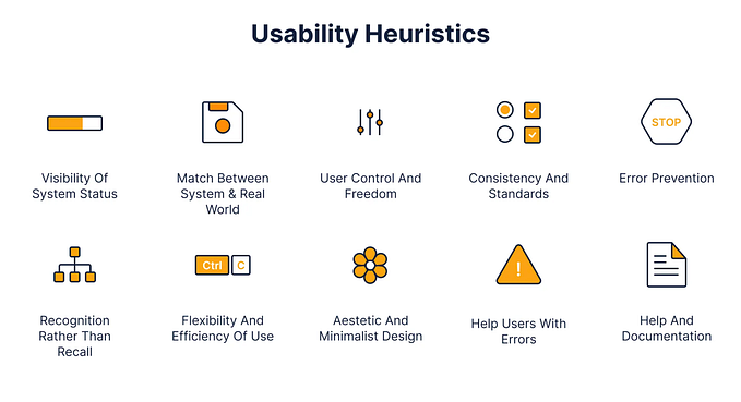
The 10 Usability Heuristics for User Interface Design by The Nielsen Norman Group was used as the 10 defining evaluation criteria.
- Visibility of system status
The system should always keep users informed about what is going on, through appropriate feedback within reasonable time. - Match between system and the real world
The system should speak the users’ language, with words, phrases and concepts familiar to the user, rather than system-oriented terms. Follow real-world conventions, making information appear in a natural and logical order. - User control and freedom
Users often choose system functions by mistake and will need a clearly marked “emergency exit” to leave the unwanted state without having to go through an extended dialogue. Support undo and redo. - Consistency and standards
Users should not have to wonder whether different words, situations, or actions mean the same thing. - Error prevention
Even better than good error messages is a careful design which prevents a problem from occurring in the first place. Either eliminate error-prone conditions or check for them and present users with a confirmation option before they commit to the action. - Recognition rather than recall
Minimize the user’s memory load by making objects, actions, and options visible. The user should not have to remember information from one part of the dialogue to another. Instructions for use of the system should be visible or easily retrievable whenever appropriate. - Flexibility and efficiency of use
Accelerators — unseen by the novice user — may often speed up the interaction for the expert user such that the system can cater to both inexperienced and experienced users. Allow users to tailor frequent actions. - Aesthetic and minimalist design
Dialogues should not contain information which is irrelevant or rarely needed. Every extra unit of information in a dialogue competes with the relevant units of information and diminishes their relative visibility. - Help users recognize, diagnose, and recover from errors
Error messages should be expressed in plain language (no codes), precisely indicate the problem, and constructively suggest a solution. - Help and documentation
Even though it is better if the system can be used without documentation, it may be necessary to provide help and documentation. Any such information should be easy to search, focused on the user’s task, list concrete steps to be carried out, and not be too large.
Metric system for this case study
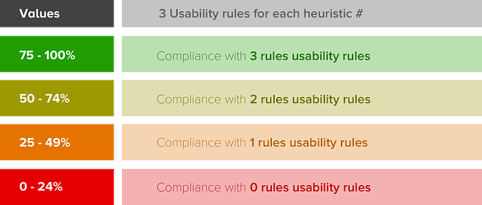
Each of the 10 evaluation criteria has been assigned 3 usability rules that support and drive the specific outcome for the heuristic (this number is not set, it can vary). The compliance to each of the usability rules are measured against 4 severity criteria as illustrated in the table below.
Evaluation for the yuppiechef.com website

1.1. Is the user aware of their current position within the user journey?
The breadcrumb trail ensures that the user is always aware of where they are within their journey on the website and the progress tracker within the checkout journey clearly shows the user what is needed to complete the transactions and where they are within the flow.

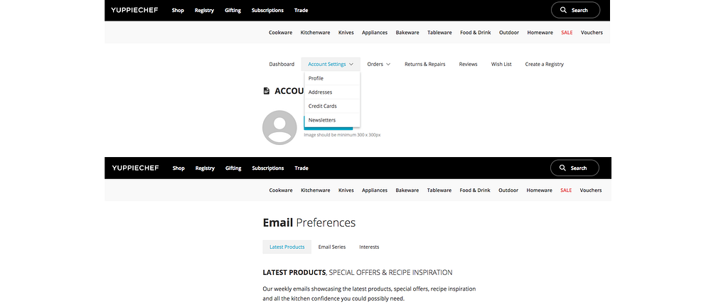
However, the Account settings navigation disappears when the user selects the Newsletter option. There is no option (other than the browser back button) to go back to the previous screen. What also adds to the confusion is that the heading, Email Preferences is not the same as the label in the dropdown (Newsletters). Labels for buttons and navigational elements must always align with page headings to avoid confusion.
1.2. Is the user notified about changes in their user journey?
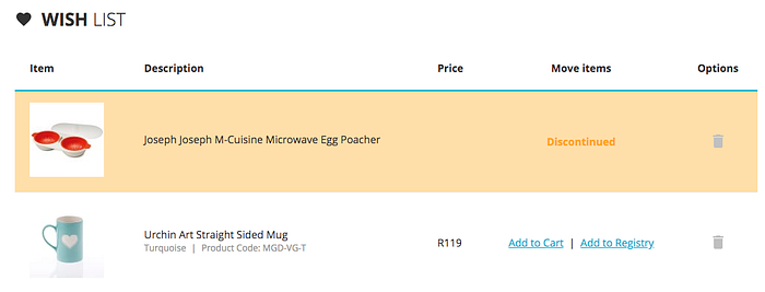
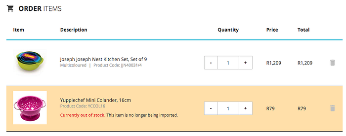
When there’s a change in the user’s wish list or cart, it is clearly highlighted which of the selected items are not available. Although this is not displayed on the mobile site.

1.3. Is the user aware of factors that can have a significant impact on their experience?
The country and currency are clearly visible in the header on all pages, and when the user wants to change the shipping country, the currency changes accordingly. However, the selected state can be visually more clear — the light blue seems to disappear within the UI.


2.1. Are UI elements and interaction prompts easily recognisable?
There are a handful of icons that owns a topic due to the consistent use of these ions in a specific context. The calendar icon is one of these icons. It’s used for indicating events or act as a call to action to launch a datepicker. In the example below, the calendar icon is used for repeat subscriptions which can be confusing. A more suitable icon would be something that illustrates continuous movement.


Another very well-known icon is the plus (+) or add icon which is almost exclusively used to indicate that something can be created from scratch or added to an existing list. On the mobile site, the cart icon in the header has a + visual element which indicates that the cart is empty and the user is prompted to shop and add something to their cart but when the icon is clicked there are already 2 items in the cart. There is a disjoint between the visual element and the required action from the user.
2.2. Does the online experience replicate the familiarity of offline actions and behaviour?
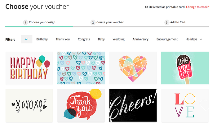
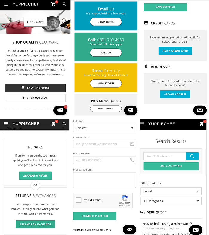
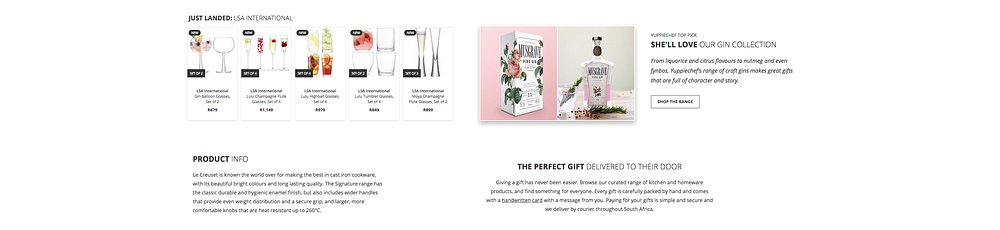
A digital experience that mimics real life actions and behaviours makes the the online experience more enjoyable. Having a handwritten card with a gift is natural behaviour and adds apersonal touch. This is something that Yuppiechef does very well.

Not only does every purchase (gift or not) from Yuppiechef include a personalised handwritten card, the user also has the option to create a personalised gift card online and send it via email or as a physical gift card with their purchase. This is an excellent example of a real-life action that is mimicked digitally to enforce familiarity and enhance the user’s personal experience.

2.3. Does the website make use of acronyms, technical terms or jargon that need an explanation? If acronyms are used, are they clearly explained?
The content is simple and easily understandable across all sections of the website.

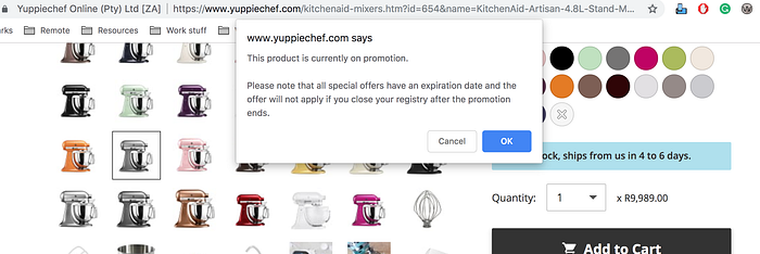
3.1. Is the user able to exit all states such as pop-ups and multimedia? Is the exit state consistent and clear?
All multimedia videos have a full-screen view and allows the user to exit the fullscreen. Most pop-ups on the website have a close icon in the top right corner to dismiss the pop-up, however, the styling is not always consistent. Some pop-ups look very different and have no close icon.
3.2. Is the user able to use the core sections of the website without signing up?
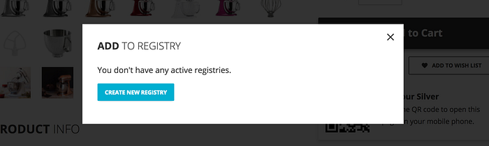
The user is able to browse all available products, create a registry, sign up for repeat subscriptions, sign up for trade, etc. until the point of payment details are required. The user is not forced to create an account at any time during their user journey.
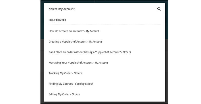
3.3. Does the user have control over their personal information?
Even though the user can update their personal information they cannot delete their profile, thus don’t have full control over their personal information. When searching how to delete your account in the FAQ section, nothing is available.

4.1. Is there a consistent design standard for all call to actions (CTA) on the website?
All buttons should be categorised based on the importance and outcome of the button. There seems to be no design standard for call to actions on the yuppiechef website. Buttons are white, charcoal, green or blue — there is even a difference in the corner radius.
4.2. Is there a consistent design standard for form controls?
Even though the form controls seem similar in styling, there are some vast inconsistencies between them. Some input fields contain icons while others have no visual representation. These icons have distinctive colours (light grey and blue) in the default state and different colours in the focus state (blue and yellow). The use of icons and focus states should be consistent.
4.3. Is there a consistent design standard for headings?
The main headings at the top of the main pages are very inconsistent and look quite random. I’m not sure if this was intentional, but even if the intent was to be creative, the big jumps in typography, headings styled as buttons and missing headings are just jarring. However, all the subheadings are consistent and the different weights of the words work well.

5.1. Are there helpful constraints that prevent the user from making mistakes?
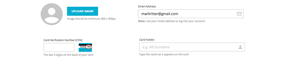
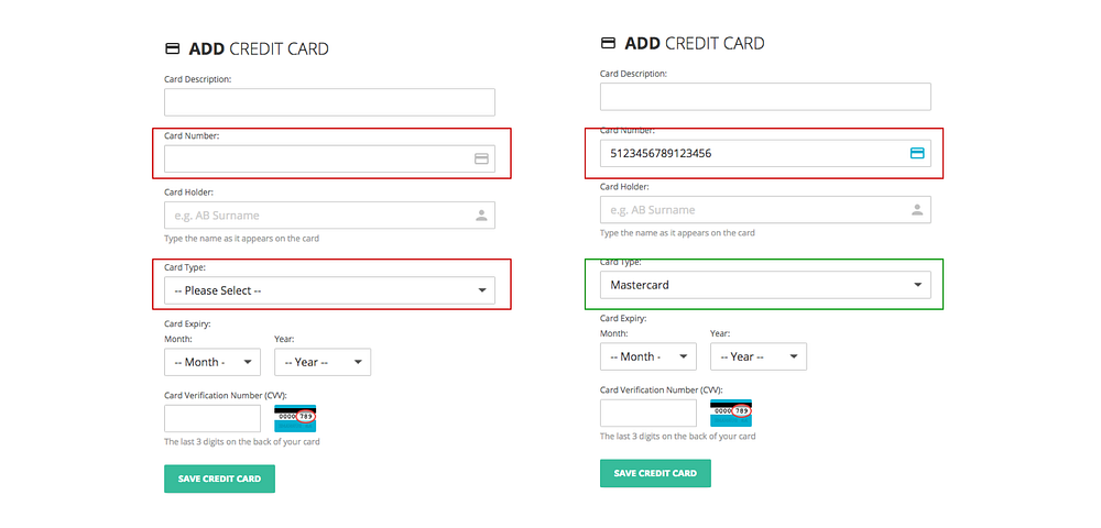
There are no UI constraints to prevent the user from entering incorrect values in forms. Within the profile section, the user has the option to add non numeric characters in the Telephone number field. The Add credit card section also lacks the UI constraint to add non numeric characters in the Card number.

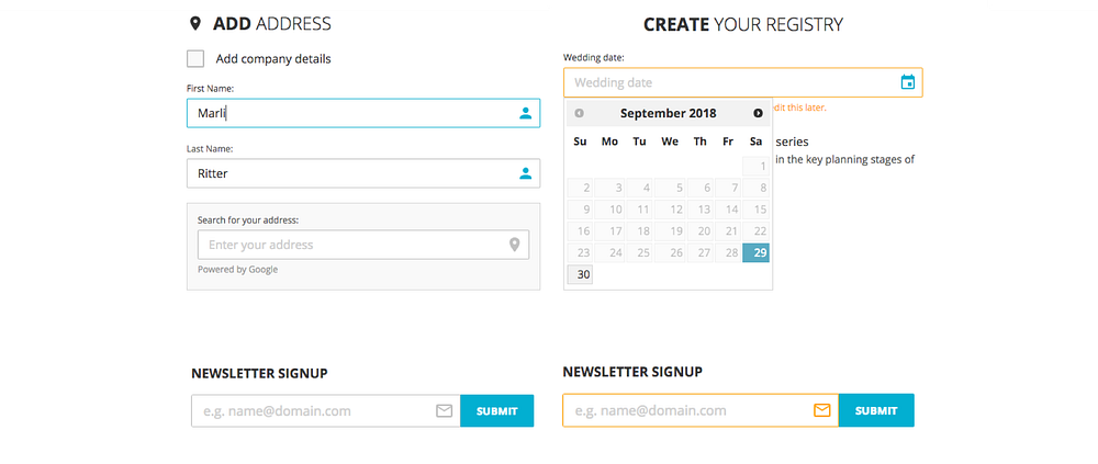
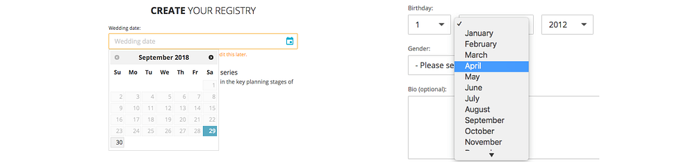
Although the datepicker for creating a registry is very helpful. The user won’t be able to enter an incorrect date format but at the same time, there’s an inconsistency with the datepicker used in the personal profile section.
5.2. Is the user guide with suggestions to prevent incorrect actions?
There are several guidelines within the forms on the website that guide the user in what type of information is needed for the specific field.
5.3. Is the user presented with forgiving formatting for information?
Often the user can feel overwhelmed by the number of fields when filling in forms and can easily make a mistake. By using forgiving formatting to relieve the user’s cognitive load, will not only ensure that more accurate information is provided but also make the experience of filling in forms more endurable.
The first example is from the Add address section. When the user adds their address in the Google input field, the City field is prepopulate. It would be great if the Telephone field could also be prepopulated with (021), the extension for the Cape Town area.
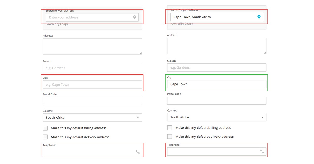
The second example is from the Add credit card section. All credit cards have unique formatting — American Express cards start with either 34 or 37, Mastercard numbers begin with 51–55 and Visa cards start with 4. Thus, when the user adds their credit card number, the card type is prepopulated accordingly.

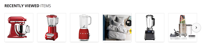
6.1. Is the user presented with a list of recently viewed products or pages
At the bottom of every product page there is a list of recently viewed items, which allows the user to easily revert back to previously viewed products. However it would be nice if the search component could show recently searched phrases as well.
6.2. Is the user presented with customised content based on previous actions?
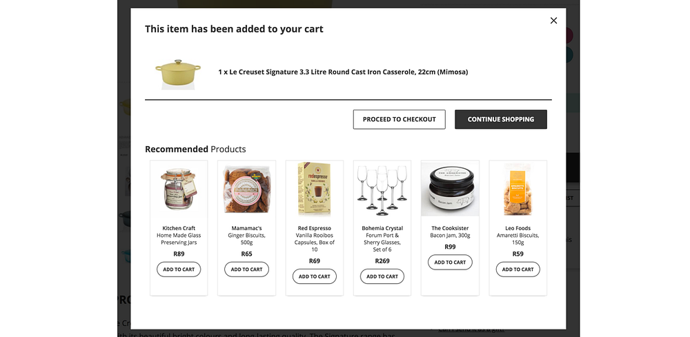
When adding a product to the cart, the suggested products listed below has no relevance — not to the product in the cart nor to previously viewed items.
6.3. Is the user presented with navigational items that reduce cognitive load and aids recall?
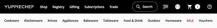
The principle of recognition and recall is based on the amount of effort it takes the user to retrieve a concept from memory. Within the secondary navigation the labels Cookware, Kitchenware, Bakeware, Tableware & Homeware might not be as obvious as it seems.
Based on users’ mental models certain items can be grouped in more than one category. Pots and pans fall in Cookware, but are pots and pans not also classified as Kitchenware or Bakeware? Thus if the user has a specific product they’re searching for, their recall of where that product fits in can add unnecessary cognitive load.

The Nielsen Norman Group refers to “accelerators” which are often unseen by the novice user, but are essential for the experienced user to advance them in their user journey.
7.1. Is the user presented with shortcuts to end goals?
7.2. Is the user able to tailor frequent actions?
7.3.Is the user presented with ambient information for quick actions?

8.1. Is the user interface design simple and easy to understand?
The visual design of the Yuppiechef website is simple and professional, accent colours are used for important information such as CTAs, validity of stock, sale items, etc. The use of white space gives the content breathing space and makes it easy to read and understand.
8.2. Is the user clear on what all the icons mean and why they’re included in the design?
There is no excessive use of icons and where icons are used there’s a label or description that accompany the icon.

8.3. Are all forms easy to understand and effortless to fill in?
The forms are straightforward, however small tweaks to larger forms such as segmenting parts of the form by adding subheadings can improve the readability.

9.1. Is the user presented with error messages (as opposed to no message) when adding incorrect information in a form control?
All form fields have validation messages when incorrect information has been entered, although the styling of the validation messages are not consistent. Also, some validation messages disappear after a couple of seconds which can leave the user confused if they didn’t manage to read the message the first time around.
9.2. Is the user presented with human-readable error messages that offer useful information on how to rectify the problem?
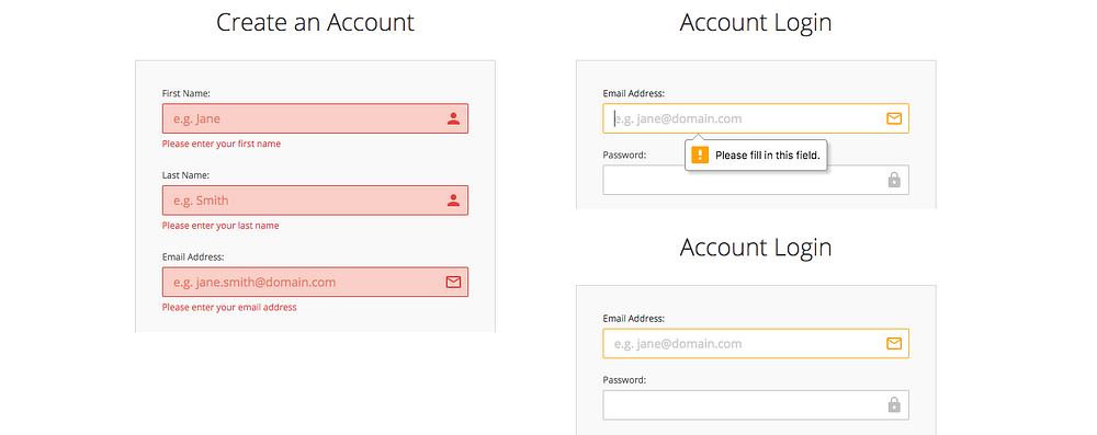
All input fields on the Yuppiechef website, except for the Create an account form, lacks useful descriptions on how to rectify the problem. The standard “Please fill in this field” message will not help the user recover from the error.
9.3. Is the user presented with polite error messages that don’t blame the user for the error?
The validation messages are not descriptive nor polite.

10.1. Is the user presented with clear steps/guidelines to use the product service?
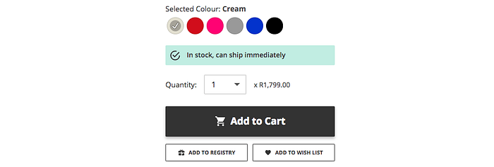
Shopping on the Yuppiechef website is pretty simple, no onboarding or guide is needed to purchase an item. Each page includes clear CTAs to choose colour, change quantity and add the item to the the cart, registry or wish list.
10.2. Does the user have access to documentation with relevant topics to help reach their goal?
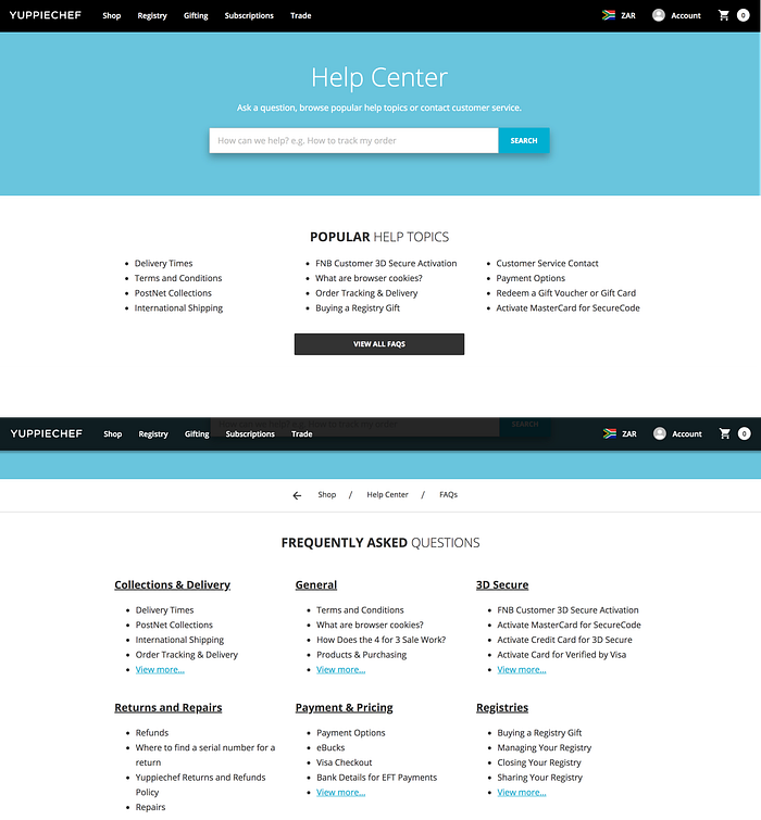
The Help centre is easily accessible from the top navigation and is easy to use. The user can either search or browse topics by popularity or by category.
10.3. Is the user presented with other channels of communication to enquire assistance to reach their goal?
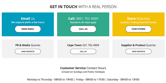
The user has the option to contact Yuppiechef through a range of other channels, both online and offline.
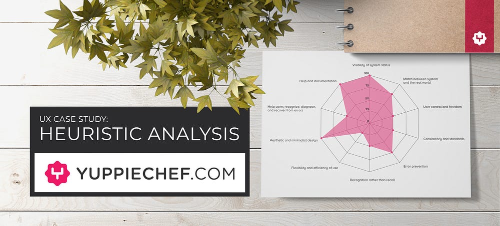
Yuppiechef Heuristics Analysis report
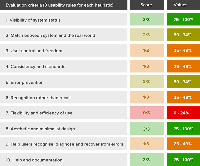
From the level of compliance for the usability rules, a score is allocated for each of the 10 heuristics. Don’t get lost in the detail of the scoring but rather on the usability rules that have not met the compliance criteria. Drawing up a radar chart is an excellent way to get an overview of the areas in which the website is lacking.

Conclusion
Conducting a Heuristic Analysis is an excellent way to get an objective view of a website’s usability status. By diving into each of the 10 Usability Heuristics by Nielsen Norman Group, will give a whole new perspective on existing functionality and UI elements within the website. Ultimately this UX methodology should be included in a larger UX strategy that’s accompanied with user research & usability testing.
Disclaimer: This is a case study to illustrate my personal approach in conducting a Heuristic Analysis of a website.


