Improving the way mobile money transfers work — a UX case study
Venmo’s pay & request money feature

Venmo is one of the most used mobile payments apps in the US with more than 40 million users as of 2019. With this increase in popularity, the app has similarly grown in features over the years — from shared payments to spending history. However, certain aspects of the app remain stagnant, and as a result, create friction for its users.
One of these sticking points is the UX for how you pay & request money. As someone who has accidentally sent someone money more often than I’d like to admit, it’s an unpleasant experience. Thus, I decided to investigate if others share the same problems I have with the app and explore ways to improve it.
Preliminary Research — Sample Survey
To make sure that the problems I had were real problems, I created a survey with a series of 10 questions. This was to get an overview of the users and whether the problems I had resonated with them. I sent the survey to my friends and had them share it among their networks to get immediate feedback.
Some of the questions I asked included:
- How often do you use Venmo?
- What’s the primary reason you use Venmo?
- On average, what’s the amount you pay/request per transaction?
- Have you ever sent someone money by accident instead of requesting money from them or vice versa?
Some takeaways from the 25 participants:

From this assessment, it was fair to assume that I was not the only one experiencing issues with paying and requesting money using Venmo. While I can’t be certain that the percentages scale relatively with their massive user base due to the small sample size, I was relieved to find out others had problems with the app as well.

Persona
Based on my analysis of the survey results and online research, I came up with three attributes shared by most of the survey participants who had the problems: young, tech-savvy, professional. Or as I like to call it, the “working millennials.”
From those attributes, I created a persona for the “working millennial” to help guide my thinking process and design decisions.

User Research — Interviews & Usability Testing
I interviewed 8 of my friends and colleagues who were in the same demographic as Amy to get their general thoughts on using the app. Furthermore, I asked them scenario questions related to paying or requesting money to understand their motivations and needs.
Some of the questions I asked were:
- How often do you use the app to pay money to someone?
- How often do you use the app to request money from someone?
- Tell me about the time you accidentally paid someone money instead of requesting.
- How did it make you feel?
- How did you resolve the problem?
After the interview, I asked them to do a mini-usability test of the app to get a deeper understanding of how they use it first hand. I gave my participants two scenarios with specific tasks and asked them to walk me through how they would complete the tasks.
Scenario #1 — Paying Money
Walk me through how you would pay your friend $100.

Scenario #2 — Requesting Money
Walk me through how you would request $100 from your friend.

I recorded each session and broke down each task on a timeline to capture the amount of time it took the participants to complete a task. The point of the exercise was to observe their current behaviors using the app and how those behaviors could affect the success of completing specific tasks. Also, I asked them to pinpoint areas where they felt the app failed to help them achieve their tasks.
Identifying and Prioritizing Pain Points
Using the data collected through the interviews and usability testing, I narrowed it down to the four biggest pain points that most users shared.
Pain Point #1: Unconventional pay/request money experience
Users felt that asking them to pay or request after entering the amount takes some time to get used to.

“I usually think to myself ‘I want to pay Anna $10’, I never think, ‘I want to Ana $10 pay her’ like the order that the app wants me to do. I already know if I’m going to pay or request someone from the start, why does the app force me to think about it at the end?”
Pain point #2: Similar UI for pay/request money causes confusion
Users have a hard time differentiating the pay & request buttons being so similar that they often mistake one over the other.
They also don’t like how their focus has to go all the way to the bottom of the screen to press “pay” or “request.”

“I’m the “designated payer” of the group, meaning I often pay for the whole group and send Venmo requests to them afterward. I tend to have the opposite problem. I experience the issue with requesting money instead of paying because I am used to just pressing the “request” button on the left side.”
Paint Point #3: Style for dollar amount input is hard to see
Users feel the light gray and small font size for the dollar amount makes it hard to catch mistakes if they were to input the incorrect amount.
Pain Point #4 Mistakes irreversible and require time to fix
Users who have accidentally sent someone money instead of requesting described their experience as annoying because it ends up taking up more time than expected to resolve the problem. However, once the problem has been resolved, they tend to have a more positive association of the experience.
Users who have accidentally been sent money by someone else described their experience as something fun, but note that they are still annoyed about having to pay back the money afterward.

Users who have sent money by accident more than once said they are less likely to use Venmo with acquaintances or strangers because of the possibility they might not get the money back.
“I am concerned about sending a large amount because of the potential of adding additional zeroes. Like how do I ask for $200, $300 back?”
User Flow
Using the data collected through the interviews and usability testing, I mapped out the existing user flow to pay & request money and highlighted places where the pain points occur. The purpose was to identify opportunities to improve the experience.

Solution Development
With the four biggest pain points identified, and their locations mapped, I brainstormed some ideas on how I wanted them to be solved. Below are some ideas I think would provide the most impact to the app’s experience:
- Change the flow so that the user determines whether they want to pay or request money from the start.
- Change the design of pay or request buttons so that they are not entirely similar.
- Make it clearer to the users whether they are paying or requesting money, the amount of the transaction, and the recipients.
- Make the confirmation more prominent so that users are more aware of their actions and are given more assurance of their actions.
Task Flow
Along with those ideas, I mapped our two new user flows that would alleviate the pain points users had.
User Flow #1 — Low cost, high impact
This flow mirrors the current existing flow in the app with an additional layer for the confirmation step.

User Flow #2 — High cost, high impact
This flows shifts the pay/request step to the beginning, followed by adding recipients and amount.

Wireframe Sketches
I came up with three different solutions, since I think it’s important to try different ways to solve the problem. After all, the design process is an experiment, and I didn’t want to develop tunnel vision with just one solution.
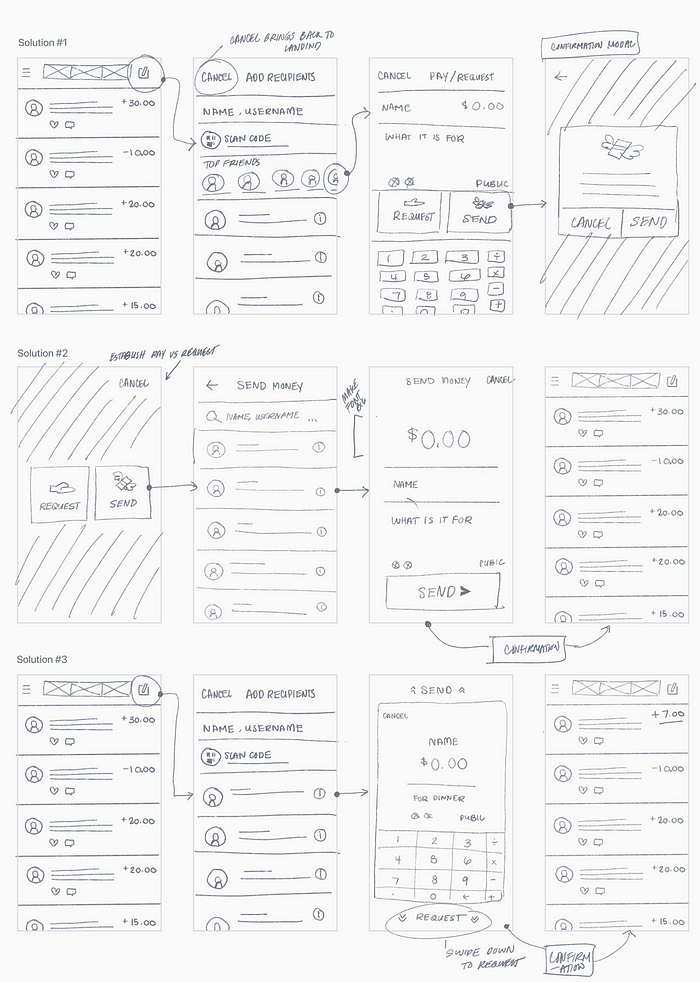
Solution #3 is inspired by a game I used to play as a kid called Make It Rain: The Love of Money that uses swiping up as a way to throw money.
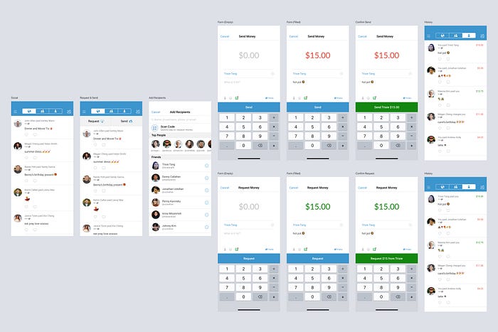
Hi-fi Mockups & Prototypes
Once I had the sketches, it was time to implement my solutions! I imported them into Figma and began mocking up the hi-fi screens and creating the prototypes for each of them. I took Venmo’s existing UI components into consideration, reusing what I could to keep the visual design consistent.
Solution #1: Better Confirmation & Button Differentiation

Pain points addressed: 1) differentiation between pay & request buttons and 2) more reassurance with confirmation modal
- Request and pay buttons are 15% bigger compared to the original for visibility.
- Money and receipt emojis are added for each button to create a subtle difference between the two so that users do not just see two blue buttons.
- A confirmation modal focuses the user’s attention to the action that they are performing. Header text highlights if the user is paying or requesting.
- Enhancement: the list of top 10 people are condensed into a left/right swipe-able bar for accessibility.

Solution #2: Action First, Add Recipients and Amount After
Pain points addressed: 1) actions are established at the beginning and 2) stylized dollar amount input is prominent and easy to notice mistakes.
- Clicking on the form icon prompts the user if they want to request or send money.
- “Send” replaces “pay” since it is a collective term for more use cases such as sending money to a friend a gift.
- Font size for dollar amount is 4x more prominent than the original for visibility.
- Font colors are added, green for requesting money and red for sending money. This alerts the user of their current action before they confirm the transaction.
- Confirm button is in the same location as the request button to promote the double-tap as a compound confirmation gesture.

Solution #3: Swipe Up to Send, Down to Request

Pain point addressed: 1) different gestures to send or request money
- Form is in a card to accommodate the swipe up/down gestures. These two gestures require the user to be actively thinking about their actions instead of having a quick tap.
- The user holds and releases to confirm which adds another layer of gestures the user has to perform to send or request money.
- Header text for confirmation highlights if the user is sending or requesting money.

Feedback
I showed my prototypes to 6 of the people I interviewed and asked them to perform the same two tasks they did previously. All participants were receptive of the different solutions provided:
- While there were minor stumbles, 4/6 were able to complete the tasks slightly better than Venmo’s current flow.
- Solution #1 is the most successful. Participants like it because it enhances the experience of users already familiar with Venmo instead of having them learn how to adjust to the new flow.
- Participants liked the idea of swiping or down as a way to send or request money with solution #3. However, they had trouble trying to perform the gestures correctly (I think it’s partly because of the limitation with the prototype).
“… [Solution #3] is like tinder but for your money.”
- Solution #2 is confusing for some because of the new pay/request buttons. It was still interesting to see people react to the idea of choosing an action at the beginning of the process.
- Participants like different things from each of the three solutions. Two suggested an iteration with solution #1 confirmation modal and solution #2 large and colored dollar input font.
What’s Next
Since this was a weekend side project, it is difficult to push it into the validation phase. However, if possible, I would do the following: iterate and validate to see whether or not the solutions solve Venmo’s stickiness with its pay & request feature effectively and efficiently.
Additionally, I think it would be awesome to explore potential ways to reduce the annoyance of making mistakes such as an “oops please send me back the money I accidentally sent you” feature. Or potentially implement a 10 sec period to undo a transaction like how Gmail has implemented in their mailing feature.

Takeaways
What started as an experiment out of my frustration with the app has turned into a fruitful exploration of the design process — from thinking about the questions to ask to sketching out potential solutions.
From this experiment, I learned about users’ perceptions of Venmo and areas that Venmo could improve to address their needs.
Secondly, it is difficult to change how people use the app, and rather than introduce an entire solution to a problem, sometimes it’s best to enhance the existing structure and utilize UX patterns that users are familiar with.
Lastly, something as simple as the process of pay/request requires a lot of research and understanding of users in order to craft meaningful experiences and interactions.
Final Thoughts
This experiment is not in any way a negative critique of Venmo, nor is it to say the solutions I provided are the best ones to address problems that only a handful of users experience. Please don’t @ me.
With that being said, I do not work for Venmo. Maybe the problems with pay/request money occur in such a low percentage of users that they do not feel the incentive to change their existing UX. With over 40 million users and counting, I could see why these problems take time to be addressed.
This was meant to prompt possible solutions from a user’s perspective that could improve the app and make it even better.
Big thanks to everyone who contributed to this experiment!
- To my friends and colleagues who participated in my sample survey and interviews and gave me feedback to improve my design.
- To the creators of these wonderful design tools that made this possible: Figma, draw.io, and flaticon.
Here’s the Figma file for this project. Feel free to test the prototypes ✌️

