UX Decoding: design better forms
 Forms are one of the most important components of digital product design. Forms are omnipresent, be it in a signup flow of a new social media, a discussion forum, online shopping, a new digital subscription, and the list goes on.
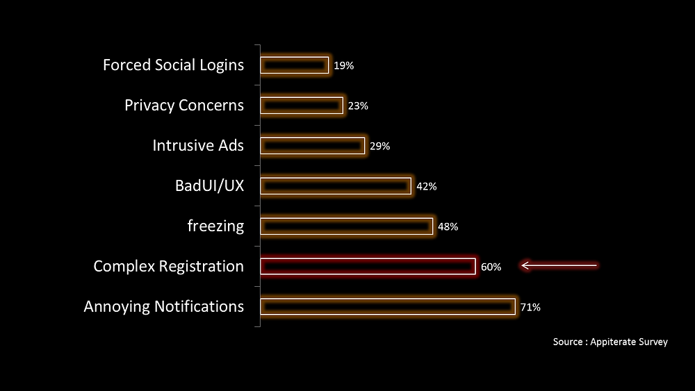
A website or an app faces maximum drop-offs at the registration step itself. 60% of the users drop off because of complex registrations. [Appiterate Survey]. There are multiple reasons to it such as complexity, tediousness, and protracted sometimes.

Let’s see how this burdensome task can be made more effortless and less time-consuming.
However, let me also highlight the fact that forms are highly-contextual and depend more on just these guidelines. These guidelines are based on experiments and statistically valid data. Keep in mind, this article focuses on the common dos and don’ts of form design and these shouldn’t be considered ultimate truth.
With that said, let’s dive in.
1. The label should always be visible:
There should always be a visual label associated with the input field. A lot of time, form designers avoid using labels to save space and just use placeholders instead. A label should be present all the time. Why? Because as soon as you start writing in the text field, the placeholder text disappears which forces people to use their memory and recall what this field was about.
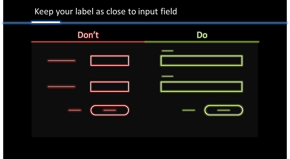
2. Keep your label as close to the input field:
Having a label as close to the input field makes it easier for the user to understand the association. The top-left aligned labels give better visual association assuming your language uses left to right script].

3. Use a single-column layout:
As you top-left align the labels of your input-field, the best way to make it work in your way is to provide a single column layout. A single-column layout will allow a user to insert information faster.

The idea of points 2 and 3 is to create a simple path for the user. It will help the user to navigate through the form quickly in the design. The faster a user would be able to scan the form, the shorter a form would look.

With this we have reduced the zig-zag visual drag and visual fixation, hence better UX.
4. Group related info:
Try to group related information close to each other. This allows the user to insert information faster as they are filling all the information about one particular category at a time.

5. Break long forms into steps:
Don’t overload users to insert too much information. If you are asking a user to enter more than six fields, a good practice would be to break a form into smaller logical steps and provide proper progress indicator.

Progress bars encourage completion and clearly communicate how far they are from finishing.
6. Use in-line input field validation:
You must have come across the form that shows the validation errors at top. Errors are frustrating already, don’t make the user struggle to find it. Try to make it easy for user to understand what’s wrong. Show them exactly below the input field which has a wrong entry.

7. Remove * and show optional fields
The idea is not to deface your forms with these unnecessary asterisks (*). A form should only have mandatory fields and have optional fields as less as possible. Ask yourself why this optional field is in the forms and check if this can be inferred or omitted completely. So instead of including that asterisks on every mandatory field, mark the optional ones.

8. Address possible user concerns :
Sometimes forms get too personal and sharing private information is really sensitive for users. Avoid asking personal information but if the information is really necessary for your system to work properly, explain why you need it.

Summary:
- The label should always be visible
- Keep your label as close to the input field
- Use single-column layout
- Group related info
- Break long forms to steps
- Use in-line input field validation
- Remove * and show optional fields
- Address possible user concerns
Please comment below what’s your view on this post and suggest me some more topics that I should write on. You can also get in touch with me on LinkedIn, Instagram, or Gmail. Cheers!


